The Evolutionary Architecture of the Screen
The screens we look at every day are changing. For many years, software developers and web designers built digital spaces using rigid grid systems. These spaces used sharp boxes, gray lines, and unnatural layouts. This style of design made sense when computers were new because it helped organize data like a spreadsheet.
However, humans did not evolve to live inside a spreadsheet. We evolved to live in nature. Today, we are seeing a major shift away from these sterile grids. Designers are starting to use biological design principles to build digital products. This approach brings the logic of the natural world onto our screens.
The core idea behind this shift is called biophilia. Biophilia is a word that means humans have an innate, natural affinity for living systems. This affinity is driven by our evolutionary history. Our brains developed over millions of years while we lived in forests, plains, and near water.
Because of this history, our minds process natural shapes and movements much faster than they process abstract computer shapes. When we translate these natural systems into digital user interfaces, we reduce interaction friction. Users do not have to work as hard to understand what they are seeing.
By using visual metaphors based on nature, we can make software feel familiar and safe. A visual metaphor is a tool where an image or design element represents a different idea or function. When we use visual metaphors from nature, we use patterns like water flow, leaf growth, or sunlight to guide the user.
This article will look closely at how these visual metaphors work. We will study functional, high-performing applications of biological systems within web and product design. We will explore how to build digital environments that align with human biology to create better user experiences.
Table of Contents
Defining the Core Concept: What Are Nature-Based Visual Metaphors in UI/UX?
To understand this design method, we must look at how visual metaphors work under the hood. Every metaphor has two parts. The first part is the source domain, which is the thing we borrow from. In this case, the source domain is nature. Nature gives us fluid dynamics, growth rings in trees, botanical geometry, and solar transitions. The second part is the target domain, which is the thing we are trying to explain or build. In digital design, the target domain consists of micro-interactions, information hierarchies, color theory, and component layouts. When we connect these two parts, we create successful visual metaphors that users can understand without training.
This connection helps with cognitive load reduction. Cognitive load is the amount of mental effort it takes to use a website or an app. When a user lands on a strange website, their brain has to work hard to figure out where to click. If the website uses abstract shapes, the brain has to learn a new set of rules.
However, when we use nature-based visual metaphors, we leverage existing human mental models. A mental model is the internal map a person has about how the world works. Since everyone knows how gravity works, or how light casts a shadow, they already understand the basic rules of your website if you use those same rules. This eliminates the need to learn abstract user interface conventions.
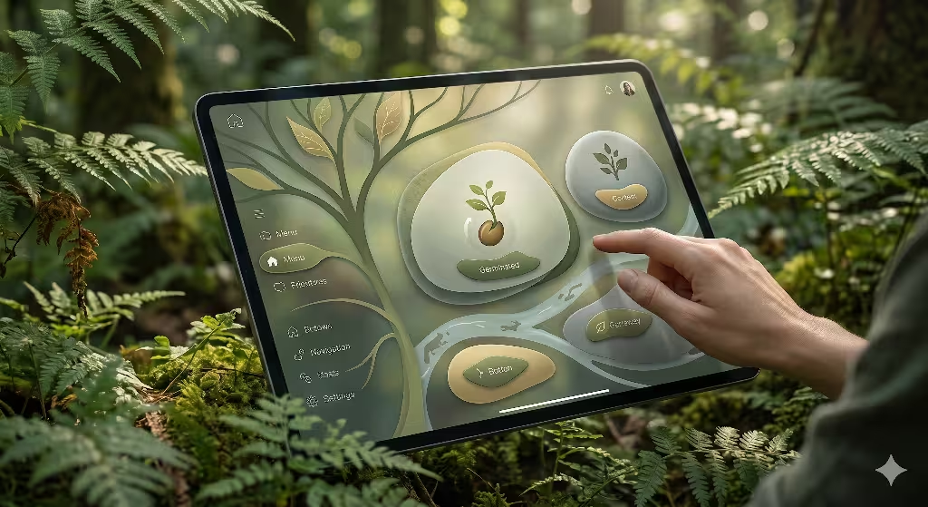
People often ask about how these ideas appear in real life. What are visual metaphors of nature in web design? They are not just pictures of trees or background videos of waterfalls. Instead, they are structural choices. For example, a menu that expands outward like the leaves of a plant is a great example. A loading bar that fills up smoothly like a river filling a basin is another example. These choices use the logic of nature to show data. When we use these visual metaphors, we do not just decorate a webpage. We build a functional language that speaks directly to the subconscious mind of the user.
The Three Structural Pillars of Natural Analogues
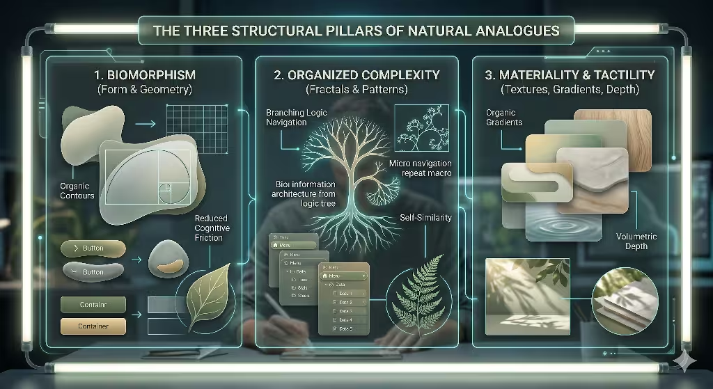
To build these systems (visual metaphors) correctly, we divide natural design into three main pillars. These pillars help us organize our visual metaphors so they are clean, useful, and fast.
1. Biomorphism (Form and Geometry)
The first pillar is biomorphism. This means we focus on form and geometry. For a long time, web design relied heavily on rectangles with perfectly sharp ninety-degree corners. You see these boxes in buttons, form fields, and image galleries. In the natural world, perfectly straight lines and sharp ninety-degree angles are incredibly rare. Nature prefers organic, soft, curvilinear shapes. We can see these shapes in the contours of leaves, the curves of riverbeds, and the shell spirals of sea creatures.
When we use biomorphism, we replace harsh geometric angles with these soft curves. For instance, we can design buttons that have a slight, irregular curve rather than a mechanical radius. We can organize content modules using layouts based on the Fibonacci sequence, which is the mathematical ratio nature uses to arrange seeds in a sunflower or leaves on a stem.
The psychological impact of contours versus sharp edges is massive. Studies show that human brains associate sharp triangles and hard rectangles with threat or danger. When a user sees a screen filled with sharp edges, their brain experiences a tiny amount of anxiety. On the other hand, soft contours activate areas of the brain linked to safety and focus. By using rounded, organic visual metaphors for our content containers, we lower user anxiety. This keeps users calm and helps them focus on the content.
2. Organized Complexity (Fractals and Structural Patterns)
The second pillar is organized complexity. Nature is complex, but it is never messy or random. It uses fractals and structural patterns to manage large amounts of information. A fractal is a pattern that repeats itself at different scales. If you look at a fern leaf, the whole leaf has a specific shape. If you look closely at one single branch of that leaf, it has the exact same shape as the whole leaf. This is called self-similarity.
We can use these branching patterns as visual metaphors for information architecture and nested navigation menus. Think about how tree roots or vascular systems in animals transport nutrients. They start with one large trunk, split into large branches, and then split into tiny twigs. We can design a website menu the exact same way. The main menu is the trunk. The categories are the branches. The individual pages are the twigs.
When we utilize fractal-like grids where macro layouts repeat down to micro-components, the website becomes highly organized. The user can easily guess where to find deep information because the structure makes sense at every level. The user’s eye follows the branches naturally. This kind of organized complexity makes large data sets feel small and easy to manage.
3. Materiality and Tactility (Textures, Gradients, and Spatial Depth)
The third pillar is materiality and tactility. This pillar looks at textures, gradients, and spatial depth. In the early days of the internet, designers used heavy skeuomorphism. This meant making digital buttons look exactly like real plastic buttons, complete with shiny reflections and fake textures. Later, designers rejected this and created flat design, which removed all depth, shadows, and gradients. Flat design made websites load fast, but it also made them hard to use because users could not tell what was a button and what was just text.
Biophilic design offers a middle ground. We can use visual metaphors that bring back depth and texture without falling into outdated, heavy skeuomorphism. We can achieve this by studying how light interacts with real-world surfaces. Nature does not use perfectly flat colors. If you look at a green leaf, it contains hundreds of shades of green, yellow, and blue because of how light hits it.
We can use organic color palettes that feature low-saturation moss greens, mineral grays, and coastal sand tones. These colors reflect healthy ecosystems. When users see these palettes, the colors unconsciously trigger user trust. We can also use subtle gradients that mimic the way light spreads across a smooth stone. This gives digital elements a sense of weight and presence. It tells the user that an item is real and can be interacted with, making the interface feel intuitive.
Practical Examples of Nature-Based Visual Metaphors in UI/UX
Let us move from theory to real-world application. Here are four detailed examples of how to build nature-based visual metaphors into your digital products.
1. Spatial Navigation via Prospect and Refuge
The first example is a concept called prospect and refuge. This comes from evolutionary psychology. In the wild, animals and early humans needed two things to feel safe. First, they needed a clear view of their surroundings so they could spot food or danger from a distance. This is called prospect. Second, they needed a safe place to hide or rest where nothing could sneak up behind them. This is called refuge. Think of a cave on the side of a mountain looking out over a valley.
We can turn this environmental setup into powerful visual metaphors for web navigation. We can build a user interface that offers both views at the same time. The main content area can act as the prospect space. This area can feature large, expansive hero imagery, wide-open canvas spaces, and clear paths that show the user where they can go next. It feels open, bright, and full of possibilities.
At the same time, we can create a refuge space on the screen. This is done by using a fixed, predictable navigation anchor or a sticky sidebar. This sidebar can use a slightly darker, warmer background color to make it feel solid and protective. When the user scrolls through a massive amount of information in the prospect area, the sidebar stays perfectly still. It acts as a safe home base. If users ever feel lost or overwhelmed, their eyes can instantly jump back to the refuge space. This balance keeps users comfortable, which encourages them to stay on your website longer.
2. Chronobiological UX (Circadian UI)
The second example is chronobiological design, which is also known as Circadian UI. This approach uses the natural shifting of sunlight and atmospheric tones throughout the day as one of its core visual metaphors. In the physical world, living things rely on the circadian rhythm. The blue light of the morning sun wakes us up, the bright white light of noon keeps us alert, and the warm amber light of evening helps us wind down.
Many modern applications offer a basic light mode and dark mode. However, these modes are usually static. The user has to flip a switch manually, or the system changes abruptly at a specific hour. A biophilic approach uses dynamic background changes that happen slowly over time. The software tracks the user’s localized time and adjusts its appearance gradually.
In the morning, the website can feature a crisp dawn palette with soft blues and gentle pinks. As the day progresses, the interface shifts to a clean, bright white with high contrast to match the midday sun. As evening approaches, the system automatically fades into a warm amber and copper tone, before finally settling into a soft, low-contrast dark mode for the night. This slow change mimics the real world perfectly. It reduces eye strain and respects the biological health of the user. It uses the visual metaphors of the sun to create an interface that feels connected to the real world.
3. Kinematic Easing and Fluid Motion Dynamics
The third example focuses on how things move on our screens. This is called kinematic easing and fluid motion dynamics. In the natural world, nothing moves linearly. If a rock falls from a cliff, it starts slow and speeds up because of gravity. If a leaf falls from a tree, wind resistance causes it to sway and slow down. When a swing moves, it slows down gently before it changes direction. Nature relies on physics, mass, and friction.
Many web animations use mechanical, uniform motion. A menu pops out at the exact same speed from start to finish. This feels jerky, artificial, and surprising to the human eye. To fix this, we can replace mechanical animations with organic curves by using specific CSS easing functions. We can design visual metaphors based on natural movement.
Imagine a drop-down menu that does not just drop down, but instead behaves like a weighted tree leaf returning to equilibrium after a raindrop hits it. It drops down quickly, bounces just a tiny bit at the bottom, and settles into place smoothly. Imagine a notification alert that does not just vanish, but instead fades away slowly like dispersing mist or smoke in a gentle breeze. When we use these fluid visual metaphors for motion, the interface feels alive. The animations do not distract the user. Instead, they feel predictable and satisfying because they follow the laws of physics that our brains expect.
4. Volumetric Light Filtration (Komorebi Effect)
The fourth example is the use of volumetric light filtration. In Japan, there is a beautiful word for this: Komorebi. It refers to the sunlight filtering through the canopy of trees. When light passes through layers of leaves, it does not create a harsh, black shadow. Instead, it creates soft, layered depths of shadow and gentle pools of light. The ground below shows a clear sense of depth because you can see multiple layers of leaves casting shadows on top of each other.
We can bring this effect onto our screens by using advanced CSS drop-shadows and backdrop filters. Traditional web design often uses a single, dark, heavy shadow under a modal window to make it look like it is floating. This looks fake and cuts the screen into harsh sections. A biophilic interface uses multi-layered, soft shadows instead.
To build this visual metaphor, you can stack five or six very light shadows with large blur radiuses under an element. You can also use a subtle blur filter on the background behind the modal window. This creates an effect where the background elements look like they are sitting under a pool of soft, filtered light. It establishes a clear visual hierarchy and digital depth without using harsh lines. The user can instantly tell which element is on top and which element is underneath. This clean layout makes the screen easy to read and beautiful to look at.
The Biological ROI: Why Biophilic Metaphors Drive Conversion and User Trust
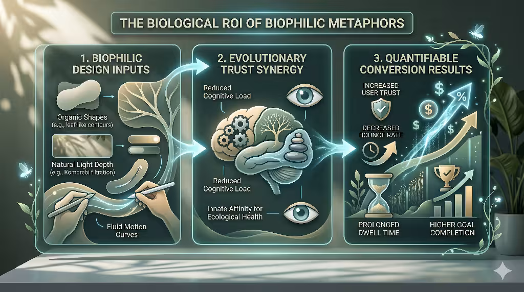
Designers love beautiful websites, but businesses care about results. They want to see a Return on Investment, or ROI. Fortunately, using nature-based design principles provides a strong biological ROI. This happens because these systems drive conversions and build deep user trust by working with human psychology.
Humans possess an evolutionary urge to trust health. For thousands of years, our survival depended on our ability to spot a healthy ecosystem. If a forest was green, filled with clean water, and full of balanced life, it meant safety, food, and shelter. If an area was dry, sharp, gray, and chaotic, it meant danger or disease. Our brains are hardwired to gravitate toward flourishing, hydrated, balanced environments.
When we build websites using biophilic visual metaphors, we take advantage of this ancient wiring. When a user visits a website that uses soft organic curves, balanced fractal hierarchies, and natural lighting effects, their brain registers those signs as a healthy ecosystem. The user feels safe. They sub-perceptually transfer these feelings of ecological health onto the company’s brand authority and reliability. They assume the business is stable, honest, and safe to deal with.
This trust shows up clearly in standard web data metrics. When users feel safe and experience low cognitive load, their behavior changes. They do not click the back button immediately. This results in reduced bounce rates. Because the interface is easy on the eyes and satisfying to navigate, users spend more time exploring different pages. This leads to prolonged dwell times. Most importantly, when a user trusts a website and feels calm, they are much more likely to fill out a form, sign up for a newsletter, or buy a product. Biophilic visual metaphors transform a cold digital sales pitch into an inviting environment where users want to do business.
Frequently Asked Questions about Nature-Based Visual Metaphors
To fully explore this topic, let us look at some of the most common questions people ask about nature-based web design.
How does nature inspire UI/UX design?
Nature inspires digital design by providing a massive library of proven solutions. Every system in nature has been tested and refined over millions of years of evolution. Nature handles complex problems with incredible efficiency. For example, a leaf needs to maximize its surface area to catch sunlight while using the least amount of material possible. The branching veins of a leaf solve this problem perfectly.
When we look to nature for inspiration, we are participating in functional biomimicry. This does not mean we just copy the look of a plant. It means we study the underlying logic. We optimize user interaction through balance, symmetry, and logic inherent in ecosystems. We use the way an ecosystem balances itself to learn how to balance our visual elements on a screen. Nature teaches us how to organize information, how to use color palettes that do not cause fatigue, and how to create motion that feels comfortable. It acts as a master blueprint for building complex software systems that feel simple to use.
What is the difference between hyper-realistic skeuomorphism and biophilic UI design?
It is easy to confuse these two design styles, but they are actually very different. Hyper-realistic skeuomorphism is a style that mimics human-made artifacts from the physical world. In the early days of smartphones, apps used this style to help people understand touchscreens. For example, a calendar app was designed to look exactly like a physical desk calendar with a fake leather border and white paper pages with torn edges. A notes app looked like a yellow legal notepad with red lines. This style mimics old objects, many of which are now obsolete. It often adds unnecessary visual clutter to a screen because those fake textures do not help the software run better.
Biophilic UI design is completely different because it mimics universal, organic systems and natural patterns. Instead of copying a human-made leather calendar, biophilic design looks at how the planet manages time through light and dark cycles. Instead of copying a wooden bookshelf to show digital books, it looks at how trees organize branches to manage growth. Biophilic design focuses on the fundamental laws of nature, such as gravity, fluid motion, light filtration, and biological geometry. It uses these natural elements to improve functionality without adding visual clutter. It does not decorate a screen with fake human objects. Instead, it shapes the digital interface to match human evolutionary psychology.
How do you implement nature-based design without harming site performance and SEO?
This is a critical question for any modern web developer. If you build a website that uses massive, heavy videos of forests or giant, unoptimized images of landscapes, your website will load very slowly. A slow website ruins the user experience. It also hurts your search engine optimization because search engines penalize slow pages. To prevent this, you must focus on code-based implementation strategies instead of relying on heavy media files.
You can create beautiful nature-based layouts by using lightweight code rather than heavy raster graphics. For instance, you do not need an image file to show a soft, natural gradient. You can write a few lines of clean CSS to generate programmatic gradients that render instantly in the user’s browser. If you want to use organic curves and biomorphic shapes, you should use standard Scalable Vector Graphics, which are known as SVGs. SVGs are tiny code paths that describe shapes mathematically. They load instantly and look perfectly sharp on every screen size.
For fluid motion and complex natural animations, you can use CSS transitions or lightweight WebGL scripts. These tools use the computer’s graphics card to run animations smoothly at sixty frames per second without slowing down the page load. By using these smart coding techniques, you can build rich environments that keep your core web vitals incredibly fast. This keeps your users happy and ensures your search engine rankings stay high.
The Evolution of Digital Ecosystems
The internet is growing up. We are moving past the era where digital spaces have to feel cold, mechanical, and separate from our real lives. As we spend more of our waking hours looking at screens, the design of those screens matters more than ever. We must treat websites and applications not as static billboards made of plastic and glass, but as living digital habitats.
By embracing nature-based design, we can create a beautiful synthesis between technology and biology. Using these principles allows us to build software that respects human evolutionary psychology. When we use organic shapes, branching structures, natural lighting, and realistic physics, we break down the wall between the user and the device. We create digital ecosystems that feel healthy, intuitive, and deeply trustworthy. The future of design is not about forcing humans to think like machines. It is about building machines that adapt to the natural history of humans.
Implementation Examples
To help you get started with these design principles, let us look at some practical code examples. These examples demonstrate how to implement nature-based concepts using clean, high-performance CSS.
Implementing Biomorphic Button Contours
Instead of using a perfectly uniform border-radius on your buttons, you can use an asymmetrical border-radius. This mimics the organic, irregular curves found in river stones and plant leaves.
CSS
.biomorphic-button {
  background: linear-gradient(135deg, #e0e7ff 0%, #c7d2fe 100%);
  color: #1e1b4b;
  padding: 12px 28px;
  border: none;
  /* An irregular, organic curve that feels soft and natural */
  border-radius: 60% 40% 60% 40% / 40% 60% 40% 60%;
  font-family: sans-serif;
  font-size: 16px;
  cursor: pointer;
  transition: border-radius 0.4s ease-in-out, transform 0.2s ease;
}

.biomorphic-button:hover {
  /* The shape shifts gently when touched, like an organic cell */
  border-radius: 40% 60% 40% 60% / 60% 40% 60% 40%;
  transform: scale(1.02);
}
Creating the Volumetric Light Filtration Effect
To build a modal window or a content card that looks like it sits under filtered sunlight, you can layer multiple soft shadows. This avoids harsh, artificial lines and establishes a gentle visual hierarchy.
CSS
.komorebi-card {
  background: rgba(255, 255, 255, 0.85);
  /* The backdrop blur filter makes background elements look soft and distant */
  backdrop-filter: blur(12px);
  -webkit-backdrop-filter: blur(12px);
  border: 1px solid rgba(255, 255, 255, 0.4);
  border-radius: 24px;
  padding: 32px;
  max-width: 400px;

  /* Five distinct layers of very soft, transparent shadows mimic natural light depth */
  box-shadow:
    0 2px 4px rgba(45, 55, 72, 0.02),
    0 6px 12px rgba(45, 55, 72, 0.02),
    0 16px 24px rgba(45, 55, 72, 0.03),
    0 32px 48px rgba(45, 55, 72, 0.03),
    0 64px 96px rgba(45, 55, 72, 0.04);
}
Setting Up Natural Kinematic Easing
To make elements move across the screen like objects in the physical world, you can use a custom cubic-bezier curve. This curve simulates acceleration and deceleration influenced by friction and mass.
CSS
.natural-motion-element {
  transition-property: transform, opacity;
  transition-duration: 600ms;
  /* This specific curve mimics a natural swing or a leaf catching the wind */
  transition-timing-function: cubic-bezier(0.25, 1, 0.5, 1);
}

.natural-motion-element:hover {
  transform: translateY(-8px);
}
By applying these minor technical updates, you can easily shift your website away from standard mechanical layouts. These simple adjustments allow you to build an experience that aligns perfectly with human perception and behavioral patterns.