The Biological Logic of Natural Color
When you look at a forest environment, you do not just see a flat wall of green. You are looking at a highly complex system of light and biology. Moving beyond the simple idea of green means we must understand how light works in the real world. A true color palette from nature relies on environmental light distribution. This means looking at how the sun hits different surfaces at different times of the day. To build a successful website today, you need to understand this biological logic. It is not just about making things look pretty. It is about how the human brain processes visual data.
There is a very specific evolutionary hook that explains why the human eye is optimized for natural gradients. This is often called the Savanna Hypothesis. Millions of years ago, human beings evolved on the open plains and in the dappled light of the forest edge. Our eyes were trained to spot the difference between safe plants and dangerous predators.
Because of this entrenched history, our brains feel relaxed when we see a color palette from nature. We are hardwired to process organic tones quickly and with very little effort. When you use a color palette from nature on your website, you trigger this ancient feeling of safety. This makes the user want to stay on your page longer. In the web design world, we call this dwell time.
Our main objective at Silphium Design LLC is merging ecological aesthetics with digital functionality. We want to take the beauty of the outdoors and make it work on a computer screen. This is the core of biophilic design. It is not enough to just pick a random green or brown. You must use a color palette from nature that actually works within the rules of web code. A proper color palette from nature will improve user experience and boost your search engine optimization. It creates a seamless bridge between the biological world we evolved in and the digital world we work in today.
Table of Contents
Field Research: Capturing High-Fidelity Source Imagery
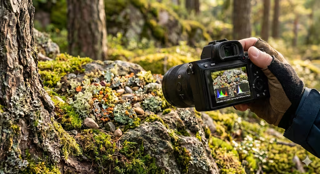
Before you can create a color palette from nature, you have to go outside and do field research. You cannot just guess what colors look like. You have to capture high quality images of the real world. The first thing you need to understand is the difference between the golden hour and high noon.
The golden hour happens just after sunrise and just before sunset. The light temperature during this time is very warm. Light temperature is measured in Kelvin. A lower Kelvin number means warmer, yellower light. A higher Kelvin number means cooler, bluer light. If you take a picture at high noon, the light is harsh and washes out the true colors. If you want a warm color palette from nature, you must shoot during the golden hour.
You also need to think about the difference between macro photography and landscape photography. Macro photography focuses on very small micro textures. You might take a close up picture of tree bark, a piece of moss, or the rough surface of a stone. These micro textures give you a very detailed color palette from nature.
Landscape photography captures the big picture, like a whole forest canopy or a wide mountain range. Both methods are useful. A macro photo gives you rich accent colors for buttons and links. A landscape photo gives you great background colors for large sections of your website. To get a complete color palette from nature, you should take both types of photos during your field research.
The tooling you use to take these photos is also very important. You should always utilize RAW format photography to preserve color depth. A standard JPEG image compresses the color data. It throws away millions of subtle shades to make the file size smaller. A RAW image file keeps all the data captured by the camera sensor. This is critical for digital sampling later on. When you extract a color palette from nature from a RAW file, you get much richer and more accurate results. You avoid the muddy colors that often come from compressed JPEG files. Using the right tools ensures your color palette from nature is as vibrant as the real thing.
The Digital Extraction Process
Once you have your RAW photos, you move to the digital extraction process. This is the core skill you need to master. Knowing how to create a color palette from nature using the Mosaic method is a game changer for web designers. The Mosaic method involves breaking your photo down into small squares, much like a tile mosaic. Instead of looking at the whole picture, you look at the average color of each square. This helps you ignore the tiny, distracting details and focus on the main color groups. It is the best way to start building a color palette from nature because it simplifies the visual data into workable chunks.
After using the Mosaic method, you should apply algorithmic sampling to refine your choices. You can utilize tools like Adobe Color or write custom Python scripts using K-Means Clustering. K-Means Clustering is a math formula that groups similar pixels together. It helps identify your dominant colors and your accent colors automatically. When you let a computer algorithm analyze your photo, it removes human bias. It finds the true mathematical average of the colors present. By using K-Means Clustering, you can pull a highly accurate color palette from nature that reflects the true mathematical harmony of the environment. This digital extraction ensures your color palette from nature is balanced.
However, you cannot rely completely on algorithms. You must understand the difference between the eyedropper tool and the human eye. The eyedropper tool in a design program picks a single pixel. A single pixel from a photo of a leaf might actually be dark gray because of a shadow, even though the leaf looks bright green to your eye.
This is why manual refinement is necessary to avoid muddy digital transitions. You must use your eye to adjust the colors the algorithm gives you. If the color palette from nature looks too dull on a bright computer screen, you need to turn up the brightness slightly. A successful color palette from nature requires a balance between mathematical extraction and human visual perception.
The 60-30-10 Rule in Biophilia
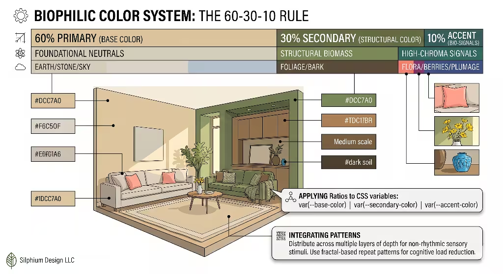
After you extract your colors, you need a system to apply them to your website. We use semantic mapping based on the classic design rule. The 60-30-10 rule in biophilia organizes your color palette from nature into three distinct categories. The first category is your primary color. This should make up 60 percent of your website design. For a color palette from nature, these are your foundational neutrals. Think of the colors of earth, stone, and the vast open sky. These colors should be used for your main backgrounds and large sections of negative space. They give the user’s eyes a place to rest.
The second category in the 60-30-10 rule is your secondary color. This should make up 30 percent of the design. In a color palette from nature, these are the structural colors. Look at the colors of heavy foliage, thick tree bark, and deep water. These colors are darker and richer than your primary neutrals. You use these secondary colors for headers, footers, and large text blocks. They provide structure and guide the user through the page. A well balanced color palette from nature relies heavily on these strong structural colors to create visual hierarchy.
The final category is your accent color, which makes up just 10 percent of the design. These are high chroma bio signals. In the wild, high chroma means very bright and saturated. Think of the bright red of poisonous berries, the vivid pink of a blooming flower, or the brilliant yellow of bird plumage. In your color palette from nature, these accent colors are used sparingly to grab attention. You map these ratios directly to CSS variables for site wide consistency. You write CSS code like dash dash primary color, dash dash secondary color, and dash dash accent color. This ensures every page on your site perfectly follows your chosen color palette from nature.
Common Questions about Making a Color Palette from Nature
When people search for information about biophilic design, they have specific questions. One major question is, how do you pick a color palette from a photo? The answer requires a detailed walkthrough of pixel sampling and averaging. As discussed in the extraction section, you do not just click once. You take multiple samples from different areas of the photo and average them out. You look for the midtones, avoiding the absolute brightest highlights and the darkest shadows. This careful averaging is the secret to extracting a usable color palette from nature.
Another common question is, what are natural color schemes called? There are many terms used in the design industry. Some people call them Earth Tones, which usually means browns, tans, and warm grays. Others call them Organic Palettes, which might include more greens and soft blues.
At Silphium Design LLC, we prefer the term Biophilic Color Arrays. This term is more scientific. It implies a connection to living systems rather than just dirt and rocks. No matter what name you use, the goal is always to create a color palette from nature that resonates with human biology. Knowing these terms helps you understand the different ways designers talk about a color palette from nature.
Finally, users often ask, how do you extract colors from a landscape? Extracting from a wide landscape is different from a close up photo. We must discuss the importance of depth and atmospheric perspective. As objects get further away in a landscape, they lose saturation and take on a blue or gray tint. This is because of the atmosphere between you and the distant object. When extracting a color palette from nature from a mountain view, you must capture these distant blues and grays. They make excellent background colors for web design because they naturally recede and create a sense of depth on a flat screen.
The Science of Fractals and Non-Rhythmic Sensory Stimuli
Biophilic design is not just about static colors. It is also about patterns. The science of fractals explains why a color palette from nature feels so good to look at. Fractals are complex patterns that look similar at any scale. Think of a fern leaf. Each small part of the leaf looks exactly like a miniature version of the whole leaf. Natural color patterns often mimic this fractal geometry.
When you use a color palette from nature that follows a fractal pattern, it reduces user cognitive load. Cognitive load is how hard the brain has to work to understand what it is seeing. A fractal color palette from nature is easy for the brain to process, making the user feel relaxed.
Nature is also constantly changing. The light shifts, clouds move, and leaves rustle in the wind. We call these non rhythmic sensory stimuli. You can bring this concept into your web design by creating dynamic palettes. Instead of keeping your color palette from nature exactly the same all day, you can use CSS transitions to mimic the subtle shifts in natural light. We call this a Circadian UI. A Circadian UI changes slowly over time.
In the morning, your color palette from nature might feature cooler, brighter tones to mimic the sunrise. By the afternoon, the colors might warm up. In the evening, the color palette from nature can shift to darker, deeper shades to reduce eye strain. This dynamic approach makes the digital experience feel alive. It connects the user to the natural passage of time. A static color palette from nature is good, but a dynamic, shifting color palette from nature is exceptional. It proves you understand the deeper biological connections of biophilic design.
Accessibility: Nature Meets WCAG 2.1
Creating a beautiful design is only half the job. The design must also be usable by everyone. This is where accessibility comes in. Nature meets WCAG 2.1 standards when we apply strict rules to our designs. WCAG stands for Web Content Accessibility Guidelines. The biggest challenge in biophilic design is the contrast conflict. How do you maintain biophilic integrity while meeting the AA or AAA accessibility standards? A true color palette from nature often features low contrast. In a forest, many colors blend together for camouflage. But on a website, if the text blends into the background, people with visual impairments cannot read it.
To solve this, we cannot just use the exact colors we pulled from a photograph. We must adjust the luminance and saturation of our natural earth tones. Luminance is how bright or dark a color is. Saturation is how intense the color is. To ensure readable text overlays, you need a contrast ratio of at least 4.5 to 1 for normal text. You have to take the background color from your color palette from nature and make it much lighter or much darker. Then you test it against your text color using an online contrast checker.
This is an essential step in refining a color palette from nature. You might have to sacrifice a tiny bit of natural realism to make the site accessible. For example, a soft olive green from your color palette from nature might look beautiful as text on a tan background, but it might fail the contrast test. You would need to darken that olive green significantly until it passes. A truly professional color palette from nature does not just look organic, it also guarantees that every single user can easily read the information on the screen without straining their eyes.
Seasonal Variation in Web UX
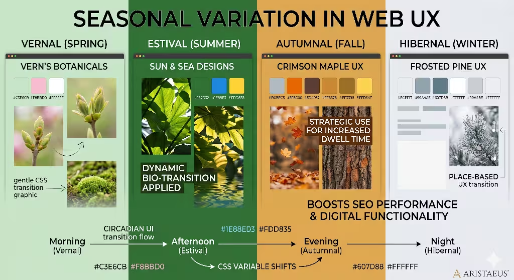
Nature never stays the same, and neither should your website. Seasonal variation in web UX is a powerful way to engage users. You can create different versions of your color palette from nature for different times of the year. We break this down into four distinct seasonal palettes. The Vernal palette is for spring. It features bright, fresh greens and soft pastels like new flower buds. The Estival palette is for summer. It uses deep, saturated greens, bright blues, and vibrant yellows. The Autumnal palette is for fall. It relies on warm ochres, burnt oranges, and deep browns. Finally, the Hibernal palette is for winter. It utilizes stark neutrals, icy blues, and muted grays.
Switching your color palette from nature based on the season is a highly strategic move. It shows that your website is active, alive, and in tune with the environment. We call this strategic use place based design. It aligns your site palettes with the current regional seasons of your target audience. If your audience is primarily in the Northeast, rolling out an Autumnal color palette from nature in October creates a strong emotional connection. The user looks out their window, sees the changing leaves, and then sees those same colors reflected on their screen.
Managing a seasonal color palette from nature is easy if you use CSS variables properly. You simply change the core hex codes in your stylesheet every three months. Your entire website updates instantly. This keeps the user experience fresh and encourages repeat visits. People will subconsciously notice that the site feels current and relevant to their real world surroundings. Using a seasonal color palette from nature is one of the most effective ways to build a long term relationship with your users through design.
Advanced SEO: Semantic Keywords and Entities
A color palette from nature does not just help human users. It also helps search engines understand what your website is about. To optimize your article or page, you must use semantic keywords and entities. Google does not just look for single words anymore. It looks for related concepts that prove you are an expert. When writing about a color palette from nature, you must include specific technical entities. You should define terms like chromaticity, which is the quality of a color regardless of its luminance. You should explain biomimicry, which is the design practice of copying natural biological systems.
You must also include technical web design terms. Talk about hex codes and RGB values to show you know how to build a color palette from nature in the digital space. Discuss spectral distribution, which is the physical science of how light waves create color. Mention visual hierarchy to prove you understand user experience. When search engines see all these related entities surrounding the phrase color palette from nature, they recognize the content as highly authoritative. This will significantly boost your rankings in the search results.
Your internal linking strategy is also vital for advanced SEO. You should connect your articles about color theory to other pages about biophilic site architecture and UX. Create a web of information. If you mention a color palette from nature in a blog post, link that phrase back to your main service page where you offer biophilic design. This tells the search engine crawlers exactly how your content is structured. A strong internal linking structure built around the topic of a color palette from nature will establish your site as the ultimate resource for biophilic web development.
Implementing the Silphium Standard
Creating a biophilic website requires discipline, research, and a deep understanding of biology. Let us summarize the entire process. You begin by understanding the evolutionary reasons why we prefer organic designs. Then, you conduct careful field research with RAW photography to capture true light data. Next, you extract your color palette from nature using algorithmic tools and careful human refinement. Once extracted, you map those colors using the 60-30-10 rule to create structure. You answer common user questions, integrate fractal patterns, and ensure strict WCAG 2.1 accessibility. Finally, you adjust for the seasons and optimize the entire package with semantic SEO entities.
This complete process from camera capture to final CSS code is what we call the Silphium Standard. It is not a quick fix. It is a comprehensive framework for building digital spaces that respect human biology. I strongly encourage all designers to step away from their desks. Go outside and botanize your digital assets. Observe the moss on a rock or the gradient of a sunset. Bring those observations back to your code. When you build a true color palette from nature, you are not just making a pretty website. You are creating a digital environment where human beings can thrive.