At Silphium Design LLC, we think about the web in a new way. Most people see the internet as a world of boxes and straight lines. They see data as cold numbers on a screen. I see something else. I see a chance to bring the natural world into our digital lives.
My work is about making websites feel like a walk in the woods and to build tools that talk to the human brain. We call this biomorphic data visualization. It is not just about making things look pretty. It is about how we think and feel when we look at a screen. We want to make data easy to trust. We want to make the web a place where people feel good. This article will show you how we do that.
Table of Contents
Defining the Domain: What is Biomorphic Data Visualization?
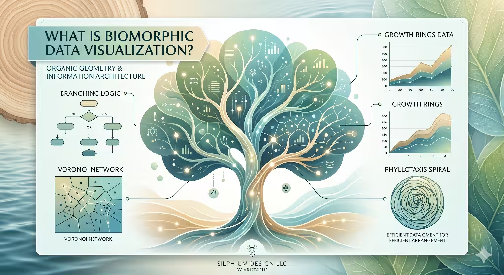
To understand this topic, we must look at the words. The word bio means life. The word morph means shape. When we talk about biomorphic data visualization, we mean data that takes the shape of living things. Most charts use bars or pies. These shapes are not found in nature. You do not see many perfect squares in a forest. You see curves. You see branches. You see patterns that repeat.
Biomorphic data visualization takes the numbers from your business or your research and turns them into these natural shapes. Imagine a chart that looks like a growing tree. The thick trunk shows the main goal. The branches show different parts of the work. The leaves show the small details. This is much easier for a person to understand than a big table of numbers.
We use biomorphic data visualization to help the brain relax. When we see natural shapes, our minds do not have to work as hard. We have spent thousands of years looking at trees and clouds. Our eyes know how to follow those lines. When a website uses biomorphic data visualization, it taps into that history. It makes the data feel like it belongs in our world. It is not just a bunch of code. It is a living story.
At Silphium Design LLC, we believe that biomorphic data visualization is the future of the web. We want to move away from the cold feel of old websites. We want to create spaces that feel warm. We use biomorphic data visualization to bridge the gap between humans and computers. It is a way to make technology feel more like us. It is a tool for better communication.
The Biological Imperative: Fractal Fluency and Cognitive Load
Your brain is a very busy tool. It is always trying to make sense of the world. When you look at a screen, your brain has to process everything it sees. If the screen is messy or confusing, your brain gets tired. We call this cognitive load. One way to lower this load is through biomorphic data visualization.
Nature uses patterns called fractals. A fractal is a shape that looks the same whether you look at it from far away or up close. Think of a snowflake or a fern leaf. These patterns are everywhere in nature. Scientists have found that humans have something called fractal fluency. This means our eyes and brains are very good at seeing these patterns. We can look at a fractal and understand it almost instantly.
When we use biomorphic data visualization, we put these fractals into our charts. This helps the reader. They do not have to study the chart for a long time to get the main idea. Their brain sees the pattern and knows what it means. This makes the data feel easy. It makes the user feel smart.
Using biomorphic data visualization to lower cognitive load is a big part of our design work. We want people to enjoy looking at data. We do not want them to feel stressed. If a chart is built with fractals, it feels smooth. It feels right. This is because biomorphic data visualization works with the way our eyes were built. It is a natural fit for the human mind.
The Computational Backbone: Algorithmic Nature
Creating biomorphic data visualization is not a simple task. It takes a lot of math and computer code. We use something called algorithms. An algorithm is just a list of instructions for the computer. To make a chart look like a plant, we give the computer rules about how plants grow.
We use parametric design for biomorphic data visualization. This means we set certain rules, but the data changes the final shape. If one number is big, the “branch” of the data might grow longer. If a number is small, it might stay short. This makes every chart unique. It makes the biomorphic data visualization feel alive.
We also use things like Voronoi patterns. These look like the cells in a leaf or the spots on a giraffe. They are great for showing how different groups of data relate to each other. By using these complex codes, we can make biomorphic data visualization that is very accurate. It is not just art. It is a precise tool for showing facts.
The tech behind biomorphic data visualization is always getting better. We are now able to make charts that move and change in real time. This is very exciting for Silphium Design LLC. We can show people how data grows over time. We can use biomorphic data visualization to show the heartbeat of a business. It is a powerful way to use code to reflect life.
How does biomorphic visualization differ from traditional charts?
People often ask how biomorphic data visualization is different from a regular bar chart. The biggest difference is the shape. Traditional charts use rigid lines. They use 90-degree angles. They are built for machines to read. Biomorphic data visualization is built for people to feel.
A bar chart tells you a number. It is very direct. But it can also be very boring. It does not tell a story. Biomorphic data visualization tells you the number and the context. It shows you how that number fits into the whole system. It uses curves and flow. In nature, things do not move in straight lines. They curve. They bend. Biomorphic data visualization follows these natural paths.
Another difference is engagement. People tend to look at biomorphic data visualization for a longer time. They want to explore the shapes. They want to see how the patterns work. Traditional charts are often skipped over. People see them as a chore. But biomorphic data visualization is seen as a feature. It is something people want to interact with.
At Silphium Design LLC, we see biomorphic data visualization as a way to improve the user experience. We are not saying that bar charts are bad. They have a place. But for many things, biomorphic data visualization is better. It is more human. It is more interesting. It turns a boring task into a moment of discovery.
The Vibe Factor: Subjective Trust and Affective Design
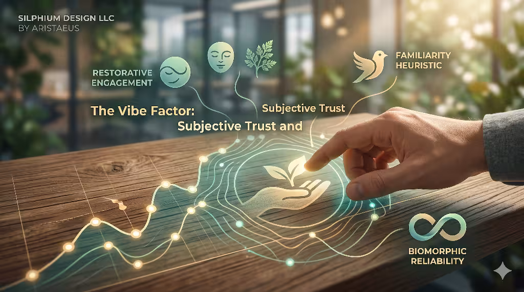
We often talk about the vibe of a website. This is a simple way of saying how the site makes you feel. Does it feel safe? Does it feel honest? Biomorphic data visualization has a huge impact on this feeling. When people see natural shapes, they tend to feel more trust.
This is because nature feels real. We trust trees to grow. We trust the sun to rise. When data is shown through biomorphic data visualization, some of that trust carries over. The data feels less like a lie and more like a truth. It feels like something that was discovered, not something that was made up in an office.
We also use biomorphic data visualization for affective design. This means we design for emotions. We want the user to feel calm and focused. The soft curves of biomorphic data visualization help with this. They take away the sharp edges of the digital world. They make the screen feel like a friendly place.
The vibe of biomorphic data visualization also helps with business. If people trust your data, they are more likely to buy from you. If they enjoy being on your site, they will come back. Using biomorphic data visualization is a way to build a long-term bond with your audience. It shows them that you care about their experience. It shows them that you value their peace of mind.
Can biomorphic design lead to data misinterpretation?
A common question is whether biomorphic data visualization can be confusing. Some people worry that the pretty shapes might hide the facts. This is a fair point. If a designer is not careful, biomorphic data visualization can become too complex. It can look like a mess of lines.
To solve this, we use a two-step approach at Silphium Design LLC. First, we use biomorphic data visualization to give a big picture. This shows the general trend and the feeling of the data. Then, we provide a way to see the exact numbers. We might use a small table or a hover effect. This way, the biomorphic data visualization provides the story, and the numbers provide the proof.
It is also important to use the right shapes. We do not just pick a random plant shape. We pick a shape that matches the math. If we are showing how a budget is split, we might use a pattern like the seeds in a sunflower. This is a mathematical way to show parts of a whole. By using math as our guide, we make sure our biomorphic data visualization is honest.
The key is balance. We want the beauty of nature and the truth of science. When we do biomorphic data visualization correctly, it does not hide the truth. It makes the truth easier to see. It highlights the most important parts of the data. It guides the user to the right conclusion.
Designing for Nature as Infrastructure
At Silphium Design LLC, we do not just use biomorphic data visualization for charts. We use it for the whole website. We think of the website as a garden. Each page is a different plant. The links between pages are like roots or vines. This is what we call semantic architecture.
We use biomorphic data visualization principles to organize information. We group related topics together in clusters. We make sure the most important information is at the center, like the heart of a flower. This makes the website easy to navigate. People do not get lost because the layout makes sense to their natural instincts.
This approach also helps with search engines. Google likes websites that are well organized. When we use biomorphic data visualization to plan a site, we create a clear map for the search engine robots. They can see how everything is connected. This helps the site rank higher. It means more people will find the work we do.
Using biomorphic data visualization as infrastructure is a very powerful idea. it means that the beauty of the site goes all the way to the core. It is not just on the surface. It is built into the very code and structure. This creates a very strong and stable website. It is a site that can grow and change over time, just like a living thing.
Case Study: A Real Estate Home Growth Model
I want to tell you about a theoretical real estate project. The company had a lot of data about how many houses were being built and how prices were changing. Instead of using a normal line graph, we used biomorphic data visualization.
A model was created based on tree rings. Each year was a new ring. The thickness of the ring showed how many houses were built. The color of the ring showed the average price. This biomorphic data visualization allowed people to see 50 years of history in one glance. They could see when the market was growing fast and when it slowed down.
The results were amazing. People loved using the tool. They found it much easier to understand than the old reports. The biomorphic data visualization made the history of the area feel personal. It was not just numbers on a page. It was the life story of their community.
This project showed us the power of biomorphic data visualization in the real world. It helped our client build trust with their customers. It made complex information accessible to everyone. This is exactly what we strive for at Silphium Design LLC. We want to use biomorphic data visualization to make the world a more informed and connected place.
How to Implement: From Biology to Browser
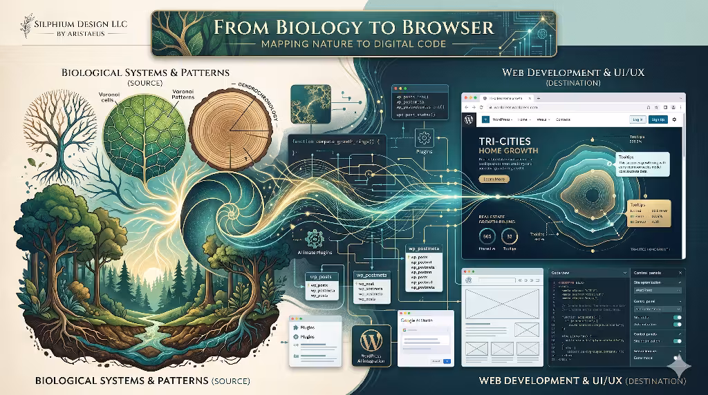
How do we actually build biomorphic data visualization? We use a mix of modern web tools. One of the favorites is D3.js. This is a coding library that is perfect for making complex charts. It allows developers to map data to any shape we want. They can use it to create the base of their biomorphic data visualization.
Some developers use Three.js for 3D designs, when the biomorphic data visualization needs to have depth. It needs to look like you could reach out and touch it. This helps create a more immersive experience. Custom filters and styles are used to make sure the colors look natural. We want the biomorphic data visualization to look like it was painted by nature, not rendered by a computer.
Performance is also very important. We make sure our biomorphic data visualization loads quickly. We do not want the user to wait for a slow page. We use smart coding tricks to keep the file sizes small. This ensures that everyone can see the beauty of the biomorphic data visualization, no matter what device they are using.
At Silphium Design LLC, we are always testing new tools. The world of web tech moves very fast. We want to be at the front of the line. We are looking at ways to use AI to help generate biomorphic data visualization. This would allow us to create even more complex and beautiful patterns. It is an exciting time to be a designer.
The Future of Data Wellness
We live in a world with too much data. It can feel like a storm of numbers hitting us every day. This can make us feel tired and stressed. I believe that biomorphic data visualization is the cure for this. It is a way to turn that storm into a gentle rain. It makes information feel like a part of life again.
By using biomorphic data visualization, we can create a healthier internet. We can build websites that respect the human brain. We can show data in a way that builds trust and brings peace. This is the goal of Silphium Design LLC. We want to lead the way in this new field of biomorphic data visualization.
As we move forward, we will keep looking to nature for answers. Nature has already solved most of the problems we face. It knows how to organize things. It knows how to be efficient and beautiful at the same time. By following its lead, we can make biomorphic data visualization that truly matters.
We hope you see the value in biomorphic data visualization. It is more than just a trend. It is a new way of seeing the world. It is a way to bring a little bit of the forest into the digital world. And I think that is something we all need.