The Biological Need for Change
Nature is never still. If you step outside your door in Pennsylvania in April, you see something very different than what you see in October. This change is called phenology. Phenology is just a fancy word for the study of nature’s calendar. It tracks when buds open, when birds fly south, and when the first frost hits the ground. As humans, our brains are wired to notice these changes. For millions of years, our survival depended on it. We had to know when the fruit was ripe or when the cold was coming.
Today, we spend most of our time looking at screens. Most websites look the same on a Tuesday in July as they do on a Friday in January. This creates what I call a digital disconnect. When the world outside is changing but your digital world is frozen, it feels unnatural. It can even make people feel tired or bored without knowing why. At Silphium Design LLC we focus on fixing this. We believe that using seasonal design is the best way to make the internet feel like a living, breathing place.
The main idea is simple. We want to align our websites with the natural rhythms of the Earth. This is not just about making things look pretty. It is about biology. When a website uses seasonal design, it matches the internal clock inside the user. This is called the circadian rhythm. By matching the digital environment to the real world, we reduce the work the brain has to do. This makes the user feel more relaxed. It makes them want to stay on the site longer. In this guide, we will look at how to use nature as a blueprint for better websites.
Table of Contents
The Spectral Shift: Seasonal Color Theory
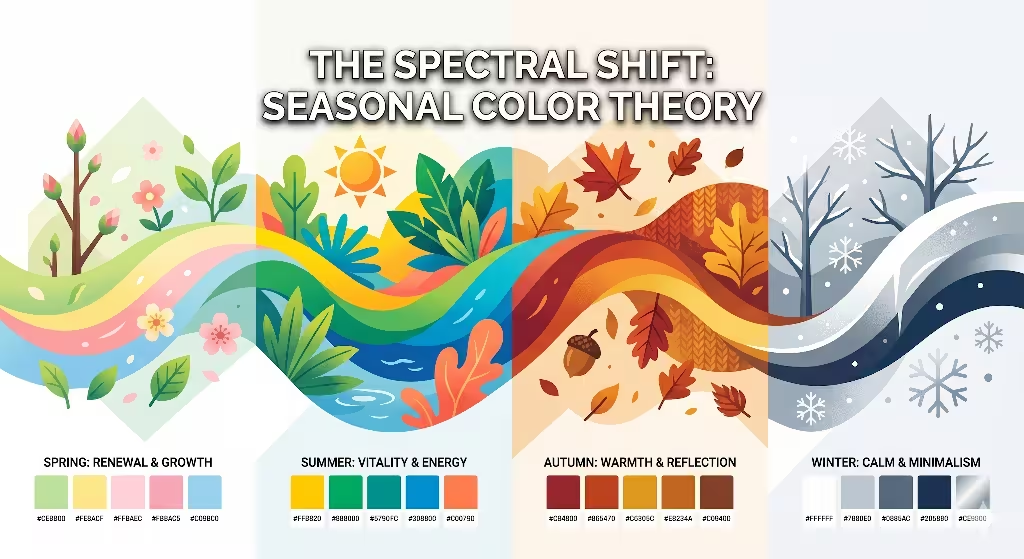
Color is one of the strongest tools we have. In nature, colors change to tell us a story. In the spring, we see a lot of bright, yellowish greens. These are colors of new life. In the winter, colors fade away, leaving us with whites, grays, and deep blues. A good seasonal design will follow these shifts to keep the user engaged.
Spring (Vernal)
Spring is about emergence. The light is crisp. We use colors that look like new leaves and clear skies. These are often low-wavelength colors. They feel fresh and energetic. When you use spring colors in your seasonal design, you are telling the user’s brain that it is time to wake up and start something new.
Summer (Estival)
Summer is the time of high heat and bright sun. The colors are very saturated and bold. Think of the deep blue of the ocean or the bright yellow of the sun at noon. In a summer seasonal design, we use high contrast. This mirrors the sharp shadows you see on a sunny day. It feels active and full of life.
Fall (Autumnal)
In the fall, nature starts to slow down. Plants stop growing and prepare for winter. The colors shift toward the warm end of the light scale. We see oranges, reds, and deep yellows. This is light in the 580 to 650 nanometer range. Using these tones in seasonal design helps the user feel cozy. It signals that it is time to reflect and settle in.
Winter (Hibernal)
Winter is a time of rest. The world becomes very simple. We focus on shapes instead of bright colors. A winter seasonal design might use a lot of white space. It might use dark, cool tones like navy or charcoal. This creates a feeling of quiet and peace. It allows the user to focus on the content without too many distractions.
| Season | Primary Color Palette | Feeling |
| Spring | Lime Green, Soft Pink, Sky Blue | Fresh, New, Energetic |
| Summer | Bright Yellow, Deep Teal, Sun Orange | Active, Bold, Strong |
| Fall | Burnt Sienna, Goldenrod, Rust | Warm, Cozy, Calm |
| Winter | Slate Gray, Frost White, Midnight Blue | Quiet, Simple, Clean |
Dynamic Lighting and Circadian UX
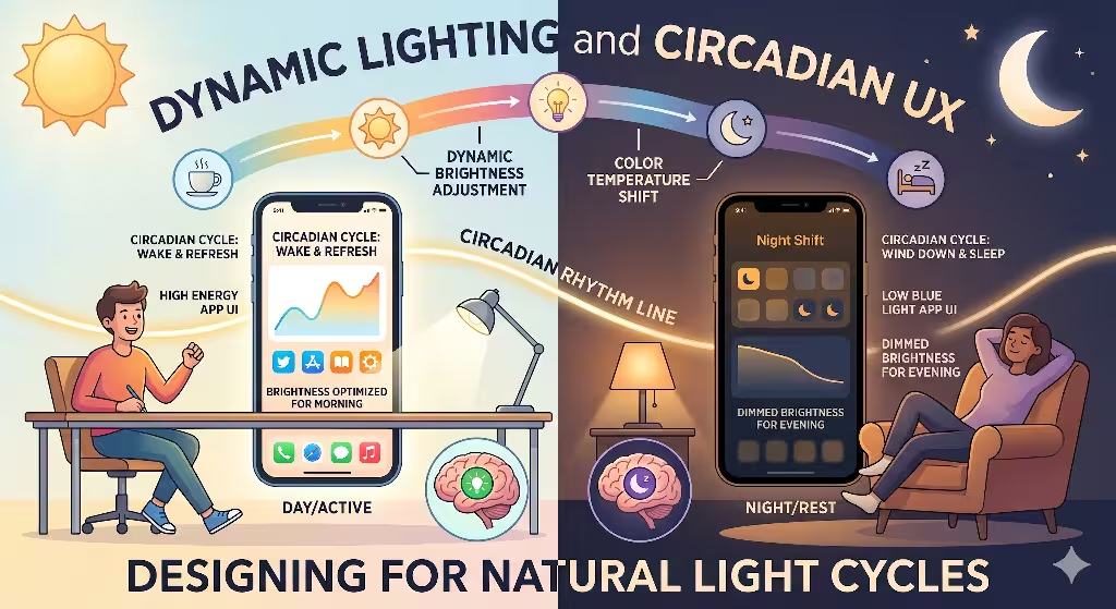
The sun is the most important light source in our lives. It tells our bodies when to be awake and when to sleep. Most screens give off a lot of blue light. This is fine during the day, but it is bad at night. It tricks the brain into thinking it is noon when it is actually midnight. We can use seasonal design to fix this through code.
We can use tools called APIs to find out where a user is located. If we know it is sunset in their city, we can change the website. We can make the colors warmer and dim the brightness. This is called circadian UX. It means the user experience changes based on the time of day and the season.
In the winter, the days are shorter. A website using seasonal design might turn on its dark mode earlier in the day to match the sky outside. We can also use shadows that move. Just like the sun moves across the sky, we can use CSS code to make the shadows on the website buttons change their angle during the day. This is a very subtle way to bring nature into the computer. It makes the site feel three-dimensional and real.
Materiality and Tactile Digital Textures

Nature is full of patterns. These patterns are not random. They follow rules of math. One of the most common is called a fractal. A fractal is a pattern that repeats at different sizes. You can see this in a fern leaf or a snowflake. When we use these in seasonal design, we make the website feel more organic.
In the summer, we might use complex patterns that look like thick forests or coral reefs. These patterns feel rich and full. In the winter, we can switch to simpler patterns. We might use the skeletal shape of a tree branch or the crystal shape of ice. These are biomorphic patterns. They are shapes that look like living things.
Using these textures makes a website feel less like a machine and more like a tool. We can even add “weather states.” If it is raining in the user’s city, the hero image on the website could have a soft mist over it. This uses a biophilic pattern called “Non-Rhythmic Sensory Stimuli.” These are small, gentle movements that catch the eye but do not distract the brain. It is like watching leaves blow in the wind. Using this in seasonal design creates a very deep connection with the user.
Answering Common Questions about Seasonal Design Inspired by Nature
People often wonder how these concepts work in the real world. We have gathered the most common questions from search engines to help explain why seasonal design is so powerful.
How can nature inspire design?
Nature is the best designer in history. It has had billions of years to solve problems. We can use something called biomimicry. This means we copy how nature works. For example, a website menu can be built like a tree. The main topics are the trunk, and the smaller links are the branches. This makes sense to the human brain because we understand how trees work. Nature gives us a map for how to organize information so it is easy to find.
What is biophilic seasonal design?
This is a style of design that focuses on our love for living things. There are 14 patterns that experts use to make spaces feel more natural. When we apply these to a website using seasonal design, we are looking at things like “Thermal & Airflow Variability.” In the digital world, we translate this as changes in the pace of animations or the “warmth” of the colors. It is about making the digital space feel like it has a climate.
How do you use seasons without being gimmicky?
This is a very important question. You do not want your website to look like a holiday card. You should not just put pumpkins on the screen in October. Instead, you should use subtle changes. Change the weight of your fonts. Use a slightly different shade of green. Shift the timing of your transitions. Good seasonal design is felt more than it is seen. It should be a quiet shift that makes the user feel “right” in the current moment.
Why is seasonal design important for SEO?
Search engines like Google love websites that are updated often. When you use seasonal design, you are showing Google that your site is active. Also, what people search for changes with the seasons. People look for different things in the spring than they do in the winter. By changing your visuals and your words to match the season, you stay relevant. This helps you show up higher in search results. It builds trust with both the users and the search robots.
Local SEO and the Seasonal Search Ecosystem
Search engine optimization, or SEO, is all about being found. But being found is not enough. You want to be found by the right people at the right time. This is where seasonal design meets local search.
In Titusville, PA the seasons are very strong. If a local business uses a website that shows snowy mountains in the middle of a July heatwave, it looks out of touch. It tells the user that the business is not paying attention. By using seasonal design, a local business can show they are part of the community. They are experiencing the same weather and the same changes as their customers.
Search traffic also goes in waves. For example, people might search for “outdoor seating” in May and “cozy cafes” in November. A website that uses seasonal design can change its layout to highlight these things automatically. This is great for “Freshness” scores in SEO. Google tracks how often a site changes. If your CSS files update with the seasons, it signals that the site is well-maintained. This can give you a small boost over competitors who leave their sites the same all year long.
We also have to think about the hemisphere. If your user is in Australia, their summer is during the northern hemisphere’s winter. A truly smart seasonal design will use the user’s location to show the correct season. This level of detail shows great expertise and care. It makes the user feel like the website was built just for them.
Case Study: The Living Website
This is an example of pushing the limits of what a website can do. This hypothetical agency once built a project that we called a “Living Website.” The goal was to use seasonal design to its full potential. They picked a specific plant called the Compass Plant. Its scientific name is Silphium laciniatum.
The agency then wrote code that connected the website to a local weather station. They also looked at the growth cycle of the plant. In the early spring, the website was very simple. The colors were earthy browns and soft greens. As the weeks went by, the background images of the plant grew taller. By July, the website was full of bright yellow flowers and deep, sun-drenched colors.
When fall arrived, the website shifted. The yellow flowers turned to seeds. The colors became gold and bronze. In the winter, the site showed the tall, dried stalks of the plant against a gray sky.
The results were amazing. The agency found that people visited the site more often just to see how the plant was doing. The “bounce rate,” which is how fast people leave a site, went down by 40 percent. This proved that seasonal design is a powerful way to keep people coming back. It turned a static piece of code into a destination. It created a story that people wanted to follow.
Technical Implementation for Designers
If you are a designer, you might wonder how to start. You do not need to rewrite your whole site every three months. You can use variables in your code. In CSS, we use something called “Custom Properties.” You can set a group of colors for each season. Then, with a tiny bit of JavaScript, you can tell the site which group to use based on the date.
For example, you can define a variable called --main-bg-color. In the spring, this might be a soft leaf green. In the autumn, you change that one variable to a warm terracotta. Because you are using a system, the whole site updates instantly. This makes seasonal design very easy to manage.
You can also use “Media Queries.” Usually, we use these to make sites look good on mobile phones. But we can also use them to check for things like “light mode” or “dark mode.” Advanced seasonal design can even check the user’s local weather. If it is a cloudy day, the website could reduce its contrast to match the soft light outside. This level of biophilic integration is the future of the web.
Future-Proofing with Nature
The internet does not have to be a cold, static place. By using seasonal design, we can bring the beauty and rhythm of the natural world into our digital lives. We are biological creatures. We have spent thousands of years living in sync with the sun and the moon. It makes sense that our digital tools should work the same way.
Using seasonal design is about more than just trends. It is about building a better relationship between humans and computers. It is about making websites that feel comfortable, familiar, and alive. When we follow the rules of nature, we create designs that do not go out of style. Nature is the ultimate expert, and we are just its students.
Whether you are a business owner or a web developer, I encourage you to look out your window. See what the light is doing. Look at the colors of the trees. Think about how you can bring that feeling into your next project. When you align your work with the seasons, you are not just making a website. You are building an ecosystem.
At Silphium Design LLC, we will continue to monitor how these natural patterns help businesses grow. The data is clear. People prefer environments that feel natural. By using seasonal design, you are giving your users exactly what their brains are looking for. You are making the internet a little bit more human, one season at a time.
If you leave your website the same all year, you are missing a huge chance to connect. The world is changing every day. Your website should too. That is the power of seasonal design. It is the art of moving with the world, instead of standing still. Through color, light, and texture, we can create a digital world that feels like home. Let nature be your guide, and your design will never fail to bloom.