Designing a website or a marketing campaign is a lot like planting a garden. You need to think about how everything fits together to create a healthy space. Here at Silphium Design, we see the digital world through a natural lens. One of the most elegant tools we have in our design kit is light typography. This style of writing uses very thin lines and lots of open space. It is not just about looking pretty. It is about how our brains and eyes work together to understand a message.
In this guide, we will explore the creative uses of light typography in marketing. We will look at why it works, how to use it safely, and how it can help your brand stand out. By using light typography correctly, you can create a feeling of luxury and calm that draws people in. Let us dive into the world of thin lines and clear spaces.
Table of Contents
The Ethereal Power of Minimalism
When we talk about light typography, we are talking about fonts that have very thin strokes. Imagine a leaf on a tree. It has a strong structure, but the veins inside it are often very thin and delicate. This typography works the same way. It provides structure to a page without being heavy or loud. In the world of marketing, being loud is not always the best way to get attention. Sometimes, a whisper is more powerful than a shout.
The use of thin typography creates a psychological feeling of “breathable” space. When a person looks at a screen that is filled with thick, bold text, their brain can feel crowded. It is like being in a noisy room where everyone is talking at once. Using light typography is like walking into a quiet park. It gives the reader’s eyes a place to rest. This sense of calm is part of what we call biophilic design. Biophilic design is the practice of bringing the feeling of nature into our modern, digital spaces.
In nature, we see thin, light patterns everywhere. We see them in the frost on a window or the way light filters through the branches of a forest. By using light typography, we tap into these natural patterns. This makes the reader feel more at home and less stressed. My goal in this article is to show you that light and thin typography is a strategic choice. It is a way to make your marketing feel premium, honest, and easy to understand.
The Anatomy of Light Type: Technical Considerations
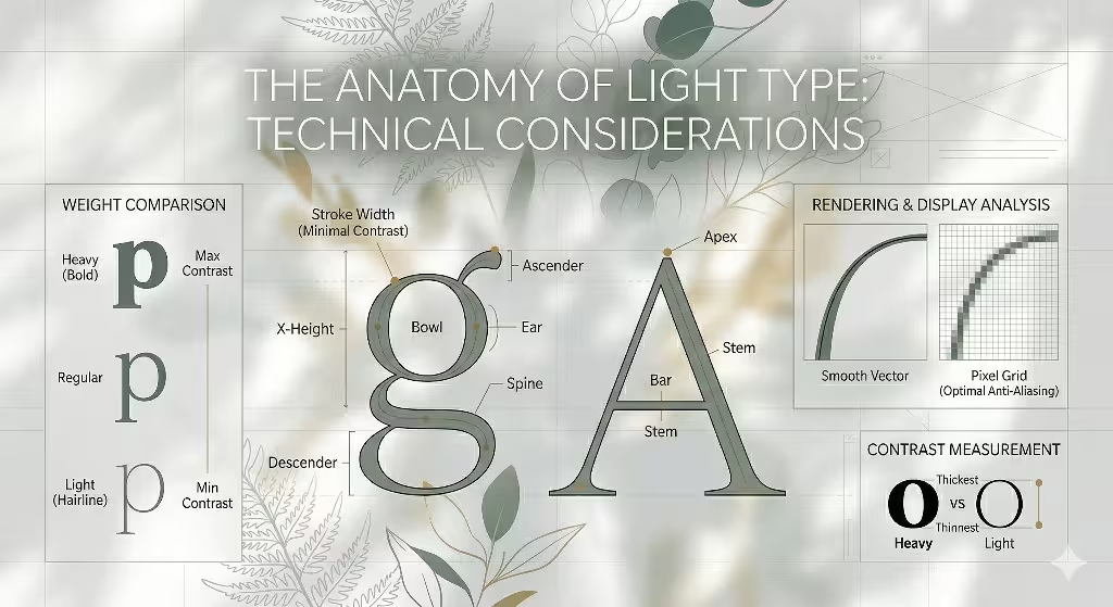
To use this typography well, you have to understand how it is built. In the world of computer science, we look at the pixels on the screen. A font weight is the thickness of the lines that make up a letter. Light typography usually refers to weights like “Thin,” “Hairline,” or “Light.” These weights use very few pixels. This means we have to be very careful about how they look on different screens.
One major technical point is stroke weight and contrast. Because the lines in light typography are so thin, they can sometimes disappear if the background is too busy. You need a high level of contrast. If you have light typography on a dark background, the letters can look like they are glowing. If you have them on a white background, they look very clean and sharp. You must ensure that the “stroke” of the letter is thick enough to be seen but thin enough to maintain that light feeling.
Another important part of light typography is called kerning and tracking. These are fancy words for the space between letters and words. When you use very thin fonts, you often need more space between the letters. We call this “letting the type breathe.” If the letters are too close, the thin lines can blur together. This makes it hard for the brain to tell which letter is which. By adding space, you make the typography look more expensive and organized.
We also have to think about rendering. Rendering is how the computer draws the font on the screen. High-resolution screens, like the ones on modern phones, show thin typography very well. However, older computer monitors might make thin lines look jagged or blurry. As an expert, I always check how light typography looks on many different devices. You want your marketing to look great for everyone, not just people with the newest gadgets.
Creative Uses of Light Typography in Marketing Strategy
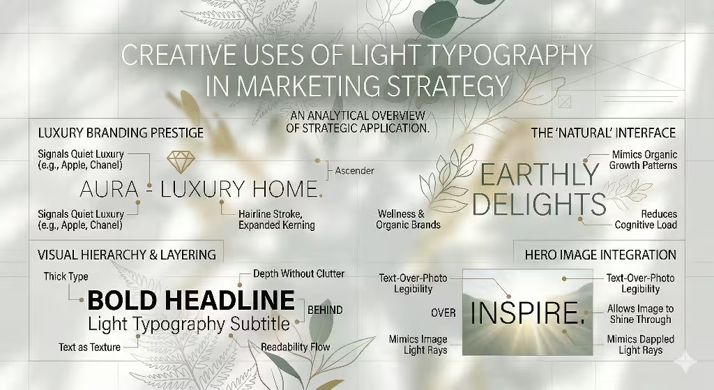
Now let us talk about how to actually use light typography to sell a product or share a message. One of the most common places you see this typography is in luxury branding. Think about high-end fashion or expensive watches. These brands do not need to scream about their prices. They use this typography to show that they are confident and sophisticated. It tells the customer that the brand is high-quality without being pushy.
You can also use light typography to create a “Natural” interface. If you are marketing a wellness product, a spa, or an organic food brand, you want to feel connected to the earth. Light typography mimics the thin stems of flowers or the lightness of the air. It makes the brand feel “clean.” For clients of Silphium Design, we often suggest light typography for websites that want to show they care about the environment. It feels much more organic than heavy, blocky letters.
Another creative use is visual hierarchy. This is just a way of saying “what the reader looks at first.” You can use a big, bold headline to grab attention, and then use light typography for the details. This creates a beautiful layer of information. It is like looking at a mountain range. You see the big peaks first, and then you notice the small trees and rocks. Using thin typography for secondary information makes the page look deep and interesting instead of flat.
Light and thin typography is also great for hero images. A hero image is the big photo you see at the top of a website. If you put big, thick letters over a beautiful photo, you hide the photo. But if you use light typography, you can see the image through the letters. This allows the text and the photo to work together as one piece of art. It is a very effective way to tell a story visually.
The Psychology of “Less is More”
Why does our brain like light typography so much? It comes down to something called cognitive load. Cognitive load is how much work your brain has to do to understand something. When a screen is full of heavy, dark text, your brain has to work hard to process all that “ink.” Light typography reduces the amount of visual noise. This means the reader can focus on the actual message. It makes the reading experience feel faster and easier.
There is also an emotional side to this form of typography. Thin lines often feel fragile and delicate. In marketing, this can be used to show honesty and transparency. A brand that uses light typography seems like it has nothing to hide. It feels open and lighthearted. This can build trust with your audience. When people trust a brand, they are more likely to buy from it.
Light typography provides that balance. It provides enough information to be useful but enough “white space” to be beautiful. It is the visual version of a deep breath. In a world that is always trying to get our attention, providing a “deep breath” is a very smart marketing move.
Technical SEO and User Experience (UX)
Here we talk abuot the technical side of things like SEO and UX. SEO stands for Search Engine Optimization. It is how we make sure people can find your website on Google. You might wonder how light typography affects SEO. Google cares a lot about how people experience your site. If people find your site hard to read because of the light typography, they will leave quickly. This tells Google that your site is not very good.
To avoid this, you must think about readability. This is the “Accessibility Trap” we mentioned in the outline. Some light typography is so thin that people with vision problems cannot see it. You must use tools to check the contrast ratio between your font and your background. A good designer knows that beauty should never come before function. You can have light typography that is also easy to read if you pick the right color and size.
Load times are another big factor. Every font weight you use on a website takes a little bit of time to load. If you use ten different versions of typography, your site will be slow. I recommend picking one or two weights and sticking with them. This keeps your site fast, which Google loves. A fast site with beautiful light typography is the perfect combination for a marketing campaign.
Finally, we have to think about mobile devices. Most people look at marketing on their phones now. On a small screen, light typography can look even thinner. You might need to use a slightly thicker version of your light typography for mobile users. This is called “responsive design.” It means the website changes based on how big the screen is. This ensures that your light typography looks perfect whether it is on a giant TV or a tiny phone.
Common Questions about Light Typography
When people search for information about design, they often ask similar questions. We want to answer some of those here to give you even more value.
One common question is: “Is light typography hard to read?” The answer is that it can be, but it does not have to be. If you make the font large enough and provide enough contrast, this typography is very readable. It actually feels more modern to many readers. However, for very long paragraphs of text, like a book, you might want to use a regular weight. Light typography is best for headlines, quotes, and short sections of marketing copy.
Another question people ask is: “When should you NOT use light fonts?” You should avoid using light typography for your most important buttons, like a “Buy Now” button. These buttons need to be bold and clear so that people know exactly where to click. You should also avoid using light typography on backgrounds that have a lot of different colors or patterns. This makes the thin lines get lost in the mess.
People also want to know: “What are the best light fonts for digital marketing?” There are some classic choices. Montserrat Light is very popular because it looks clean and friendly. Helvetica Now Hairline is great for luxury brands because it is very precise. Inter is a modern font that was built specifically for computer screens, so its light weights look great even on older monitors. These fonts are all excellent choices if you want to experiment with light typography.
Finally, “How does typography affect SEO?” Typography affects how long people stay on your page. If your typography makes your site look professional and easy to navigate, people will stay longer. This is a positive signal to search engines. Good design and good SEO go hand in hand.
Case Studies: Biophilic Light Typography in Action
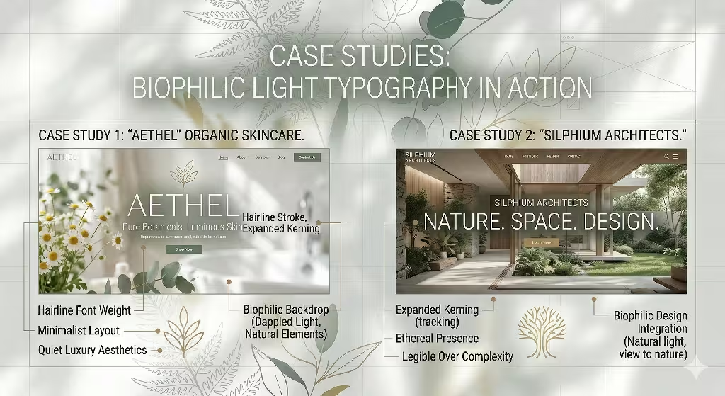
Let us look at two examples of how to use light typography in the real world. First, let us imagine a skincare brand called “Clear Stream.” They want to show that their products are pure and made from natural spring water. For their website, we choose a very thin, font. We use a lot of white space and photos of clean water. The light typography looks like the ripples on a pond. It makes the customer feel like the product is gentle and safe. This is a perfect use of light typography in biophilic design.
Next, let us look at a tech company called “SwiftCode.” They build software that makes computers run faster. They want to show that they are efficient and modern. We use a light typography that is very geometric and sharp. This makes the brand feel “high-tech” but not heavy. It shows that their code is “light” and doesn’t slow down the computer. By using light typography, they stand out from older tech companies that use thick, heavy fonts. It makes them look like the future.
In both cases, the light typography was chosen to match the brand’s personality. It was not just a random choice. It was a strategic way to communicate a feeling to the customer. This is the secret to great marketing. You use every tool, including the weight of your fonts, to tell your story.
The Importance of Testing Light Typography
Before you finish your marketing project, you must test your light typography. This is the scientist in me talking. You cannot just assume it looks good. You need to look at it on an iPhone, an Android phone, a laptop, and a large desktop monitor. You should also ask people to read it. If they squint or move closer to the screen, your light typography might be too thin or too small.
Testing is especially important for marketing emails. Different email programs (like Gmail or Outlook) render fonts differently. Sometimes, a beautiful light typography choice can turn into a messy, blocky font if the email program doesn’t support it. I always recommend using a “web-safe” light typography for emails. This ensures that your message looks the same for every customer who opens it.
Another thing to test is how light typography looks when it is printed. If you are making a flyer or a business card, light typography can be tricky. Printing uses tiny dots of ink. If the lines are too thin, the printer might not be able to print them clearly. Always get a test print before you order a thousand copies. It is better to find a mistake early than to spend money on something that people cannot read.
Combining Light Typography with Color
Color is another way to make light typography work better. If you use a very light gray font on a white background, it will be impossible to read. But if you use a dark navy or a deep forest green, the light typography will pop. I love using natural colors with light typography. Think of colors like charcoal, deep ocean blue, or earth brown. These colors feel grounded and help the thin lines of the font stand out.
You can also use light typography with bright colors for a modern look. For example, using white light typography on a bright orange background can look very exciting. It is a great way to grab attention for a summer sale or a new product launch. The key is to make sure there is enough “pop” between the font and the background. If you do that, your light typography will be both beautiful and effective.
Balancing Nature and Code
In the end, using light typography is about finding a balance. It is about balancing the technical needs of a computer screen with the natural beauty of simple lines. As someone who lives in Boston but grew up in the green mountains of Vermont, I am always looking for ways to bring those two worlds together. Light typography is one of the best ways to do that. It is modern, it is efficient, and it is deeply connected to the way we see the world.
Remember that light typography is a tool for creating space. It is a way to tell your customers that you value their time and their peace of mind. By using thin lines and lots of air, you create a marketing message that is elegant and easy to digest. Whether you are designing a website for a small flower shop or a giant tech company, light typography can help you reach your goals.
We hope this guide has given you a new way to think about your marketing. Start with a bold idea, but let it breathe with light typography. When you give your message room to grow, your audience will notice. It is the natural way to design.