It is a pleasure to look into this topic with you. The way we respond to shapes on a screen to be a fascinating reflection of our ancient history. We often think of the internet as a cold, digital space, but our brains process it using the same survival instincts we used thousands of years ago in the wild.
Let’s explore why the presence of curves in our digital world is so much more than a simple design trend.
Table of Contents
The Evolutionary Bias for Curvature
When you walk through a forest, you rarely see a perfect square. Nature is a world of flowing lines, rounded river stones, and the gentle arches of tree branches. Because of this, our eyes are naturally tuned to find comfort in curves. In the world of design, we call this the biophilic approach. It is the practice of bringing the outside world into our digital spaces to make us feel more at home.
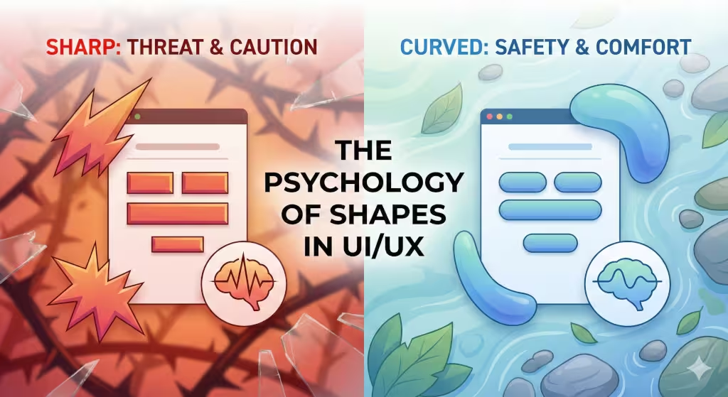
The human brain has a very specific reaction to sharp angles. Think about a thorn, a jagged rock, or a set of teeth. These are all sharp, and they all represent a potential threat. When our eyes see a sharp corner on a website, a small part of our brain called the amygdala has a tiny “fear” reaction. It signals a sense of caution. On the other hand, curves signal safety. A curve is a shape you can hold without getting hurt.
By using curves in UI/UX design, we are practicing what we like to call digital wellness. We are creating a refuge for the user. Instead of a screen full of sharp boxes that feel like a cage, we use curves to create a path that feels like a natural trail. This makes the website easier to use because the brain doesn’t have to work as hard to stay on guard. When we reduce that hidden stress, the user feels better, stays longer, and trusts the site more.
My goal today is to show you how these soft lines can change the way people feel about your brand.
The Psychology of Shapes: Why Curves Feel Safe
To understand why curves work so well, we have to look at how our minds process visual information. There is a concept in science called neuroaesthetics. This is just a fancy way of saying “the study of how our brains react to beauty.” Research shows that when people are shown two different objects, one with sharp edges and one with curves, they almost always prefer the rounded one.
This happens because of the contour congruence effect. Our brains are able to process a curve much faster than a sharp angle. A sharp corner forces the eye to stop and change direction suddenly. A curve allows the eye to glide smoothly along the edge. This creates a sense of “fluidity.” When a user lands on a website that uses curves, they feel a sense of calm. The curves suggest that the brand is approachable and friendly.
Many people ask, “Do rounded corners make a website look more professional?” The answer is about balance. While a perfect square feels stable and formal, too many squares can make a site feel cold and robotic. Curves add a human touch. In today’s world, being “professional” also means being “accessible.” By using curves, you show your audience that you care about their comfort, which is the ultimate sign of a professional business.
UI Components and the Rounded Corner Revolution
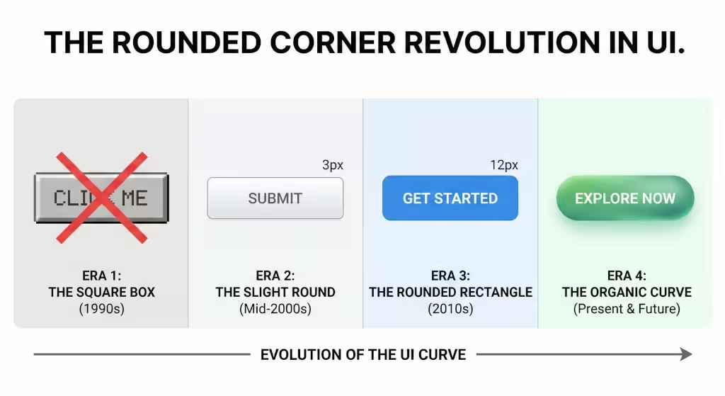
In the early days of the internet, everything was a box. This was mostly because the code used to build websites back then didn’t make it easy to create curves. But as technology improved, designers realized they could finally make the internet look more like the real world. This led to a massive change in how we build the parts of a website.
Take a look at the buttons you click on a site. These are called Call-to-Action or CTA buttons. If a button has sharp corners, it can feel like a “keep out” sign. But if you give that button a high border-radius to create curves, it starts to look like a physical pill or a smooth stone. This makes the button look more “clickable.” It draws the eye toward the text in the center and makes the user want to interact with it.
We also see this in “cards,” which are the little boxes that hold different pieces of information on a page. When these cards have curves, they create a sense of containment that feels like a warm hug rather than a prison cell. This lowers the “cognitive load,” which is just a way of saying it makes the brain work less. The more curves you use in these small areas, the more natural the whole experience feels for the person using the mouse or touch screen.
Biophilic Design Patterns in Modern UX
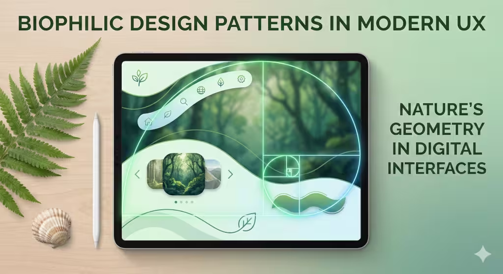
In the world of web design, we often look for patterns that make sense to our eyes. As a biologist and a web designer, I have found that the most successful patterns are the ones that have existed for millions of years. This is the heart of biophilic design. It is not just about putting a picture of a leaf on a screen; it is about using the “rules” of nature to build digital structures. When we talk about biophilic design patterns in modern UX, we are talking about creating a digital ecosystem that feels familiar to our primitive brains.
The Fibonacci Sequence: Nature’s Mathematical Curve
One of the most powerful tools in my design kit is the Fibonacci sequence. This is a series of numbers where each number is the sum of the two before it. In nature, this math creates the perfect curves of a nautilus shell, the arrangement of seeds in a sunflower, and the spiral of a galaxy. When we apply this math to a website layout, we create a visual flow that feels balanced and “correct” to the user.
Instead of placing elements on a screen in a random grid, we can use the golden spiral to guide the user’s eyes toward the most important information. By placing a curved path along this spiral, we lead the eye in a way that feels effortless. This reduces the work the brain has to do to understand the page. When the math of a website matches the math of a seashell, the user feels a subconscious sense of peace. These curves provide a “map” that the human eye already knows how to read.
Prospect and Refuge: Creating Digital Comfort
In nature, animals look for places where they can see out into the world (prospect) while feeling safe and protected from behind (refuge). We can use curves to create this same feeling on a website. Instead of a flat, open screen that can feel overwhelming, we use curved “containers” or “pods” to hold information.
These rounded shapes act as a refuge for the content. When a user sees a section of a website with soft, curved edges, it feels like a safe space to focus. Meanwhile, the open areas of the site provide the prospect—the ability to see what else is available. This balance keeps the user from feeling “exposed” or stressed. By using curves to define these spaces, we tap into a deep-seated need for environmental security. It makes the digital world feel less like a vast, empty void and more like a comfortable, sheltered clearing in a forest.
Fluid Motion and Natural Transitions
In the natural world, nothing moves in a perfectly straight line or starts and stops with a mechanical jerk. A bird glides in an arc; a river bends around a bank. In UI/UX, we use “tweening” and easing functions to make sure that when a menu slides out or a button changes, it moves along a curved path.
This is often called “organic animation.” When a digital element moves in a straight line at a constant speed, it looks “fake” and can be jarring to the eye. But when it follows a curve, speeding up slightly and then slowing down as it reaches its destination—it feels like a living thing. This use of curves in motion helps the user stay immersed in the experience. It prevents the “digital shock” that happens when things on a screen behave in ways that defy the laws of physics. By mimicking the curves of natural movement, we make the technology disappear, leaving only a smooth, pleasant interaction.
The Fractal Nature of Curves
Fractals are complex patterns that look the same whether you look at them up close or from far away, like the branches of a tree or the veins in a leaf. We can use this idea in design by repeating curved shapes at different scales. For example, the large hero image might have a gentle curve, the buttons might have a smaller version of that curve, and even the icons might follow that same rounded logic.
This repetition creates a sense of “organized complexity.” It is interesting to look at, but it doesn’t feel messy. Our brains are very good at recognizing these fractal curves. When a website uses this pattern, it feels cohesive and whole. It tells the user that every part of the site belongs together. This builds a sense of brand integrity. If the curves are consistent from the largest section to the smallest detail, the user feels that the company is organized, thoughtful, and reliable.
Sensory Connection Through Visual Softness
Finally, we use curves to suggest a sense of touch. Humans are sensory creatures. When we see a sharp corner, our brain “feels” a poke or a scratch. When we see a curve, our brain “feels” smoothness. This is vital for mobile design because we are literally touching the screen with our fingers.
Using curves on a mobile app makes the interface feel like an extension of our own bodies. The rounded corners of the screen on modern phones are already curved; by matching the software’s curves to the hardware’s curves, we create a seamless physical-to-digital connection. This is the ultimate goal of biophilic UX: to erase the border between the human and the machine, creating a world that feels as soft, safe, and inviting as the world outside our windows.
Emotional Impact of Curves in UI/UX Design: Semantic Deep Dive
The true power of curves lies in how they build trust. If you are a bank or a doctor, you want people to feel safe. A website for a hospital that is full of sharp, jagged shapes might make a patient feel more nervous. But a site with soft curves suggests a gentle touch and a caring heart. This is why we see so many modern apps for health and money moving toward a style with more curves.
Curves also help keep people on your site longer. When a design is too “blocky,” the eye gets tired. It’s like walking through a city with only tall, grey buildings. But when a site has curves, it feels like walking through a park. The eye is happy to keep moving and exploring. This reduces “bounce rates,” which is when people leave a site quickly because they don’t like the feel of it.
If you ever wonder how curves affect user experience, just think about a path in the woods. A straight path is efficient, but a curved path is an adventure. We want users to feel like they are on a journey, not just completing a task. By focusing on the emotional side of design, we create a bond between the user and the brand that lasts much longer than a single click.
The Technical Implementation: Balancing Performance and Aesthetics
Making a website look natural is a science as much as it is an art. We have to be careful about how we build these shapes. In the past, designers used heavy image files to create curves, which made websites slow. Today, we have better tools. We use things like CSS code to create a border-radius, or we use SVG files. SVGs are great because they are based on math, so the curves stay perfectly smooth no matter how big or small the screen is.
Performance is very important for search engines. If a site takes too long to load because of complex designs, Google might not show it to as many people. That is why we focus on “clean code.” We want the curves to be beautiful but also “lightweight.” This ensures that the site is fast and follows the rules of Core Web Vitals, which is how Google measures a site’s health.
We also have to think about people who have trouble seeing. While curves are beautiful, we must make sure there is enough contrast. A soft, light-colored curve on a light background can be hard to see. We always make sure that our designs are accessible to everyone. The goal of biophilic design is to include everyone in the beauty of nature, regardless of how they access the internet.
Case Studies: Industry Leaders Embracing the Arc
You don’t have to look far to see the impact of curves. Look at your phone. For years, Apple has used a very specific kind of curve called a “squircle.” It is a mathematical blend of a square and a circle. It looks much more natural than a simple rounded square. This is why iPhones and iPads feel so premium and friendly at the same time.
Google has also made a big change with their “Material Design 3” system. They moved away from flat, sharp edges and started using very large curves for their buttons and menus. They realized that as we spend more time on our devices, we need those digital spaces to feel softer and more human. They even use colors that change based on your wallpaper, which is a very biophilic idea—making the technology adapt to the user’s personal environment.
At Silphium Design, we take these ideas and apply them to local businesses. We have seen that when a local service site switches from a rigid, old-fashioned layout to one with organic curves, people stay on the page longer. They click more buttons and fill out more contact forms. It turns out that the secret to a successful business online is often as simple as following the curves of nature.
Designing for the Human Animal
At the end of the day, we must remember that the people using our websites are biological creatures. We are not robots. We respond to the world through our senses and our emotions. When we fill our digital world with sharp corners and cold boxes, we are ignoring thousands of years of human evolution.
Using curves is a way to tell your users that you understand them. It shows that you value their peace of mind and their comfort. By choosing a design that mirrors the natural world, you are creating a space where people want to be. The internet does not have to be a cold, mechanical place. With the right use of curves, it can be a place of beauty, growth, and connection.
The next time you look at a website, pay attention to the shapes. Notice how your body feels when you see a sharp edge versus a soft arch. You will realize that the most powerful tool in design isn’t a complex piece of software—it is the simple, humble curve. It is our bridge back to the natural world, and it is the key to creating a digital future that feels truly human.