In the world of design, every choice sends a message. From the colors of a website to the font on a business card, each element communicates something about a brand’s identity. At the very foundation of visual design lie shapes, the basic building blocks of everything we see. These shapes generally fall into two distinct categories: geometric and organic.
Geometric shapes are the ones we learn about in math class. They are precise, structured, and often symmetrical, like circles, squares, and triangles. They speak a language of order, stability, and technology. Think of the logos for Mitsubishi (three diamonds) or Microsoft (four squares). They feel strong and predictable.
On the other side of this divide, we have organic shapes. These are the forms of the natural world. They are irregular, free-flowing, and often asymmetrical. Think of the outline of a cloud, the curve of a leaf, the edge of a puddle, or the branching pattern of a tree. These organic shapes communicate concepts like growth, comfort, and spontaneity.
This article will explore the power of using organic shapes in logo design. We will look at why these natural forms have such a strong effect on us, a principle we call biophilia, which is our natural, built-in tendency to connect with nature. By using organic shapes, brands can create logos that feel more human, friendly, and dynamic. We will analyze some of the best examples of logos with organic shapes, break down why they are so successful, and discuss how you can use these ideas to build a powerful brand identity that connects with people on a deeper level.
Table of Contents
The Psychology of Natural Forms: Why Organic Shapes Resonate

Why do we feel a sense of calm when looking at a flowing river but a sense of alertness when looking at a jagged rock? The answer is rooted deep in our psychology and evolution. Our brains are wired to interpret shapes as signals. For thousands of years, sharp, angular shapes in nature often meant danger, like the teeth of a predator or a shard of rock. Soft, curved, organic shapes, on the other hand, were often associated with safety and life, like fruit, gentle hills, or the clouds in the sky. This ancient programming still affects how we react to design today.
When a brand uses a logo built with organic shapes, it is tapping into this fundamental part of our human nature. Curved lines and soft edges feel welcoming and non-threatening. They create a sense of ease and friendliness. This makes a brand feel more approachable and trustworthy. A logo with smooth, flowing organic shapes can make a company seem more flexible and adaptable, while a logo with rigid, geometric lines can feel more strict and unmoving. The use of organic shapes helps build an immediate emotional connection with the viewer. It bypasses our critical thinking and speaks directly to our feelings.
Our brains also find it easier to process natural patterns. The world around us is filled with organic shapes, and our minds have become experts at recognizing and understanding them. This is called cognitive ease. When we see something that is easy for our brains to process, we tend to feel more positive about it. A complex, messy design can be confusing and stressful, but a simple, elegant design using organic shapes feels right.
This is why the principles of biomorphic art, which uses forms that look like they came from living things, are so powerful in branding. By using logos that echo the shapes of nature, companies can create a positive feeling about their brand before a customer even knows what they sell. The organic shapes do the work, creating a foundation of comfort and trust that makes all other marketing efforts more effective.
A Taxonomy of Organic Logos: From Literal to Abstract
Not all organic shapes in logos are used in the same way. We can group them into different categories based on how directly they represent something from the natural world. Understanding these categories helps us see the different strategies brands use to connect with their audience. Some use very clear images from nature, while others use more subtle, abstract forms to create a feeling or an idea.
Representational & Nature-Inspired

This is the most straightforward category. These logos use organic shapes that are easily recognizable as specific things from nature, like leaves, animals, or fruit. This approach is very effective for brands that want to communicate a direct connection to the environment, health, or natural products.
- Case Study 1: Whole Foods Market. The Whole Foods logo is a perfect example of this style. It features a stylized letter ‘O’ that is also clearly a piece of fruit, like an orange or a tomato, with a leaf on top. The organic shapes of the fruit and leaf instantly tell you that this brand is about natural, healthy food. The message is simple, direct, and powerful. There is no confusion about what the company stands for.
- Case Study 2: The old Twitter Logo. Before it was rebranded to ‘X’, Twitter’s logo was a small blue bird named Larry. A bird is a living creature, and its shape is a classic example of an organic form. The logo communicated freedom, the idea of messages flying across the world, and the “tweeting” sound of birds. The soft curves and upward-facing beak of the bird created a feeling of optimism and connection. It was a friendly and instantly recognizable symbol that perfectly matched the platform’s purpose.
- Case Study 3: The National Geographic Logo. This one is interesting because its main element is a geometric shape: a yellow rectangle. However, the logo’s function is to act as a window or a frame looking out onto the natural world. In all of its branding, National Geographic places this yellow frame around stunning images of animals, landscapes, and cultures. The rectangle itself is rigid, but it works in partnership with the infinite variety of organic shapes found in nature. It represents the mission to explore and understand our world.
Abstract & Biomorphic
This category includes logos that use organic shapes without being a picture of a specific thing. These are often called biomorphic, meaning they have the form of a living thing. They might look like a cell, a drop of water, or just a soft, flowing shape. This approach is great for brands that want to communicate feelings like community, innovation, or fluidity.
- Case Study 4: Airbnb. The Airbnb logo, called the “Bélo,” is a brilliant piece of abstract design. It is a simple, looped shape that can be interpreted in many ways. It looks like the letter ‘A’ for Airbnb, a heart for love, a location pin for place, and two people coming together in an embrace. All of these meanings tie back to the brand’s core mission of belonging anywhere. The shape is soft, rounded, and welcoming. It is a powerful symbol that is both unique and universally understood.
- Case Study 5: BP. The British Petroleum logo, named the “Helios” mark after the Greek god of the sun, is another famous example. It is a vibrant green, yellow, and white sunburst that also looks like a flower. For a company in the oil and gas industry, this was a strategic choice. The organic shapes of the flower/sun are meant to suggest green energy, environmental responsibility, and a move toward a more sustainable future. It is designed to soften the image of a massive energy corporation.
- Case Study 6: PayPal. The PayPal logo uses a monogram of two overlapping ‘P’s. The letters are designed with very soft, rounded edges and a slight forward tilt, which creates a feeling of movement. The overlapping design suggests connection and partnership. The organic shapes of the letters make the logo feel friendly and accessible, which is important for a financial service that people need to trust with their money. It feels less like a cold bank and more like a helpful tool.
Fluid & Amorphous

This category of logos uses organic shapes to emphasize movement, flexibility, and dynamism. These designs often look like they are in motion, like flowing water, smoke, or wind. They are perfect for brands that want to appear modern, energetic, and adaptable.
- Case Study 7: Spotify. The Spotify logo is a circle with three curved lines inside. While a circle is a geometric shape, the lines inside are organic and represent sound waves. These waves create a sense of vibration and movement, perfectly capturing the essence of music and audio streaming. The logo is simple, but the use of these flowing organic shapes makes it feel alive and energetic. It’s a modern symbol for a modern way to listen.
- Case Study 8: The Coca-Cola Script. The Coca-Cola logo is one of the most famous in the world, and it is built entirely on flowing, organic shapes. The Spencerian script used for the lettering is all curves and loops, with no sharp angles. This fluid script gives the brand a feeling of timelessness, joy, and movement. It looks like it was written by hand, which adds a personal, human touch. The logo feels classic and friendly, and its organic shapes have helped it remain popular for over a century.
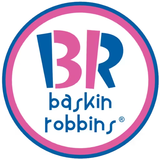
- Case Study 9: Baskin-Robbins. The ice cream chain’s logo cleverly hides the number “31” in its initials, representing its famous 31 flavors. The parts of the ‘B’ and ‘R’ that form the number are made of bright pink, bubbly, and rounded organic shapes. This makes the logo feel fun, playful, and delicious, just like ice cream. The soft, melting look of the font reinforces the product itself, making it an incredibly effective and memorable design.
The remaining examples follow these patterns. Brands like Patagonia use the organic shape of a mountain range to connect directly with outdoor enthusiasts. The Red Cross uses a simple, soft cross that feels caring and humanitarian, unlike a sharp, rigid cross that might feel more militant. Even a simple detail, like the bite taken out of the Apple logo, adds an organic, human element to an otherwise simple shape, making it less perfect and more approachable. Each of these brands uses organic shapes to tell a story and build an emotional bridge to their audience.
Technical Framework: Principles for Designing an Organic Logo

Creating an effective logo with organic shapes is more than just drawing a wavy line. It requires a thoughtful process that combines inspiration from the natural world with solid design principles. A successful organic logo feels both natural and intentional. It should look effortless, but that simplicity often comes from careful planning and a deep understanding of what makes these shapes work.
First, the process must begin with inspiration and observation. The best organic shapes come from looking closely at the world around you. This could mean studying the veins on a leaf, the patterns in wood grain, the shape of a coastline on a map, or the way water ripples in a pond. As a designer with a background in biology and a love for botanizing, I find that spending time in nature is the most valuable research I can do. By collecting and sketching these natural forms, a designer can build a visual library of ideas that feel authentic and unique. Don’t just look at other logos for inspiration; look at the source material that nature provides.
Second, it is important to embrace the role of imperfection. The beauty of organic shapes lies in the fact that they are not perfect. No two leaves on a tree are exactly the same. This slight asymmetry and irregularity are what make them feel real and alive. When designing a logo, resist the urge to make everything perfectly symmetrical. A hand-drawn quality can make a brand feel more personal and trustworthy. It suggests that there are real people behind the company, not just a cold corporation.
A more advanced technique is the application of natural ratios. Throughout nature, we see recurring mathematical patterns that our eyes find beautiful. The most famous of these is the Golden Ratio, an irrational number approximately equal to 1.618, often represented by the Greek letter phi (ϕ). We see this ratio in the spiral of a seashell, the branching of trees, and the proportions of the human body.
The Fibonacci sequence (0, 1, 1, 2, 3, 5, 8…) is closely related to this. When the proportions of a logo’s curves and elements align with these natural ratios, the design feels balanced and harmonious, even if the viewer doesn’t consciously know why. Using these principles can elevate a simple organic shape into a truly elegant and timeless design.
Finally, there is the matter of tooling and technique. The design process often starts with analog tools like a pencil and paper. Sketching is the best way to capture the fluid, spontaneous energy of organic shapes.
Once a strong concept is developed, it is then refined using digital vector tools like Adobe Illustrator. Vector graphics are essential because they allow the logo to be scaled to any size, from a tiny favicon on a website to a huge billboard, without losing any quality. This technical step ensures that the logo is versatile and professional, ready for any application. By combining natural inspiration with technical skill, a designer can create a logo that is not only beautiful but also a powerful and effective asset for the brand.
Beyond the Logo: Integrating Organic Shapes into Biophilic Web Design

A great logo is just the starting point. For a brand’s identity to be truly effective, the design philosophy behind the logo must extend to every part of the brand’s presence, especially its website. When a logo is built on organic shapes, it provides a perfect foundation for creating a biophilic web design, a website that uses principles from nature to create a more calming, engaging, and human-friendly user experience.
The most obvious way to do this is through UI/UX echoes. This means that the shapes and feelings from the logo are echoed in the user interface (UI) and user experience (UX) of the website. For example, if the logo has soft, rounded curves, then the website’s buttons, content boxes, and photo frames should also have rounded corners. This creates a sense of visual harmony. The user feels that the entire website is part of the same family as the logo. Straight lines and sharp corners can feel jarring next to a soft, organic logo. Using consistent organic shapes throughout the site makes the entire experience feel more cohesive and gentle.
This concept can be taken even further by using natural patterns and textures. The organic shapes from the logo can be used as a subtle background pattern, a unique bullet point style, or a favicon in the browser tab. Textures that mimic natural materials like wood, stone, or paper can also be used to add depth and warmth to a digital space. This helps to make the website feel less like a cold, flat screen and more like a real, tactile environment. These details reinforce the brand’s connection to the natural world and make the user experience richer and more memorable.
Finally, the fluidity of organic shapes is perfect for motion and animation. An organic logo can be animated to move in a natural way. For example, a logo that looks like a drop of water could have a subtle ripple effect when the page loads. A logo that looks like a leaf could gently sway. These small, fluid animations, often created with SVG (Scalable Vector Graphics), can make a website feel alive and interactive.
They capture the user’s attention and guide them through the site in a natural, intuitive way. By extending the design language of the organic logo across the entire website, a brand can create a powerful and immersive digital experience that truly connects with people on a human level, making them feel calm, comfortable, and engaged.