Why do we instinctively trust a logo with a leaf or feel calmed by a design that mimics the gentle curve of a wave? Is it just a preference, or is something deeper at play? The truth is, our reaction to these shapes is not an accident. It is a fundamental part of our human wiring. The integration of natural forms in branding is not merely an aesthetic choice; it is a strategic imperative rooted in human psychology. This deep seated connection, often called biophilia, is a powerful tool that savvy brands use to build trust, create emotional bonds, and stand out in a crowded marketplace.
This article will deconstruct the importance of natural forms in branding, from their subconscious impact on consumers to their practical application in creating a resilient and memorable brand identity. When we talk about natural forms in this context, we are referring to a wide spectrum of design elements: the organic shapes of leaves and stones, the complex yet orderly patterns of fractals found in ferns and snowflakes, the flowing lines of rivers, biomorphic designs that hint at living organisms, and color palettes drawn directly from the earth, sea, and sky. Understanding how to use these natural forms can transform a brand from a simple commercial entity into a trusted presence in a customer’s life.
Table of Contents
The Science of Shapes: The Psychological Impact of Natural Forms
The reason natural forms have such a profound effect on us lies in science. Our brains are hardwired over millennia to respond to the patterns and shapes of the natural world. For our ancestors, correctly interpreting these signals meant the difference between finding food and encountering danger. A gently curving path was inviting, while sharp, jagged rocks signaled caution. These ancient instincts are still with us today, influencing how we feel about the world around us, including the brands we interact with.
This built in preference makes the use of natural forms in design a remarkably effective strategy for communicating specific messages and emotions without using a single word. When a brand uses natural forms, it is tapping into a universal language that every human understands on a subconscious level. This understanding is key to grasping why the incorporation of natural forms is so much more than a passing trend.
Tapping into Biophilia: Our Innate Connection to Nature
One of the most important concepts in understanding this connection is the biophilia hypothesis. This idea, popularized by biologist E.O. Wilson, suggests that humans have an innate tendency to seek connections with nature and other forms of life. We feel better when we are surrounded by natural elements. Think about how a walk in a park can reduce stress, or how an office with plants feels more welcoming. This is biophilia in action.
Brands can leverage this powerful human affinity for nature to create incredibly positive associations. When a customer sees a logo or a website that uses natural forms, their brain often experiences a subtle sense of calm, well-being, and safety. This emotional response gets transferred directly to the brand itself. The company is no longer just a seller of products; it becomes associated with the positive feelings that nature evokes. This is a crucial step in building brand loyalty. People do not just buy products, they buy feelings and identities.
By using natural forms, a brand can align itself with health, tranquility, growth, and authenticity, creating a much deeper and more enduring emotional connection with its audience. The consistent use of natural forms helps reinforce these positive feelings over time, making customers feel good about their choice to support that brand.
The Semiotics of Organic vs. Geometric Shapes
In the world of design, shapes communicate. They are a form of visual language, and the two main dialects are organic and geometric. Geometric shapes, like squares, triangles, and perfect circles, are defined by sharp angles and straight lines. They communicate stability, power, order, and technology. They can feel strong and reliable, but they can also feel rigid, cold, and artificial. Think of the logos for Microsoft or Mitsubishi. They convey precision and structure.
Organic shapes, on the other hand, are the shapes we see in nature. They are irregular, flowing, and curved. They are the shapes of clouds, leaves, cells, and coastlines. These natural forms communicate comfort, approachability, gentleness, and life. They feel more human and less intimidating. A brand can use this fundamental difference to perfectly align its visual identity with its core message.
For example, a wellness spa would likely choose a logo with soft curves and flowing lines to communicate relaxation and care. A bank or a law firm, however, might choose a strong, angular logo to communicate stability and security. The choice of shape is a strategic decision. By choosing natural forms, a brand is making a conscious statement that it is approachable, human-centered, and perhaps even environmentally conscious. These organic and gentle natural forms can make a powerful first impression that resonates with our innate preferences.
Fractal Fluency and Pattern Recognition
Have you ever found yourself mesmerized by the intricate pattern of a snowflake, the branching of a tree, or the unfurling of a fern? These patterns are called fractals. A fractal is a never ending pattern that repeats itself at different scales. They are the building blocks of the natural world, and our brains are exceptionally good at processing them. This is a concept known as “fractal fluency.”
Studies have shown that looking at these complex yet orderly patterns can reduce stress and mental fatigue. Our brain finds a sense of pleasure and engagement in decoding them. This is a huge opportunity for brands. By incorporating fractal patterns into their designs, whether in a logo, a website background, or product packaging, they can create a more engaging and aesthetically pleasing experience for the customer. These natural forms are visually interesting without being overwhelming. They can hold a viewer’s attention and create a sense of depth and sophistication.
Using fractal based natural forms is a subtle but highly effective way to make a brand’s visual assets more captivating and memorable, leveraging the brain’s natural affinity for the beautiful complexity found everywhere in nature. This deep appreciation for natural forms makes them a lasting choice for any brand.
How Do You Incorporate Nature in Branding?
Bringing natural elements into your branding is a holistic process that goes far beyond just putting a picture of a tree on your business card. It is about infusing the essence of nature into every touchpoint a customer has with your brand. From the core logo to the feeling of your website, the goal is to create a cohesive and authentic experience that speaks to that innate human connection to the natural world. This means thinking about shape, color, texture, and even movement. When done correctly, the use of natural forms can make your brand feel more alive, relatable, and trustworthy.
The versatility of natural forms allows for endless creativity, enabling a brand to be both unique and universally appealing. Let’s explore some of the most effective ways to weave natural forms into the fabric of your brand identity.
Logo Design: The Epicenter of Brand Identity
The logo is the most concentrated expression of a brand, and it is the perfect place to start incorporating natural forms. There are two main approaches to this: direct and abstract representation.
Direct representation is the most straightforward method. It involves using literal and recognizable images from nature. A leaf, a mountain, an animal, or a drop of water can immediately communicate a message. For example, a brand selling organic food might use a leaf to signal health and natural ingredients. A company focused on adventure travel might use a mountain peak to evoke a sense of exploration and challenge. These symbols are powerful because they are shortcuts; they tap into a pre-existing library of meanings in our minds.
Abstract representation is a more subtle and often more sophisticated approach. Instead of using a literal image, this method uses shapes, lines, and patterns that are inspired by nature. This could mean designing a logo using biomorphic shapes that hint at living cells or flowing water without being a direct illustration. Another powerful tool is the use of spirals and ratios found in nature, like the Fibonacci sequence or the Golden Ratio. These mathematical principles are found in everything from seashells to galaxies, and our eyes are naturally drawn to their harmonious proportions.
Using these underlying principles can result in a logo that feels balanced, beautiful, and organically complete, even if the viewer does not consciously know why. These abstract natural forms can give a brand a timeless and elegant feel.
Beyond the Logo: A Holistic Biophilic Brand Experience
A truly effective brand uses natural forms across all its materials to create a consistent and immersive world for its customers. The logo is just the beginning.
Color Palette: The colors you choose are just as important as the shapes. A biophilic color palette is drawn directly from the natural world. This includes earthy tones like browns, tans, and ochres; the endless shades of green found in a forest; the calming blues of the ocean and sky; and the warm hues of a sunset. These colors can evoke specific moods and feelings. Greens often signal health and growth, blues create a sense of calm and trust, and browns feel grounded and reliable. Using a nature derived color palette reinforces the message communicated by your natural forms.
Typography: Even the fonts you choose can have an organic feel. While many brands use clean, geometric sans serif fonts for a modern look, there are countless typefaces that have more natural, flowing characteristics. Fonts with gentle curves, slight irregularities in their lines, or a handwritten quality can feel more personal and approachable. The right typography can complement the natural forms in your logo and imagery, adding to the overall organic feel of the brand.
Web & UI Design: A brand’s website is its digital home, and it is a prime opportunity to create a biophilic experience. This can be achieved by using background textures that mimic natural materials like wood, stone, or paper. The layout of the site can also guide the user’s eye in a more organic, flowing path rather than a rigid grid. Incorporating subtle animations that mimic natural movements, like a gentle breeze or flowing water, can also make the digital experience feel more alive.
Using high quality photography of natural landscapes or elements is another powerful way to bring the outside in. These design choices that use natural forms can improve the user experience by making the website feel less stressful and more enjoyable to navigate.
Packaging and Physical Spaces: For brands that sell physical products, the packaging is a critical touchpoint. Using sustainable, recycled, or natural materials like cardboard, wood, or glass immediately sends a powerful message. The design on the packaging can feature natural patterns and organic shapes. If a brand has a physical storefront or office, biophilic design principles can be applied to the space itself. This includes using natural materials for furniture and flooring, maximizing natural light, and, of course, incorporating live plants. Creating a physical environment that reflects the natural forms in the branding creates a seamless and powerful brand experience from start to finish.
Case Studies: Brands Masterfully Using Natural Forms
To truly understand the power of natural forms in branding, it is helpful to look at successful companies that have made it a cornerstone of their identity. These brands come from different industries and have different goals, but they all share a common understanding: connecting with human nature is good for business. They expertly use natural forms to communicate their core values, differentiate themselves from competitors, and build lasting relationships with their customers. By examining their strategies, we can see the principles we have discussed in action and appreciate the subtle genius behind their visual identities. These examples show that the effective use of natural forms is a hallmark of intelligent and enduring brand design.
The Tech Giant: Apple

It may seem counterintuitive for a technology company to be a prime example of using natural forms, but Apple’s branding is a masterclass in subtlety. The iconic Apple logo is not just a random shape of a fruit. Its curves are based on the principles of the Golden Ratio and the Fibonacci sequence, those same mathematical patterns that govern the growth of a seashell or the arrangement of petals on a flower. This gives the logo an inherent visual harmony that is incredibly pleasing to the human eye.
The simple, organic shape is approachable and friendly, which was revolutionary in a tech industry once dominated by cold, complex, and intimidating imagery. Apple’s logo communicates knowledge and innovation (the apple as a symbol of discovery) in a package that feels human and natural. This clever use of underlying natural forms helped Apple position itself not as a machine company, but as a lifestyle brand that creates tools for human creativity.
The Retailer: Whole Foods Market
Whole Foods Market is a more direct example of a brand built entirely around the concept of nature. Their entire business model is based on selling natural and organic products, and their branding reflects this perfectly. The logo is a clear and simple execution of natural forms. The name “Whole Foods” is crafted into a shape that looks like a piece of produce, with a leaf elegantly forming the crossbar of the letter ‘O’ in “Whole.” The primary color is a vibrant green, the universal color of plant life and health.
This branding immediately communicates the company’s core promise: freshness, health, and a connection to the earth. Everything from their in store signage to their reusable shopping bags consistently reinforces this message with imagery of farms, fresh vegetables, and natural textures. Whole Foods has so effectively used natural forms that their brand has become synonymous with the organic food movement itself.
The Media Company: National Geographic

National Geographic has one of the most recognizable logos in the world: a simple yellow rectangle. At first glance, this appears to be a purely geometric shape, the opposite of our topic. However, its genius lies in its function. The yellow rectangle is not just a shape; it is a frame. It represents a window or a portal looking out into the natural world. It is the border of their iconic magazine, the frame through which we have seen some of the most stunning images of nature and human culture ever captured.
In this context, the logo does not need to be an organic shape itself. Instead, it serves to frame and elevate the natural forms of the world it explores. It is a symbol of exploration, knowledge, and a deep, respectful gaze upon our planet. The brand’s power comes from its consistent association with authentic and breathtaking images of nature, all presented within that simple, brilliant frame.
The Financial Sector: S&P Global
The financial world is typically associated with rigid, geometric forms that communicate stability and security. However, S&P Global, a leading provider of financial market intelligence, chose a different path for its branding. Their logo is called the “progress ripple,” and it is a beautiful example of an abstract natural form. The design consists of a series of concentric, expanding lines that mimic the pattern of a ripple spreading across the surface of water after a drop has fallen.
This natural image is a powerful metaphor for their business. It symbolizes impact, connectivity, and the cascading effect of information and insight in a global market. The ripple is a natural form that represents growth and influence moving outward from a central point. By choosing this dynamic and organic symbol, S&P Global positions itself as a forward thinking and influential force in an industry often seen as static and uninspired.
The SEO and Market Advantage of Natural Branding
In today’s highly competitive market, a strong brand is more important than ever. Choosing a branding strategy centered on natural forms is not just an artistic decision; it is a smart business move with tangible benefits, especially in the digital landscape. This approach can improve how customers perceive your brand and how they find you online. By tapping into the deep-seated human preference for nature, brands can build stronger connections, stand out from the crowd, and create a more resilient identity that resonates with the values of the modern consumer. The use of natural forms can directly and indirectly contribute to better market performance and a stronger online presence.
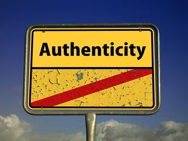
Building Authenticity and Trust
Modern consumers are savvier and more skeptical than ever before. They are bombarded with advertising and are increasingly drawn to brands that feel authentic, transparent, and aligned with their values. Natural forms are a powerful visual cue for these very qualities. In a world full of artificial products and digital noise, organic shapes and nature inspired imagery can act as a signal of genuineness. They suggest that a brand is grounded, honest, and possibly more sustainable or ethical. This is especially true for millennials and Gen Z, who consistently show a preference for brands that demonstrate social and environmental responsibility.
When a customer feels that a brand is authentic, they are far more likely to trust it, and trust is the foundation of long term loyalty and advocacy. The simple inclusion of natural forms can start building that bridge of trust before a single word is read.
Differentiation in a Crowded Digital Space
The principles of biophilic design are not just for physical spaces; they are highly relevant to web design and user experience (UX). A website that incorporates natural forms, textures, and color palettes can feel like a breath of fresh air compared to the sterile, cookie cutter corporate sites that are all too common. This unique aesthetic helps a brand stand out and be more memorable. More importantly, it can improve key UX metrics that search engines like Google pay attention to.
A visually pleasing and calming design can reduce a user’s cognitive load, making the site easier and more enjoyable to navigate. This can lead to lower bounce rates and increased time on page, two signals that tell search engines that your site provides a valuable experience. While the use of natural forms is not a direct SEO ranking factor, the positive impact it has on user behavior can indirectly boost a site’s visibility over time.
Future Proofing Your Brand
Design trends come and go. What looks fresh and modern today can look dated and cheesy in just a few years. However, the appeal of nature is timeless. The beauty of a sunset, the elegance of a leaf, and the calming presence of a forest are universal and eternal. By grounding your brand’s visual identity in these enduring natural forms, you are making it less susceptible to the whims of fleeting trends. A well designed logo based on the Golden Ratio will still look balanced and beautiful in twenty years.
A color palette drawn from a natural landscape will not suddenly go out of style. This creates a stable and resilient brand identity that does not require constant and costly redesigns to stay relevant. Investing in a branding strategy based on natural forms is an investment in longevity, ensuring that your brand’s visual appeal will endure for years to come.
Conclusion: Cultivating a Brand That Breathes
We have explored the deep connection between humanity and the natural world and seen how this bond can be a brand’s most powerful asset. The importance of natural forms in branding is not about simply adding a floral pattern or a green logo. It is about understanding the fundamental psychology of why these shapes and patterns resonate with us. From the science of biophilia and fractal fluency to the practical application in logos, websites, and packaging, natural forms offer a universal language to communicate trust, authenticity, and well being.
The case studies of brands like Apple and S&P Global show that this strategy is not limited to “green” companies but can be applied with sophistication across any industry. In today’s market, using natural forms provides a distinct advantage by building genuine customer trust, enhancing digital user experience, and creating a timeless identity that will not fade with the next trend. Ultimately, the importance of natural forms in branding lies in their unique ability to communicate on a primal, subconscious level. They allow a brand to bypass the noise and forge a connection that is both immediate and enduring. Now is the time to re-evaluate your own branding through a biophilic lens and ask: does your brand breathe?