Modern web design is obsessed with a critical flaw: the pursuit of sterile perfection. We, as designers, are given tools that demand precision. We create rigid grids, enforce perfect symmetry, and hunt for “pixel perfection” until our designs are mathematically flawless. The result, however, is often cold, impersonal, and disconnected from the very humans we are trying to engage. These perfect digital spaces feel artificial because they are. In the natural world, which our brains are evolved to inhabit, perfection does not exist.
This is where we must introduce a more intelligent framework: wabi-sabi.
Wabi-sabi is a traditional Japanese worldview rooted in Zen Buddhism. It is not a “style” or a “trend” that can be simply copied. It is a mindset centered on accepting and finding beauty in the imperfect, the impermanent, and the incomplete. It is the understanding that true beauty is not perfect, shiny, or new. Instead, true beauty is found in things that are humble, authentic, and show the marks of time and use. The wabi-sabi philosophy values the natural cycle of growth and decay.
This is not just a philosophical exercise. By understanding the core principles of wabi-sabi, along with biophilic design, we can consciously move away from sterile digital environments. We can design websites and user experiences that feel more authentic, more natural, and more resonant. A wabi-sabi approach allows us to create digital spaces that are not just functional, but are also calm, engaging, and fundamentally human. This is the real potential of wabi-sabi in web design.
Table of Contents
Deconstructing Wabi-Sabi: The 7 Aesthetic Principles
To apply wabi-sabi in a technical field like web design, we must first translate its philosophical concepts into practical principles. These seven principles are the foundation of the wabi-sabi aesthetic. Understanding them allows us to make deliberate design choices.
1. Kanso (簡素): Simplicity
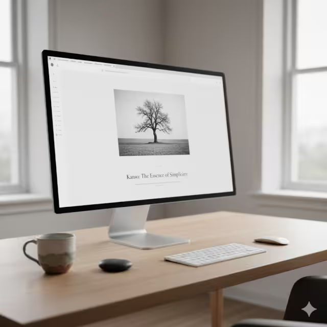
Kanso is the principle of simplicity or clarity. It means eliminating clutter to see what is truly essential. This is not about making something bare just to be bare. It is about removing the non-essential so that the essential can have more power and meaning. In a world full of digital noise, Kanso is a form of respect for the user’s attention.
In the real world, Kanso is a room with only the necessary furniture: a bed, a desk, and a lamp. Nothing is there for decoration alone. Every object has a purpose and has room to breathe.
In web design, Kanso is the direct opposite of a cluttered, “busy” homepage. It means focusing on a single, clear call to action (CTA). It means using generous white space (or “negative space”) to guide the user’s eye. It means removing all the extra banners, pop-ups, and social media widgets that distract from the main message. A wabi-sabi design using Kanso is clean, clear, and honest. It does not try to overwhelm the user; it tries to communicate directly. This simplicity is a hallmark of a good wabi-sabi approach.
2. Fukinsei (不均斉): Asymmetry and Irregularity
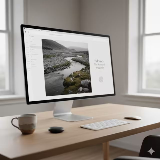
Fukinsei is the principle of asymmetry or irregularity. This is a core concept in wabi-sabi. Nature is full of balance, but it is never perfectly symmetrical. A tree has branches on both sides, but they are not mirror images. A coastline is balanced, but it is jagged and irregular. Fukinsei is the rejection of rigid, artificial symmetry in favor of this more natural, organic balance.
In the real world, this is the beauty of a handmade ceramic bowl. It is not a perfect circle. One side might be slightly higher, and the glaze is not perfectly even. This irregularity is what gives it character and life and the reason handmade objects are sought out. They are unique, different, and fascinating.
In web design, Fukinsei is the most powerful tool for creating a wabi-sabi feel. It means consciously “breaking the grid.” Instead of a perfectly balanced 50/50 layout, a wabi-sabi design might use a 60/40 or 70/30 split. You can use modern CSS tools like Grid or Flexbox to create layouts that are balanced but not symmetrical. You might place an image slightly off-center. This controlled irregularity forces the user’s brain to engage, making the design feel more dynamic and less like a boring template. This is the essence of wabi-sabi in layout.
3. Shibui (渋い): Simple, Unobtrusive Beauty
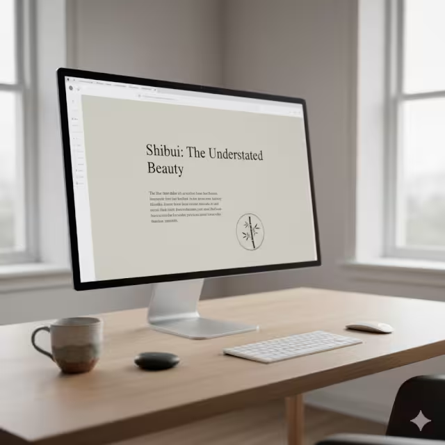
Shibui is a complex idea. It refers to a type of beauty that is simple, subtle, and unobtrusive. It is a beauty that is not loud, flashy, or obvious. A Shibui object does not shout for your attention. You might not even notice its beauty at first. But as you use it or live with it, its depth and quality become clear. It is a quiet confidence.
In the real world, think of a simple, well-made tool. A high-quality knife or a simple linen shirt. They are not covered in logos or bright patterns. Their beauty is in their function, their material, and their understated quality.
In web design, Shibui is about avoiding “loud” design. It means not using flashy animations, neon colors, or auto-playing videos. Instead, a wabi-sabi design with Shibui uses a muted color palette. It relies on excellent typography and high-quality content. The beauty is in how easy the site is to read and how calm it makes the user feel. This subtle, quiet approach is a key part of wabi-sabi. It builds trust with the user because it is not trying to trick them.
4. Shizen (自然): Naturalness
Shizen means naturalness. It is the absence of pretense, artificiality, or force. A design with Shizen feels effortless and authentic. This principle is at the heart of my work in biophilic design. It is about using natural materials, colors, and patterns. A core part of wabi-sabi is this connection to the natural world.
In the real world, Shizen is a bouquet of wildflowers, not a perfectly arranged rose bouquet. It is a piece of wood that still shows its grain, rather than wood painted to look like plastic.
In web design, Shizen means bringing in organic elements, similar to biophilic design. This is a vital part of applying wabi-sabi. You can use colors found in nature: earth tones, soft greens, cloudy grays, and deep blues. You can use textures that look like paper, stone, or wood. Instead of using sharp, perfect vector icons, you might use hand-drawn SVG icons that have a slight imperfection. You would choose photographs that show natural light and real people, not glossy, airbrushed stock photos. This infuses the digital space with a sense of wabi-sabi authenticity.
5. Yūgen (幽玄): Subtle and Profound Grace
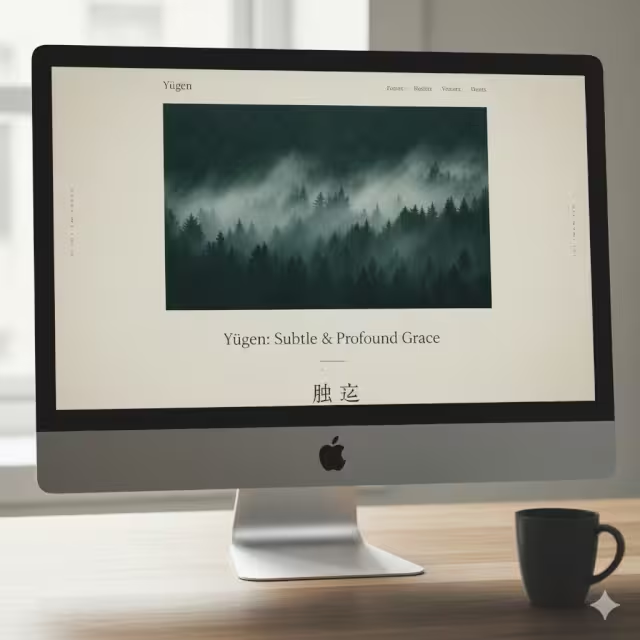
Yūgen is perhaps the most complex wabi-sabi principle. It refers to a beauty that is subtle, deep, and not fully revealed. It is a “dimly perceived” grace. It suggests a larger world or a deeper meaning without showing it all at once. It is the beauty of mystery. It invites the user to look deeper and engage their imagination.
In the real world, Yūgen is the sight of the moon partly hidden by a cloud, or the feeling of watching fog roll over a mountain. You do not see the whole picture, and that mystery is what makes it beautiful and profound.
In web design, this wabi-sabi principle is used to create depth and intrigue. You can use it in your imagery by choosing photos that are suggestive rather than obvious. For example, instead of a picture of a whole building, you might show just a corner of it with an interesting shadow. In typography, you can use layering. You might place text slightly behind another element, so the user has to look closely. This wabi-sabi technique creates a more engaging experience because it does not give the user all the information at once. It makes them curious.
6. Datsuzoku (脱俗): Freedom from Convention
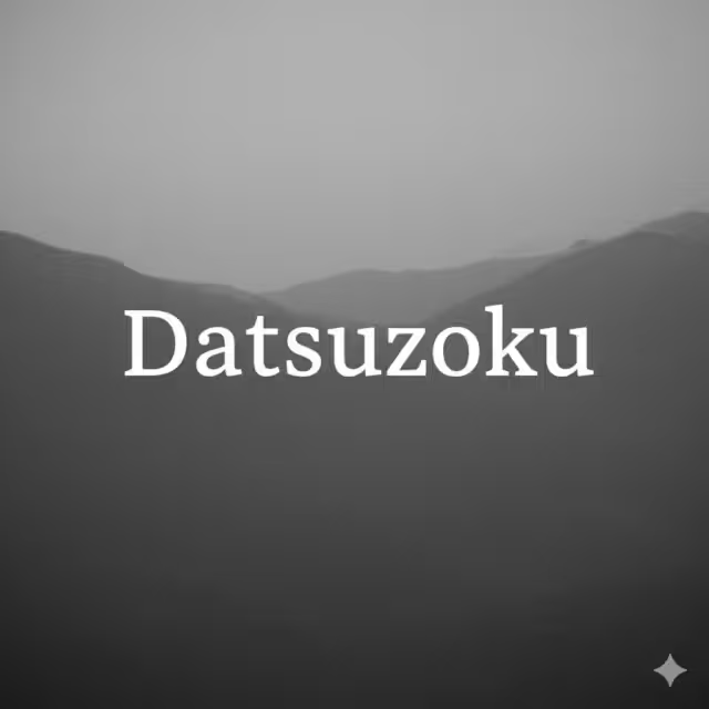
Datsuzoku means freedom from habit or convention. It is the principle of breaking free from the “rules.” When a design is too conventional, it becomes boring, predictable, and invisible. Datsuzoku is the element of surprise that makes a design feel fresh, creative, and original. It is the part of wabi-sabi that embraces the unique.
In the real world, Datsuzoku is an artist who creates a new style, or a chef who combines flavors in a way no one has before. It is the creative spark that breaks the pattern.
In web design, Datsuzoku is about breaking free from the standard “template” look. We see the same layouts everywhere: the big hero image, the three columns of features, the contact form at the bottom. A wabi-sabi design with Datsuzoku might challenge this. Maybe the navigation is on the side instead of the top. Maybe the footer is a beautiful, simple poem. It is about making a design choice that is unconventional but still serves the user. This is how wabi-sabi keeps design from becoming rigid and lifeless.
7. Seijaku (静寂): Tranquility and Stillness
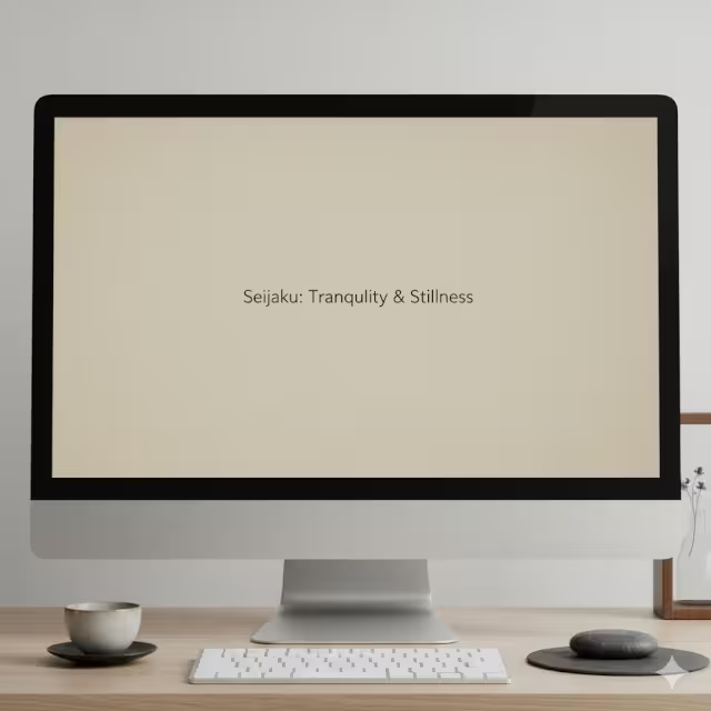
Seijaku is the principle of tranquility, quiet, or energized calm. In a world of constant digital noise, Seijaku is perhaps the most needed wabi-sabi principle. It is the feeling of peace and stillness you find in a quiet forest or a silent temple. It is an active, energized quiet, not a dead emptiness.
In the real world, Seijaku is the feeling of sitting in a garden and hearing only the wind. It is a state of calm and focus.
In web design, Seijaku is achieved through the intentional and masterful use of negative space. In wabi-sabi, this space is not “empty.” It is an active element of the design. It is the silence between the notes that makes the music beautiful. By giving text, images, and buttons plenty of room, you create a calm, uncluttered, and focused experience. The user does not feel rushed or stressed. This feeling of tranquility, this Seijaku, is the ultimate goal of a wabi-sabi user experience. It makes the user feel respected and at peace, which is the opposite of what most of the internet does.
Wabi-Sabi vs. Minimalism: A Critical Distinction
Many designers confuse wabi-sabi with minimalism. This is a fundamental error. While both philosophies value simplicity (Kanso), their core goals are completely different.
Minimalism is a Western design movement. Its goal is to achieve simplicity by reducing an object to its essential function. It celebrates the machine. It loves perfect, clean lines, sharp geometric shapes, and precise, man-made materials like steel and plastic. A minimalist design is often cold, abstract, and universal. Think of a brand new, white smartphone. It is perfect, sleek, and identical to all the others. Its beauty is in its flawlessness and precision.
Wabi-sabi, on the other hand, is a Japanese philosophy. Its goal is to achieve simplicity by finding an object’s essential character. Wabi-sabi celebrates the natural and the handmade. It loves organic shapes, rough textures, and natural materials like wood, clay, and paper. A wabi-sabi design is warm, authentic, and unique.
Think of a handmade clay mug. It is simple, but you can see the potter’s fingerprints in the clay. The glaze is uneven. It is one of a kind. Its beauty is in its flaws, its authenticity, and the story it tells. This is the heart of wabi-sabi.
Where minimalism tries to defeat time by being timeless and perfect, wabi-sabi embraces time. Wabi-sabi finds beauty in the way things age. It loves the patina on metal, the cracks in pottery (sometimes even highlighting them, as in the art of Kintsugi), and the weathered look of old wood.
Minimalism is about perfection. Wabi-sabi is about authenticity. A minimalist website might feel sterile. A wabi-sabi website feels human. This distinction is critical for any designer wanting to create a true wabi-sabi experience.
The Technical Application: Integrating Wabi-Sabi Principles into UI/UX
So, how do we take this philosophy and apply it to code and design software? Understanding wabi-sabi principles is the first step. The next is implementation. This is how we build a wabi-sabi framework for a user interface (UI) and user experience (UX).
1. Layout and Composition (Applying Fukinsei and Datsuzoku)
This is where we fight the tyranny of the perfect grid. Most web templates are rigid and symmetrical. A wabi-sabi layout must be organic.
- Break the Grid: Use CSS Grid or Flexbox to create asymmetrical layouts. Instead of two columns of equal
50%width, try65%and35%. This imbalance (Fukinsei) is more natural and visually interesting. - Embrace Ma (Negative Space): The wabi-sabi principle of Seijaku (tranquility) is implemented as Ma, or negative space. Do not be afraid of “empty” space. In your CSS, add generous
paddingandmarginaround your elements. This space is not empty; it is a design element that calms the user, directs their eye, and gives your content room to be seen. - Avoid Strict Alignment: While text should be readable, not every element needs to be perfectly aligned on a single axis. You can use
transform: translate()in CSS to slightly offset an image or a block of text, giving it a “floating,” unconventional (Datsuzoku) feel. This breaks the rigid machine-like quality of the web.
2. Color and Texture (Applying Shizen and Shibui)
A wabi-sabi color palette is quiet, natural, and textured. It is the opposite of the bright, flat, corporate colors we see in “Material Design.”
- Muted, Natural Palettes: Your color scheme should come from the natural world (Shizen). Think of the colors of a foggy day, a forest floor, or a rocky beach. This means using desaturated colors: earth tones, soft grays, muted greens, and deep, inky blues. This is the “quiet beauty” of Shibui.
- Introduce Subtle Texture: A core part of wabi-sabi is the tactile quality of natural materials. The web is flat, so we must imply texture. Instead of a flat, sterile background color (
#FFFFFF), use a subtle background image of handmade paper or a light linen. You can also use CSS to create texture.44 A simplebackground: url(noise.png);or a CSSfilter: blur(0.5px) contrast(1.1);on an image can add a layer of grain and imperfection that makes the design feel less digital and more tangible. - Avoid “Perfect” Colors: A flat color block is artificial. Use subtle gradients or color variations to mimic the way color appears in nature. This small touch makes the design feel more organic and aligns with the wabi-sabi mindset.
3. Typography and Elements (Applying Kanso and Yūgen)
Your choice of fonts and small elements is critical for achieving a wabi-sabi feel.
- Choose Humanist Fonts: Many designers use cold, geometric fonts. A wabi-sabi design should use fonts that have character and a human touch. Look for “humanist” sans-serifs (which have slight variations in stroke width, like a pen) or character-rich serif fonts. The simplicity (Kanso) of the typography must be clear, but the font itself should feel warm, not mechanical.
- Embrace Authentic Imagery: This is crucial. Stop using polished, perfect stock photos. A wabi-sabi site (Shizen) demands authentic photography. Use images with natural light, shadows, and “imperfect” compositions. Show real people, not models. Show products in use, with their small flaws. This builds a massive amount of trust and authenticity.
- Imperfect Elements: Your buttons, icons, and dividers should not be sharp, perfect rectangles. Use
border-radiusin CSS to give buttons slightly rounded, softer corners. For icons, consider using an SVG set that looks hand-drawn. Instead of a perfect 1-pixel line (<hr>), use a subtle SVG shape that looks like a brush stroke. These small imperfections (Yūgen) add up to create a profound and authentic wabi-sabi experience.
Case Study: Wabi-Sabi in Biophilic and Web Design (The Silphium Perspective)
As a specialist in biophilic design, I see wabi-sabi not just as an aesthetic but as a necessary partner. Biophilic design is the practice of connecting humans to nature in the built environment. This is based on the “biophilia hypothesis,” which states that humans have an innate, evolutionary need to connect with nature.
The wabi-sabi principle of Shizen (naturalness) is a direct expression of biophilia. But the connection goes deeper.
Our brains are not designed for the rigid, geometric, sterile world of modern computers. We are hard-wired to respond positively to the “controlled chaos” of nature. We love to look at fractal patterns, like the veins in a leaf or the branches of a tree. These patterns are irregular and asymmetrical (Fukinsei), yet they feel balanced and calming (Seijaku).
A wabi-sabi website, by embracing these natural principles, is inherently biophilic.
When a user lands on a site that uses a rigid grid, bright artificial colors, and perfect symmetry, their brain perceives it as an artificial, stressful environment. This can subconsciously increase anxiety and the desire to leave.
When a user lands on a wabi-sabi site—with its muted earth tones, organic textures, and asymmetrical layout—their brain perceives it as a natural, non-threatening environment. This is the biophilic connection at work.
The SEO Impact of Wabi-Sabi
This is where philosophy translates directly into data. As an SEO expert, I analyze user behavior metrics. A wabi-sabi design, because it is biophilic, creates a demonstrably better user experience.
- Lower Bounce Rate: The feeling of calm (Seijaku) and intrigue (Yūgen) makes the user feel safe and curious. They are less likely to “bounce” (leave the site immediately).
- Higher Time-on-Page: A calm, uncluttered environment (Kanso) that feels natural (Shizen) is more comfortable to be in. Users will stay longer, read more, and engage more deeply with the content.
These user signals—lower bounce rates and higher time-on-page—are two of the most powerful metrics that search engines like Google use to determine a site’s quality and relevance.
By applying wabi-sabi principles, you are not just making a “prettier” site. You are creating a technically superior, biophilic user experience. This signals to Google that your site is a high-quality resource, which directly improves your search engine ranking. The wabi-sabi approach is, therefore, a highly effective SEO strategy.
Conclusion: Embracing Imperfection for Authentic Digital Futures
We must stop chasing the impossible goal of digital perfection. This pursuit only leads to designs that are sterile, cold, and inhuman. It is a technical and philosophical dead end.
Understanding wabi-sabi principles in web design offers a way out. Wabi-sabi is not an excuse for sloppy or broken design. It is a deliberate, high-level philosophical choice. It is the intentional application of asymmetry, the careful use of natural texture, and the brave celebration of the authentic.
Wabi-sabi is not about making things look “old” or “dirty.” It is about making them feel real. It is about building digital interfaces that respect the user’s humanity and their innate connection to the natural world. This wabi-sabi mindset allows us to create websites that are not just machines for information, but are calm, authentic, and resonant digital spaces.
I challenge you to audit your own website. Find one “perfect” element. Perhaps it is a perfectly centered call to action or a perfectly symmetrical image gallery. Now, experiment. Apply the wabi-sabi principle of Fukinsei. Make it asymmetrical. Offset it slightly. See how that one small act of imperfection brings the entire page to life. That is the power of wabi-sabi.