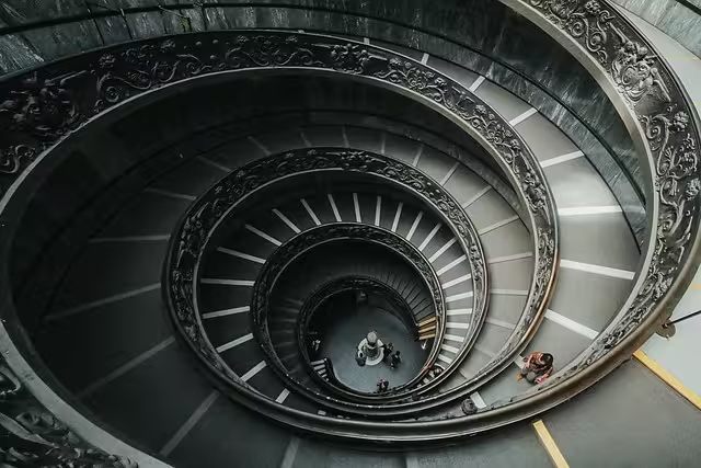
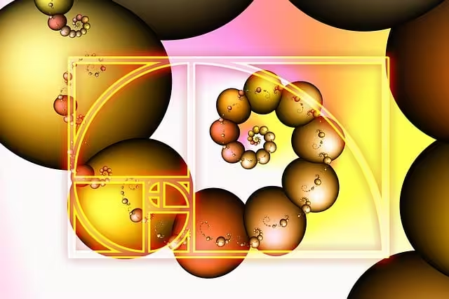
An observable pattern exists throughout the natural world, from the elegant spiral of a nautilus shell to the precise arrangement of seeds in a sunflower. This recurring motif is not an accident of biology but a product of mathematical efficiency. It is governed by a simple numerical sequence first introduced to the Western world by the Pisan mathematician Leonardo Fibonacci. This sequence, where each number is the sum of the two preceding it, gives rise to a powerful design proportion known as the Golden Ratio, or phi.
For centuries, artists, architects, and designers have understood that compositions based on this “divine proportion” possess an inherent balance and a natural aesthetic that is universally appealing. In the digital age, this timeless principle remains as relevant as ever. An exploration of the available modern applications reveals a suite of powerful digital instruments designed to implement this natural harmony.
This guide serves to detail the most effective tools to create Fibonacci-based layouts, providing a framework for designers to build web pages that are not just structured, but feel intrinsically correct and visually settled.
Table of Contents
The Principle Before the Practice: Why Use a Fibonacci Grid?
Before we open any software or write a line of code, it’s critical to understand why this mathematical concept is so powerful in design. Simply put, using a Fibonacci grid or the Golden Ratio isn’t an arbitrary rule; it’s a way to tap into a pattern our brains are already programmed to recognize and appreciate.
The Psychology of Harmony
Have you ever looked at a design and it just felt “right”? You might not have been able to explain why, but the balance and spacing seemed perfect. There’s a good chance that design used proportions similar to the Golden Ratio. The scientific term for this feeling is “cognitive fluency.” It means your brain can process the information easily and without stress.
Because we see these patterns everywhere in nature, in flower petals, pinecones, and even the proportions of the human face, our brains have become incredibly efficient at understanding them. When a website layout uses these same proportions, it feels familiar, orderly, and trustworthy on a subconscious level. It reduces the mental effort needed to scan the page, making the experience more pleasant for the user.
The Biophilic Design Connection
As a specialist in biophilic design, this is where the concept becomes truly powerful for me. Biophilic design is the practice of connecting people with nature through architecture and design. One of its core principles is the use of “Biomorphic Forms & Patterns,” which involves using shapes and patterns that are found in the natural world. A layout built on the Fibonacci sequence is a perfect digital example of this principle. You are not just creating a grid; you are embedding a fundamental pattern of nature directly into the user experience.
This creates a subtle, calming effect and makes the digital space feel less artificial and more organic. It’s a way to bring the harmony of the outside world into the rigid structure of a screen.
Practical Benefits for Any Website
Beyond the psychological and philosophical reasons, using a Fibonacci-based layout has very concrete advantages that improve any website:
- Creates Clear Visual Hierarchy: The Golden Ratio helps you decide the size and placement of elements. For instance, in a common two-column layout, the main content block would be 1.618 times larger than the sidebar. This immediately tells the user, “This is the most important information,” without you having to use loud colors or giant text.
- Establishes a Natural Focal Point: When you overlay a Golden Spiral on your design, the tightest point of the spiral creates a natural focal point. This is the perfect place to put your most important element, like a “Buy Now” button, a key headline, or the subject’s eye in a photograph. The viewer’s gaze is naturally drawn there.
- Improves Spacing and Balance: Instead of guessing how much space to put between your header, your images, and your text, you can use the numbers from the Fibonacci sequence (e.g., 5, 8, 13, 21, 34, 55…) as your units for margins and padding. Using an 8px margin here and a 13px margin there creates a consistent, rhythmic spacing that feels balanced and intentional.
So, to answer the common question, “Is the golden ratio good for web design?” The answer is an emphatic yes. It’s one of the most reliable frameworks for creating designs that are not only beautiful but also highly functional and user-friendly.
Digital Design Software: Plugins & Native Tools
The most efficient tools are those that integrate directly into your daily workflow. Modern design applications like Figma, Adobe XD, and Sketch have robust communities that have built excellent plugins to bring the Golden Ratio to your canvas with a single click.
For Figma Users
Figma has become a dominant force in the UI/UX design world, and its plugin library is vast. For our purposes, a few stand out for their simplicity and power.
- Tool: Golden Grid Plugin
- What It Is: This plugin is a straightforward utility that overlays your choice of a Golden Ratio grid, a Golden Spiral, or a basic rule-of-thirds grid directly onto your artboard.
- How to Use It: Once installed, you simply select a frame (your main design canvas) and run the plugin. A pop-up will ask you what type of grid you want and what its orientation should be (e.g., spiral starting from the top-left, top-right, etc.). It then creates a new, locked layer containing the guide. You can then use this transparent “map” to align your key elements. For example, you can place your logo in one of the smaller rectangles and your main hero image in the largest one, ensuring their proportions are in perfect harmony.
- Tool: Guide Mate Plugin
- What It Is: While Golden Grid is great for overlays, Guide Mate is for creating actual, snappable layout guides within Figma. It’s a more technical tool that allows you to create complex grid systems based on mathematical rules.
- How to Use It: Guide Mate lets you define rows and columns with specific gutter spacing. You can input Fibonacci numbers directly into its fields. For example, you could create a 12-column grid but set the gutter (the space between columns) to 13px and the margins on the side to 21px. This infuses the DNA of the Fibonacci sequence directly into your layout’s core structure.
For Adobe XD & Photoshop Users
Adobe’s suite of design tools has long been the industry standard, and they are well-equipped for creating balanced layouts, both with plugins and native features.
- Tool: PhiGrid Plugin
- What It Is: Similar to Figma’s Golden Grid, PhiGrid for Adobe XD is a simple plugin that generates Golden Ratio overlays. It’s a quick and easy way to check your composition’s balance or to start a new design on the right foot.
- How to Use It: You select your artboard, run the plugin, and it adds a shape layer with the grid or spiral. A key benefit is being able to easily change the color and opacity of the overlay to make it visible without being distracting as you work. Use it to position the headline in a banner or to crop a photograph so the subject’s face lands right in the spiral’s focal point.
- Tool: Native Guide Layouts in Photoshop/Illustrator
- What It Is: Sometimes, you don’t need a plugin. Adobe applications have powerful built-in guide systems. The “New Guide Layout” feature is your best friend here.
- How to Use It: In Photoshop, you go to
View > New Guide Layout.... A dialog box appears where you can specify the number of columns and rows, as well as the width and gutter space. This is where you can manually implement the Fibonacci sequence. For a 1200px wide layout, you could set your main content area to ~742px and a sidebar to ~458px (which closely follows the 1.618 ratio). You can then set your gutters to a Fibonacci number like 13px or 21px. This manual method gives you absolute precision and control over your design’s structure.
For Sketch Users
Sketch remains a favorite for many UI designers, particularly on macOS. Its plugin ecosystem is mature and offers excellent tools for proportional design.
- Tool: Golden Ratio Sketch Plugin
- What It Is: This is an all-in-one tool for Sketch. It doesn’t just create overlays; it can also draw shapes and create artboards that conform to the Golden Ratio.
- How to Use It: You can use it to draw a perfect Golden Rectangle and then use its internal divisions to structure your content. Or, you can select an existing shape and have the plugin generate a spiral within it, showing you the ideal focal point. It’s particularly useful for designing smaller components like cards or image containers, ensuring that even the smallest parts of your design follow harmonious principles.
Web Development & CSS: Code-Based Solutions
A beautiful design is only effective if it can be built properly on the web. For web developers and designers who write code, there are fantastic tools and techniques to translate Fibonacci principles directly into CSS (Cascading Style Sheets), the language that styles web pages.
CSS Grid & Flexbox Generators
- Tool: Golden Ratio Grid Calculator (Online Tool)
- What It Is: This is a type of simple, web-based application where you input the total width of your website’s content area and it does the math for you. It’s perfect for quickly figuring out the dimensions for a main content area and a sidebar.
- How to Use It: You visit the website, type in your total width (e.g.,
1140px) and your desired number of columns (usually two for this purpose). The calculator instantly spits out the exact pixel widths for the larger column (~705px) and the smaller column (~435px). Many of these tools will also provide the basic CSS code. You can then copy and paste this code into your stylesheet to create a perfectly proportioned, two-column layout in seconds. This answers the question “How do you use the Fibonacci sequence in web design?” from a very practical coding standpoint.
Frameworks and Libraries
- Tool: Modern CSS with Custom Properties and
calc()- What It Is: While older frameworks like “The Golden Grid System” were important, modern CSS gives us much more flexible ways to achieve the same result. The best method today is to use CSS custom properties (often called CSS variables).
- How to Use It: This is a more advanced technique, but it’s incredibly powerful. At the top of your CSS file, you can declare the Golden Ratio as a variable, like this:CSS
:root { --phi: 1.618; }Now, you can use this--phivariable throughout your code. For instance, if you want to make a container’s height related to its width by the Golden Ratio, you could write:CSS.my-container { width: 600px; height: calc(600px / var(--phi)); /* Calculates height to be ~371px */ }This approach is flexible, maintainable, and allows you to build dynamic, responsive designs that scale beautifully while always maintaining their perfect proportions.
Calculators & Standalone Utilities for Precision
Beyond the broad strokes of your page layout, the Fibonacci sequence can and should be applied to the finer details, especially typography and individual elements.
Typography Sizing
- Tool: Golden Ratio Typography Calculator (GRT Calculator)
- What It Is: This is arguably one of the most valuable tools for any web designer. It’s a web-based calculator that helps you create a harmonious “typographic scale.” This means it determines the perfect font sizes for your body text, headings (H1, H2, H3, etc.), and other text elements, all based on the Golden Ratio.
- How to Use It: You start by inputting your ideal font size for your main body text (e.g.,
16px). You might also input the width of your content area. The tool then calculates a full scale of font sizes. It might suggest your H1 should be42px, your H2 should be26px, and so on. By using these exact sizes, you ensure that the relationship between your different text elements is mathematically and visually harmonious. This creates what designers call good “vertical rhythm,” making your text incredibly easy and pleasant to read.
General Proportion Calculators
- Tool: Phiculator
- What It Is: The Phiculator is a dead-simple online calculator for the Golden Ratio. It has two boxes. You type a number in one box, and it instantly shows you the corresponding number in the other box, either larger or smaller, based on the 1.618 ratio.
- How to Use It: Its beauty is in its speed. Let’s say you’re designing a hero section with a large photograph, and you know it needs to be
900pxwide. You can type900into the larger box in Phiculator, and it will instantly tell you the ideal height is556px. No complex math needed. It’s a quick-reference tool for ensuring any single element has divine proportions.
- Tool: Atrise Golden Section
- What It Is: This is a downloadable piece of software for Windows that overlays a resizable Golden Ratio grid on top of any application on your screen.
- How to Use It: You can use it to analyze other websites you admire to see how they use proportions. Or, you can use it while you’re working in a program that doesn’t have a grid plugin, like a word processor or presentation software. It’s a universal tool for composing and analyzing images, layouts, or slides, ensuring balance no matter what you’re designing.
Practical Application: A Step-by-Step Workflow
Knowing the tools is one thing; using them together in a real project is another. Here’s a simplified workflow for designing a blog post page using these principles.
- Step 1: Define Your Canvas. Let’s say your website’s main content container has a maximum width of
1280px. This is your starting point. - Step 2: Calculate Your Columns. You want a main area for the blog post and a sidebar for links and ads. Go to a Golden Ratio Grid Calculator online. Enter
1280pxas your total width. The tool will tell you to make your main content column791pxand your sidebar489px. You now have the fundamental structure of your page. - Step 3: Place Your Focal Point. The most important part of a blog post is its headline and opening image. In Figma or Adobe XD, use the Golden Grid plugin to overlay a Golden Spiral on your
791pxcontent column. Place your headline and the most engaging part of your image right near the tightest part of the spiral’s curve. This will immediately draw the reader’s eye. - Step 4: Set Your Typography. Go to the Golden Ratio Typography Calculator. Enter your base font size, let’s say
18pxfor comfortable reading, and your content width of791px. The calculator will generate your scale. For example: Body:18px, H3:29px, H2:47px, H1:76px. Apply these sizes consistently throughout your article for your main title, subheadings, and body text. - Step 5: Refine Spacing. Now, use Fibonacci numbers for your spacing. Use
13pxof space below your subheadings. Use21pxof margin between paragraphs. Use34pxof padding around the entire content container. This creates a subtle, consistent rhythm that feels much more polished than just choosing random spacing values. It’s a small detail that makes a huge difference.
By following these steps, you use a combination of tools to build a layout that is balanced from its overall structure down to the smallest bit of spacing, all guided by a single, harmonious principle.
Conclusion: Integrating Logic and Nature
The pursuit of good design often feels like a mysterious art, a quest for an intangible sense of balance. The tools and principles surrounding the Fibonacci sequence and the Golden Ratio provide a logical and reliable map for that quest. They demonstrate that effective design is not just about creative intuition; it’s also about understanding the profound and predictable patterns that govern our perception of beauty.
Using these plugins, calculators, and coding techniques is not about being constrained by mathematical rules. On the contrary, it’s about using a proven framework to handle the foundational decisions of layout, proportion, and hierarchy. This frees you up, as a designer, to focus on the more creative aspects of your work—color, imagery, and messaging—with the confidence that your underlying structure is sound, stable, and naturally appealing. By learning to wield these tools, you are doing more than just arranging pixels on a screen; you are weaving a fundamental pattern of the natural world into the digital fabric, creating experiences that are not only more beautiful but also more human.