The Biology of User Experience
As a species, we have spent 99% of our history living outdoors or near to it and under the influence of it. We evolved to track the movement of the sun, the changing of leaves, and the shifting of the winds. Today, we spend most of our time inside, staring at lighted rectangles that look the same in July as they do in January. This disconnect is a design flaw. It creates a subtle friction in our minds. When I approach web design at Silphium Design LLC, I do not just look at pixels. I look at biology.
True biophilic design is not about pasting a picture of a Christmas tree on a homepage in December and calling it a day. A Christmas tree, although from the natural world, is cultural decoration. It is shallow beyond its cultural significance. Real design goes deeper. It looks at seasonal motifs as a way to connect the digital world to the physical world. The Biophilic Hypothesis, a concept popularized by E.O. Wilson, suggests that humans have an innate urge to seek connections with nature and other forms of life. When we ignore this, we create sterile environments. When we embrace it, we create spaces where people want to stay.
This article will explore how seasonal motifs function as a vital user experience strategy. We are not talking about holiday clip art. We are talking about phenology, which is the study of cyclic and seasonal natural phenomena. By using seasonal motifs effectively, we can align digital interfaces with the biological rhythms of the user. This improves engagement. It reduces the mental effort needed to use a website. It makes a website feel like a living thing rather than a static brochure. We will explore how to use code, color, and psychology to bring these seasonal motifs to life in a way that satisfies both the human user and the search engine algorithms.
Table of Contents
The Science of Seasonality: Why It Matters

To understand why seasonal motifs work, we have to look at how the human brain works. For thousands of years, our survival depended on noticing changes in the seasons. We had to know when to plant, when to hunt, and when to seek shelter. Our brains are wired to look for these cues. When a website remains static and unchanging while the world outside changes, it feels unnatural. It creates a cognitive dissonance.
One of the most important biological factors here is the circadian rhythm. This is your internal body clock. It tells you when to wake up and when to sleep. There is also a longer rhythm called the circannual rhythm, which tracks the year. Seasonal motifs in design help support these rhythms. For example, bright blue light suppresses melatonin and keeps us awake. This is great for a summer midday design. However, in the winter, when the sun sets early, that same blue light can be jarring.
Using seasonal motifs allows us to adjust the “temperature” of a website. By matching the screen to the environment, we reduce eye strain. We also help the user feel more at home.
We also have to consider conditions like Seasonal Affective Disorder (SAD). Many people feel lower energy in the winter. A design that ignores this by being overly aggressive or cluttered can cause stress. Alternatively, a design that uses winter seasonal motifs correctly, like clean, open space and warmer accent colors, can actually be soothing. It validates the user’s current reality. When we weave seasonal motifs into the architecture of a site, we are practicing empathy. We are acknowledging that the user is a biological being, not just a data point.
Deconstructing Seasonal Motifs (The What)
When I say seasonal motifs, I am referring to the specific patterns, textures, and behaviors associated with each time of year. In computer science, we break big problems down into smaller parts. We can do the same with seasons. We must look past the obvious symbols. Do not just think of a pumpkin for autumn. Think about the texture of a dry leaf. Think about the angle of the light.
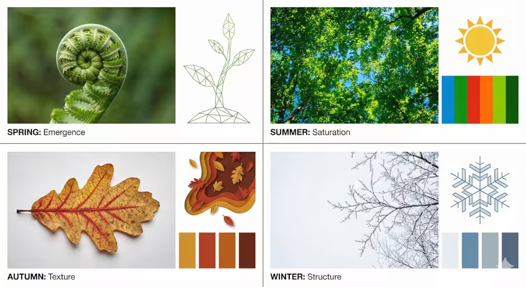
Spring: Emergence and Fractal Growth
Spring is about waking up. The primary seasonal motifs for spring involve emergence. In biology, we see this in the way ferns uncurl. This is a mathematical pattern called a fractal. A fractal is a never-ending pattern. In web design, spring seasonal motifs can be subtle.
You might use animations that “grow” or unfold as the user scrolls down the page. The colors should not just be green. They should be the pale, yellow-greens of new shoots. The contrast should be high and crisp. The energy of the site should feel fast and light. When you use these seasonal motifs, you signal to the user that the site is fresh. It implies that the content is new and current.
Summer: Saturation and Energy
Summer is the season of maximum energy. The sun is high. The shadows are short and dark. The leaves are a deep, dark green. The seasonal motifs for summer should reflect this fullness. In design terms, this means we can use higher saturation. This means the colors are more intense.
Structure is also one of the key seasonal motifs here. In summer, the canopy of the forest is full. There is a sense of weight and stability. A website designed with summer seasonal motifs can handle more content. It can be denser. You can use bold headers and strong blocks of color. The user has more energy in the summer, so the design can demand a little more attention.
Autumn: Senescence and Warmth
Autumn is biologically interesting because it is about senescence. This is the scientific term for biological aging or drying out. As chlorophyll leaves the plants, we see the underlying colors of red and gold. The seasonal motifs for autumn are about texture and entropy. Entropy is a measure of disorder.
In design, autumn seasonal motifs might involve slightly more chaotic layouts. You might use textures that look like paper or grain. The lighting should feel lower. We lower the brightness but increase the warmth. This creates a “cozy” effect. Using these seasonal motifs helps the user settle in. It encourages them to read longer articles. It promotes a slower pace of browsing.
Winter: Dormancy and Minimalist Structure
Winter is my personal favorite for design because it is pure structure. In winter, the leaves are gone. You see the skeleton of the tree. The primary seasonal motifs for winter are minimalism and high contrast. Snow creates negative space. Negative space is the empty area around the content.
When applying winter seasonal motifs, you should increase the white space (or dark space) on your site. The design should be quiet. The colors should be cool, icy blues, whites, and greys, but punctuated with deep, warm accents to provide comfort. This mimics the feeling of a fire in a cold landscape. These seasonal motifs are excellent for accessibility. The high contrast makes text very easy to read. It reduces the cognitive load when the user is likely tired.
Technical Implementation: The How (Computer Science Perspective)
Now, let us put on our developer hats. How do we actually build seasonal motifs into a website without redesigning the site four times a year? We use smart coding practices. As a web designer, I prefer efficient systems. We do not want to manually change the code every equinox. We want the code to do the work for us.
CSS Custom Properties
The best tool for implementing seasonal motifs is CSS Custom Properties, also known as CSS variables. Imagine you have a bucket of paint labeled “Main Color.” In your code, you just tell the browser to use “Main Color.” You do not tell it exactly what color that is yet.
We can define a “theme” for each season. In the Spring theme, “Main Color” is a sprout green. In the Winter theme, “Main Color” is an ice blue. By changing one line of code at the top of the file, the entire website updates its seasonal motifs instantly. This makes the system scalable. You can change hundreds of pages at once.
JavaScript Date Objects
To make this automatic, we use JavaScript. JavaScript is the programming language that makes websites interactive. We can write a simple script that asks the user’s browser, “What month is it?”
If the browser says “October,” the script automatically loads the Autumn seasonal motifs. We can get even more advanced. We can ask the browser for the user’s location. If the user is in Australia, their winter is our summer. A truly smart biophilic design will flip the seasonal motifs to match the user’s local reality. This is the height of user-centric design.
Server-Side Rendering Considerations
We also must think about speed. We call this performance. Winter seasonal motifs might be very simple and load fast. Summer seasonal motifs might use heavy, rich images. We can use Server-Side Rendering (SSR) to decide what to send to the user before it even reaches their phone. This ensures that the aesthetic choices do not slow down the experience. Google loves fast websites, so this helps with SEO as well.
Color Theory and Lighting Across the Year
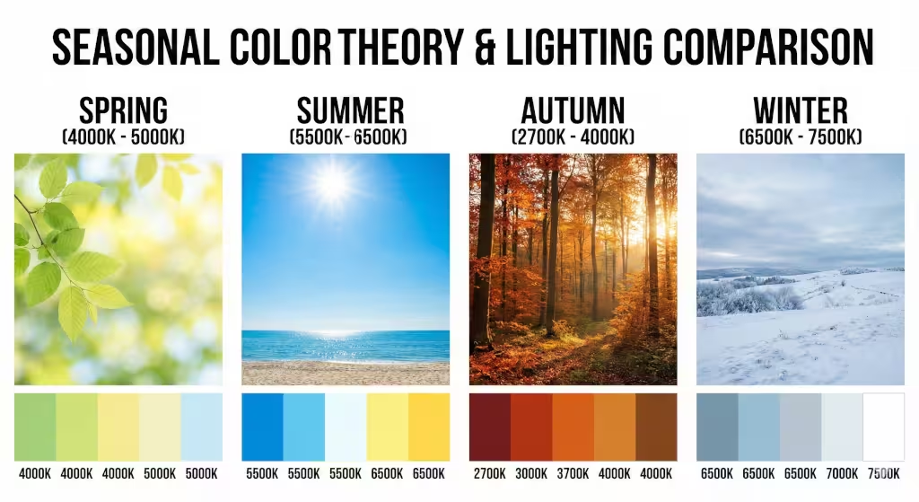
Color is not just about what looks pretty. It is about physics. It is about light waves. The color of sunlight changes throughout the year. In winter, the sun is lower in the sky, and the light travels through more atmosphere. This changes the quality of the light. Our digital seasonal motifs should mimic this.
Kelvin Temperatures in UI
We measure light temperature in Kelvin. A high Kelvin number is blue and cool. A low Kelvin number is yellow and warm. In the summer, the ambient light is cool (blue). In the winter, we rely on artificial light, which is often warm (yellow/orange).
Contrast Ratios
We must also follow the rules set by the W3C. These are the people who set the standards for the web. They have guidelines called WCAG (Web Content Accessibility Guidelines). These rules ensure that people with vision problems can read your site. When we swap out seasonal motifs, we must verify the math.
The formula for contrast looks complex, but the concept is simple: is the text distinct enough from the background? Sometimes, a color that looks good in a Summer palette might be too light for a Winter palette. We have to test our seasonal motifs mathematically to ensure they are accessible to everyone, including the elderly or visually impaired.
Questions about Seasonal Motifs
When people search for design topics on Google, they ask specific questions. To make this article valuable, we need to answer them. Here is how seasonal motifs relate to common queries.
“How do you use seasonal motifs in design?”
Many people think this means adding a turkey icon in November. The expert answer is biomimicry. You use seasonal motifs by imitating the processes of nature, not just the images. Mimic the growth of spring or the stillness of winter. Use layout and motion, not just stickers.
“Why is seasonal design important?”
The answer lies in retention. Retention is the ability to keep a user on your site. Users get bored with static things. Seasonal motifs provide variety without changing the core function of the site. It keeps the experience fresh. It also creates an emotional bond. When a site matches the user’s mood, they trust it more.
“What are examples of biophilic web design?”
Examples include using organic shapes instead of perfect squares. It includes using natural textures as backgrounds. But the best example is the use of time-based seasonal motifs. A site that changes its color palette based on the time of year is a prime example of high-level biophilic design.
SEO Benefits and Signals
As an expert in SEO (Search Engine Optimization), I can tell you that search engines like Google behave a bit like people. They like things that are alive. They like things that are updated.
The Freshness Signal
Google has something called a “Query Deserves Freshness” (QDF) signal. When you update your website with seasonal motifs, you are changing the code and the content. When Google’s “spiders” crawl your site, they see these changes. They see that the site is active. This is a positive signal. It can help your rankings.
User Engagement Metrics
Search engines also watch how people use your site. If a user clicks on your site and leaves immediately, that is called a “bounce.” It is bad. If they stay and read, that is good. Seasonal motifs capture attention. They create a moment of delight.
If a user visits your site in December and sees a beautiful, subtle winter theme, they might pause. “Oh, that’s nice,” they might think. That pause is measured in milliseconds. But those milliseconds add up. It increases the “Time on Page.” When users stay longer, Google assumes your content is good. Therefore, seasonal motifs are not just for looks; they are a hard-nosed SEO tactic to improve your metrics.
Conclusion: The Future of Organic Interfaces
We are moving toward a future where the internet is not a separate place. It is a layer on top of our physical world. The days of static, rigid websites are ending. We are entering the era of organic interfaces.
In the future, we will see more Generative Design. This is where Artificial Intelligence (AI) designs the website in real-time. Imagine a website that knows it is raining where you are. The website might display softer colors and play a subtle sound of rain. It might use seasonal motifs that are accurate to the exact day, not just the month.
For now, we can start by implementing the strategies outlined here. We can use CSS variables and simple JavaScript to bring seasonal motifs into our work. We can respect the biological needs of our users. We can create digital spaces that feel like a walk in the garden rather than a walk in a hospital hallway.
By embracing seasonal motifs, we bridge the gap between the machine and the human. We acknowledge that even though we are using high-tech devices, we are still biological creatures who respond to the rhythms of the earth. Whether it is the fractal growth of spring or the high-contrast minimalism of winter, these patterns anchor us. They make the web a more human place to be.