Here at Silphium Design LLC, we look at websites differently than most people. We do not just see code and colors. I see a digital ecosystem. Our background in biology and web design allows us to understand how our brains react to nature. Humans have spent thousands of years living in the wild. Our eyes are trained to find peace in a vast Mountain range or a deep blue sea. When we bring these feelings into a website, we create something special. This is called biophilic design. It is not just about making a site look “pretty.” It is about making it feel right.
In this article, we will look at Mountain and Ocean-inspired website design examples. We will talk about why these shapes work. We will explore how a big Mountain can make a user feel safe. We will see how the moving water of the sea can make a user feel calm. Our goal is to show you how to build a digital home that feels as real and refreshing as a hike in the woods or a day at the beach.
Table of Contents
The Neurobiology of Nature: Why Peak and Wave Aesthetics Convert
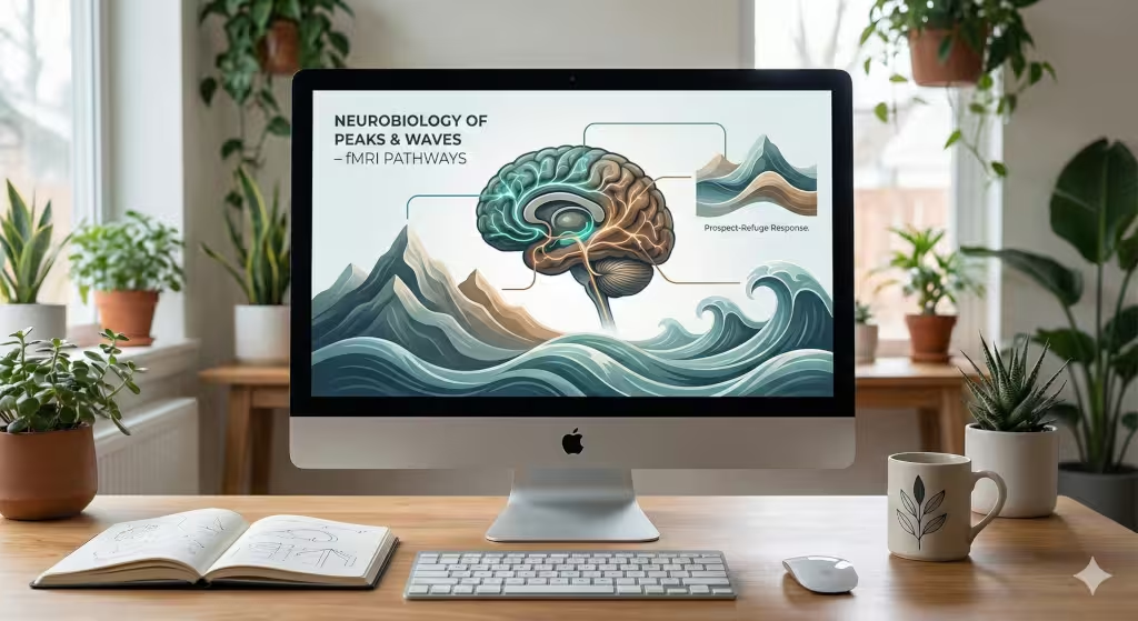
Why do we love looking at a tall Mountain? Science tells us that our brains are wired to enjoy natural shapes. This is called the “prospect-refuge” theory. In the wild, being high up on a Mountain gave our ancestors a “prospect.” They could see far away. This meant they could see food or danger coming. At the same time, they needed “refuge” or a place to hide. A good website design does the same thing. It gives the user a clear view of where to go while making them feel safe in the digital space.
When a designer uses a Mountain as a visual anchor, they are giving the user a sense of strength. A Mountain does not move. It is solid. In the world of the internet, things move very fast. People feel tired. Seeing a sturdy Mountain on a screen can slow down their heart rate. It makes the brand feel like something they can trust. Also, think about it, a lot of people have mountains on their screensavers.
Ocean designs work in a different way. The ocean is always moving. It has a rhythm. This rhythm is very soothing to the human mind. When we see waves on a screen, our brain follows the flow. This reduces digital stress. If you want people to stay on your site for a long time, using the flow of the sea is a great way to do it. These designs convert visitors into customers because they make the person feel good. When people feel good, they stay. When they stay, they buy.
Defining the Mountain-Inspired Web Aesthetic
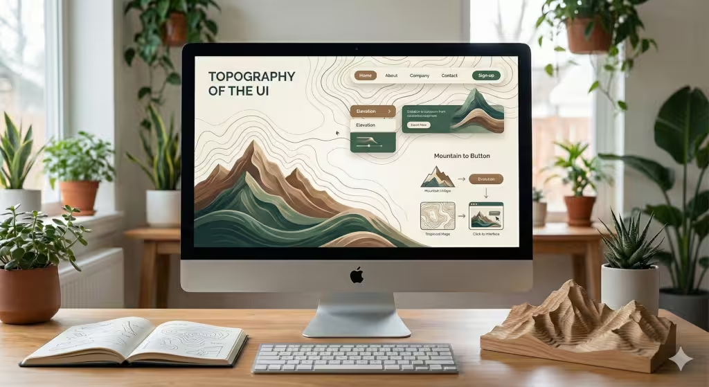
Creating a Mountain look on a website is about more than just a photo. It is about the “topography” or the shape of the page. Think about how a Mountain is built. It has a wide base and a sharp peak. In web design, we can use this hierarchy. We put the most important info at the “peak” of the page. We use the “slopes” of the Mountain to lead the user’s eyes down to the buttons we want them to click.
We also use textures. A Mountain is not smooth like a piece of plastic. It has rocks, trees, and snow. We can use “fractal geometry” to make our websites look more natural. Fractals are patterns that repeat at different sizes. You see them in snowflakes and Mountain ridges. When a website uses these natural patterns, it looks more organic. It does not look like a cold machine. It looks like a living thing.
Mountainous Topography
To truly master Mountain design, we have to look at how we use space. One of the best ways to show off a Mountain is through parallax scrolling. This is a technical trick where the background moves slower than the foreground. When you scroll down, the Mountain stays in the distance while the text moves past it. This creates a sense of depth. It feels like you are actually walking toward the Mountain.
Brands like Patagonia do this very well. They use high-altitude photography that makes you feel the cold air. They use jagged edges for their boxes instead of soft circles. These sharp edges remind us of a rocky Mountain cliff. The colors are also key. We use “earth tones” like slate grey, pine green, and snowy white. These colors are easy on the eyes. They do not yell at the user. Instead, they invite the user to explore.
Ocean and Aquatic Fluidity
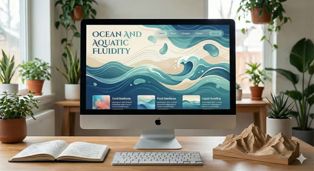
Now, let’s talk about the water. If a Mountain is about strength, the ocean is about movement. An ocean-inspired website should never feel “stiff.” We use fluid transitions to make the page feel like it is floating. Instead of straight lines, we use waves to separate different parts of the page.
We can also use “liquid” animations. Imagine a mouse cursor that leaves a small ripple behind it, like a stone dropped in a pond. This makes the user feel connected to the screen. We use “Gaussian blurs” to create depth in the water. This is when the background looks fuzzy, like you are looking through a deep pool. The colors here are bright blues, soft teals, and sandy beiges. These colors make us think of a vacation. They help the user relax. This is very important for websites that sell luxury items or health products.
Common Questions About Natural Design
Many people ask, “What are the benefits of nature-inspired web design?” The biggest benefit is that it lowers “cognitive load.” This is a fancy way of saying it makes the brain work less. When a site is messy and full of bright, flashing lights, the brain gets tired. A site inspired by a Mountain or the sea is easy to understand. It follows the rules of the world we live in.
Another question is, “How do you create a coastal-themed website without looking dated?” In the old days, people just put pictures of anchors and shells on a page. That looks old. Today, we use “minimalism.” We use the feeling of the coast. We use the colors of the sand and the movement of the tide. We do not need to show a picture of a boat to make someone feel like they are at the sea.
People also ask about color palettes. For a Mountain look, you want to use “heavy” colors at the bottom and “light” colors at the top. This mimics how a Mountain looks against the sky. For the ocean, you want to use “transparency.” Layers that you can see through make the site feel like water.
The Words of the Wild
When we build these sites, we use specific words and ideas. These are called LSI keywords. They help search engines understand what the site is about. For a Mountain site, we talk about “ascent,” “summit,” “ruggedness,” and “elevation.” We use visual terms like “rocky textures” and “alpine palettes.”
For an ocean site, we use words like “flow,” “tide,” “horizon,” and “clarity.” We look for “fluid UI” and “aquatic gradients.” These words help the search engine see that our site is part of a bigger conversation about nature. It helps the site show up when people search for “Mountain and Ocean-inspired website design examples.”
Biophilic Pattern Application: The 14 Patterns
There are 14 patterns of biophilic design. These were made for buildings, but I apply them to websites. The first is “Visual Connection with Nature.” This means using real photos of a Mountain or the sea. The second is “Non-Visual Connection.” On a website, this can be sound. Imagine a site that plays a soft wind sound when you look at a Mountain peak.
Another pattern is “Thermal and Airflow Variability.” We can show this through movement. A soft, swaying motion in the background can make it feel like there is a breeze. This makes the digital world feel less like a box and more like a park. We also use “Complexity and Order.” A Mountain is complex, but it follows a plan. Our code should do the same. It should have many layers but still be easy to navigate.
Entity and Topic Modeling: Knowledge Graph Alignment
To rank well on Google, a site needs to be part of a “Knowledge Graph.” This means the site must be linked to important ideas. In our case, we link biophilic design to famous people like Edward O. Wilson. He was the man who started the biophilia movement. We also link it to “Human-Computer Interaction.” This is the study of how people use computers.
When we talk about a Mountain, we are not just talking about a pile of dirt. We are talking about an “entity.” An entity is a big idea that the computer understands. By using the word Mountain in the right way, we tell the computer that our site is an expert source on nature and design.
Geographic and Local SEO: Connecting with the Land
Local SEO is very important. If you are a designer in Boston, you might want to focus on the “New England Coastal” look. If you are in Vermont, you might focus on the “Green Mountain” aesthetic. This is called GEO optimization. People in different parts of the world have different feelings about nature.
A person living near the Rocky Mountains wants to see a Mountain that looks familiar to them. They want to see those tall, grey peaks. A person in the South might want to see the rolling blue ridges of the Appalachian Mountain range. By matching the design to the local area, we make the website feel like it belongs to the community. This builds a lot of trust very quickly.
Answer Engine Optimization: Preparing for the Future
Today, people do not just type into Google. They ask their phones questions. They use “Answer Engines.” To be ready for this, our article uses clear headings. We use tables and lists. When a person asks, “What makes a good Mountain design?”, the computer can easily find the answer in our text.
We make sure our “Mountain” mentions are natural. We do not just repeat the word. We use it to explain things. We talk about the Mountain air, the Mountain height, and the Mountain shadow. This helps the AI understand that we are providing real value, not just trying to trick the system.
Value-Add: The Future of Adaptive Biophilia
An up and coming aspect of biophilia is “Adaptive Biophilia.” This is a new way of designing. Imagine a website that knows what the weather is like outside your window. If it is snowing where you live, the website shows a snowy Mountain. If it is a sunny day at the beach, the website turns bright and blue like the ocean.
This creates a bridge between the real world and the computer. It makes the user feel like the website is alive. This is the ultimate goal of Silphium Design LLC. We want to take the beauty of a Mountain and the peace of the sea and put them into the palm of your hand. When we do this, we are not just making websites. We are making the world a little more natural, one pixel at a time.
Creating the Mountain Vibe: Textures and Shadows
To make a Mountain feel real on a screen, you have to think about light. In the real world, the sun hits a Mountain from one side. This creates a bright side and a dark side. In web design, we call this “shadow work.” By adding soft shadows to our buttons, we make them look like they are popping out of the page, just like a Mountain peak pops out of the ground.
We also use “high-contrast” colors. Think about a white Mountain peak against a dark blue sky. This is very easy to see. It helps people with poor eyesight read the site better. It also looks very clean and professional. We use these “alpine” colors to guide the user’s eye to the most important parts of the page.
The Rhythm of the Sea: Timing and Animation
When we design for the ocean, we have to think about “timing.” The waves do not crash all at once. They have a slow, steady beat. We use this same beat for our animations. If a menu slides out, it should slide out slowly, like a tide coming in. If a photo fades in, it should fade in like mist clearing off the water.
This slow timing is very different from most websites. Most sites try to be as fast as possible. But a biophilic site knows that nature takes its time. By slowing things down just a little bit, we make the user feel more relaxed. They don’t feel like they are being rushed. They feel like they are standing on the shore, watching the water.
Choosing the Right Images: Quality over Quantity
Not every photo of a Mountain is a good photo for a website. If the photo is too busy, it will distract the user. We look for photos that have “negative space.” This is a big area of the photo where nothing is happening, like a clear sky above a Mountain. This is where we put our text.
The text needs to be easy to read. If we put white text on a white Mountain peak, no one can see it. We use dark overlays or “scrims” to make the text pop. This keeps the beauty of the Mountain while making sure the site still works well. A good design is a balance between art and function.
Typography: The Voice of the Landscape
The fonts we choose are very important. For a Mountain-themed site, we use “strong” fonts. These are usually sans-serif fonts with thick lines. They look like they were carved out of stone. They represent the strength of the Mountain.
For an ocean-themed site, we might use “serif” fonts with elegant curves. These curves look like the movement of a wave. They feel more sophisticated and calm. By picking the right font, we reinforce the feeling of the landscape. We make the brand’s voice match the visual world we have built.
Sustainable Design: Protecting the Digital Environment
At Silphium Design LLC, we believe that a biophilic site should also be a green site. This means the code should be clean and fast. A site that takes a long time to load uses more energy. It makes the user frustrated. A fast site is like a breath of fresh Mountain air. It is clean, crisp, and refreshing.
We optimize our images so they don’t take up too much space. We use modern coding tricks to keep the site light. This helps the environment and it also helps the site rank better on search engines. Google loves fast sites. And users love sites that don’t waste their time.
Case Study: The Alpine Lodge Website
Imagine a website for a hotel in the mountains. We start with a big, hero image of a snowy Mountain peak at sunrise. The colors are orange, pink, and deep purple. As the user scrolls, the background shifts to a forest green. The buttons are the color of slate rock.
We use “topographic lines” as a subtle pattern in the background. These lines look like a map. They give the site a sense of adventure. The user feels like they are planning a trip, not just looking at a computer screen. This is how you use Mountain-inspired design to tell a story.
Case Study: The Coastal Retreat Website
Now, imagine a site for a spa by the sea. The hero video shows soft waves hitting the sand. The sound is muted, but the motion is there. The colors are very light; mostly whites, light blues, and soft sands. The layout is very open. There is a lot of “breathing room” between the pictures.
This openness mimics the vastness of the ocean. It makes the user feel like they have space to breathe. The navigation menu is simple and floats at the top of the page like a piece of driftwood. Everything about the site says “relax.” This is the power of the ocean in web design.
Final Thoughts: The Peak of Digital Design
We have covered a lot of ground today. We have traveled from the highest Mountain to the deepest sea. We have seen how nature can make our websites better, faster, and more beautiful. Biophilic design is not a trend. It is a return to what makes us human.
At Silphium Design LLC, we will keep looking for new ways to bring the Mountain and the ocean into the digital world, as well as other aspects of nature. We want every website we build to be a place where people can find a moment of peace in a busy world.
The internet does not have to be a cold, grey place. It can be a landscape. It can be a forest. It can be a Mountain. All we have to do is look outside and bring that beauty back to our screens. Thank you for joining me on this journey. I hope you feel inspired to build something natural today.