Light is the first thing we see. Before we notice color, shape, or text, we see the play of light and shadow. In the world of graphic design, light is not an effect you add at the end of your work; it is the most important tool you have for communicating with your audience. It is the silent force that tells our eyes what is important, what has depth, and how we should feel. This connection is not accidental.
As humans, our brains are wired to understand the world based on how light works in nature. We know a round object because of the soft way light wraps around it. We feel the drama of a sunset because of its long shadows and warm colors. Mastering light usage in graphic design is about learning to speak this universal, visual language.
This post will break down the rules of light usage, from the basic building blocks that create shape and depth to the advanced tools used by professionals, giving you a complete guide to using light with purpose and skill.
Table of Contents
The Core Components: Value, Contrast, and the Illusion of Form
To understand light, you first need to understand its most basic parts. Think of these as the alphabet of light usage. Once you know them, you can start forming words and telling stories with your designs. The three most important components are value, contrast, and form.
Defining Value
Every color has a “value,” which is just a simple way of saying how light or dark that color is. Imagine you took a color photograph and then turned it into a black and white photo. The different shades of gray you see are the values. A bright, sunny yellow has a very light value. A deep, navy blue has a dark value. Value is the secret ingredient in light usage because it does what color cannot. It creates depth and structure.
A common tool designers use is a value scale, which is a bar showing a smooth transition from pure white to pure black with all the shades of gray in between. When you are working on a design, it is a great exercise to check its values by looking at it in grayscale. If everything blends into one shade of medium gray, your design will look flat and uninteresting. Good light usage means using a wide range of values. You need bright spots (highlights), dark spots (shadows), and all the tones in between (mid-tones) to make your image feel real and three-dimensional. It is this careful control of value that truly defines expert light usage.
Contrast and Hierarchy
Contrast is the difference between elements in your design. You can have color contrast (like red and blue) or size contrast (a big circle next to a small one). But the most powerful type is value contrast, which is the difference between light and dark areas. Our eyes are naturally drawn to areas of high contrast. It is a survival instinct; we are built to notice things that stand out from their background. It is also needed for people who visually impaired.
In graphic design, you can use this instinct to control where a person looks. This is called creating a visual hierarchy. The most important part of your design, like a headline or a “Buy Now” button, should have the highest contrast with its background. This makes it the first thing people see. For example, white text on a black background is the ultimate high contrast element. Gray text on a slightly darker gray background is low contrast and will feel less important.
Effective light usage is all about managing contrast. By placing bright highlights next to dark shadows, you create a focal point. By using soft, low contrast light in other areas, you tell the eye that this information is secondary. Without a clear plan for contrast, a design becomes a confusing jumble where everything is shouting for attention at once. This principle of light usage helps create order and guide the viewer through your message.
Modeling Form
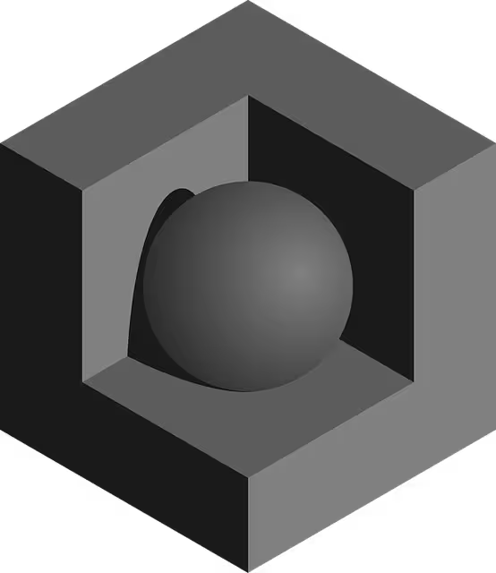
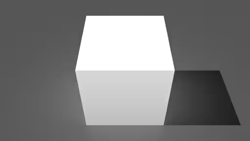
The screen you are reading this on is flat. The paper a poster is printed on is flat. So how do designers make things look like they have real shape and weight? The answer is through the skillful light usage that models form. This is the process of using value and gradients to create an illusion of three dimensions.
Think of drawing a simple ball. If you just draw a circle, it looks flat. But if you add a bright spot where the light hits it (a highlight) and a dark area on the opposite side (a core shadow), it suddenly looks like a sphere. If you add a shadow on the ground underneath it (a cast shadow), it now looks like it is sitting on a surface. You have not changed the shape, only the light usage on its surface.
This is done with gradients, which are smooth transitions between different values. A soft, gradual gradient makes a surface look curved and rounded. An abrupt change in value makes a surface look like it has a sharp edge or corner. The science of good light usage is understanding how light falls on different objects in the real world and then recreating that effect in your design. Whether you are designing a simple button that needs to look clickable or a complex illustration of a car, the principle is the same. The way you handle the light usage will determine whether it looks flat and fake or realistic and tangible.
Historical Precedent and Stylistic Application: The Language of Light
Great ideas in design rarely come from nowhere. They are almost always built on the work of artists who came before us. To truly understand modern light usage, it helps to look back at how painters from hundreds of years ago solved the same problems we face today: how to create drama, emotion, and realism on a flat surface. Their solutions are still just as powerful today.
Entity Focus: Chiaroscuro
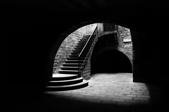
Hundreds of years ago, during a period called the Renaissance, painters like Caravaggio and Rembrandt developed a revolutionary technique for light usage. It was called “chiaroscuro,” an Italian term that simply means “light-dark.” The idea was radical at the time. Instead of bathing their entire scene in flat, even light, they used a single, strong light source to create extreme contrasts between bright highlights and deep, dark shadows.
What did this do? It created an incredible amount of drama and emotion. The bright areas would pull your eye directly to the most important part of the story, like a person’s face, while the rest of the scene would fade into mysterious darkness. This light usage was not just about showing what something looked like; it was about telling you how to feel about it.
Today, graphic designers use the principles of chiaroscuro all the time, even if they do not call it by that name. You can see it on movie posters, where a character’s face is half lit and half in shadow to show they have a dark side. You see it on websites that use a photograph with a bright focal point against a dark, moody background to create a feeling of luxury or seriousness. This historical approach to light usage is a powerful tool for grabbing attention and telling a compelling story without using a single word.
Hard vs. Soft Light
Not all light is the same. The type of light source you use, or pretend to use in your design, has a huge impact on the final mood. We can group most lighting into two main categories: hard light and soft light.
Hard light comes from a single, direct, and often small light source. Think of the sun on a clear day at noon, a spotlight on a stage, or a bare lightbulb. Hard light creates very high contrast and sharp, clean, well defined shadows. This type of light usage is excellent for creating a feeling of drama, intensity, energy, or clarity. It is often used in designs for sports brands, action movies, or tech products because it feels bold and direct.
Soft light, on the other hand, comes from a large, diffused light source. Think of the sun on a cloudy day, the light coming through a frosted window, or the light from a photographer’s softbox. Soft light wraps around objects gently, creating low contrast and soft, blurry shadows with gradual transitions. This type of light usage is perfect for creating a feeling of calm, elegance, beauty, or friendliness. It is often used in designs for health and wellness brands, baby products, or high end fashion. Understanding the difference between these two types of light is key to effective light usage because it allows you to choose the right mood for your message.
The Digital Toolkit: Simulating Light in Modern Design Software
Understanding the theory of light is one thing, but creating it is another. Luckily, modern design programs like Adobe Photoshop and Adobe Illustrator give us an incredible set of tools to control and manipulate light. Learning how to use these tools is what separates an amateur from a professional. This section will break down the essential tools for practical light usage in your daily work.
Raster Based Lighting (Adobe Photoshop)
Photoshop is a “raster” program, which means it works with pixels. This makes it the perfect environment for creating rich, detailed, and realistic lighting effects. The light usage techniques here are all about painting and adjusting pixels to build up layers of light and shadow.
First are the foundational tools: Dodge, Burn, and Sponge. These are some of the oldest tools in Photoshop, and they mimic techniques from old film darkrooms. The Dodge tool makes pixels lighter, as if you are adding light. The Burn tool makes pixels darker, as if you are adding shadow. The Sponge tool changes the color saturation, which can make a highlight look more intense or a shadow look deeper. Using these tools with a soft brush allows you to manually paint light onto an object, giving you total control over its form. This hands on light usage is an art form in itself.
Next are Layer Styles. These are automated effects you can apply to any layer. For light usage, the most important ones are Drop Shadow, Inner Shadow, Outer Glow, and Bevel & Emboss. A Drop Shadow makes a layer look like it is floating above the surface behind it. An Inner Shadow makes it look like the layer has been cut out, creating depth inside it. An Outer Glow can simulate a soft light radiating from an object. Bevel & Emboss is a powerful tool that uses a combination of inner highlights and shadows to make flat shapes look like they have raised, three dimensional edges, perfect for making buttons and interface elements look tangible.
Finally, for more advanced light usage, there is the Lighting Effects Filter. This filter allows you to add virtual lights to your entire image. You can choose different types of lights, like a spotlight that focuses on one area or a point light that shines in all directions like a lightbulb. You can change the color, intensity, and direction of these lights to completely transform the mood and focus of a photograph or illustration.
Vector Based Lighting (Adobe Illustrator)
Illustrator is a “vector” program, which means it works with mathematical lines and shapes instead of pixels. This makes it perfect for logos, icons, and illustrations that need to be scaled to any size without losing quality. While it might seem less suited for realistic lighting, its tools for light usage are incredibly powerful and precise.
The king of light usage in Illustrator is the Gradient Mesh. A regular gradient just transitions colors in a straight line or a circle. A Gradient Mesh, however, creates a grid over a shape, and you can change the color of every single point on that grid. This allows you to create incredibly detailed and photorealistic surfaces. You can map out exactly where the highlights, mid-tones, and shadows should go on an object, giving you a level of control that is hard to achieve otherwise.
For a more modern and organic approach to light usage, Illustrator now has Freeform Gradients. Instead of a rigid grid, this tool lets you place color points anywhere inside a shape and control how they blend together. This is perfect for creating the soft, diffuse, and natural-looking pools of light that are very popular in design today. It is a much more intuitive way to handle complex light usage.
Finally, an essential technique in any program is using Blend Modes. Blend modes change how a layer interacts with the layers beneath it.34 For light usage, the most useful modes are Screen, Multiply, and Overlay. If you want to add a highlight, you can create a new layer, paint a soft white shape where you want the highlight to be, and set the layer’s blend mode to Screen or Overlay. The white shape will now act like a light, brightening whatever is underneath it without erasing the details.
To add a shadow, you can do the same thing with a black shape and set the blend mode to Multiply. This is a non destructive way to work, meaning you can easily adjust your light usage without permanently changing your original artwork.
Advanced Concepts: Borrowing from 3D Rendering
As technology gets better, the lines between 2D graphic design and 3D art are starting to blur. Many of the most interesting and realistic trends in light usage today are actually ideas borrowed from the world of 3D rendering. Understanding these concepts, even at a basic level, can elevate your 2D work and make it look more polished and professional.
Ambient Occlusion (AO)
This sounds like a very technical term, but the idea is actually very simple. Ambient Occlusion is the very soft, subtle shadow that appears in creases, corners, and areas where two objects touch. Go look at the corner of the room you are in right now. You will likely see a soft, dark line where the two walls and the floor meet. That is AO. It happens because ambient light, or the general light bouncing around a room, has a hard time reaching into tight spaces.
In 2D design, faking this effect adds a huge amount of realism. When you place one object on top of another, adding a small, soft, dark gradient where they meet will instantly make them feel like they are in the same space. It grounds objects and gives them weight. Before this technique in light usage became popular, designers would use a simple, hard drop shadow, which can often look fake. Adding a touch of AO makes the connection between objects feel much more natural. This subtle light usage is a sign of a designer with a great eye for detail.
Specular Highlights
A specular highlight is the bright, sharp reflection of a light source itself on a shiny object. If you look at a shiny object like a glass of water or a polished metal spoon, you will see a small, bright white dot or shape on it. That is the reflection of the lights in your room.
The shape, sharpness, and brightness of this highlight tells our brain a lot about the object’s texture. A very sharp, bright specular highlight tells us the surface is smooth and glossy, like glass or chrome. A softer, more blurry highlight tells us the surface is less shiny, like plastic or leather. A surface that is completely matte, like rough wood or concrete, has no specular highlight at all. By carefully designing the specular highlights in your illustrations, you can communicate what an object is made of. This type of detailed light usage is what makes illustrations feel convincing and real.
Global Illumination
Global Illumination is another fancy term for a simple real world idea: light bounces. Light from a lamp does not just travel in a straight line, hit an object, and stop. It hits the object, and then some of that light bounces off and hits other things around it. If you are holding a bright red apple, you might notice a very faint red glow on the white table it is sitting on. That is global illumination, or bounced light.
While it is very difficult to perfectly simulate this in 2D, you can fake it to make your scenes feel more connected and believable. If you have a character standing on green grass, adding a very subtle green tint to the bottom of their shoes and legs will make it look like they are really standing there. This advanced light usage technique makes all the elements in your composition feel like they belong in the same environment, lit by the same light. It is a small detail, but it can make a huge difference in the overall quality of your work. The sophisticated light usage demonstrated here ties a whole scene together.
Of course. Completing the framework is essential. A strong conclusion and a clear summary of the most common questions will solidify the understanding of these principles.
Common Questions About Brand Colors

Even with a detailed guide, it is natural to have some core questions. This section provides direct answers to some of the most common inquiries about light usage in graphic design, summarizing the key ideas we have discussed.
How does light affect graphic design?
Light is arguably the most powerful element in a designer’s toolkit. Its primary effect is creating the illusion of depth and three dimensional space on a flat screen or page. Beyond that, the type of light usage directly controls the mood and emotion of a piece. Bright, soft light can make a design feel happy and friendly, while dark, high contrast light can make it feel dramatic and serious. Finally, light affects graphic design by creating a visual hierarchy. Our eyes are automatically drawn to the brightest and highest contrast areas, so strategic light usage allows a designer to guide the viewer’s attention to the most important parts of a message, like a headline or a call to action.
What are the principles of light and shadow?
The principles of light and shadow are based on how light behaves in the real world. The first principle is that light travels in straight lines from a source. Where this light hits an object directly, it creates a highlight. The parts of the object that are turned away from the light source are in shadow, known as the core shadow. The object itself will also block the light from hitting the surface it is on, creating a cast shadow. The shape and sharpness of these shadows are determined by the light source. This consistent set of rules is the foundation for all realistic light usage.
How do you create depth with light in design?
Creating depth is a primary goal of effective light usage. There are several techniques to achieve this. The most basic is modeling form with gradients, using highlights and shadows to make flat shapes look like solid objects. Second is using cast shadows to make objects look like they are grounded on a surface or floating above it. Third, you can create layers of depth by making objects in the foreground sharper and higher in contrast, while objects in the background are hazier and lower in contrast. This mimics a real world effect called atmospheric perspective, where distant things appear less clear.
What is value in graphic design?
Value is simply the lightness or darkness of a color. It is one of the most fundamental concepts in all of art and design. If you were to remove all the color from an image, the remaining shades of gray are the values. A design that has a full range of values, from very bright parts to very dark parts and plenty of tones in between, will feel rich, deep, and full of life. A design with a very limited range of values will look flat and uninteresting. Understanding value is the first step to mastering light usage, because light and shadow are what create these different values.
Conclusion: Designing with Intentional Illumination
We have journeyed from the core components of light, like value and contrast, to the practical tools in software like Photoshop and Illustrator, and even touched on advanced concepts from the world of 3D. The consistent thread through all these topics is a simple but powerful idea: light is not just for decoration. It is a tool for communication.
Mastering light usage is about moving from accidental to intentional design. It means making conscious choices about the mood you want to create, the information you want to prioritize, and the story you want to tell. Our deep, biological connection to the way light works in the natural world is what makes these techniques so effective. A soft, diffuse glow feels calming because it reminds us of an overcast day, and a sharp, dramatic shadow feels intense because it mimics direct, unfiltered sunlight. By learning to control these elements in your designs, you are tapping into a universal language that everyone understands instinctively.
The next step in your journey is simple: look around. Pay attention to the light in your own world. Notice how it falls on objects, how it changes throughout the day, and how it makes you feel. Then, carry those observations into your next design project and begin to shape light with purpose.