The Weight of Weightlessness
There is a quiet tension in the world of design right now. It is a battle between what looks beautiful and what our eyes can actually see. We often see this tension in the rise of light typography. Designers love these thin, airy fonts. They look clean. They feel like a breath of fresh air. They remind us of the sleek products from tech giants or high-end fashion magazines. But there is a hidden cost to this beauty. When we strip away the weight of a letter, we risk stripping away its meaning.
In my work at Silphium Design, I often look to nature for answers. Nature is a master of using light materials. Think of a spiderweb. It is incredibly thin, almost invisible, yet it is strong enough to catch prey. Think of the veins in a leaf. They are delicate, yet they carry life to every part of the plant. This is biomimicry. We try to copy these natural structures in our designs. We want our websites to feel as light and efficient as a spiderweb.
However, nature also has limits. A spiderweb is hard to see for a reason. It is meant to be hidden. Text on a website is the opposite. It is meant to be seen. It is meant to be read. When we use light typography without care, we fail the basic survival test of the internet. If a user cannot read your words, they will leave. It is that simple.
This article will explore the impact of light typography on user experience. We will look at why we love it, why our eyes struggle with it, and how to use it safely. We will bridge the gap between the art of design and the biology of vision.
Table of Contents
The Aesthetic Allure: Why We Crave Lightness

We are drawn to light typography for the same reason we are drawn to a clearing in a dense forest. It feels open. It feels free. In a crowded digital world full of popping ads and bright colors, light typography offers a sense of calm. It is the visual equivalent of a whisper in a room full of shouting.
This style connects deeply with modern minimalist trends. Minimalism is not just about having less stuff. It is about making room for what matters. When a designer chooses a thin font, they are usually trying to create “white space.” This is the empty space around the text. White space is crucial. It gives our brains a break. It reduces what we call cognitive load, which is just a fancy way of saying mental effort.
Luxury brands have used light typography for decades to show elegance. A thick, bold font feels loud and sturdy, like a truck. A thin, light font feels precise and expensive, like a fine watch. It suggests transparency. It suggests that the brand has nothing to hide.
Technology has pushed this trend even further. We now have “variable fonts.” These are special font files that let designers pick the exact weight of a letter. You are no longer stuck with just “Regular” or “Bold.” You can pick a weight of 250, or 255, or 300. This gives us total control. But with great power comes great responsibility. Just because we can make a font thinner does not mean we should. The allure of light typography is strong, but we must not let it blind us to the needs of the user.
The Biological Barrier: How the Eye Processes “Thin”

To understand why light typography can be hard to read, we have to look at how the human eye works. I studied biology before I became a designer, and the mechanics of vision are fascinating.
When you read, your eyes do not move in a smooth line. They jump. These jumps are called saccades. Your eye jumps from one group of letters to the next. Between these jumps, your eye pauses for a fraction of a second to take in information. This is called a fixation.
For this process to work, your eye needs something to grab onto. It needs contrast and shape. Light typography often lacks the stroke width needed for your eye to “grip” the letter. It is like trying to climb a wall with very tiny handholds. Your eye slips. It has to work harder to recognize the letter shapes. This slows down reading. It causes eye fatigue.
There is also the issue of the “crumple zone” of pixels. Screens are made of tiny squares of light called pixels. When you draw a curved line on a screen, the computer has to fake it. It uses a trick called anti-aliasing. It adds gray pixels to the edges of the letter to make it look smooth.
When you use light typography, the strokes are already very thin. When the computer adds those gray pixels to smooth the edges, the letter can start to look fuzzy. It might even disappear in some spots. This is even worse on older screens or in bright sunlight. If a user is reading your site on their phone while walking outside, the glare of the sun can wash out light typography completely. The thin lines just do not have enough substance to stand up to the light.
Quantifying Usability: WCAG and Contrast Ratios
In design, we cannot just guess if something is readable. We need numbers. This is where the Web Content Accessibility Guidelines, or WCAG, come in. These are the rules we follow to make sure people with visual impairments can read our content.
The most important rule for light typography is contrast ratio. Contrast is the difference in brightness between the text and the background. The standard rule for normal text is a ratio of 4.5 to 1. This means the text needs to be significantly darker (or lighter) than the background.
However, light typography breaks this rule. Because the lines are so thin, they perceive as lighter than they actually are. A gray color might pass the math test, but if the font is very thin, it will fail the eye test.
Think of it like writing with a pencil versus a marker. You can press hard with a pencil, but the line is still thin. It is harder to see from a distance than a thick marker line, even if both are black.
For light typography to work, you need much higher contrast. I often recommend a ratio of 7 to 1 or higher for thin fonts and aim for this ratio in all websites, regardless of font. In nature, animals use camouflage to blend in. They want to have low contrast so they are not seen. In web design, low contrast is a death sentence. If you use light typography with low contrast (like gray text on a white background), you are effectively camouflaging your content. You are hiding it from your user.
Here is a simple breakdown of how weight affects the need for contrast:
- Standard Weight (400): Needs normal contrast.
- Light Weight (300): Needs high contrast.
- Thin Weight (100): Needs very high contrast and should only be used at large sizes.
Biophilic Typography: Learning from Nature’s Legibility
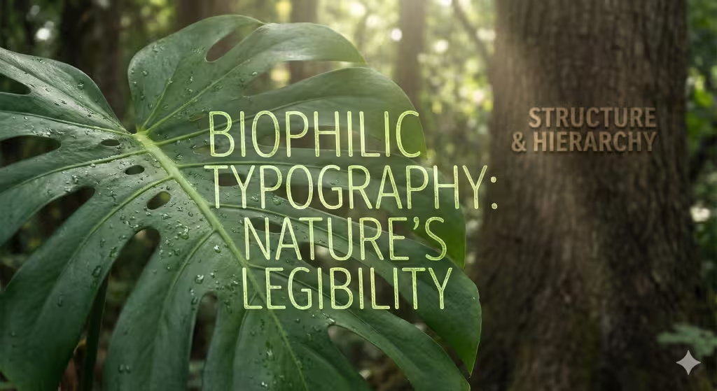
As a biophilic design expert, I believe we can solve digital problems by looking at the natural world. Nature is full of complex patterns, yet it is rarely confusing. A forest is messy, but you can still tell a tree from a bush. You can still see the path. This is called fractal fluency. Our eyes are built to process the patterns of nature efficiently.
So, how does nature handle “light typography”? It uses it for atmosphere, not for the main structure.
Look at a tree. The trunk is thick and solid. This is like your main body text or your bold headlines. It supports the weight of the tree. The branches get thinner as they go out. The leaves have tiny, delicate veins. These veins are the “light typography” of the tree. They are beautiful and efficient, but they are not the trunk.
We should use light typography in the same way. It is perfect for setting a mood. It works well for large, short titles that act like the canopy of the forest, airy and grand. But we should not use it for the trunk. We should not use it for the main navigation or the paragraphs of text that the user needs to rely on.
We can also look at “organic typography.” These are fonts that have human or natural touches. They might have slight irregularities in the curves. They feel warmer than the cold, geometric shapes of many tech fonts. Interestingly, organic shapes often hold up better at lighter weights. The slight variations give the eye more to latch onto. A perfectly straight, thin line is the hardest thing for the eye to track. A line with a bit of a wave or a curve is much easier to process.
The User Experience Don’ts: Where Light Typography Fails
There are specific places where light typography almost always fails. Knowing these traps can save your design.
The biggest mistake is using light typography for body copy. Body copy is the main blocks of text, like the paragraphs in this article. When you set a whole paragraph in a light font, you create a strain on the reader. It is like asking them to listen to a whisper for an hour. It is exhausting. The lack of weight makes the block of text feel gray and washed out. Readers will often skim over it or give up entirely.
Another major trap is “Dark Mode.” Dark mode is very popular right now. It uses light text on a dark background. However, light acts differently on a screen when it is white-on-black versus black-on-white.
When you put white text on a black background, the light from the letters spills out slightly into the black space. This is called the halation effect. It makes the text look a little thicker than it really is. But if you use an extremely thin font, this glow can blur the letter shapes together. It can make the text look fuzzy or vibrating.
You should also be careful with light typography on mobile devices. Phone screens are small. People often read them while moving, or in bad lighting. A font that looks elegant on your large desktop monitor might become invisible on a phone screen in the sunlight. Mobile readability relies on clarity. Thin, delicate fonts usually lack the sturdiness needed for mobile environments.
Strategic Implementation: How to Use Light Type Correctly
I am not saying you should never use light typography. I use it, if a site benefits from it. But I use it with a specific set of rules. I treat it like a spice, not the main course.
The first rule is the Scale Rule. If you go light, you must go large. The thinner the font, the bigger it needs to be.
If you are using a font weight of 300 (Light), the size should be at least 24 pixels.
If you are using a font weight of 100 (Thin), the size should be at least 48 pixels.
At these large sizes, the thin lines are actually quite thick in terms of pixels. They become easy to see. The character of the font shines through without hurting readability.
The second rule is the Background Check. Light typography needs a solid, flat background. Do not place thin text over a busy photograph. The lines of the text will get lost in the details of the image. It is like a stick insect hiding on a branch. You cannot see it. If you must place text over an image, use a bold weight. Light typography needs a clean, high-contrast canvas to survive.
You must also think about visual hierarchy. Hierarchy is the order in which we read things. We usually read big, bold things first. If you make your most important headline a thin, light font, you are sending a mixed signal. You are saying “this is big, but it is weak.” Sometimes this works for a subtle, elegant look. But often, it just confuses the user. Make sure your light typography does not accidentally demote important information.
Tools for Testing and Validation
As a scientist at heart, I believe in testing. You should never trust your own eyes alone. You know what the text says, so your brain cheats. It fills in the gaps. Your users do not have that advantage.
There are great digital tools to help you. Google Lighthouse is a tool built into the Chrome browser. It can scan your site and tell you if your contrast is too low. It will flag light typography that fails accessibility standards.
There are also tools like the Stark Accessibility Tool and WebAIM Contrast Checker. These let you enter your foreground color and background color to get a pass/fail grade.
But I also use my own “biophilic” tests.
First is the Squint Test. Sit back from your screen and squint your eyes until your vision is blurry. Can you still see the text? Does the light typography disappear completely? If it vanishes when you squint, it is too thin.
Second is the Sunlight Test. Take your phone outside at noon. Turn the brightness down to 50%. Can you read the light typography? This simulates the worst-case scenario for your users. If you cannot read it, neither can they.
Third is the Render Check. Fonts look different on different computers. Apple computers use a different method to draw text than Windows computers. Windows text often looks a bit sharper and thinner. Apple text looks a bit bolder. A light font that looks okay on a Mac might look like a spiderweb on a Windows PC. You need to check both.
Questions about Light Typography
In my research on search trends, I see many people asking similar questions about fonts. Let’s answer a few of them here.
Is light font bad for eyes?
Light typography itself is not “bad” for eyes, but it causes more strain. When the contrast is low or the font is too thin, the muscles in your eyes have to work harder to focus. This leads to digital eye strain. It can cause headaches and blurred vision. So, while the font isn’t toxic, the effect of struggling to read it is real.
What is the best font weight for reading?
For long reading, like a blog post or a book, the best weight is Regular (400) or Medium (500). These weights have enough thickness to be seen clearly without being so bold that they distract you. They are the “Goldilocks” zone of typography, not too thin, not too thick, just right.
Does font weight affect SEO?
Yes, indirectly. Google does not read your font weight and punish you directly. However, Google watches how users behave. If users come to your site, struggle to read your light typography, and immediately click “back,” that hurts your SEO. It sends a signal that your user experience is poor. Good typography keeps people on the page longer.
Conclusion: The Ecological Balance of Design
Design is an ecosystem. Every element affects every other element. Light typography is like a rare, delicate flower in that ecosystem. It is beautiful. It adds value and delight. But it cannot survive everywhere. It cannot grow in the deep shade, and it cannot be trampled on.
We must treat light typography with respect. We must understand its biological limits. It is a tool for elegance, openness, and atmosphere. It is not a workhorse for heavy information.
When we use light typography correctly, we create websites that feel natural and human. We create spaces that breathe. But this only works if we prioritize the user’s ability to see and understand.
The impact of light typography on user experience is profound. It can elevate a brand to the heights of sophistication, or it can sink a website into usability failure. The difference lies in the hand of the designer. By combining the aesthetic beauty of thin lines with the scientific principles of vision and contrast, we can create designs that are both beautiful and functional. We can create designs that survive and thrive.