The Weight of “Lightness”
Imagine walking through a dense forest at noon. The sun does not hit the ground in a solid block of white; it filters through the canopy, creating dappled patterns of light and shadow. It is beautiful, breathable, and easy on the eyes. This is the essence of good design. However, if that light becomes too faint, or the shadows too deep, you lose your footing. You trip over a root because your eyes cannot distinguish the texture of the ground.
In the world of web design, light typography works the same way. It is a design trend that aims to make websites feel airy, modern, and elegant, much like a spiderweb glistening in the morning dew. But there is a dangerous trap here. When designers push light typography too far, or use it without understanding the underlying mechanics, the text disappears. It becomes like footprints in a blizzard; faint, hard to track, and frustrating for the user.
We saw a massive shift toward this aesthetic years ago, particularly when mobile operating systems began favoring ultra-thin fonts to look sleek. Suddenly, everyone wanted their website to look weightless. But there is a biological reality we must face: human eyes need contrast to function. When we force users to squint at thin gray letters on a white background, we create cognitive load. That is a fancy way of saying we make their brains work too hard just to read a simple sentence. It can even cause the writers of the articles to have problems also.
The goal of this article is to bridge the gap between that beautiful, airy aesthetic and the hard science of how we see. We will look at light typography not as a mistake, but as a tool that needs precision. True readability is not about banning light fonts. It is about anchoring them. We must use the right contrast, the correct spacing, and clever rendering techniques to make sure that light typography is as functional as it is beautiful.
Table of Contents
The Physics of Legibility and Readability

When we talk about light typography, we first have to understand the difference between two very important concepts: legibility and readability. Legibility is the micro view. It asks, “Can I tell that this letter is an ‘e’ and not an ‘o’?” Readability is the macro view. It asks, “Can I read this whole paragraph without getting a headache?”
Light typography often fails at the legibility stage first. If the stroke of a letter is too thin, it dissolves into the background. This is where the concept of “x-height” becomes critical. The x-height is simply the height of the lowercase letter “x” in any given font. It is the backbone of the font’s visibility.
If you are committed to using a light font face, you must choose one with a tall x-height. A tall x-height makes the letters feel bigger and more open, even if the lines themselves are thin. Think of it like a bamboo stalk. Bamboo is thin, but because it stands tall and straight, you can clearly see it against the jungle background. If you use a font with a short x-height and thin lines, the letters crush down on themselves.
We also have to deal with an optical illusion called irradiation. This happens when you use light typography on a dark background, often called “Dark Mode.” Light text on a dark screen tends to glow. This glow bleeds into the surrounding darkness, making the text look even thicker than it actually is. Conversely, black text on a white background looks thinner because the white light eats away at the edges of the black letters.
Because of this physics, light typography needs to be treated differently depending on the background color. You might need a slightly heavier font weight for black text on white than you do for white text on black. It is all about compensating for how light physically enters the human eye.
Technique I: Intelligent Font Weighting
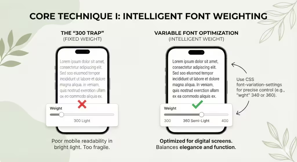
One of the biggest mistakes in web design is the “300 trap.” In CSS code, font weights are assigned numbers. Normal text is usually 400. Bold is 700. A “Light” font is often set to 300.
Many designers set their body text, the main paragraphs of the page, to weight 300 because it looks elegant on their high-definition design monitors. But on a cheap laptop screen or a phone in bright sunlight, that 300-weight text vanishes. It is too frail to survive in the wild.
To fix this, we need to stop thinking in solid steps like 300 or 400. We need to look at “Variable Fonts.” This is a newer technology in light typography that allows us to pick any number we want. Instead of being stuck with a too-thin 300 or a too-thick 400, we can dial in a weight of 340 or 360.
This is like watering a plant. You don’t dump a whole bucket (400) or give it a single drop (300). You give it exactly what it needs to thrive. Using a weight of 340 might give you that elegant, light feel you want, but adds just enough thickness to be readable on a mobile phone.
My rule of thumb for light typography is simple: never go below a weight of 400 for body text on a mobile device. Phones are used in distracting environments, on buses, outside, in cafes. The text needs to be robust enough to compete with the environment. You can use lighter weights for huge headlines, where the sheer size of the letters makes up for the thinness of the lines, but for the main text, you must prioritize weight.
Technique II: Contrast Ratios and Luminance

If you want to master light typography, you must become best friends with contrast. Contrast is the difference in brightness between the text and the background. The World Wide Web Consortium (W3C) has a set of guidelines called WCAG (Web Content Accessibility Guidelines). They state that for normal text, you need a contrast ratio of at least 4.5 to 1. Here at Silphium Design, we try to aim for at least 7 to 1, when we can.
This is where light typography often fails. A thin gray font on a white background might have a ratio of only 2 to 1. This is invisible to many people, especially older adults whose eyes let in less light.
However, we also want to avoid “pure” contrast. Pure black (#000000) on pure white (#FFFFFF) is very harsh. It creates a vibrating effect that can cause eye strain. In the biophilic design world, we look for “Biophilic Grey.” This is not a flat gray, but a dark charcoal or a very deep forest green. While it is not a guideline, generally try to have less than 16 to 1 to avoid eye strain.
When you use light typography, try using a dark charcoal color (#222222) instead of pure black. This softens the blow to the eye. But, because the font is thin, you cannot afford to go too light with the gray. If you make the font thin and light gray, you are effectively erasing your content.
If you thin out the font, you must darken the color. If you lighten the color, you must thicken the font. It is a seesaw. You cannot lower both ends at the same time, or the system collapses.
Technique III: Spacing and the “Air” of the Page
Light typography is delicate. Because the strokes are thin, the letters feel like they are floating. If you pack them too closely together, they don’t look like words anymore; they look like a barcode. To make light typography readable, you need to add “air.”
In design terms, we call this tracking (letter-spacing) and leading (line-height).
First, let’s talk about tracking. When you use a bold font, the letters can sit close together because they are heavy and distinct. But with light typography, the letters need room to breathe. You should slightly increase the space between each character. This prevents the thin vertical lines of an “l” or an “i” from visually merging with their neighbors.
Next is line-height. This is the vertical space between lines of text. A standard website might use a line-height of 1.5 (meaning the space is 1.5 times the size of the font). For light typography, you should push this to 1.6 or even 1.7.
Think of a field of wheat. If the wheat is planted too densely, it looks like a solid wall. If you space the rows out, you can see the individual stalks swaying in the wind. Light typography needs that open field. By increasing the white space around the text blocks, you reduce the cognitive load on the user. Their eyes can easily track from the end of one line to the start of the next without getting lost.
This use of white space is a core biophilic principle. It mimics the openness of a savannah, a landscape that humans are evolutionarily programmed to find peaceful and safe.
Technique IV: Technical Implementation and Rendering Engines
Now we must get a little technical. The way a font looks on your screen depends on the software that draws it. This is called the rendering engine. Different computers do this differently. A Mac uses a system called Quartz, which tends to make fonts look a bit bolder and smoother. Windows uses DirectWrite, which focuses on making the edges sharp, often making light typography look jagged or thinner.
There is a CSS command that many designers use: -webkit-font-smoothing: antialiased. This command tells the browser to smooth out the jagged edges of the font. It makes text look very clean and crisp. However, it also makes the font look significantly thinner.
If you are using light typography, be very careful with this command. If you have a font weight of 300 and you apply antialiasing, you might effectively be reducing the visual weight to 200. The text becomes anorexic.
If you decide to use antialiasing to make your light typography look smooth, you should compensate by bumping up the font weight. If you were using 340, maybe move it up to 360. You have to manually adjust the thickness to make up for the slimming effect of the rendering engine.
Also, be aware of high-resolution screens (like Retina displays) versus standard screens. Light typography looks beautiful on a Retina screen because there are enough pixels to draw the delicate curves. On an old, low-resolution monitor, those thin lines might disappear entirely because there aren’t enough pixels to display them. Always test your light typography on the worst screen you can find, not just your best one.
Technique V: Biophilic Typography and Fractal Fluency

As an expert in biophilic design, I look for patterns in nature to guide my choices. One of the most interesting concepts is “fractal fluency.” Fractals are complex patterns that repeat at different scales, think of the branching of a tree or the veins in a leaf. Humans are naturally good at processing these images. They are “fluent” in them.
When choosing a font for light typography, avoid fonts that are too geometric or robotic. A perfect circle “O” or a stick-straight “l” feels unnatural. Instead, look for “humanist” typefaces. These are fonts that have a little bit of variation in the stroke width, mimicking the way a human hand writes with a pen.
Humanist fonts often have more open shapes and slightly organic curves. When you use light typography with a humanist font, it feels like dried grass or a spiderweb, delicate but organic. It is easier for the brain to process because it feels familiar.
We can also look at “Circadian Design.” Our eyes work differently at different times of the day. In the bright morning light, we can handle lower contrast and thinner fonts. At night, our eyes are tired.
Using modern CSS code, specifically prefers-color-scheme, we can actually change the weight of our typography based on the user’s setting. If a user is in “Dark Mode” (often used at night), we can program the site to automatically thicken the light typography by 50 points. This compensates for their tired eyes and the light bleed effect we discussed earlier. It is a way of making the website live and breathe in sync with the user’s biological clock.
Commonly Asked Questions on Light Typography
Is light font hard to read?
Yes, it can be. If the font size is small (under 16 pixels) or the contrast is low, light typography is very hard to read. However, if you use a large font size and ensure high contrast between the text and the background, it can be perfectly readable. The key is balance. You cannot have small, light, and low-contrast text all at once.
What is the best font weight for web?
For the main body text, the best weight is usually between 400 (Regular) and 600 (Semi-Bold). This range is safe for almost all screens and eyes. You should generally reserve weights like 300 (Light) or 200 (Extra Light) for large headlines that are at least 24 pixels or larger.
How does font weight affect SEO?
Search engines like Google care deeply about “User Experience.”20 If your users cannot read your text because the light typography is too faint, they will leave your site quickly. This is called “bouncing.” A high bounce rate tells Google that your page is not helpful, which can lower your rankings. So, making your text readable directly helps your SEO.
Conclusion: Nature favors efficiency
In nature, nothing is wasted. A flower stem is exactly as thick as it needs to be to hold up the bloom, but no thicker. It is efficient. Light typography should follow this same principle.
It is not about making text as thin as possible just to be trendy. It is about finding the perfect efficiency, the lightest weight that still communicates the message clearly and strongly.
By understanding the physics of light, utilizing variable fonts, respecting the need for white space, and choosing organic, humanist typefaces, you can master light typography. You can create websites that feel open and airy, like a walk in a Vermont forest, without forcing your users to strain their eyes to find the path.
We must always remember that design is for humans, and humans are biological creatures. Our digital environments should respect our biological limits. When you treat light typography with this level of care, you create a space that is not only beautiful to look at but effortless to use.