The Death of the Pixel-Perfect Grid
We have spent the last twenty years in a digital box. As a biologist and a web designer, I see a strange conflict in how we build websites. In nature, there are no straight lines. You will never find a perfect square in a forest. A river does not flow in a straight grid. A tree does not grow in perfect symmetry. Yet, when we look at the internet, almost everything is made of strict grids, perfect boxes, and exact pixels.
This pursuit of perfection is actually a problem. Our brains are designed to look at nature. We are evolved to scan leaves, clouds, and complex textures. When we force the human eye to look at perfect digital grids for hours a day, it creates a sense of cold distance. It feels sterile. It feels like a hospital room rather than a living room. This is why imperfection is becoming the most important trend in modern web design.
Amdist the imperfection is a Japanese idea called Wabi-Sabi. This is a worldview that finds beauty in things that are incomplete, temporary, and imperfect. In the world of web design, embracing imperfection does not mean doing a bad job. It does not mean your code is broken. It means you are choosing to make your website feel human. It means adding a little bit of chaos to the order.
When you allow imperfection into your design, you create a connection. A user stops seeing a corporate machine and starts seeing the humans behind the screen. This article will guide you through the specific ways you can break the grid. We will look at how moving things out of alignment, using rough textures, and choosing “off” colors can actually make your website perform better. We will explore why imperfection is the key to trust.
Perfection creates a wall. Imperfection opens a door. Let’s learn how to walk through it.
Table of Contents
Principle 1: Asymmetry and the “Natural” Flow
The first step in using imperfection is to break the grid. Most websites are built on a 12-column grid. This is a system where everything lines up perfectly down the page. It is neat, tidy, and safe. It is also very boring. Nature is balanced, but it is almost never symmetrical. If you look at your own face in a mirror, one eye is slightly different than the other. If you look at a tree, the branches on the left do not perfectly match the branches on the right.
To bring this natural feeling to a website, you must use asymmetry. This is a controlled type of imperfection. Instead of centering your text and images perfectly, try pushing them to the side. Place a large image on the left and a small block of text on the lower right. This forces the user’s eye to move across the screen in a diagonal line. This movement is much more active than simply scrolling down a straight line.
This creates “visual tension.” It keeps the brain awake. When everything is perfectly symmetrical, the brain predicts what comes next and stops paying attention. When you use asymmetry, the layout feels alive. It feels like it is moving. This is a major tip for embracing imperfection because it stops the user from skimming.
You can start small. If you have a row of three boxes, do not make them all the same height. Make the middle one lower or higher. Make one slightly wider. This small amount of imperfection makes the group of boxes look like a collection of rocks on a beach, rather than bricks in a wall. It feels organic. It signals to the user that this content was arranged by a human hand, not a computer program.
Principle 2: Leveraging Organic Textures and Noise
The screen of a computer or phone is made of glass. It is smooth, cold, and flat. In the real world, nothing is perfectly smooth. Everything has a texture. Paper has grain. Wood has rings. Stone has bumps. One of the biggest problems with digital design is that it lacks this tactile feel. To fix this, we need to introduce texture as a form of imperfection.
For a long time, “Flat Design” was the standard. This meant solid blocks of color with no shadows or depth. This is very easy for computers to load, but it feels fake. By adding subtle noise or grain to your background, you reduce the harshness of the digital light. This is a visual imperfection that mimics film grain or expensive paper.
You do not need heavy image files to do this. You can use simple code to create a “noise” layer. This looks like static on an old TV, but very faint. When you overlay this on a solid color, it breaks up the pixels. It makes the color look softer. It makes the screen feel less like a lightbulb and more like a printed page.
This imperfection helps with eye strain. A perfectly solid, bright white background can be painful to look at for a long time. A background with a little bit of grey texture or noise is gentler. It absorbs the eye rather than repelling it. You can also use “skeuomorphic” elements. These are digital items that look like real-world items, like a button that looks like it is made of cloth, or a border that looks like torn paper. These rough edges are a welcome imperfection in a world of sharp corners.
Principle 3: Hand-Drawn Elements as “Human” Signals
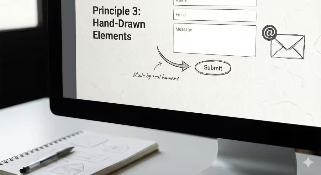
Trust is the most valuable currency on the internet. Users are skeptical. They know that AI can write text and that templates can build websites. They want to know if there are real people behind a business. The fastest way to show this is through handwriting. Handwriting is the ultimate form of imperfection. No two people write exactly the same way. Even your own signature looks different every time you write it.
When you use hand-drawn elements on a website, you are signaling authenticity. You can replace those standard, boring icons that everyone uses with hand-sketched versions. If you have a “contact us” button, imagine how different it would look if the arrow was drawn with a pen stroke rather than a perfect vector line. That wobble in the line is a good imperfection. It shows effort.
You can also use handwritten fonts for emphasis. Do not use them for the main body text, because that is hard to read. But for headlines or small notes in the margins, a script font works wonders. It looks like someone took notes on the screen. It breaks the rhythm of the mechanical text.
This type of imperfection appeals to our biology. We have evolved to recognize the marks of other humans. We look for footprints in the sand or scratches on a tree. When we see a hand-drawn circle around a word on a website, our attention goes there immediately. We value it more because it looks like a human put it there. A perfect circle feels like a machine; a wobbly circle feels like a friend.
Principle 4: The Glitch as an Aesthetic Choice
Sometimes, we can take imperfection a step further. We can embrace the fact that computers sometimes break. This is a style often called “Anti-Design” or “Glitch Art.” It accepts that the digital world is fragile. Instead of hiding errors, we use them as decoration.
A “glitch” effect might look like an image tearing apart for a split second when you hover your mouse over it. It might look like colors separating into red, green, and blue, like an old monitor acting up. This is a very specific type of imperfection. It is edgy and modern. It tells the user that the brand is not afraid of being raw.
Why would you want your site to look broken? Because it stands out. If every other website looks like a shiny, perfect magazine, a website that flickers or distorts feels rebellious. It grabs attention. It creates a memory. This is a powerful use of imperfection for brands that want to seem young, high-tech, or artistic.
However, you must be careful. This imperfection must be aesthetic, not functional. The buttons still need to work. The text still needs to be readable. The “glitch” is just a layer of paint on top. It is a way of admitting that technology is not magic. It is just code, and sometimes code gets messy. By owning that mess, you create a unique identity. You are saying, “We are real, and reality is sometimes glitchy.”
Principle 5: Typography and Typesetting “Mistakes”
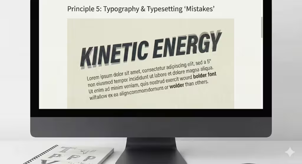
Typography is the art of arranging type (text). In traditional web design, there are strict rules. You must have perfect spacing. You must not let letters touch each other. You must keep lines straight. Embracing imperfection means breaking these rules to create energy.
You can experiment with overlapping text. Imagine a headline where the second line slightly covers the bottom of the first line. In a strict design school, this would be a mistake. In the world of organic design, this imperfection creates a layered feeling. It looks like posters pasted on a wall, one over the other. It adds depth.
You can also use “variable fonts.” These are modern font files that can change their weight and width smoothly. You can program them to breathe. Imagine a headline that gets slightly bolder and then thinner as you scroll. It is a subtle motion, like a chest expanding and contracting. It is an imperfection in the weight of the letters that makes the words feel alive.
Another trick is to tilt text blocks. Instead of horizontal lines, tilt a paragraph five degrees. It catches the eye instantly. It feels like someone dropped a note on a table. It is casual. This imperfection removes the stiffness of the corporate web. It suggests that the content is dynamic and flowing, rather than set in stone.
Principle 6: Color Palettes Derived from Decay
Computer screens are capable of showing millions of colors. Because of this, many designers use the brightest, most saturated colors possible. Neon greens, electric blues, and hot pinks. These colors do not exist in nature in large amounts. When we see them, they signal “danger” or “artificial.” They cause eye fatigue.
A biophilic approach to imperfection involves looking at colors found in decay and age. Think about the colors of dried leaves, rusted metal, mossy rocks, or old paper. These colors are muted. They are not pure. A “perfect” red is pure #FF0000. An imperfect red is the color of a brick that has been in the sun for fifty years.
These earthy, muddy tones are very calming. They lower the cortisol (stress) levels in the user’s brain. By using a palette of “imperfect” colors, ochre, olive, slate, terracotta, you make the website feel grounded. You are bringing the calmness of the forest into the screen.
This also helps with the flow of reading. Bright neon colors scream for attention. Muted, organic colors invite you in. They suggest a history. A brand that uses these colors feels established and permanent, like a mountain. A brand that uses neon colors feels temporary, like a plastic toy. Embracing the imperfection of muddy, washed-out colors creates a sense of sophistication and maturity.
Principle 7: Content “Incompleteness”
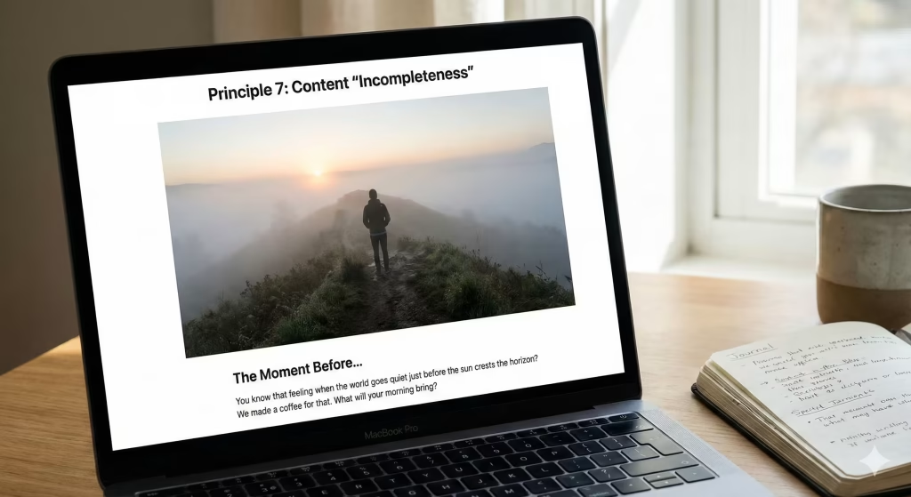
There is a psychological concept called the Zeigarnik Effect. It states that people remember uncompleted or interrupted tasks better than completed ones. If you give someone a puzzle and let them finish it, they forget it. If you stop them halfway through, they think about it all day. We can use this imperfection in how we write content.
Usually, companies want to present themselves as the perfect solution. They want to show a finished package. But it is often better to leave an “open loop.” This means your content should invite the user to participate. Do not tell the whole story. Ask questions that the user has to answer in their head.
This is a narrative imperfection. You are leaving a gap for the user to fill. For example, instead of saying “We have the best coffee,” you might say “You know that moment of silence before the world wakes up? We made a coffee for that.” You aren’t finishing the thought about the coffee’s taste; you are letting the user imagine their own moment.
This approach treats the brand as an evolving entity. You can admit that you are still learning. You can share behind-the-scenes failures. If you write a blog post about a mistake your company made and how you fixed it, that imperfection builds massive trust. People do not trust perfect companies because they know perfection is a lie. They trust companies that are honest about their flaws and their journey.
Principle 8: Technical Implementation of Organic Shapes
In the code of the web (HTML and CSS), everything is a box. Every button, every image, every paragraph is inside a rectangular box. Even if you make it a circle, the browser sees a box. This is the ultimate rigid geometry. To bring imperfection to the structure itself, we need to manipulate the shape of these boxes.
We use a tool in CSS called border-radius. Usually, people use this to round the corners of a button slightly. But you can use it to create “blobs.” A blob is a shape that is not a circle and not a square. It is lumpy. It looks like a cell under a microscope or a pebble.
By using uneven numbers in your code, you can create these shapes. Instead of a perfect circle, you create a shape that is 60% round on one side and 40% on the other. This imperfection removes the harsh mathematical feel of the web.
You can even animate these shapes. You can make the blob morph and change shape slowly, like a lava lamp. This is incredibly engaging. It adds a “heartbeat” to the page. It makes the white space (the empty space) around the text feel active. It is no longer just empty space; it is a living fluid that holds the content.
This technical imperfection changes the whole mood of a website. It goes from being a spreadsheet to being an organism. It makes the user feel like they are interacting with something living. It is softer, friendlier, and much more memorable than a standard grid of squares.
Conclusion: The Value of Authentic Connection
We are entering a new era of the internet. For years, we chased high-resolution, pixel-perfect, symmetrical designs. We wanted everything to look sleek and futuristic. But we are humans, not robots. We are biological creatures who evolved in a messy, complex, beautiful world. We crave connection, and connection comes from imperfection.
When you embrace imperfection in your web design, you are not being lazy. You are being strategic. You are using the psychology of trust. You are using the biology of the eye. You are creating a space that feels safe, authentic, and human.
Whether it is through a handwritten font, a grainy texture, an asymmetric layout, or a blob-shaped image, every piece of imperfection adds value. It creates a hook for the mind to grab onto. It tells a story of reality.
So, look at your website today. Find the places where the grid is too stiff. Find the colors that are too bright. Find the lines that are too straight. Dare to break them. Dare to add a little bit of noise. Dare to be real. In a digital world of perfect copies, the only thing that stands out is a genuine imperfection.