When designers and developers discuss digital accessibility, the conversation often centers on a critical, measurable standard: color contrast. We run our palettes through checkers, ensuring our text and background pairings meet the Web Content Accessibility Guidelines (WCAG). This is a vital practice, but it is only one part of a much larger picture. Beyond the stark mathematics of contrast ratios lies a more nuanced, biological factor that profoundly affects a user’s comfort and comprehension: color temperature. This element, often considered purely aesthetic, is in fact a critical component in creating truly accessible web experiences that serve all users.
This article provides a thorough analysis of the impact of color temperature on digital accessibility. We will break down the science of how the human eye perceives light, exploring how different light qualities can either hinder or help readability. We will then connect these scientific principles to practical application in UI/UX design, offering actionable strategies for implementation. Finally, we will examine this topic through the lens of biophilic design, framing the creation of more human-centric digital environments as the ultimate goal of accessibility. By understanding the Kelvin scale, the effects of blue light, and the needs of users with visual and cognitive sensitivities, we can design interfaces that are not just compliant, but genuinely comfortable and effective for everyone.
Table of Contents
Foundational Concepts: Defining Color Temperature and Accessibility
Before we explore the deep connection between color temperature and accessibility, we must first establish a clear, shared vocabulary. These foundational concepts are the building blocks for creating more thoughtful and inclusive digital products.
What is Color Temperature?
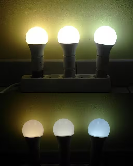
Imagine the light from different sources. A candle gives off a soft, orange-yellow glow. The sun on a clear day at noon is bright and white, with a hint of blue. These differences in the “color of light” are what we describe as color temperature. It is not about how hot the light source is in terms of physical heat, but rather where the color of the light falls on a spectrum from warm to cool.
We measure this scientifically using the Kelvin (K) scale. Think of it like a thermostat for light.
- Low Kelvin values (below 3000K) represent “warm” light. This light is reddish, orange, or yellow, like a sunset or a traditional incandescent light bulb (around 2700K).
- Mid-range Kelvin values (3500K to 5000K) are considered “neutral” or “natural” white light.
- High Kelvin values (above 5000K) represent “cool” light. This light appears bright white or even blueish, similar to the light on an overcast day or the default setting on most computer monitors and smartphones (often around 6500K).
On a website or application, the background color, the images, and even the “white” space all have a perceptible color temperature. A pure white background (#FFFFFF) often feels very cool and blue to our eyes. In contrast, an off-white or cream background (#F5F5DC) has a much warmer color temperature. Understanding this concept is the first step toward controlling its effect on your users. A specific color temperature can dramatically change the mood and readability of a design.
What is Digital Accessibility?
Digital accessibility is the practice of designing and building websites, apps, and other digital tools so that people with disabilities can use them. It means that everyone, regardless of their physical or cognitive abilities, can perceive, understand, navigate, and interact with the digital world.
The globally recognized “rulebook” for this practice is the Web Content Accessibility Guidelines, or WCAG. These guidelines are developed by the World Wide Web Consortium (W3C) to provide a single shared standard for web content accessibility. WCAG is built on four core principles, often remembered by the acronym POUR:
- Perceivable: Users must be able to perceive the information being presented. It cannot be invisible to all of their senses.
- Operable: Users must be able to operate the interface. The interface cannot require an interaction that a user cannot perform.
- Understandable: Users must be able to understand the information as well as the operation of the user interface.
- Robust: Content must be robust enough that it can be interpreted reliably by a wide variety of user agents, including assistive technologies.
You will not find the phrase “color temperature” mentioned explicitly in the WCAG documentation. However, its effects are directly related to the “Perceivable” and “Understandable” principles. If the chosen color temperature of a design causes glare, eye strain, or makes text harder to read, it is creating a barrier to perception and understanding. Therefore, a thoughtful approach to color temperature is not just a design choice, but an essential part of a comprehensive accessibility strategy.
The Photobiology of Digital Interfaces: How the Eye Processes Light

To truly grasp the impact of color temperature on accessibility, we need to look at the biology of our own eyes. Our visual system did not evolve to stare at fixed, glowing screens for eight hours a day. It evolved to process the dynamic, full spectrum light of the sun. This is why the specific quality of digital light matters so much.
Human Vision and Spectral Sensitivity
Our eyes contain specialized cells called photoreceptors. The two main types are rods and cones. Cones are responsible for seeing color and detail in bright light, while rods handle vision in low light. Critically, our cones are not equally sensitive to all colors of light. The human eye has a particular sensitivity to short wavelength light, which is the blue light that is highly present in cool color temperature displays.
This blue light also scatters more easily than other colors. It is the reason the sky appears blue. On a digital screen, this scattering effect, known as Rayleigh scattering, can cause a subtle “fuzziness” or a halo effect around text and other elements. This forces our eyes to work harder to maintain focus, leading to a condition many of us are familiar with: digital eye strain.
Furthermore, our eyes contain a third type of photoreceptor discovered relatively recently: intrinsically photosensitive retinal ganglion cells (ipRGCs). These cells contain a photopigment called melanopsin and are highly sensitive to blue light. Their primary job is not vision, but to communicate with the brain’s master clock to regulate our circadian rhythms, our body’s natural 24 hour cycle. When these cells detect the high amount of blue light common in a cool color temperature screen, they send a strong signal to the brain that says, “It is midday. Be awake and alert!” This is helpful during the day, but it can disrupt sleep patterns and cause cognitive fatigue when we are exposed to it late at night.
Readability and Contrast Perception: The Warm vs. Cool Debate
One of the most direct ways color temperature affects accessibility is through its influence on readability. While contrast ratios tell us the mathematical difference between two colors, color temperature affects the quality of that contrast.
Impact on Text Clarity
As mentioned, the blue light in high Kelvin displays can create a visual artifact called chromatic aberration. In simple terms, the lens of our eye struggles to focus all wavelengths of light onto the same point. It focuses blue light slightly in front of our retina, which creates a soft halo and can reduce the perceived sharpness of black text on a white background.
By lowering the color temperature of a background, for instance, by shifting from a stark #FFFFFF to a warmer, sepia tone like #FBF5E9, we reduce the amount of blue light being emitted. This minimizes the chromatic aberration effect, making text appear crisper and requiring less effort from the eye’s focusing muscles. This can be a game changer for users who spend long hours reading on screens, significantly reducing fatigue and improving comprehension over time. The subtle shift in color temperature can have a major ergonomic benefit.
Dark Mode vs. Light Mode Considerations
The conversation about color temperature is highly relevant to the popular light mode and dark mode debate.
- For Light Mode: The biggest accessibility challenge is often glare. A pure white background is like a light panel, reflecting a huge amount of light back at the user. This is particularly challenging for people in brightly lit environments or for those with light sensitivity. Using a background with a warmer color temperature, like an off white or light cream, softens the entire presentation. It lowers the overall luminance and reduces the harsh, cool glare, making the entire page more visually comfortable without sacrificing the necessary contrast for text.
- For Dark Mode: Dark mode is often praised for reducing eye strain, but it comes with its own accessibility challenges. One is “halation,” where bright text on a true black (
#000000) background can appear to bleed or glow, making it difficult to read for some users, especially those with astigmatism. A better practice is to use a dark gray background (#121212) and text that is not pure white. Furthermore, using accent colors with a slightly warmer color temperature can feel more natural and less jarring against the dark background. The right color temperature in dark mode creates a comfortable, high contrast experience rather than a harsh, high-tech one.
Accessibility for Specific User Groups: Beyond the Average User

A truly accessible design considers the needs of all users, especially those with specific conditions that make them more vulnerable to visual stress. A designer’s choice of color temperature can be the difference between a usable product and an unusable one for these individuals.
Color Vision Deficiency (CVD)
For users with color blindness, or CVD, telling certain colors apart can be difficult. While color temperature does not directly cause CVD, it can worsen the issue. Shifting the overall color temperature of a display subtly alters every single color on the screen. A cool color temperature can wash out certain tones, while a warm color temperature can enrich them. This shift can change the perceived difference between two colors, potentially pushing a color combination that was once distinguishable into a range that is confusing for a user with protanopia or deuteranopia. Designers must be aware that the color temperature of the user’s display is a variable that can affect their carefully chosen, CVD friendly palettes.
Low Vision
Users with low vision often rely on high contrast modes and screen magnification to navigate the web. For these users, glare is a significant barrier. The bright, cool light of a standard display can be overwhelming, causing a “washout” effect that makes it even harder to see content. By designing with a warmer color temperature as a default or an option, we can significantly reduce this glare. This makes the existing high contrast more effective and usable, allowing the user to focus on the content itself rather than fighting against the light emitting from it. The right color temperature improves the quality of the visual information.
Photosensitivity and Neurological Conditions
For a significant portion of the population, light is not just a medium for vision, it is a potential trigger for pain and discomfort. Individuals with conditions like Irlen Syndrome, photophobia, epilepsy, or those who experience chronic migraines can be extremely sensitive to the harsh, high frequency light found in cool color temperature displays.
The flickering and intense blue light from a standard cool white screen can trigger migraines, increase visual stress, and make it nearly impossible to concentrate. Providing a warmer color temperature, such as a sepia or cream theme, can be a profound accessibility feature. This simple change reduces the aggressive visual stimulation, creating a calmer digital environment that these users can engage with safely and comfortably. For them, control over color temperature is not a preference, it is a medical necessity.
Practical Implementation: Strategies for Accessible UI Design
Understanding the theory is important, but applying it is what makes a difference. Here are some practical strategies for incorporating an awareness of color temperature into your design and development workflow.
Choosing a Base Palette
Start by moving away from pure black and pure white in your primary palettes. These absolutes are often the harshest on the eyes.
- For light backgrounds: Instead of
#FFFFFF, consider a slightly warm white like#FFFCF2or a neutral off white like#F8F8F8. These colors have a much gentler color temperature and drastically reduce glare. - For dark backgrounds: Instead of
#000000, opt for a dark, rich gray like#121212or#212121. This reduces the halation effect for text. - For text: On dark backgrounds, avoid pure white (
#FFFFFF) text. A slightly softer white like#E0E0E0is easier on the eyes and still provides excellent contrast.
Dynamic Theming and User Control
The most accessible solution is one that puts the user in control. People know what is best for their own eyes.
- Implement Theme Toggles: Provide easy to find controls that allow users to switch between a light theme, a dark theme, and ideally, a “sepia” or “warm” theme. This single feature can dramatically improve the user experience for a wide range of people.
- Leverage System Settings: Use the CSS media query
prefers-color-scheme. This code automatically checks if the user’s operating system (like Windows, macOS, or Android) is set to a light or dark theme and applies your corresponding website theme.29 This respects user preference without them needing to do anything.
Tools for Testing and Evaluation
Incorporate color temperature awareness into your testing process.
- Use Your Device’s Features: Most modern operating systems have built in “night light” or “blue light filter” settings. Test your design with these settings turned on to see how your colors and contrasts hold up under a warmer color temperature.
- Browser Developer Tools: Browsers like Chrome and Firefox have built in accessibility tools that can simulate various forms of color vision deficiency. Use these to check your palette.
- Design Software Plugins: Tools like Figma and Sketch have numerous plugins that can check for accessibility issues, including contrast. While they may not measure color temperature directly, you can use them to ensure your warmer palettes still meet contrast requirements.
A Biophilic Design Perspective: Aligning Digital Light with Natural Cycles

As an expert in biophilic design, I see this entire topic as part of a larger principle: designing technology that works with our biology, not against it. Biophilic design is the practice of connecting humans with nature in the built environment. We can extend this principle to the digital environments we build.
For millions of years, the only light humans experienced was from the sun, the moon, and fire. The sun’s light has a dynamic color temperature. It is warm and gentle at sunrise, becomes intensely bright and cool at midday, and then returns to a warm glow at sunset. Our bodies are perfectly attuned to this daily cycle.
The problem with most digital screens is that they are locked into a single, static, high Kelvin color temperature, effectively shouting “midday!” at our brains all day and all night. A truly advanced and biophilic approach to digital design would be to create interfaces whose color temperature shifts with the user’s local time.
Imagine a website that has a crisp, neutral color temperature during work hours but then automatically and subtly shifts to a warmer, gentler palette in the evening. This would align the digital experience with the user’s natural circadian rhythm, supporting their well being in a passive, seamless way. This is the future of human-centric design: creating digital spaces that feel less like artificial tools and more like natural extensions of our environment.
Conclusion: A New Spectrum of Inclusive Design
The discourse on digital accessibility is evolving. While the foundational guidelines of WCAG remain our essential bedrock, we must build upon them with a deeper, more scientific understanding of human perception. Color temperature is a perfect example of this next frontier. It is an invisible force in user interface design that has a visible, tangible effect on every person who interacts with our work.
We have seen that the choice of a warm or cool palette is not merely stylistic. It is an ergonomic and accessibility decision that impacts eye strain, readability, and cognitive load. The right color temperature can make content clearer for someone with low vision, prevent a migraine in a photosensitive user, and help everyone else feel more comfortable and focused. By moving beyond a simple pass or fail on contrast and embracing the nuances of color temperature, we can begin to craft digital experiences that are more than just accessible. We can make them comfortable, sustainable, and fundamentally aligned with our own biology.