When you walk into a room, what is the first thing you notice? Before the furniture and the art, your brain processes the color. It is an instant, subconscious reaction. Most people think of color as a matter of taste, a simple decorative choice to make a space look nice. But this view is incomplete. Color is not just decoration; it is a powerful architectural tool. It is a silent force that actively shapes your experience, manipulates your feelings, and fundamentally alters your sense of scale and distance. Color is the language of space, and understanding its grammar allows you to become the architect of perception itself.
This article will deconstruct the science and psychology behind this powerful phenomenon. We will explore the core principles that dictate how a simple coat of paint can make a tiny room feel open and airy, or turn a vast, empty hall into a cozy and inviting retreat. The goal is to move beyond personal preference and into the realm of intentional design.
We will analyze precisely how color influences space perception, not just on the walls around you but also in the digital environments you navigate every day. Woven into this analysis is a concept from my own field of biophilic design: the idea that our reactions to color are not random. They are ancient, hardwired responses tied to our species’ long history in the natural world. Our innate understanding of an open, blue sky or a dense, green forest directly informs our modern space perception. By the end of this guide, you will have the knowledge to use color with purpose, transforming any space to perfectly suit your needs.
Table of Contents
The Science Behind Color and Space Perception
To understand how to use color, we must first understand how we see it. It is a process that involves physics, biology, and psychology working together in an instant. Everything we see is thanks to light. Light travels in waves, and different colors have different wavelengths. Red has a long, slow wavelength, while blue has a short, fast one.
When light enters your eye, it hits the retina at the back. The retina has special cells called rods and cones that act as light detectors. These cells send signals through the optic nerve to your brain. Your brain then interprets these signals as colors and images. Here is where it gets interesting for our understanding of space perception. Because different colors have different wavelengths, your eye’s lens has to adjust slightly differently to focus on each one.
This tiny adjustment is the secret behind a huge design illusion. This is what creates the effect of “advancing” and “receding” colors.
Advancing Colors: The Warm Welcome

Warm colors, like red, orange, and yellow, have the longest wavelengths. To focus on these colors, the lens in your eye has to become slightly rounder. Your brain interprets this muscular action as a sign that the object is closer to you. As a result, warm colors appear to advance or jump out at you. They feel energetic, active, and close. Using a warm color on a wall can make that wall feel nearer than it actually is, which has a major impact on space perception. It shrinks the room, making it feel more intimate and enclosed. This is a powerful tool for controlling space perception in large, impersonal areas.
Receding Colors: The Cool Retreat

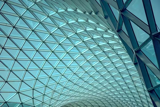
Cool colors, like blue, green, and light purple, have the shortest wavelengths. To focus on them, your eye’s lens flattens out. Your brain reads this as a sign of distance. Therefore, cool colors appear to recede or move away from you. They feel calm, restful, and far away.
Painting a wall a cool color makes it seem more distant, which enhances your space perception to make the room feel larger and more open. This effect on space perception is why so many people choose light blues and greens for small rooms or bathrooms. It is a simple trick that plays on the fundamental mechanics of how our eyes and brain work together to interpret the world. Understanding this science is the first step to mastering the art of space perception.
Making Rooms Feel Bigger: The Art of Expansion
One of the most common goals in design is to make a space feel larger than it is. Whether you live in a small apartment or just have a room that feels a bit cramped, color is your most effective and affordable tool. By choosing the right colors, you can trick the brain and create a powerful illusion of openness. This is a practical application of controlling space perception.
Light and Cool Palettes
As we just learned, cool colors like blue, green, and violet naturally recede, making walls appear farther away. When you combine this with lightness, the effect is magnified. Light colors are excellent reflectors of light. This is a concept measured by a metric called Light Reflectance Value, or LRV.
LRV runs on a scale from 0 (absolute black, which absorbs all light) to 100 (pure white, which reflects all light). A paint color with a high LRV will bounce a lot of light around the room, whether it is natural light from a window or artificial light from a lamp. This abundance of reflected light eliminates shadows, especially in corners, which are the visual cues that tell our brain the boundaries of a space. When shadows disappear, the boundaries become less clear, and our space perception is altered to make the room feel much bigger and more airy. For maximum effect, choose colors like soft blues, pale greens, and gentle grays with an LRV of 60 or higher.
Monochromatic Schemes
Another highly effective strategy for improving space perception is to use a monochromatic color scheme. This simply means using different tints, tones, and shades of one single color. For example, you might paint the walls a very light gray, choose a sofa that is a medium gray, and have accent pillows in a dark charcoal gray.
This approach works because it creates a seamless and harmonious visual experience. When your eye can move around the room without being interrupted by sharp, contrasting colors, the space feels more unified and expansive. There are no jarring visual stops that break the room into smaller zones. This continuous flow creates an illusion of a single, large area, which is a clever way to manipulate space perception.
The Fifth Wall: Look Up!
When thinking about a room, people often forget about the ceiling, sometimes called the “fifth wall.” The color of your ceiling has a dramatic effect on your space perception.
To make a room feel taller and more open, the best strategy is to paint the ceiling a color that is lighter than the walls, most often a crisp white. A light ceiling feels higher up because, just like light walls, it reflects more light and seems to recede. This draws the eye upward and creates a sense of vertical space, making the entire room feel less confined. Some designers even use a paint that is the same color as the walls but mixed at 50% strength for a subtle, cohesive lift.
Creating Coziness: The Art of Contraction
While many people want to make their rooms feel larger, there are times when the goal is the exact opposite. A huge living room with high ceilings can feel cold, empty, and unwelcoming. In these situations, color can be used to alter space perception to create a sense of intimacy, warmth, and comfort. This is just as valuable a skill in design as creating openness.
Dark and Warm Palettes
To make a space feel smaller and cozier, you use the opposite principles of expansion. Instead of light, cool colors, you should choose dark, warm colors. Colors like charcoal gray, navy blue, deep plum, chocolate brown, and forest green are perfect for this. These colors have a low LRV, meaning they absorb light instead of reflecting it. This creates soft shadows and diminishes the sense of brightness, which immediately fosters a more enclosed, intimate atmosphere.
Warm colors like terracotta, deep reds, and rich golds are advancing colors. They make walls feel as if they are closing in slightly, which reduces the perceived size of the room and makes it feel more like a comforting hug. This is an excellent technique for large family rooms, dining rooms meant for intimate gatherings, or bedrooms where you want to create a restful sanctuary. Mastering this aspect of space perception allows you to make any oversized room feel perfectly scaled and comfortable.
Accent Walls
Sometimes, you do not want to shrink the entire room, but instead, you want to change its perceived shape. This is where an accent wall comes in. An accent wall is one wall that is painted a different color from the other three. This is a very strategic tool for managing space perception.
Imagine you have a long, narrow room that feels like a hallway. To fix this, you can paint the shortest wall at the far end a dark or warm color. Because that color will advance, it will make that wall appear closer to you. This visually shortens the room, making its proportions feel more balanced and pleasing. This simple trick completely changes the space perception of the room’s dimensions without you having to move a single piece of furniture.
Lowering Ceilings
Just as a light ceiling can make a room feel taller, a dark ceiling can make it feel lower and more intimate. In a room with very high ceilings that feels too cavernous, painting the ceiling a color darker than the walls is a bold and effective move. This brings the ceiling down visually, creating a “canopy” effect that feels protective and cozy. This change in space perception can transform a formal, imposing room into a place where people feel comfortable gathering and connecting.
Color and Space Perception on the Screen: Websites and Apps
The principles that govern space perception in a physical room apply just as strongly to the “digital rooms” we visit every day: websites and applications. As a designer who works in both physical and digital biophilic design, I see a direct connection. A screen is a finite space, and how we arrange color and elements within it dramatically affects the user’s experience, their ability to find information, and their overall feeling about a brand.
Creating Visual Hierarchy
On a webpage, you need to guide the user’s eye to the most important elements, like a “Buy Now” button or a “Sign Up” form. This is called creating a visual hierarchy, and color is your primary tool. We can use the concept of advancing and receding colors to control this digital space perception.
Backgrounds and less important container elements should use cool, light, or muted colors. These colors recede, creating a calm and stable backdrop. They tell the user, “This is the environment, you can relax.” In contrast, important, clickable elements like buttons, links, and alerts should use bright, warm, advancing colors. A vibrant orange or red button on a light gray background will appear to pop off the page. It feels closer to the user, more tangible, and more urgent. This manipulation of digital space perception is not just aesthetic; it directly increases the usability and effectiveness of a website.
Managing White Space
In web design, “white space” (or more accurately, negative space, since it can be any color) is the empty area around elements. It serves the same function as open floor space in a room. A webpage crammed with text and images with very little white space feels cluttered, stressful, and small. It negatively impacts the user’s space perception, making the experience feel claustrophobic.
By increasing the amount of white space, you allow elements to breathe. The layout feels more organized, calm, and open. A light-colored background enhances this feeling of spaciousness even further. This clean approach improves the reader’s space perception of the content, making it easier to read and absorb. It signals quality and confidence, much like a well-designed, uncluttered room does.
Biophilic Web Design
Here, we can apply a key concept from biophilic design. Humans are inherently drawn to colors and patterns that mimic nature. Using a nature-inspired color palette, such as earthy browns, leafy greens, and watery blues, can make a digital interface feel more intuitive and calming. These colors are familiar to our subconscious and can improve a user’s digital space perception by reducing cognitive load. A website for a health spa that uses soft greens and light wood tones will instantly feel more relaxing and trustworthy than one that uses harsh, artificial colors. It connects the digital space to a sense of well being rooted in the natural world.
Simple Rules for Mastering Color and Space Perception
While the science behind color can seem complex, applying it does not have to be. Designers have developed some simple, time tested rules that can help anyone make smart color choices to control space perception.
The 60-30-10 Rule
This is a classic design principle that ensures a balanced and harmonious color scheme. It is easy to remember and apply to any space, physical or digital.
- 60% is your dominant color. This is the main color for your space, the one that sets the overall tone. In a room, this is typically your wall color. If your goal is to enhance space perception for a larger feel, this color should be light and cool.
- 30% is your secondary color. This color is used for about half as much area as your dominant color. It should support your dominant color but be different enough to create interest. This could be the color of your furniture, an accent wall, or the main content area of a website.
- 10% is your accent color. This is the boldest color in your palette. It is used sparingly to create visual interest and draw the eye to specific points. This might be for throw pillows, artwork, or, in web design, for your call to action buttons and links.
By following this rule, you create a palette that is visually balanced and effectively directs the viewer’s space perception.
The Critical Role of Light
No color choice can be made without considering light. The same can of gray paint will look completely different in a room with large, south facing windows than it will in a basement with only artificial light. Light is the ingredient that activates color and your space perception.
When choosing colors, always test them in the actual space where they will be used. Paint a large sample on the wall and observe it at different times of day: in the bright morning light, the warm afternoon light, and under your artificial lights at night. The color may change dramatically.
Furthermore, pay attention to your lightbulbs. The Color Rendering Index (CRI) is a score from 0 to 100 that measures how accurately a light source reveals the true colors of objects. A lightbulb with a high CRI (90 or above) will show your paint and furniture colors much more faithfully. A bulb with a low CRI can make colors look dull, yellowed, or washed out, ruining your carefully planned space perception.
Frequently Asked Questions
Q1: How does color influence space perception?
A: Color influences space perception primarily through the properties of light waves. Warm, dark colors have long wavelengths that make them seem to advance or come closer, making a space feel smaller. Cool, light colors have short wavelengths that make them seem to recede or be farther away, making a space feel larger and more open.
Q2: What colors are best for making a small room look larger?
A: The best colors are light and cool. Think of soft blues, pale greens, off whites, and light grays. These colors have a high Light Reflectance Value (LRV), meaning they bounce a lot of light around the room, which eliminates shadows and tricks the brain into perceiving a more expansive space.
Q3: Can dark colors ever be used in a small space?
A: Absolutely. While they will make the space feel smaller, this can be used to create a specific mood. Using a dark color like navy blue or charcoal gray in a small powder room or study can create a dramatic, sophisticated, and very cozy “jewel box” feel. It is a bold choice that can be very effective when done intentionally.
Q4: How does this apply to website design?
A: On a website, these principles control the user’s digital space perception to guide their attention. Cool, receding colors are used for backgrounds to create a calm, open feel. Warm, advancing colors are used for important buttons and links to make them “pop” and feel closer and more clickable, improving the user experience.
Conclusion: Designing with Purpose
Color is so much more than a finishing touch. It is a fundamental element of design that speaks a silent, powerful language to our subconscious. From the physics of light waves to the deeply ingrained psychology of our biophilic past, color constantly shapes our reality. It holds the power to transform our homes, offices, and digital worlds, making them more functional, beautiful, and emotionally resonant.
The key is to design with purpose. Instead of choosing a color simply because it is trendy or your personal favorite, think about what you want to achieve. Do you need a small office to feel more open and conducive to clear thinking? Do you want a large living room to feel warm and perfect for family connection? Do you need a website visitor to feel calm and easily find what they are looking for? By understanding the principles of advancing and receding colors, light reflectance, and visual balance, you are equipped to make intentional choices. You can effectively control space perception to build environments that not only look good but also feel right.