The digital world, by its very nature, is built on a foundation of order and logic. We build websites within the rigid confines of code, often defaulting to symmetrical, box like structures that stack neatly upon one another. This predictability has its place, ensuring functionality and a certain degree of clarity. Yet, when we step away from our screens and into the natural world, we rarely find such perfect, mirrored symmetry. Think of a forest path or the sprawling, jagged edge of a coastline. These scenes are balanced, captivating, and deeply calming, yet they are anything but symmetrical. One might wonder, what if our digital interfaces could evoke that same sense of organic fascination and intuitive flow?
The vast majority of websites rely on conventional layouts that, while safe, can lead to a sense of monotony and user fatigue. The human eye is incredibly adept at recognizing patterns, and when a pattern is too simple or predictable, we quickly lose interest. Asymmetrical design, when executed with precision and purpose, offers a compelling solution. It creates visual tension, captures attention, and guides the user’s eye through a carefully orchestrated journey. This article serves as a technical framework for moving beyond the standard grid. We will deconstruct the elegant mathematical principles that govern asymmetry in the natural world and translate them into actionable web design strategies using modern, efficient code.
Table of Contents
Foundational Principles: Understanding Asymmetry and Biophilia
To build something new, we must first understand its foundational components. The concepts of asymmetrical balance and biophilic design are not merely aesthetic choices; they are rooted in psychology and human biology. They represent a deliberate shift from creating websites that are simply functional to creating digital environments that are fundamentally more human.
At its core, asymmetrical balance is often misunderstood. It does not imply a lack of balance or a chaotic arrangement of elements. Instead, it is a state of dynamic equilibrium. Imagine a classic playground seesaw. To achieve balance with two people of different weights, the heavier person must sit closer to the center pivot point, while the lighter person sits further away. This is asymmetrical balance in its simplest form.
In web design, we do the same thing, but our “weights” are visual elements. A large, vibrant photograph on one side of the screen can be perfectly balanced by a smaller block of dense text, a brightly colored call to action button, and a generous amount of empty space on the other. This visual weight is determined by factors like size, color, contrast, texture, and even the complexity of an element. Symmetrical design, by contrast, is like having two people of the exact same weight sitting at the exact same distance from the center. It is stable and simple but lacks the dynamic energy that makes a composition interesting.
This brings us to a deeper, more intrinsic concept: the Biophilia Hypothesis. This term was popularized by the renowned biologist E.O. Wilson, who proposed that human beings have an innate, genetically determined tendency to seek connections with nature and other forms of life. For hundreds of thousands of years, our survival depended on our ability to interpret natural patterns, find shelter, and understand the rhythms of the environment.
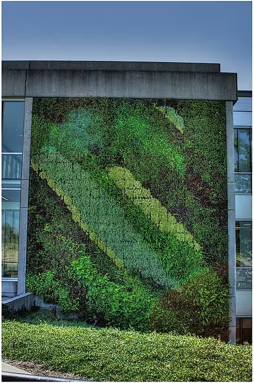
Though we now live in cities and spend our days online, that deep seated connection has not disappeared. Biophilic web design is the practical application of this hypothesis. It involves incorporating natural patterns, forms, light, and spatial relationships into our digital creations. The goal is to leverage our innate affinity for nature to create websites that reduce stress, improve focus, and feel more welcoming and intuitive.
So why does this combination of asymmetry and biophilia work so well for the user experience, or UX? When a layout is asymmetrical and inspired by natural forms, it inherently creates a more engaging visual path. Instead of a grid that gives every element equal importance, this approach establishes a clear visual hierarchy. The user’s eye is naturally drawn to the element with the most visual weight, which should be the most important piece of information, and then guided to secondary and tertiary elements in a logical sequence. This creates a sense of discovery and flow, making the user’s journey through the content feel less like a chore and more like a pleasant exploration.
Nature’s Blueprint: Deconstructing Organic Asymmetry
Nature is the ultimate designer, having refined its patterns over billions of years of evolution. To create truly effective nature influenced layouts, we must look closer at this blueprint and understand the underlying mathematical and structural principles that create such effortless beauty and efficiency. These are not random occurrences; they are systems of profound elegance that can be directly applied to our work.
One of the most famous and widespread of these principles is the Golden Ratio. This is a special mathematical constant, approximately equal to 1.618, often denoted by the Greek letter phi (ϕ). It is found when a line is divided into two parts so that the ratio of the whole length to the longer part is the same as the ratio of the longer part to the shorter part. While that sounds complex, its visual result is a proportion that the human eye finds incredibly pleasing.
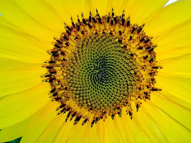
We see this ratio everywhere in nature. The spiral of a nautilus shell grows in accordance with this ratio. The seeds in a sunflower head are arranged in spirals, and the ratio of clockwise spirals to counterclockwise spirals is almost always a pair of consecutive Fibonacci numbers, which are intimately related to the Golden Ratio. Even the branches of trees and the veins in a leaf often exhibit these proportions. In web design, we can use the Golden Ratio to define the dimensions of our layout. For example, if your main content area is 1000 pixels wide, you could create a sidebar that is approximately 618 pixels wide, creating a naturally balanced, asymmetrical composition.
Closely related to the Golden Ratio is the Fibonacci Sequence. This is a series of numbers where each number is the sum of the two preceding ones: 0, 1, 1, 2, 3, 5, 8, 13, 21, and so on. The ratio of any two consecutive numbers in this sequence approximates the Golden Ratio. This sequence governs the pattern of leaf arrangement on a stem, a phenomenon known as phyllotaxis, which ensures each leaf gets maximum sunlight without shading the ones below it. This is a system of perfect efficiency and beauty.
We can use Fibonacci numbers to create a harmonious visual rhythm in our designs, for instance, by setting font sizes, margins, and padding based on this sequence (e.g., 13px, 21px, 34px, 55px).
Beyond specific numbers and ratios, we can also draw inspiration from fractal patterns. A fractal is a never ending pattern that repeats itself at different scales. A fern is a perfect example. A large frond is made up of smaller branches, each of which is a smaller version of the main frond, and so on down to the smallest leaflet. Coastlines, snowflakes, river deltas, and even lightning bolts all exhibit fractal properties.
This concept of “self similarity” creates a sense of organized complexity that is both fascinating and orderly. In web design, this can inform how we design and place repeating elements like cards, icons, or image galleries. We could design a main component, then create smaller, simplified versions of it to be used elsewhere on the page, maintaining a consistent visual language that feels complex yet unified.
Finally, we should consider the power of natural textures and forms. The digital world is dominated by the rectangle. But in nature, straight lines and perfect ninety degree angles are rare. The world is made of organic shapes, gentle curves, and irregular forms. We can break free from the box by incorporating these shapes into our designs.
Using modern web technologies like the CSS clip-path property or Scalable Vector Graphics (SVG), we can create containers for our images and text blocks that have soft, curved edges or mimic the shape of a leaf, a stone, or a wave. This simple change can instantly make a design feel less rigid and more approachable, creating a visual connection to the natural world.
The Digital Toolkit: Translating Natural Patterns to Code

Understanding the theory is essential, but its true power is only unlocked when we can translate it into practical, functional code. Fortunately, modern web development provides us with incredibly powerful tools, specifically CSS Grid and Flexbox, that are perfectly suited for creating sophisticated asymmetrical layouts. This is where we move from the abstract world of nature to the concrete world of the browser.
The first concept to embrace is the “broken grid.” This might sound counterintuitive, but it does not mean abandoning the grid altogether. A grid is an essential tool for creating alignment and order. The broken grid technique involves starting with a traditional, structured grid, like a 12 column layout, and then intentionally allowing elements to break free from those rigid confines. An image might start in column 2 but extend into column 7. A block of text might overlap the edge of that image, sitting in columns 6 through 9. This creates layers, depth, and a dynamic tension that is far more engaging than a layout where every element sits perfectly within its own column.
It is a controlled and deliberate method, not a random placement of items. The underlying grid still provides structure and ensures the design does not devolve into chaos.
CSS Grid is the premier technology for orchestrating this kind of full page layout. It allows us to control both the columns and rows of our design, creating complex arrangements with surprising ease. For instance, you could define a grid with multiple columns of varying widths, some wide for main content and some narrow for spacing or minor elements. Using the grid-column and grid-row properties, you can instruct an element to start on one grid line and end on another, allowing it to span multiple cells or even overlap with other elements.
A simple example would be placing a hero image to span from column 1 to 8, and then placing the headline text to span from column 6 to 11. The overlap in columns 6, 7, and 8 is where the visual interest is created. For even more complex and semantic layouts, you can use grid-template-areas to name different sections of your grid and then assign elements to those named areas, making your code easier to read and maintain.
While CSS Grid is the master of the overall page structure, Flexbox is the ideal tool for managing alignment and asymmetry within smaller components. Think of a product card, a navigation bar, or a feature list. Flexbox is a one dimensional layout model, meaning it handles either rows or columns at a time. It excels at distributing space among items.
For example, in a header, you could place your logo and navigation on the left and a search bar and login button on the right. By setting the container to display: flex and justify-content: space-between, the items will automatically push to opposite ends. To create more nuanced asymmetry, you can apply an automatic margin (margin-left: auto) to a specific flex item, which will push it all the way to the right, away from its siblings.
Of course, the key to all of this is still balance. An unbalanced asymmetrical design just looks broken. To ensure your layout feels harmonious, you must constantly evaluate its visual weight. The checklist is straightforward. First, balance large or vibrant elements with smaller, quieter ones. A massive, colorful photograph needs a counterpoint, which could be a block of heavy, dark typography or, just as effectively, a large area of intentional negative space (often called white space).
Second, use typography strategically. A bold, oversized headline has significant visual weight and can act as an anchor point for the entire composition. Third, actively guide the user’s eye. Use subtle leading lines, either from the shapes in your images or from decorative elements, to create a path that flows from one important element to the next. Balancing a layout is an art, but it is one guided by these technical principles.
Practical Application: Case Studies and Visual Examples
Theory and code snippets are valuable, but seeing these principles in action is what truly solidifies understanding. Let’s analyze how these techniques can be applied to create a compelling and functional design.
Imagine a website for an eco tourism company. A traditional design might feature a large, centered hero image with text overlaid in the middle. It’s functional but generic. Using our principles, we could instead have a stunning, high quality photograph of a mountain range that takes up the right two thirds of the screen. The mountain’s ridgeline naturally slopes down from right to left, creating a powerful diagonal line. Instead of fighting this natural flow, we embrace it.
On the left third of the screen, we place our main headline, “Explore Uncharted Worlds,” and a short paragraph of text. The text block is aligned to the left, but its position is set so that the headline sits just below the highest peak of the mountain, creating a dialogue between the image and the text.
The call to action button, “Plan Your Adventure,” is placed below the text but further to the right, drawing the eye down and along the mountain’s slope. The underlying grid might be a 12 column layout, with the image spanning columns 5 through 12 and the text occupying columns 1 through 5. The result is a design that is dynamic, balanced, and thematically connected to the brand’s identity.
Let’s walk through a more detailed tutorial for designing a simple component, like a blog post feature on a homepage.
- Select Your Image: Start by choosing a compelling image with a clear focal point and natural lines. Let’s use a macro photograph of a leaf, with its central vein running diagonally across the frame.
- Establish the Grid: Place this image on your canvas. Let’s say it occupies a space that is four columns wide and six rows tall.
- Position the Text: Instead of placing the blog post title below the image, let’s create an overlap. We can place the title in a text box that sits over the bottom corner of the image, spanning columns 3 through 6. The text box itself could have a semi transparent background to ensure readability while still allowing the image texture to show through.
- Add Organic Shapes: To break the rectangular form, we can use an SVG
clip-pathon the image container to give one of its corners a soft, rounded curve, mimicking the natural shape of the leaf’s edge. - Balance with Negative Space: The remaining space around this combined image and text element is crucial. It gives the component room to breathe and draws attention to it as a single, unified element.
Looking at real world examples, you can see this everywhere from high fashion brand websites to innovative tech startups. They often use large, dramatic typography as a graphical element, balancing it against smaller product images. They will have elements that break the boundaries of their parent containers, creating a sense of depth and activity. These designs feel confident and modern precisely because they are not afraid to break from the symmetrical mold and create compositions that are both artful and intentional.
The SEO and Performance Nexus
A beautiful design is only successful if it is seen and performs well for users. It is a common misconception that visually complex designs are inherently bad for Search Engine Optimization (SEO) and performance. In reality, a well executed asymmetrical design can actually provide significant SEO benefits, provided it is built with technical excellence in mind.
One of the most important technical considerations today is Google’s Core Web Vitals, a set of metrics that measure a user’s experience in terms of loading speed, interactivity, and visual stability. Large images, a common feature in nature inspired design, can negatively impact Largest Contentful Paint (LCP), which measures how quickly the main content of a page loads. To combat this, you must aggressively optimize your images. Use modern formats like WebP or AVIF, and implement responsive images using the srcset attribute in your HTML. This allows the browser to download the most appropriately sized image for the user’s device, preventing a phone from loading a massive desktop sized image.
Visual stability, measured by Cumulative Layout Shift (CLS), is also critical. Asymmetrical layouts with overlapping elements can sometimes cause content to shift around as the page loads. You can prevent this by specifying the dimensions (width and height) of your images and using the CSS aspect-ratio property to reserve space for elements before they have fully loaded.
When built correctly, these designs can dramatically improve user engagement metrics, which are powerful indirect signals to search engines. A visually stunning and unique design can significantly increase dwell time and time on page. When a user is captivated by a layout, they are more likely to stay and explore the content rather than immediately bouncing back to the search results. A clear visual hierarchy, which is a strength of good asymmetrical design, naturally guides users toward key actions, like filling out a form or making a purchase.
This can increase interaction rates and conversions. Search engines like Google want to rank pages that provide a great user experience, and a thoughtful, engaging design is a massive part of that equation.
Finally, we must never sacrifice accessibility for aesthetics. For users who rely on screen readers, the visual arrangement of elements on a page is irrelevant. What matters is the logical order of the content in the underlying HTML code (the DOM). It is crucial to ensure that even if your layout places a sidebar visually before the main content, the HTML code is structured logically, with the primary article content coming first. This ensures that the page makes sense to all users, regardless of how they are accessing it. Using semantic HTML tags (<main>, <nav>, <article>) and, where necessary, ARIA attributes can help provide this essential context.
Conclusion: Cultivating a Digital Ecosystem
Creating asymmetrical layouts influenced by nature is far more than a passing design trend. It is a sophisticated, user centric philosophy that bridges the gap between the rigid logic of the digital world and the innate human need for connection with the natural world.
The methodology is a beautiful synthesis of art and science. We begin by observing the elegant principles of dynamic balance and organized complexity found in nature. We then translate these observations into a design language using the timeless mathematics of the Golden Ratio and the intricate beauty of fractals. Finally, we bring it all to life with the powerful, precise tools of modern CSS, using Grid and Flexbox to build layouts that are both resilient and visually stunning.
By embracing this approach, we move beyond simply building web pages. We begin to cultivate digital ecosystems. These are online spaces that are not just functional but are also intuitive, calming, and deeply engaging. They respect the user’s attention, guide them on a clear path, and leave them with a lasting positive impression. This is the future of design: a future that is more organic, more thoughtful, and fundamentally more human.