Why We Are Innately Drawn to Nature’s Color Palette
The sense of tranquility experienced when observing a forest canopy or a coastal horizon is not a mere poetic sentiment; it is a measurable psychophysiological response. This phenomenon is explained in the principle of biophilia—the hypothesis that humans possess an innate and genetically determined affinity for the natural world. Among the various environmental stimuli, color is one of the most immediate and powerful. The specific hues and harmonies present in a natural landscape can inform color palettes that directly influence our autonomic nervous system, measurably reducing stress, lowering blood pressure, and enhancing cognitive function.
The objective of this analysis is to move beyond abstract appreciation and provide a methodical process for designers. We will deconstruct the color systems of distinct biomes, offering concrete, actionable examples complete with their digital hex codes. We will explore not only what these palettes are but why they are effective and how they can be systematically applied in both digital and physical environments.
By deconstructing the color systems of natural landscapes, we can create designs that are not only aesthetically superior but also psychologically resonant and fundamentally human-centric. This is the core of effective biophilic design: leveraging nature’s tested patterns to build more effective and restorative human experiences.
Table of Contents
Why We Are Innately Drawn to Nature’s Color Palette
The sense of tranquility experienced when observing a forest canopy or a coastal horizon is not a mere poetic sentiment; it is a measurable psychophysiological response. This phenomenon is rooted in the principle of biophilia—the hypothesis that humans possess an innate and genetically determined affinity for the natural world. Among the various environmental stimuli, color is one of the most immediate and powerful. The specific hues and harmonies present in a natural landscape can directly influence our autonomic nervous system, measurably reducing stress, lowering blood pressure, and enhancing cognitive function.
The objective of this analysis is to move beyond abstract appreciation and provide a methodical framework for designers. We will deconstruct the color systems of distinct biomes, offering concrete, actionable examples complete with their digital hex codes. We will explore not only what these palettes are but why they are effective and how they can be systematically applied in both digital and physical environments.
By deconstructing the color systems of natural landscapes, we can create designs that are not only aesthetically superior but also psychologically resonant and fundamentally human-centric. This is the core of effective biophilic design: leveraging nature’s tested patterns to build more effective and restorative human experiences.
A Methodical Approach to Translating Nature into a Digital Palette
Extracting a functional color palette from a complex landscape photograph is a process that balances artistic interpretation with systematic analysis. A common failure is to simply select the five most vibrant colors, resulting in a chaotic and unusable scheme. A successful translation requires understanding the inherent structure and hierarchy that nature provides. This addresses a frequent query from designers: “How do I make a color palette from a picture?” The answer lies in a structured, hierarchical approach.
The 60-30-10 Rule: Nature’s Inherent Hierarchy
First observed in interior design, the 60-30-10 rule is a timeless principle for creating balanced color schemes. Its genius is that it is derived directly from observing the natural world. In any given landscape, you will find a similar distribution of color.
- 60% Dominant Color: This is the primary, foundational hue of the scene.1 It’s often the sky, a body of water, or the primary color of the ground cover like grass or sand. In design, this becomes your background or main brand color. It sets the overall tone and mood.
- 30% Secondary Color: This color supports the dominant hue and provides visual interest. In nature, this could be the color of trees against the sky, rocks on a beach, or the shadowed faces of mountains. In a design context, this is used for sub-sections, content containers, or secondary elements that need to stand apart from the background.
- 10% Accent Color: This is the most vibrant or contrasting color in the scene, used sparingly to draw the eye. Think of wildflowers in a field, the bright orange of a sunset, or a single maple tree in autumn. In design, this is your most powerful tool. It should be reserved for critical interactive elements: calls-to-action (CTAs), links, icons, and notifications. Its scarcity gives it power.
A Practical, Step-by-Step Extraction Process
- Image Selection: Begin with a high-resolution, well-lit photograph that genuinely represents the mood you wish to capture. For instance, a photo of the Allegheny National Forest near my location in Titusville, Pennsylvania, taken in late spring, will have a vastly different, more vibrant green palette than one taken in mid-October when you will have an autumn color palette. The quality of your source material is important in order to convey the colors well and achieve the maximum effect.
- Initial Color Scouting: Using a digital tool—the eyedropper in Adobe Photoshop is ideal for precision, but free online tools like Coolors.co or Canva’s Color Palette Generator are also highly effective—begin sampling colors. Do not commit yet. Sample at least 15-20 different hues from all over the image: the sky, the shadows, the highlights, the mid-tones.
- Identify the Hierarchy: Now, analyze your sampled colors. Group them by similarity. You will quickly see clusters forming. Which color group is most prevalent in the image? That is your dominant (60%) hue. Which one is the second most common? That is your secondary (30%) color. Finally, which colors are bright, rare, and eye-catching? Those are your potential accents (10%).
- Refine and Build the Color Palette: From your identified groups, select one definitive color to represent each role. You will want to build a palette of 5-6 colors for maximum flexibility. A standard structure is:
- One or two dominant/background colors (light and dark variations).
- One or two secondary/container colors.
- One primary accent color.
- One secondary, less-vibrant accent color or a dedicated text color.
- Test for Contrast and Accessibility: This final step is non-negotiable. Your color palette is useless if it is not functional. Use a contrast checking tool to ensure your text colors are legible against your background colors. The Web Content Accessibility Guidelines (WCAG) recommend a minimum contrast ratio of 4.5:1 for normal text. Natural palettes often have excellent inherent contrast (dark soil against light sky), but you must verify it.
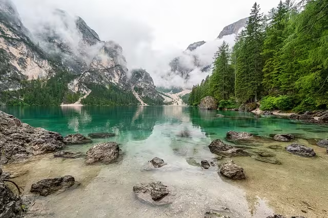
Coastal Palette: Evoking Calm and Expansiveness

The coastline is a landscape of immense psychological power, representing the boundary between the known (land) and the unknown (ocean). Childe Hassam, a noted American Impressionist, painter used these palettes on the Isle of Shoals. Its color palette is defined by diffused light, soft textures, and a sense of infinite horizontal space. It is a system of low-contrast, analogous blues, and sandy neutrals, ideal for designs aiming to foster trust, calm, and a feeling of clean, open possibility. This color palette is perfect for healthcare, finance, or any brand that needs to communicate stability and serenity.
- Soft Cloud White (
#F1F3F4): This is not a pure, stark white. It is the color of a high, thin cloud layer, softened by atmospheric haze. As the dominant background color, it feels open and clean without the clinical sterility of#FFFFFF. It provides a canvas that is easy on the eyes for extended viewing. - Misty Sky Blue (
#B4C5E4): This is your primary secondary color. It’s the color of the sky meeting the sea at the horizon—desaturated and serene. It works beautifully for content containers, blockquotes, or secondary panels. Its low saturation communicates safety and calm, reducing user anxiety. - Wet Sand Taupe (
#BFA89E): This grounding neutral connects the ethereal blues back to the earth. It’s the color of sand just after a wave has receded. It serves as an excellent secondary neutral for footers, sidebars, or as a warmer alternative to gray for text, providing a touch of organic warmth. - Dune Grass Green (
#A8BA9A): This is a subtle, almost-neutral accent. It’s the color of resilient grasses on the dunes—a sign of life and stability in a harsh environment. This color can be used for secondary interactive elements like toggles, success messages, or informational icons that don’t require the urgency of the primary accent. - Deep Ocean Slate (
#3C4E5C): This is your primary accent and your primary text color. It’s the color of the deep, mysterious ocean. Its high contrast against the Soft Cloud White ensures excellent readability (a ratio of 7.65:1, exceeding WCAG AAA standards). Used as an accent for buttons or key headlines, it provides a point of focus that is serious and stable, not jarring.
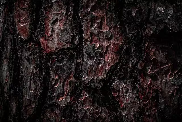
Forest Palette: Grounding, Growth, and Shelter

A temperate forest is a complex, multi-layered environment that communicates security, vitality, and grounding. Prospect-refuge theory in biophilia suggests we are drawn to environments where we can see without being seen, and a forest provides this sense of protective enclosure. Its color palette is rich with analogous greens and browns, creating a feeling of balance, health, and restoration.2 It is exceptionally well-suited for brands in the wellness, environmental, or organic food sectors.3 A website for a local conservation group, such as those protecting natural areas here in Pennsylvania, would be a perfect candidate for this palette to build an immediate connection to their mission.
- Filtered Sunlight (
#FDECDA): This is the warm, creamy white of sunlight filtering through a dense leaf canopy. It serves as the primary background color, providing a sense of warmth and gentle optimism. It is far more welcoming than a stark white and serves as an excellent canvas for the richer greens and browns. - Fern Green (
#5A7152): This is the core color of the palette, a rich, mid-tone green of healthy foliage. As the primary secondary color, it’s perfect for large content areas, banners, and illustrative elements. It is the color of life and vitality, and its presence is inherently calming and reassuring to the human eye. - Rich Soil Brown (
#4A3F35): This dark, saturated brown is the color of damp, nutrient-rich earth. It is the grounding element of the palette. Functionally, it is the ideal color for primary body text, providing a strong contrast ratio of 8.25:1 against the Filtered Sunlight background. It can also be used for footers or dark-mode backgrounds. - Tree Bark Gray (
#7A7874): Nature rarely has pure gray. This hue is a complex, warm gray derived from the bark of an oak or beech tree. It is a sophisticated neutral that can be used for secondary text, metadata, borders, or disabled states. It complements the greens and browns without competing with them. - Mossy Accent Green (
#849324): This is the vibrant, almost-chartreuse color of new moss on a fallen log. It is the palette’s primary accent.4 Used sparingly for buttons, links, and key icons, it pops against the darker greens and browns, drawing the user’s attention to key actions. It screams “life” and “energy,” making it a highly effective call-to-action.
Desert Palette: Energy, Warmth, and Resilience

The desert is a landscape of extremes, and its palette reflects this drama and resilience. A desert sunset, in particular, offers a spectacular display of high-energy, warm colors transitioning into cool, deep shadows. This color palette is not for the faint of heart; it is bold, creative, and full of passion. It is ideal for brands that want to communicate innovation, energy, and creativity—think travel companies, artistic portfolios, or disruptive tech startups.
- Sandstone Yellow (
#F2DDA4): This is the warm, glowing yellow of sun-drenched sandstone. It’s a challenging background color but can be used effectively in large, airy designs or as a secondary background for specific sections. More practically, it’s a warm highlight color that can be used within larger illustrative panels. - Dusky Rose (
#D8A293): This is a sophisticated, muted pinkish-tan, like the color of distant mesas in the late afternoon light. It functions as a beautiful, warm neutral for content cards, backgrounds, or even large typography. It’s a modern, accessible alternative to beige or gray. - Fiery Terracotta Orange (
#C65D29): This is the star of the show. It is a deep, earthy, and intensely warm orange, the color of the iconic rock formations of the Grand Canyon or Sedona. This is a powerful secondary color or a primary accent. Using this for a CTA button is a guaranteed way to draw focus. It radiates energy and passion. - Cactus Green (
#6A7B53): Every desert palette needs a resilient green to provide balance and a touch of life. This is the desaturated, waxy green of a saguaro cactus. It is a complementary accent to the Terracotta Orange and Dusky Rose, creating a sophisticated and visually arresting combination. Use it for secondary buttons, tags, or icons. - Deep Twilight Purple (
#3A2E39): As the sun dips below the horizon, the sky does not go black, but a deep, rich purple. This color is the anchor of the palette. It is a superb choice for body text, providing excellent contrast against the lighter tones. As a background color in a dark theme, it is far more interesting and emotionally resonant than pure black or gray, conveying a sense of luxury and mystery.
Alpine Palette: Crispness, Clarity, and Aspiration

An alpine landscape—of high peaks, sharp rock, and glacial ice—conveys a sense of majesty, purity, and ambition. The air is thin, the light is sharp, and the colors are clean and high-contrast. This color palette is minimalist, sophisticated, and precise. It is perfectly suited for luxury brands, technology companies, financial institutions, or any design that needs to communicate precision, clarity, and cutting-edge quality.
- Fresh Snow (
#FDFFFC): This is the dominant color, but it’s not a sterile white. It has a hint of cyan, like sunlight reflecting off pristine snow. It creates a background that is incredibly clean, open, and modern, allowing other elements to stand out with absolute clarity. - Shadowed Ice Gray (
#8B93A3): This is the cool, blue-toned gray of shadows on a glacier or the north face of a mountain. It’s a perfect secondary color for content containers, sidebars, or for creating subtle divisions in a layout. It is clinical and professional, reinforcing the palette’s mood of precision. - Glacial Blue (
#A1D2CE): This is the accent color, but it’s a calm one. It is the striking, ethereal blue that emanates from deep within a crevasse of ancient ice. This color works beautifully for interactive elements like links, selected states, and informational icons. It provides a splash of color that is refreshing and sophisticated, not loud. - Alpine Meadow Green (
#46583D): Even high mountains have life. This is the deep, hardy green of a small patch of meadow in the summer. It serves as a grounding element and a secondary accent. It can be used for success messages or positive indicators, providing a touch of organic contrast to the cool blues and grays. - Exposed Granite (
#4A4A48): This is the color of the mountain itself—a dark, strong, near-black charcoal. It is the anchor for the entire palette. Used for all primary typography, it offers uncompromising readability against the Fresh Snow background (a contrast ratio of 10.74:1). It communicates strength, stability, and permanence.
Beyond Aesthetics: Principles of an Effective Natural Palette
A collection of beautiful colors does not automatically constitute a good palette. An effective palette is a functional system where each color has a purpose and contributes to the overall communication goal. When we analyze natural landscapes, we see these principles in action. This section directly addresses common queries like “What makes a good color palette?” and “What are the 4 main types of color palettes?” through the lens of biophilic design.
Contrast & Accessibility: The Foundation of Usability
The single most important technical attribute of a color palette is sufficient contrast, particularly between text and its background. Nature is a masterclass in contrast. Think of dark, craggy rocks against a bright sky, or a red cardinal against green leaves. This visual clarity allowed our ancestors to identify opportunities (food) and threats (predators).
In digital design, this translates directly to accessibility. The WCAG 2.1 guidelines provide minimum standards: a contrast ratio of 4.5:1 for normal text (Level AA) and 7:1 for enhanced accessibility (Level AAA). All of the palettes provided in this article have been designed with a primary text color that exceeds the AAA standard against its primary background, ensuring the design is usable by the widest possible audience, including those with visual impairments. A beautiful design that cannot be read is a failed design.
Harmony & Balance: Nature’s Color Theory
Color harmony is the theory of combining colors in a way that is pleasing to the eye. The traditional models—complementary, analogous, triadic—are not arbitrary rules; they are codifications of relationships found in the natural world.
- Analogous Harmony: This involves colors that sit next to each other on the color wheel.5 Our Forest Palette is a perfect example, built on a harmonious relationship between yellows, greens, and blue-greens. This creates a serene, unified, and low-stress visual experience, mimicking the seamless color transitions in a woodland scene.
- Complementary Harmony: This uses colors from opposite sides of the color wheel (e.g., red and green, blue and orange). This creates high contrast and visual energy. Our Desert Palette leverages this by pairing the Fiery Terracotta Orange with the complementary cool tone of the Cactus Green, creating a vibrant, dynamic tension.
- Triadic Harmony: This involves three colors evenly spaced around the color wheel. While less common in a single landscape view, you can find triadic relationships in more complex scenes, like a coastal sunset with purple clouds, an orange sun, and green-blue water.
Understanding these inherent relationships allows a designer to create a palette that feels intentional and balanced, rather than random.
Implementing Landscape Palettes for Improved User Experience (UX)
Applying a biophilic color palette to a website is a strategic decision that can significantly improve key UX metrics. The goal is to create a digital environment that feels as intuitive and non-threatening as a natural one, thereby reducing cognitive load and guiding the user more effectively.
Creating Clear Visual Hierarchy
A well-structured website guides the user’s eye to the most important information. The 60-30-10 rule is the blueprint for this. Let’s map our Alpine Palette to a hypothetical website for a high-end data analytics firm:
- 60% Dominant (
#FDFFFC– Fresh Snow): This would be the main background of the page. Its clean, bright nature provides an uncluttered canvas for complex data and text. - 30% Secondary (
#8B93A3– Shadowed Ice Gray): This cool gray would be used for the background of distinct content modules—perhaps a “Key Features” section or customer testimonials. This visually separates the section from the main background without creating a jarring distraction. - 10% Accent (
#A1D2CE– Glacial Blue A4A48– Exposed Granite): The Exposed Granite is used for all headlines and body copy, ensuring maximum readability. The Glacial Blue is reserved exclusively for interactive elements: “Request a Demo” buttons, navigation hover states, and links within the text. This consistency trains the user to recognize that this specific color signifies an action, reducing hesitation and improving conversion rates.
Reducing Cognitive Load
Cognitive load is the total amount of mental effort being used in a person’s working memory. A visually chaotic, illogical, or overly stimulating website increases cognitive load, leading to user frustration, abandonment, and lower task completion rates.
Natural color palettes are inherently easy for our brains to process. We have spent millennia interpreting these color systems. They feel “right” because they are familiar. A design that uses the grounding greens and browns of a forest palette will feel more calming and less demanding than one using clashing, artificial neon colors.6 This reduction in visual noise allows the user to dedicate their cognitive resources to what matters: understanding the content and achieving their goal on the site.
Bringing the Outdoors In: Translating Palettes to Physical Spaces
The same principles apply with equal, if not greater, force to interior design. A physical space directly and constantly impacts our well-being. Using a landscape palette goes beyond simply painting a wall; it’s about creating an immersive, restorative environment.
Materiality and Texture
In interior design, color is expressed through material. Each palette suggests a corresponding set of textures that enhance its effect.
- Coastal Palette: This translates to light-colored woods like white oak or ash, soft linens, smooth glass surfaces, and polished concrete. The emphasis is on smooth, matte textures that diffuse light.
- Forest Palette: This calls for rich, dark woods like walnut or mahogany, textured wool fabrics, rough-hewn stone like slate, and an abundance of living plants. The textures are complex, tactile, and warm.
- Desert Palette: This is expressed through terracotta tiles, raw leather, burnished brass or copper fixtures, and coarse, woven textiles like jute or sisal. The materials feel sun-baked, earthy, and artisanal.
- Alpine Palette: This suggests polished chrome and steel, large panes of glass, smooth marble, and fine-grain light woods like birch. The materials are sleek, cool to the touch, and precise.
Spatial Perception and Prospect-Refuge
Color and light dramatically alter our perception of a space.7 The Alpine and Coastal palettes, with their light, cool, dominant colors, reflect more light and create a sense of openness and spaciousness. They are ideal for smaller rooms or collaborative office spaces. This taps into our desire for “prospect”—a clear, unobstructed view.
Conversely, the Forest and Desert palettes, with their warmer, darker tones, absorb more light and create a feeling of coziness, enclosure, and security. They are perfect for creating intimate spaces like libraries, bedrooms, or comfortable lounges. This satisfies our need for “refuge”—a safe, protected haven. By thoughtfully applying these palettes, a designer can craft physical spaces that actively support the desired psychological state of their inhabitants.
In Conclusion: Key Takeaways for Your Next Design Project
Nature is the most successful designer in history, having run billions of A/B tests over millennia. The color palettes it has produced are optimized for harmony, function, and life. To ignore this vast repository of proven design systems is a significant missed opportunity.
The core takeaway is that a landscape-inspired palette is not merely a stylistic choice or a passing trend. It is a strategic tool rooted in the deep, immutable principles of human psychology and perception. When you choose a palette derived from a coastal scene, you are not just choosing blue and tan; you are choosing to import the psychological attributes of calm, trust, and expansiveness into your design.8
For your next project, whether it’s a user interface or a living room, begin by defining the core emotional response you want to elicit. Do you need to convey the stability of a mountain, the vitality of a forest, the energy of a desert, or the serenity of the sea? Once you have your answer, you have your starting point. Look to the corresponding natural landscape, apply the methodical extraction process, and build your design on a foundation that has been tested and perfected for eons. Nature has already done the hard work; our job is to learn to see it.