Have you ever walked into a room and instantly felt at ease, or entered another and felt a strange sense of energy or even anxiety? The reason for these feelings is often hiding in plain sight. It’s the color on the walls, the furniture, and the decor. This is the essence of color psychology, the study of how different hues affect our moods, behaviors, and even our physical well-being. The use of color in space is one of the most powerful tools in design, capable of transforming a simple room into a place of rest, focus, or creativity.
This article will explore the deep science and simple design rules behind the psychological effects of color. We will provide a complete guide for using color in space intentionally, helping you create environments that not only look good but also feel right, enhancing every aspect of your daily life. We’ll connect these ideas to our innate human response to the colors found in nature—the calming blue of the sky or the restorative green of a forest—which forms the foundation of their powerful psychological impact.
Table of Contents
The Foundations of Color Theory: Beyond the Visual
Before we can effectively use color in space, we must first understand what it is and how we perceive it. At its most basic, color is simply how our brains interpret light waves of different lengths. When light hits an object, the object absorbs some wavelengths and reflects others. Our eyes see the reflected wavelengths, and our brain translates that information into the experience of color. This experience, however, is both scientific and deeply personal. It’s a mix of physics, biology, and psychology.
The Science of Perception
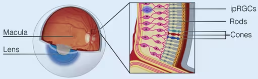
The process begins in the eye, specifically with cells in the retina called rods and cones. Rods help us see in low light and perceive brightness, while cones are responsible for seeing color. Most people have three types of cones, each sensitive to red, green, or blue light. All the colors we see are a combination of signals from these three types of cones. But the journey doesn’t end there.
Once the eye sends these signals to the brain, a much more complex process begins. The brain doesn’t just register “blue.” It connects that color to a lifetime of memories, cultural associations, and learned meanings. A calm blue might remind one person of the ocean, bringing feelings of peace. For another, it might be associated with a cold, sterile hospital room. This is why the psychological effect of color in space is never exactly the same for every single person, though there are broad patterns that hold true for most of humanity. This blend of objective science and subjective experience is what makes color theory so fascinating.
Historical Context and Key Figures
Our modern understanding of color didn’t appear overnight. It was built over centuries by scientists, artists, and thinkers.
Sir Isaac Newton is a pivotal figure. In the 1660s, he used a prism to show that what appears to be pure white light is actually made up of a full spectrum of colors. He then arranged these colors into the first color wheel, a tool that designers still use today. His work proved that color was a property of light, not an inherent quality of objects themselves. This was a revolutionary idea that laid the groundwork for the scientific study of color.
Later, thinkers began to explore the psychological side of color. The renowned psychoanalyst Carl Jung was a pioneer in this area. He believed that colors had symbolic meanings that were connected to what he called the “collective unconscious,” a set of shared ideas and images that all humans inherit. He used color in his therapy to help patients express feelings they couldn’t put into words.
More recently, researchers like Angela Wright have worked to create systems that link colors to specific psychological responses and personality types. Her Colour Affects System, for example, argues that while our personal preferences for colors may vary, our psychological responses to them are predictable and universal. Her work has been highly influential in branding, marketing, and interior design, demonstrating how the right choice of color in space can influence behavior.
Core Terminology Explained
To speak the language of color, you need to understand three core concepts: hue, saturation, and value. Every color you’ve ever seen is a combination of these three properties. Mastering them is the key to using color in space effectively.
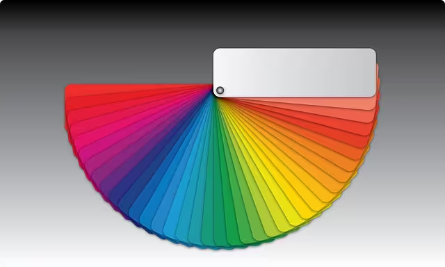
- Hue: This is the simplest component. A hue is what we would call a “pure” color—red, yellow, blue, green. It’s the first thing we name when we describe a color. The color wheel is essentially an organized chart of hues.
- Saturation: This refers to the intensity or purity of a hue. A highly saturated color is bright, vivid, and rich. A color with low saturation is dull, muted, and closer to gray. Think of a bright, fire-engine red versus a dusky, faded barn red. They are both the same hue (red), but their saturation levels are completely different. The saturation of a color in space can have a massive impact on its energy level. A highly saturated room will feel much more intense than a room with muted tones.
- Value (or Luminance): This is the lightness or darkness of a hue. Adding white to a hue creates a “tint,” making its value lighter (like pink from red). Adding black creates a “shade,” making its value darker (like maroon from red). Adding gray creates a “tone.” Value is crucial for creating contrast and mood. A room with high-contrast values (very light colors next to very dark ones) feels dramatic and energetic. A room with similar values feels much softer and calmer. The proper use of value in color in space is essential for creating a balanced design.
The Psychology of the Color Wheel: A Deep Dive into Hues
The color wheel is more than just a tool for artists; it’s a map of emotion. Colors are generally divided into two main categories, warm and cool, with neutrals providing balance. Understanding the general psychology of each hue allows you to predict its effect when used as a dominant color in space.
Warm Colors: Energy, Passion, and Attention
Warm colors—reds, oranges, and yellows—are said to be “advancing” colors, meaning they can feel like they are coming toward you, making a space feel cozier and more intimate. They are associated with the sun and fire and tend to evoke feelings of energy, happiness, and passion.
- Red: No color has a more potent psychological effect than red. It is the color of passion, energy, and excitement. It has been shown to physically increase heart rate and blood pressure. Because it’s so stimulating, it’s also a great color for grabbing attention, which is why it’s used for stop signs and sale notifications. The use of this color in space can stimulate appetite, making it a classic choice for dining rooms. However, because it is so intense, it can also signify danger or aggression. A room painted entirely in a bright, saturated red would likely feel overwhelming and stressful. It’s best used as an accent or in a more muted, earthy form like terracotta or brick.
- Orange: Orange blends the passion of red with the cheerfulness of yellow. Its psychological effects are centered on enthusiasm, creativity, and warmth. It’s a very social color that encourages conversation and a feeling of welcomeness. As such, it can be a wonderful choice for living rooms or family rooms where people gather. It’s also considered a fun and energetic color, making it suitable for a home gym or a child’s playroom. Like red, a highly saturated orange can be overpowering, but softer shades like peach or apricot can be warm and inviting. The right orange color in space can create a vibrant and friendly atmosphere.
- Yellow: Yellow is the color of sunshine, and it carries with it feelings of happiness, optimism, and intellect. It’s the most visible color to the human eye, which makes it excellent for catching attention. Using yellow as a color in space can make a room feel brighter and more expansive. It’s a great choice for kitchens, where it can create a sunny, cheerful start to the day, or for dark hallways and north-facing rooms that don’t get much natural light. However, there’s a delicate balance with yellow. Too much of it, or the wrong shade, can cause feelings of anxiety and frustration. Studies have even shown that babies cry more in bright yellow rooms. Soft, buttery yellows are often easier to live with than intense lemon yellows.
Cool Colors: Calm, Focus, and Serenity
Cool colors—greens, blues, and purples—are known as “receding” colors. They can make a space feel larger and more open because they appear to be further away. Associated with water, sky, and nature, they tend to have a calming and relaxing effect on both the mind and body. The effective use of cool color in space is key to creating environments for rest and concentration.
- Green: Sitting at the center of the spectrum, green is the color of balance and harmony. Because it is so abundant in nature, we are biologically wired to find it restful and restorative. It is the easiest color on the eyes and can actually improve vision. The psychological effects of green are overwhelmingly positive: it suggests growth, safety, and renewal. This makes it an incredibly versatile color in space. Deep forest greens can create a cozy, protective feeling in a den or library. Lighter greens like mint or sage are fresh and calming, making them perfect for bedrooms and bathrooms. Because it promotes focus and reduces eye strain, it is also an ideal color for a home office.
- Blue: Blue is perhaps the most calming color of all. It is associated with the sky and the sea, and it has been shown to lower blood pressure and slow respiration. This makes it a fantastic choice for any room where you want to create a sense of peace and serenity, especially bedrooms. Lighter blues feel airy and expansive, while darker blues like navy can feel powerful and sophisticated. Blue is also linked to trust, loyalty, and productivity. This association makes it the most popular color for corporate branding and a fantastic choice for an office. The main caution with blue is that certain shades can feel cold or sad if not balanced with warmer elements like wood furniture or warm lighting. Finding the right blue color in space can define a room’s purpose.
- Purple: Purple has a long history of being associated with royalty, luxury, and wealth. This is because purple dye was historically very rare and expensive to produce. It combines the passion of red with the calm of blue, creating a color that can be either dramatic or soft. Dark, rich purples like eggplant feel sophisticated and creative. Lighter shades like lavender and lilac are much gentler and have a calming, almost spiritual quality, making them suitable for bedrooms or meditation spaces. The use of this complex color in space often works best in moderation, as an accent to add a touch of elegance and intrigue.
Neutral Colors: The Foundation of Balance
Neutral colors are the unsung heroes of interior design. They don’t appear on most color wheels and include black, white, gray, and browns. They provide a foundational backdrop that allows other colors to shine. Using neutral color in space is a sophisticated way to create a calm, flexible, and timeless design.
- White: White represents purity, cleanliness, and simplicity. It reflects all light, which can make a space feel larger, brighter, and more open. This makes it an excellent choice for small rooms or minimalist design styles. However, a room decorated entirely in stark white can feel cold, sterile, and impersonal, like a hospital. The key to using white effectively is to layer different shades (from cool, crisp white to warm, creamy off-white) and to incorporate plenty of texture through fabrics, wood, and metal to add warmth and interest.
- Gray: For many years, gray has been the go-to neutral for designers. It is the very definition of neutrality and balance, and it is incredibly versatile. It can be warm or cool depending on its undertones. A light gray can feel calm and airy, while a dark charcoal gray can feel dramatic and cozy. Gray provides a sophisticated and stable background that pairs well with nearly any other color. The potential downside is that some shades of gray can be perceived as moody, formal, or unemotional if the room lacks texture and personality. The right gray color in space can be the perfect canvas.
- Black: Black is the color of power, elegance, and sophistication. It is the strongest of the neutrals and can make a powerful statement. When used as a color in space, it absorbs light, which can make a room feel smaller and more intimate. It’s generally too overpowering to be used on all four walls, but it is fantastic as an accent. Black can ground a color scheme, add a touch of drama, and make other colors pop. Think of black window frames, a statement piece of furniture, or a gallery wall of black-and-white photos.
- Brown/Beige: Brown and its lighter version, beige, are the colors of the earth, wood, and stone. They create feelings of stability, security, and comfort. Because these colors are so deeply connected to the natural world, they have a grounding and relaxing effect. They create a warm, cozy, and inviting atmosphere, making them a perfect choice for living rooms and family dens. The use of this earthy color in space connects us to nature and promotes a sense of well-being.
Practical Application: Using Color to Manipulate Perception and Function
Knowing the psychology of each color is only half the battle. The true art lies in applying that knowledge to create functional, beautiful spaces. Color is a powerful tool that can visually change the size of a room and enhance its intended purpose.
How to Make a Room Feel Bigger or Smaller
One of the most magical properties of color in space is its ability to trick the eye and alter our perception of a room’s dimensions.
- Expanding a Space: To make a small room feel larger and more open, your best strategy is to use light-colored paints. Whites, soft grays, pale blues, and light greens reflect more light, creating an airy and expansive feeling. Cool colors in space naturally recede, which helps to visually push the walls outward. Another effective technique is to use a monochromatic color scheme, which involves using different tints and shades of a single hue. This creates a seamless look that doesn’t break up the space. Painting the ceiling a lighter color than the walls, or even pure white, will draw the eye upward and create a sense of height.
- Creating a Cozier Space: If you have a large, cavernous room that feels impersonal, you can use color to make it feel more intimate and inviting. Dark and warm colors tend to advance, or come toward you, which can make the walls feel closer. Rich colors like charcoal gray, navy blue, deep forest green, or even a dramatic chocolate brown can create a wonderfully cozy and protective atmosphere, perfect for a library or a den. Using a slightly darker color on the ceiling can also visually lower it, adding to the feeling of intimacy.
Color by Room Function
The ideal color for a room depends entirely on its purpose. The best color in space for a bedroom is likely the worst for a home gym.
- The Bedroom: This room should be a sanctuary for rest and relaxation. The best colors are those that promote calm. This includes soft blues, tranquil greens, and gentle lavenders. These colors can help lower your heart rate and prepare your mind for sleep. It’s generally wise to avoid highly stimulating colors like bright reds and intense yellows, as they can interfere with your ability to unwind.
- The Office/Study: The goal in an office is focus and productivity. Blue is an excellent choice as it is associated with intellect and can help you concentrate. Green is another fantastic option because it is balanced and easy on the eyes, which can help reduce fatigue during long hours of work. A touch of yellow could spark creativity, but it should be used as an accent rather than the main color.
- The Living Room: This is a multi-purpose space, so the color choice depends on the desired mood. If you want to create a cozy, welcoming space for conversation, warm neutrals like beige or “greige” (a mix of gray and beige) are excellent choices. If you prefer a more formal and serene atmosphere, cooler tones like a sophisticated gray or a soft blue would work well.
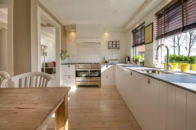
- The Kitchen: The kitchen is often the heart of the home, a hub of activity. Cheerful colors can enhance this energy. Yellows are known to increase metabolism and create a happy atmosphere. Reds, in moderation, can stimulate appetite. For a clean, modern look, you can’t go wrong with crisp whites and grays, which create a feeling of cleanliness and order. The right color in space can make cooking and gathering more enjoyable.
The Role of Light
You cannot consider color without also considering light. Light is what allows us to see color, and the type of light in a room can dramatically change how a color appears.
- Natural Light: The color of natural light changes throughout the day. Morning light is bright and clear, noon light can be harsher and cast a blueish tint, and evening light is warm and golden. A paint color will look different at 8 AM than it does at 6 PM. It’s essential to test paint swatches on your walls and observe them at different times of the day before making a final decision. The direction a room faces also matters. North-facing rooms get less direct light and can feel cool, so they benefit from warmer colors. South-facing rooms get intense light all day, which can wash out pale colors but make darker colors look spectacular.
- Artificial Light: The light bulbs you choose are just as important as your paint color. Artificial lights have a “color temperature,” measured in Kelvins (K). Bulbs with a lower Kelvin rating (around 2700K) produce a warm, yellow-white light similar to an incandescent bulb, which will enhance warm colors. Bulbs with a higher rating (4000K and above) produce a cool, blue-white light that mimics daylight and will enhance cool colors. Using the wrong bulb can make your beautiful beige wall look sickly green or your sophisticated gray look cold and blue.
Advanced Considerations in Color Psychology
To truly master the use of color in space, there are a few more nuanced concepts to consider. These factors can add layers of depth and personality to your design choices.
Cultural and Demographic Differences
While many psychological responses to color are universal, it’s important to remember that color symbolism is not. Meanings can vary dramatically from one culture to another. For example, in Western cultures, white is the color of weddings and purity. In many Eastern cultures, however, white is the color of mourning. Similarly, red signifies good luck and prosperity in China, while in South Africa, it is the color of mourning. Age and gender can also play a role in color preference. These factors are a reminder that design should always be sensitive to the people who will inhabit the space.
Chromotherapy
Chromotherapy, also known as color therapy, is an alternative medicine practice that uses color and light to treat physical and mental health conditions. While it is not a scientifically proven medical treatment, the core idea—that different colors can affect our physical and emotional state—is the same principle used in interior design. For example, in chromotherapy, blue light might be used to create a calming effect, which aligns perfectly with using blue paint in a bedroom to promote restful sleep.
Creating a Cohesive Color Palette
A successful design rarely uses just one color. The key is to create a palette where colors work together harmoniously. One of the most trusted guidelines for this is the 60-30-10 Rule. This rule provides a simple framework for a balanced color scheme:
- 60% Dominant Color: This is the main color for your room, likely the one on the walls. It sets the overall tone.
- 30% Secondary Color: This color is used for about half as much area as the dominant color. It’s often used for furniture, curtains, or an accent wall. It should support the dominant color but be different enough to create interest.
- 10% Accent Color: This is your pop of color. It’s used in small doses on things like pillows, artwork, and decorative objects. This is where you can be bold and add personality.
You can use the color wheel to find classic combinations. Complementary schemes use colors opposite each other on the wheel (like blue and orange) for high-energy contrast. Analogous schemes use colors that are next to each other (like blue, green-blue, and green) for a more serene and harmonious feel.
Conclusion: Paint with a Purpose
Color is much more than just decoration; it is a silent language that speaks directly to our emotions and influences our behavior every single day. The effective use of color in space is a blend of art and science—an understanding of color theory combined with a sensitivity to the unique purpose of a room and the people in it. From the energizing power of yellow to the deep calm of blue, every hue has a role to play.
By learning to wield this powerful tool, you can move beyond simply choosing colors you like and start making intentional choices that support your well-being, improve your focus, and turn your home into a true reflection of how you want to feel. Take a look at the spaces around you. Observe the colors and ask yourself how they make you feel. You now have the knowledge to make small changes that can have a massive impact, painting your world with purpose and creating environments that don’t just house you, but also nurture you.