Why Customization Matters in the Fediverse
Welcome to the Fediverse. If you are reading this, you likely understand that we are standing on the precipice of a digital revolution. We have moved away from the algorithmic cages of centralized tech giants and into the open plains of decentralized social media.
But here is the catch: true ownership isn’t just about owning your data; it is about owning your experience. It is about the ability to shape the digital lens through which you view the world. The Mastodon frontend not just as a user interface, but as a digital home. And just like a physical home, you should be able to paint the walls, rearrange the furniture, and knock down a partition if it blocks your view.
In the centralized world, think X (formerly Twitter) or Facebook, the frontend is a locked box. You see what they want you to see, in the colors they choose, with the buttons they place. In the ecosystem of ActivityPub, however, the Mastodon frontend is malleable. It is open. It invites you to tinker. This guide is your blueprint to that freedom.
We are going to cover the entire spectrum of customization. We will start with the “User-Level” changes—things anyone can do right now to make their timeline more readable and efficient. Then, we will move into the “Admin-Level” territory, where we discuss how instance runners can inject custom CSS to brand their servers. Finally, we will look at the code itself, exploring how forks like Glitch-soc and alternative clients like Elk or Phanpy are rewriting the rules of the Mastodon frontend. Whether you are a casual scroller or a server administrator, by the end of this article, you will possess the knowledge to mold Mastodon into a tool that perfectly fits your hand.
Table of Contents
User-Level Basics: Themes and Appearance Settings
When you first land on a Mastodon instance, you are usually greeted by the default look. It is clean, functional, and frankly, a little bit safe. But the beauty of the Mastodon frontend is that it doesn’t force you to stay in this default mode. There are several built-in levers you can pull immediately to shift the visual experience.
Native Theme Options
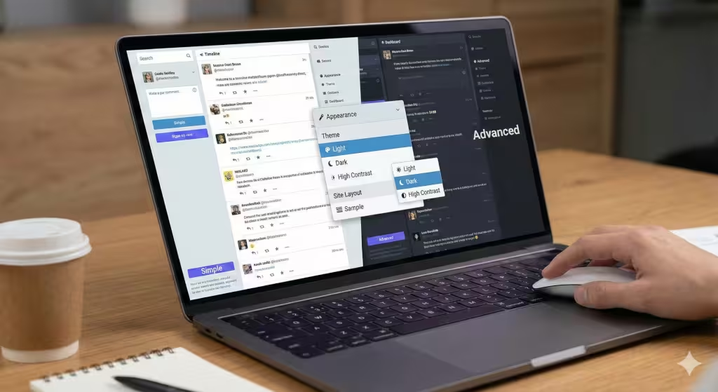
The most immediate change you can make to the Mastodon frontend is the theme. Most instances come shipping with three core options: Light, Dark, and High Contrast.
For many of us, the “Dark” theme is the default for a reason. It is easier on the eyes, especially during those late-night scrolling sessions. However, the “High Contrast” theme is often overlooked. It isn’t just for those with visual impairments; it strips away some of the subtler grays and blues, replacing them with stark blacks and whites. This can actually be a productivity booster. By increasing the contrast, the text pops more aggressively, allowing you to scan the Mastodon frontend much faster than you could with the softer “Dark” theme.
To access these, you simply navigate to your settings. Click the gear icon, head to Preferences, and then Appearance. It is a simple toggle, but it fundamentally shifts the mood of the application.
Interface Layouts
The layout is where the Mastodon frontend really starts to diverge from its competitors. By default, you are likely looking at the “Simple” interface. This is a single column of posts, very reminiscent of mobile apps or the standard Twitter feed. It is great for focus. It forces you to look at one thing at a time.
However, if you check the box for “Enable advanced web interface,” the Mastodon frontend transforms. It stops being a simple feed and becomes a command center. We will go deeper into this later, but at a basic level, switching layouts is about matching the tool to your brain. Do you need a stream of consciousness (Simple), or do you need a dashboard of data (Advanced)?
Display Density and Fonts
Another often-missed setting in the Mastodon frontend is the font usage. In the preferences menu, you can toggle “Use system default font.”
Why does this matter? The default Mastodon font (usually Roboto or Segoe UI depending on your OS) is fine. But if you are a designer or a typography nerd, you might have specific fonts installed on your computer that you find more readable. By checking this box, you force the Mastodon frontend to respect your local machine’s preferences. It makes the browser feel less like a website and more like a native app running on your computer.
Deep Dive: The Advanced Web Interface (AWI)
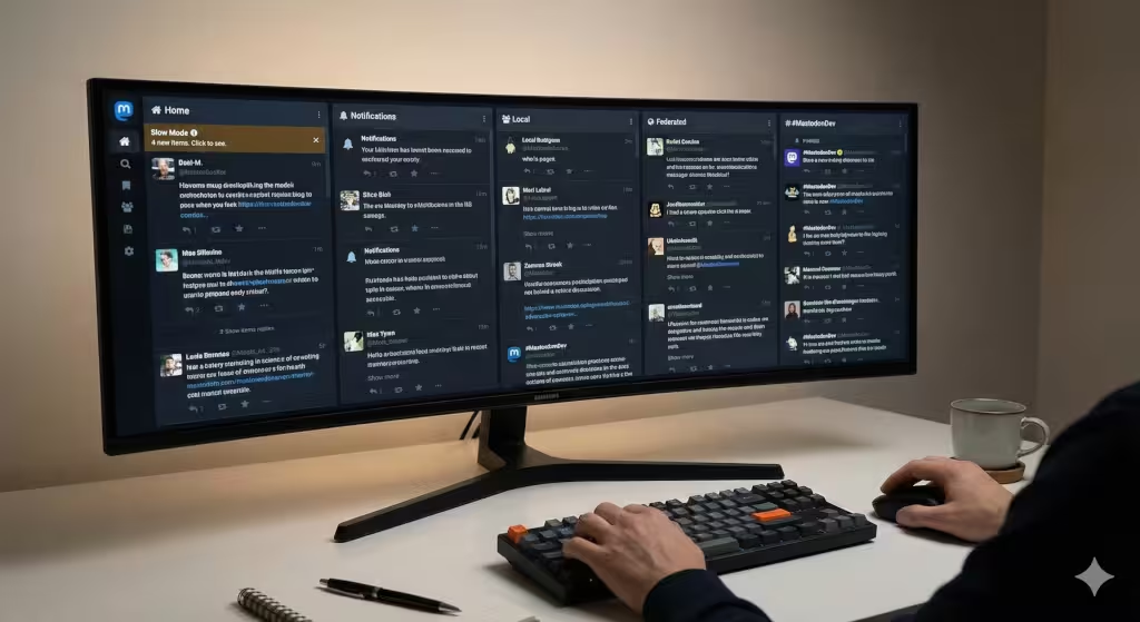
For the power user, the standard single-column view is insufficient. It is like trying to drink from a firehose through a straw. This is where the Advanced Web Interface (AWI) of the Mastodon frontend shines.
What is AWI?
If you ever used TweetDeck in the past, the AWI will feel like coming home. It changes the Mastodon frontend from a vertical scroll into a horizontal panorama. Instead of one feed, you can have ten. This isn’t just about seeing more; it is about sorting information spatially.
Column Management
The true power of the AWI lies in column management. You can pin your “Home” feed (people you follow) in the first column. In the second, you might pin “Notifications” so you never miss a reply.
But the real magic happens when you start pinning hashtags. Let’s say you are tracking the Mastodon frontend development community. You can search for #MastodonDev, click the settings icon at the top of that column, and hit “Pin.” Now, you have a live ticker tape of that specific conversation permanently docked on your screen. You can do this for as many interests as your screen width allows. This turns the Mastodon frontend into a real-time news terminal.
Productivity Hacks with AWI
One of my favorite features in the AWI is “Slow Mode.” When you have five columns open, the data flow can be overwhelming. The feeds might scroll so fast you can’t read them.
In the appearance settings of the Mastodon frontend, you can enable Slow Mode. This stops the feeds from auto-scrolling. Instead, a banner appears at the top of the column saying “4 new items.” The column stays frozen until you click that banner. This puts you back in control. You choose when to refresh the data, rather than letting the data push you around. It is a subtle change to the Mastodon frontend, but it significantly reduces cognitive load.
Accessibility and Sensory Customization
The Mastodon frontend is one of the most accessible platforms out of the box, but it requires you to configure it correctly.
Motion Control
Modern web design loves animation. Things swoosh, fade, and slide. For many users, this is delightful. For users with vestibular disorders, it can be nauseating.
The Mastodon frontend respects the prefers-reduced-motion media query from your operating system, but it also has manual overrides. In your preferences, you can check “Reduce motion in animations.” This stops the avatars from spinning and the menus from sliding. It makes the Mastodon frontend snap instantly from state to state. Even if you don’t have a medical need for it, I often recommend this to power users. It makes the interface feel faster and more responsive because you aren’t waiting for a 0.3-second transition to finish.
Visual Accessibility and Alt Text
One of the core values of the Fediverse is inclusivity. The Mastodon frontend places a high priority on Alt Text (descriptions for images).
In your settings, you can configure the Mastodon frontend to warn you before you post an image without a description. This is a “nudge”—a design choice that encourages good behavior. By enabling this, you ensure that every piece of content you add to the ecosystem is accessible to blind or low-vision users.
Furthermore, you can adjust the contrast and font size. While the “High Contrast” theme handles colors, the browser’s zoom function handles size. The Mastodon frontend is built with “rem” (relative em) units, meaning it scales beautifully. It won’t break or look blocky if you zoom in to 150%.
Content Warnings (CW)
The Content Warning system is unique to the Mastodon frontend. It acts like a subject line for a post, hiding the body text behind a “Show More” button.
You can customize how these appear. If you are in a high-trust environment, you might want to “Always expand posts marked with content warnings.” This saves you clicks. Conversely, if you are browsing on the bus or at work, you can set the Mastodon to always hide sensitive media. Mastodon uses an algorithm called “BlurHash” to show a colorful, blurry gradient of the image without revealing the details. It is a brilliant bit of UI/UX design that keeps the timeline colorful without being explicit.
Client-Side Hacking: Browser Extensions and User Styles
Sometimes, the built-in settings just aren’t enough. You want to change the font to Comic Sans (please don’t), or you want to make the “Publish” button bright pink. This is where client-side customization of the Mastodon frontend comes in.
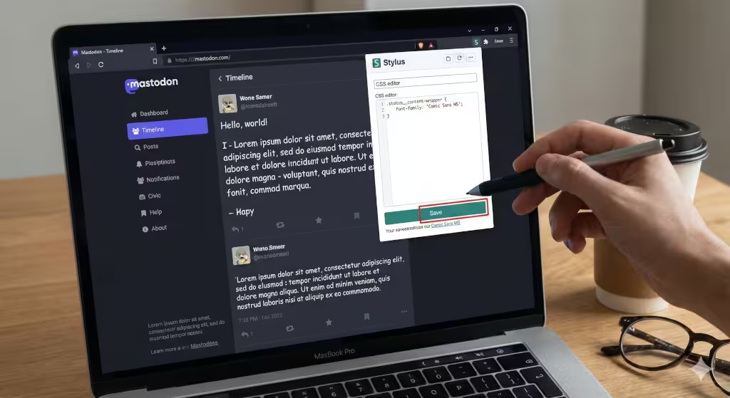
Custom CSS for Users
You do not need to be an admin to rewrite the look of your Mastodon experience. You can use a browser extension like Stylus. This extension allows you to write CSS code that your browser applies on top of the website.
For example, if you wanted to hide the “Boost” button because you find it distracting, you could target the class in the Mastodon frontend code. You would install Stylus, click on the extension while on your instance, and write a simple rule.
Popular Community Themes
If you aren’t a coder, you can visit repositories like UserStyles.world. There is a vibrant community of designers who have already written code to remodel the Mastodon frontend.
Some popular styles include “Mastodon Flat,” which removes the rounded corners and shadows for a modern, brutalist look. Another is “Tangerine UI,” which softens the entire palette. These themes are “client-side,” meaning they only exist on your computer. You are effectively putting a new skin on the Mastodon frontend without changing the underlying structure. It is safe, reversible, and highly creative.
Admin-Level: Custom CSS Injection
Now we are crossing the line from user to creator. If you run your own instance, you control the Mastodon frontend for everyone who logs in. This is a significant responsibility and a powerful branding opportunity.
The Administration Panel
Mastodon makes this surprisingly easy. You do not need to hack the source code files immediately. You can navigate to Administration, then Server Settings, and finally the Appearance tab.
Here, there is a box labeled “Custom CSS.” Whatever you type here gets loaded by every browser that visits your server. This is the standard way to brand an instance.
Global CSS Strategies
When modifying the Mastodon frontend at this level, you need to be careful. You are affecting the experience of every user.
A common change is to brand the navigation bar. You might want to change the background color of the left-hand column to match your community’s logo. To do this, you would use your browser’s “Inspect Element” tool to find the specific class name used by the Mastodon frontend.
For example, the class usually looks something like .column-header or .navigation-bar. By adding a simple CSS rule:
CSS
.column-header {
    background-color: #ff5722;
}
You instantly brand your instance. However, you must test this against the Light, Dark, and High Contrast themes. A color that looks great in Dark mode might make the text unreadable in Light mode. The Mastodon frontend is dynamic, so your CSS needs to be robust.
Advanced Admin: Modifying Source Code (The config/themes.yml Method)
For the true tech-savvy admins, the “Custom CSS” box is just the tip of the iceberg. To truly overhaul the Mastodon frontend, you need to get into the server files.
Server-Side Files
The Mastodon application is built on Ruby on Rails. The styles are located in app/javascript/styles. 13Here, you can find the SCSS (Sassy CSS) files that compile into the visual interface.
If you want to create a completely new theme, let’s say “Cyberpunk Neon”, you wouldn’t just paste code in the admin panel. You would create a new file in the source code.
Compiling Assets
After creating your new theme file, you have to tell the Mastodon frontend that it exists. This involves editing the config/themes.yml file. This file acts as a register. It tells the server, “Hey, there is a new theme called Cyberpunk, and here is where the files are.”
Once you have registered the theme, you must recompile the assets. This is done via the command line on your server. You would run a command like:
RAILS_ENV=production bundle exec rails assets:precompile
This takes your raw code and squishes it down into the efficient, fast-loading CSS that the Mastodon frontend serves to users. This process requires a reboot of the Mastodon process, so it is something you do during maintenance windows.
Forks and Alternative Frontends
Sometimes, the standard Mastodon frontend just isn’t enough, no matter how much CSS you throw at it. The code is open source, which means anyone can copy it and change the fundamental logic.
Glitch-soc
The most famous “fork” of Mastodon is Glitch-soc. It describes itself as a “friendly fork.” It is compatible with the main network, but the Mastodon frontend on a Glitch-soc server has superpowers.
Glitch-soc adds a “Local-only” posting option, allowing you to post to your instance without federating the message out to the wider world. It also allows for rich text formatting (bold, italics) which the standard Mastodon frontend lacks. If you are an admin who wants to offer your users more features, installing Glitch-soc instead of vanilla Mastodon is a great move.
Alternative Web Clients
You don’t even need to be an admin to swap the frontend entirely. Because Mastodon uses an open API, you can use third-party websites to view your timeline.
Elk is a popular alternative Mastodon frontend. It looks much more like a modern, polished app than the utilitarian default interface. It handles photos beautifully and has a very smooth user experience.
Phanpy is another contender. It takes a minimalist approach. It has a “Boost Carousel” that shrinks boosted posts so they don’t clog your timeline. It completely rethinks how the Mastodon frontend should present information.
Using these clients is easy. You just go to their website (like elk.zone), log in with your instance credentials, and suddenly you are interacting with the same data through a completely different lens.
Troubleshooting and Best Practices
Customizing the Mastodon frontend is fun, but things can break. Here is how to keep your timeline running smoothly.
Caching Issues
The number one reason your changes don’t show up is caching. The Mastodon frontend is aggressive about saving data to make the site load faster. If you change a CSS setting and don’t see it, try a “Hard Refresh” (Ctrl+F5 or Cmd+Shift+R). If you are an admin, you might need to clear the server-side cache.
Mobile Responsiveness
Always check your changes on a phone. The Mastodon frontend is responsive, meaning it changes shape based on screen size. A sidebar that looks great on a 27-inch monitor might cover the entire screen on an iPhone. When writing custom CSS, always use “media queries” to ensure your changes only happen on the screens where they make sense.
Maintenance
Mastodon updates frequently. When version 4.3 moves to version 5.0, the underlying class names of the Mastodon frontend might change. If you have heavily customized your instance, an update might break your theme. Always have a test server, or at least be prepared to revert your “Custom CSS” to a blank state if things go haywire after an update.
Questions about the Mastodon Frontend
Can I change the color of the boost button?
Yes, you can change the color of the boost button in the Mastodon frontend. If you are a user, you can use a browser extension like Stylus to apply a custom CSS rule to the button’s class. If you are an admin, you can add this rule to the “Custom CSS” section in the server settings to change it for everyone.
Does customizing my frontend affect how others see my profile?
Generally, no. Customizing your Mastodon frontend (like using “Dark Mode” or the “Advanced Interface”) only changes what you see. However, if you are an admin and you change the instance’s CSS, everyone visiting your server will see those changes. Your profile picture and header image are the only visual elements you control that other users will see on their own frontends.
Is Glitch-soc better for customization?
Glitch-soc is often considered better for customization because it exposes more settings in the Mastodon frontend to the user. It allows users to hide specific elements and offers more formatting options without needing to write code. For admins, it provides more hooks to change the behavior of the software, making it a preferred choice for instances that want a unique feel.
Conclusion: Building a Home in the Fediverse
We have traveled a long way from the simple “Light/Dark” toggle. We have explored the depths of the Advanced Web Interface, touched on the sociology of accessibility, and even looked at the code that powers the Mastodon frontend.
The takeaway is this: The Fediverse is not a product you consume; it is a community you participate in. Customizing your Mastodon frontend is an act of participation. It is you saying, “This is my space, and I want it to reflect who I am.”
Whether you are just switching to High Contrast mode to help your tired eyes, or you are an admin compiling a custom theme for thousands of users, you are taking ownership. That is the spirit of open source. That is the spirit of the Fediverse.
So, go ahead. Open those settings. Write that CSS. Make the Mastodon frontend your own. And if you create a theme that looks particularly amazing, share it. That is how we build a better web, one line of code at a time.