In a digital world that is constantly moving, a brand’s identity should not be stuck in place. We have moved past the era where a website was just a static brochure. Today, your digital presence is a living, breathing space where you connect with your audience.
A powerful way to bring this space to life is through motion. Generative, nature-inspired animations are a sophisticated tool for expressing your brand’s core essence. They are not just decoration; they are a form of communication. This type of animation uses computer code and algorithms to create visuals that grow, flow, and form in beautiful, often unpredictable ways, much like patterns in the natural world.
This article provides a complete guide for selecting the right animation style for your brand. We will explore three distinct types of generative animation: the structured growth of crystals, the gentle movement of fluid, and the organic branching of plants.
By looking at the science behind them, the feelings they create, and the types of brands they fit best, you will gain a clear framework for making a strategic choice. Choosing the right website animation is about finding the visual language that speaks authentically for your brand.
Table of Contents
The Technical & Psychological Dimensions of Three Animation Styles
Before you can choose the best animation for your website, you need to understand what makes each style unique. It is not just about what they look like. It is about how they are made and, more importantly, how they make people feel. Each style of animation carries a different message. One might say your brand is strong and precise, while another might say it is flexible and calm. Let’s break down the technical side and the emotional impact of these three powerful animation families.
Crystal Growth Animations: Precision, Complexity, and Structure
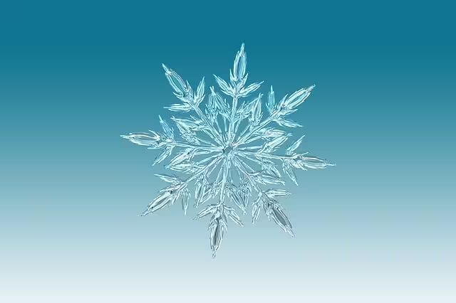
Crystal growth is a style that mimics how crystals form in nature. Think of snowflakes, quartz, or salt crystals. They all start from a small seed and grow outward following very specific, geometric rules. This type of digital animation does the same thing using computer algorithms.
- How It Works: The technical process behind this animation is fascinating. It often uses a concept from mathematics called “fractal geometry,” where a simple shape or pattern is repeated over and over again at smaller scales. The result is an image of incredible complexity that grew from a very simple rule. Another method is called “cellular automata,” where the screen is divided into a grid of tiny cells. Each cell follows a rule, like changing its color based on its neighbors. Over time, these simple rules cause intricate, crystal-like structures to emerge and grow across the screen. To make this animation look really sharp and three dimensional, designers often use a technology called WebGL, which lets the web browser use the computer’s graphics card to create very fast and complex visuals.
- How It Feels: When you see this kind of animation, it sends a clear message. The strict rules and perfect geometry create a feeling of precision, order, and intelligence. The complex patterns suggest a high level of technical skill and attention to detail. This makes the animation feel sophisticated and trustworthy. For a user, it can evoke feelings of luxury, technological advancement, and data organization. It suggests that the brand behind it is structured, powerful, and an expert in its field.
- Brands It Suits: This animation style is a perfect match for brands that want to be seen as leaders in technology and precision. Think of companies in finance that handle complex data, or software companies that build intricate systems. Luxury brands, like high-end watchmakers or jewelers, can use this animation to reflect the quality and craftsmanship of their products. It is also ideal for data analytics firms, science-based companies, and any business that wants to project an image of intelligence, security, and structure. The brand archetypes that align best with this style are The Sage (who seeks truth), The Ruler (who seeks control), and The Magician (who makes dreams happen through complex means).
Fluid Motion Animations: Adaptability, Calm, and Flow

Fluid motion is designed to look like moving liquid. It can be like gentle waves on a pond, smoke swirling in the air, or ink dropping into water. This animation is all about smooth, flowing, and organic movement that feels natural and unrestricted.
- How It Works: To create this animation, developers use algorithms that simulate the physics of liquids. They use mathematical tools like “Perlin noise,” which is a special type of randomness that creates natural-looking textures for things like clouds, water, or fire. The animation can also be built with “particle systems,” where thousands of tiny dots are programmed to move together in a fluid way. Unlike the sharp angles of crystal animation, fluid animation is defined by curves and gentle transformations. It can be created using a few different web technologies. For simpler effects, it can be done with SVG (Scalable Vector Graphics) filters. For more complex, interactive liquid effects, designers use the HTML Canvas element or JavaScript libraries that are made specifically for this kind of creative coding.
- How It Feels: The psychological impact of fluid movement is almost the opposite of crystal growth. Its smooth, continuous movement is inherently calming and soothing to the human eye. It creates a sense of adaptability, creativity, and ease. There are no harsh edges or sudden stops. This makes the brand feel flexible, friendly, and understanding. The animation guides the user’s attention gently, creating a seamless and pleasant experience. It can make a website feel more organic and less like a rigid machine, which can help users feel relaxed and welcome.
- Brands It Suits: This is a fantastic choice for brands in the wellness and health industries. Yoga studios, meditation apps, therapists, and healthcare providers can use it to create a peaceful and reassuring digital environment. Creative agencies and design studios can use it to showcase their creativity and ability to adapt. It also works well for any company that wants to appear modern, approachable, and focused on the user’s well-being. The brand archetypes that fit this style are The Caregiver (who wants to protect and care for others), The Creator (who is driven to build and innovate), and The Innocent (who seeks happiness and simplicity).
Plant Growth Animations: Organics, Sustainability, and Connection
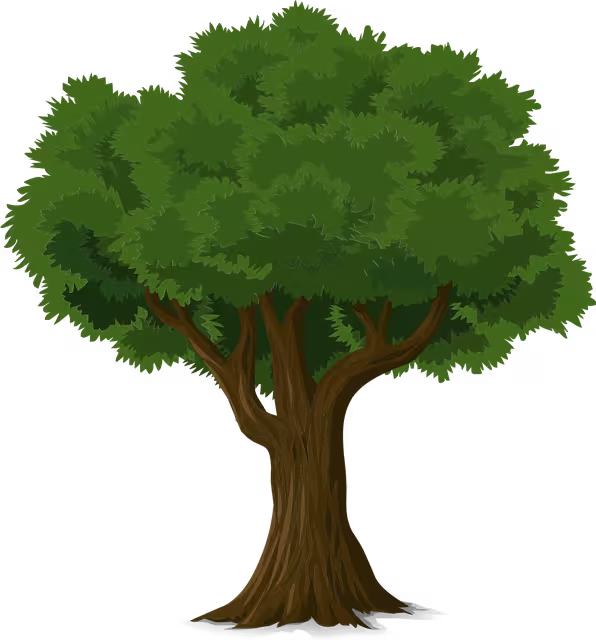
Plant growth, often called biophilic animation, is a style that mimics the way plants grow. This could be a vine creeping up a wall, a tree branching out towards the sky, or a flower blooming. It is a direct visual representation of life, development, and nature.
- How It Works: The core technology behind much of this animation is something called an L-system, or Lindenmayer system. This is a set of rules that describe how a plant structure grows. For example, a rule might say “draw a line, then turn left and draw a smaller line, then turn right and draw another smaller line.” By repeating this simple rule thousands of time, the algorithm can create an incredibly detailed and realistic-looking tree or plant. This procedural approach means the animation feels organic and natural, because it grows in the same way nature does, from a simple seed into a complex form.
- How It Feels: This type connects with us on a very deep, primal level. Humans have an innate love for nature, a concept known as biophilia. Seeing patterns of natural growth is comforting and inspiring. This style symbolizes growth, potential, sustainability, and connection. It makes a brand feel grounded, wholesome, and forward-looking. It suggests that the brand is focused on development, whether that is personal growth for its customers or a commitment to a healthier planet. This animation can make a website feel alive and hopeful.
- Brands It Suits: This is perfect for any brand with a connection to nature or growth. Eco-conscious and sustainable brands can use it to visually reinforce their mission. It is also great for non-profits, community organizations, and educational institutions focused on development. Agriculture technology companies can show their innovation through this natural lens. Even industries like real estate can use it to highlight properties with beautiful gardens or a connection to the outdoors. The best brand archetypes for this style are The Explorer (who seeks freedom and adventure), The Lover (who values connection and relationships), and The Everyman (who seeks belonging and community).
The Decision Framework: Matching Motion to Mission

Now that you understand the personality of each animation style, it is time for the practical part. How do you choose the one that is right for your specific brand? This is not just a matter of taste. It is a strategic decision that should be based on your brand’s identity, your audience, and your technical limits. Following this simple framework will help you make a confident choice.
Step 1: Audit Your Brand’s Core Adjectives
The first step is to look inward at your brand. The style you choose should be a visual reflection of your company’s personality. If your brand was a person, how would you describe it?
Get a piece of paper or open a new document. Spend a few minutes brainstorming and write down a list of 5 to 7 adjectives that you feel truly define your brand. Are you innovative, reliable, and precise? Or are you compassionate, creative, and calm? Perhaps you are adventurous, organic, and community-focused. Be honest. This is the foundation of your brand’s identity.
Once you have your list, compare it to the feelings that each style creates, which we discussed in the last section.
- If your list includes words like precise, technical, smart, luxurious, or structured, a crystal growth animation is likely a strong contender.
- If your list has words like calm, flexible, creative, smooth, or adaptable, you should seriously consider a fluid motion animation.
- If your words are organic, growing, natural, sustainable, or connected, then a plant growth animation is probably the best fit.
This simple mapping exercise can often point you clearly in the right direction. The goal is for the it to feel like a natural extension of who you already are as a brand.
Step 2: Analyze Your Audience’s Aesthetic Sensibilities
The next step is to think about the people you are trying to reach. The best animation in the world will not be effective if it does not resonate with your target audience. Different groups of people have different tastes and expectations.
Think about who your ideal customer is. What is their age? What are their interests? What kind of digital experiences are they used to?
- A young, tech-savvy audience might appreciate the futuristic and complex feel of a crystal animation. They might see it as cool and impressive.
- An older, less technical audience might find that same animation to be cold or confusing. They might respond better to the gentle and welcoming feel of a fluid animation.
- An audience that is passionate about the environment and healthy living will almost certainly connect with the natural beauty of a plant growth animation.
Your choice should make your audience feel comfortable and understood. It should match the visual style they already enjoy. Look at the websites of other brands that your audience loves. What kind of visuals do they use? This is not about copying them, but about understanding the visual language that your audience speaks.
Step 3: Evaluate Performance and Implementation Overhead
This final step is a crucial reality check. A beautiful animation is useless if it slows down your website so much that people leave before it even loads. Website performance is critical for both user experience and search engine optimization (SEO). Google and other search engines prefer sites that are fast and responsive.
Each style comes with a different technical cost.
- Crystal growth animation, especially if it is 3D and uses WebGL, can be very demanding on a user’s computer and internet connection. It can increase load times and may not run smoothly on older devices or mobile phones.
- Fluid motion animation can be more lightweight, especially if it is created with optimized code. However, very complex fluid simulations can still be resource-intensive.
- Plant growth animation can vary. Simple L-system animations can be very efficient, but highly detailed ones can slow things down.
Before you commit to a style, you must ask: can my website handle this animation without sacrificing speed? An important concept here is Google’s Core Web Vitals, which are metrics that measure a website’s loading speed, interactivity, and visual stability. A heavy animation can hurt your scores in these areas, which can cause your site to rank lower in search results. The rule is simple: a subtle, fast animation is always better than a spectacular, slow one. Your animation must enhance the experience, not get in the way of it.
Quick-Reference Comparison Chart
To help you put it all together, here is a simple chart that summarizes the key points for each style.
| Feature | Crystal Growth | Fluid Motion | Plant Growth |
| Core Symbolism | Precision, Structure, Technology, Luxury, Complexity | Adaptability, Calm, Flow, Creativity, Ease | Growth, Sustainability, Nature, Connection, Potential |
| Best For Industries | Tech, Finance, Data Science, Luxury Goods, SaaS | Wellness, Healthcare, Creative Agencies, Design | Eco-Friendly Brands, Non-Profits, Agriculture, Real Estate |
| Typical Technical Cost | High (Often requires WebGL and is GPU-intensive) | Medium (Can be done with SVG or Canvas, performance varies) | Low to Medium (Often JS-based, efficiency depends on code) |
Implementation Best Practices for Performance and UX
Once you have chosen the right style of animation for your brand, you need to implement it correctly. A great idea can be ruined by poor execution. The goal is to create an one that adds to your site’s appeal without hurting its performance, accessibility, or user experience. Here are some essential best practices to follow.
Choosing the Right Technology Stack
The technology you use to build your animation has a big impact on how it performs. There are three main options for web animation:
- CSS: For simple animations, like fades, color changes, or small movements, CSS is the best choice. It is very efficient because the browser is highly optimized to handle it. However, it is not powerful enough for the complex generative animation we have been discussing.
- JavaScript: This is the most common choice for generative animation. Using JavaScript gives you complete control to create complex visuals. There are amazing libraries that can help, like p5.js for creative coding, GSAP for high-performance animation control, and Three.js for creating 3D graphics. The key with JavaScript is to write clean, efficient code so it does not slow down your site.
- WebGL: This is the most powerful option. It lets your code talk directly to the computer’s graphics card, allowing for incredibly fast and complex 3D and 2D graphics. It is the best choice for high-fidelity crystal animation or detailed simulations, but it is also the most complex to work with and can have the highest performance cost if not done carefully.
The right choice depends on the complexity and your performance budget.
The Principle of Subtlety
One of the biggest mistakes brands make is overdoing it. Your animation should be a supporting actor, not the main star. It is there to create a mood and enhance your brand’s message, not to distract your users from their goals.
Think of it like salt in a recipe. A little bit brings out all the flavors and makes the dish better. Too much ruins it completely. Use your animation in subtle ways:
- As a gentle, slowly moving background element.
- As a small, elegant loading animation.
- As a subtle effect that appears when a user hovers their mouse over a button or image.
The best animation is often the kind that a user feels more than they actively notice. It contributes to the overall atmosphere of the site without demanding attention.
Optimization is Paramount
We cannot stress this enough: your animation must be optimized for performance. A slow website will lead to frustrated users and lower search engine rankings. Here is a simple checklist of optimization tips:
- Use
requestAnimationFrame(): This is a special JavaScript function that tells the browser you want to perform an animation. It lets the browser run your code at the best possible time to ensure the animation is smooth and efficient. - Offload Heavy Work: If your animation requires a lot of complex calculations, you can use something called a Web Worker. This runs the hard work in the background so it does not freeze up the main web page.
- Keep File Sizes Small: Compress all your assets and only load the scripts on the pages where they are actually needed.
- Respect User Preferences: Some people get motion sickness or feel dizzy from too much movement on screen. There is a web setting called
prefers-reduced-motionthat allows users to request less animation. Your website should respect this setting and turn off or reduce the animation for these users. This makes your site more accessible and user friendly.
Conclusion: Animation as an Authentic Extension of Brand Identity
We have journeyed through the intricate worlds of crystal, fluid, and plant growth animation. We have seen that they are far more than just pretty pictures. Each style has a distinct personality, a unique technical foundation, and a different emotional impact. The rigid, beautiful complexity of crystal animation speaks of precision and technological prowess. The gentle, adaptive movement of fluid animation communicates calm and creativity. And the vital, branching forms of plant growth animation tap into our deep connection with nature, symbolizing growth and sustainability.
The final takeaway is that your choice of is not merely an aesthetic one; it is a strategic one. The right generative animation does not just decorate your website. It communicates the soul of your brand. It works silently in the background to build an emotional connection with your audience and helps create a digital experience that is memorable and unique. By carefully considering your brand’s core values, understanding your audience, and respecting the technical realities of web performance, you can choose an animation that is an authentic and powerful extension of your brand’s story.