Mastering Perceptual Depth: Advanced Shadow Techniques in Biophilic Web Design
Beyond Flat Design – Reintroducing Natural Dimension
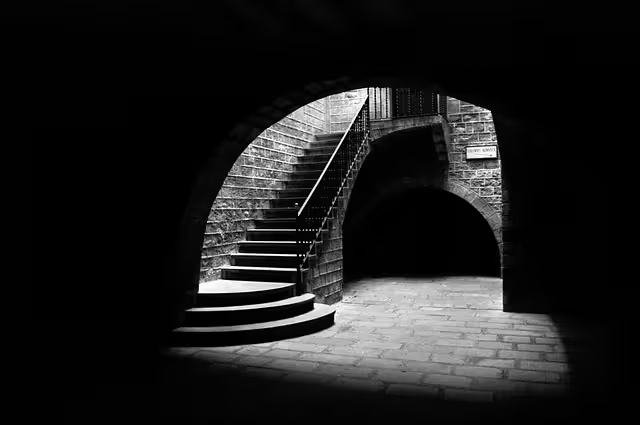
The human visual system is not engineered for a flat world, such as that found on most webpages. Human vision is a sophisticated apparatus, evolved over millennia to interpret light, shadow, and depth to navigate complex, three-dimensional environments. Our survival and interaction with the world have always depended on our brain’s instantaneous ability to judge distance, identify texture, and perceive hierarchy through the subtle cues of light interacting with form. Why, then, do we so often reduce our digital environments to flat, lifeless planes, forcing this highly evolved system to work harder to understand simple relationships between elements?
This article moves beyond the basic box-shadow properties to provide a technical framework for implementing realistic, nuanced shadows on the web. Here, we will analyze how to leverage these techniques not merely for aesthetic effect, but to create digital interfaces that align with innate human biophilic preferences. Biophilic design is a discipline centered on incorporating patterns and elements from the natural world into the built environment to improve well-being. When applied to web design, it means creating experiences that feel intuitive and reduce cognitive load. By mastering the art and science of shadow, we can build digital spaces that guide the user’s eye, communicate function, establish clear hierarchy, and ultimately, provide a more natural and comfortable user experience.
Table of Contents
The Physics and Psychology of Shadow: Why Depth Matters
Before we write a single line of code, it is critical to understand why shadows are such a powerful tool. When you look at an object in the real world, its shadow gives you a massive amount of information without you even having to think about it. Your brain instantly processes it to understand that the object is solid, where it is in relation to the ground, and how far away it is from you. This is an automatic, low-effort process.
When a website lacks these depth cues, your brain has to work harder, using other clues like size and position to figure out what’s important and what’s clickable. By adding realistic shadows, we give the brain the shortcuts it’s used to, making the website feel easier and more natural to use.
From Chiaroscuro to Material Design
This concept is not new; it is a fundamental principle of visual art that has been understood for centuries. Artists during the Renaissance perfected a technique known as Chiaroscuro, an Italian term that literally means “light-dark.”
- Chiaroscuro: This is the use of strong contrasts between light and shadow to model three-dimensional forms on a flat canvas. Painters like Caravaggio and Rembrandt were masters of this, using a single, dramatic light source to make their subjects appear as if they were emerging from the darkness. This technique directs the viewer’s eye, creates drama, and makes the scene feel intensely real and three-dimensional.
In web design, we use a digital version of Chiaroscuro to make important elements “pop.” A well-placed shadow can lift a button off the page, making it the clear focal point, just as a painter would highlight a face in a portrait.
More recently, this principle was systemized for the digital world by Google with its creation of Material Design.

- Material Design (Google): This is a comprehensive design system developed by Google and championed by designers like Matias Duarte. A core concept of Material Design is the idea of “elevation.” Imagine every element on a webpage—a button, a menu, a pop-up window—as a separate piece of paper. The more important an element is, the higher it floats above the background. In the real world, an object floating higher would cast a larger, softer shadow. Material Design mimics this physical reality. A button might be at a low elevation, casting a small, tight shadow. But a critical pop-up notification will be at a high elevation, casting a large, diffused shadow that tells your brain, “Pay attention, this is on top of everything else.” This systematic use of shadow creates a predictable and understandable interface.
Biophilic Principle: Prospect & Refuge
Beyond just art and physics, the strategic use of shadow taps into a deep-seated psychological preference explained by the biophilic concept of Prospect and Refuge. This theory suggests that humans are inherently drawn to environments where they can see without being seen.
- Prospect: The ability to have an unimpeded view of the surrounding environment. This relates to opportunity, information, and exploration.
- Refuge: A safe, protected place from which to observe that prospect. This relates to safety, comfort, and control.
Think of standing just inside a forest, looking out over an open field. The forest is your refuge, a safe, defined space. The field is the prospect, the area of interest. On a website, the overall user interface, the navigation, the sidebars, and the footer, should act as the user’s “refuge.” It should be consistent, predictable, and clearly defined. The content area is the “prospect.”
Shadows are essential for creating this effect. They clearly separate interactive elements (like navigation menus and buttons) from the static background, defining the boundaries of the user’s “safe” operational space. A well-defined shadow on a dropdown menu provides refuge by making it clear that this menu is a distinct, contained entity, separate from the content behind it. This simple cue reduces ambiguity and makes users feel more in control of the digital environment.
The Core CSS Toolkit for Shadow Implementation

To translate these powerful principles into a working website, we rely on a few core properties within Cascading Style Sheets (CSS). While they may seem simple at first, mastering their nuances is the key to creating realistic and effective depth using shadows.
A. The box-shadow Property: The Foundational Tool
This is the most common and versatile tool for adding shadows to web elements. It applies a shadow to the rectangular box of an HTML element. The syntax can look intimidating, but it breaks down into a few simple parts.
Syntax: box-shadow: [inset] [offset-x] [offset-y] [blur-radius] [spread-radius] [color];
Let’s dissect each part:
inset(Optional): If you include this keyword, the shadow will be drawn inside the element’s box instead of outside. This can be used to create a pressed-in or sunken effect.offset-x: This is the horizontal offset. A positive value (e.g.,10px) moves the shadow to the right. A negative value (e.g.,-10px) moves it to the left.offset-y: This is the vertical offset. A positive value moves the shadow down. A negative value moves it up. These two offset values are what determine the apparent direction of your light source.blur-radius: This determines how fuzzy or soft the shadow is. A value of0creates a sharp, solid shadow. A larger value (e.g.,20px) creates a very blurry, diffused shadow. This is one of the most important values for creating realism.spread-radius(Optional): This value makes the shadow grow or shrink. A positive value makes the shadow bigger in all directions, while a negative value makes it smaller. It’s often used for creating more subtle or specialized effects.color: This sets the color of the shadow. While black is the default, we rarely want to use pure black. Using a semi-transparent black (e.g.,rgba(0, 0, 0, 0.2)) is almost always better, as it allows the background color to show through, creating a more natural look.
Example 1: A Simple, Crisp Shadow
CSS
.card {
  /* offset-x: 0 (no horizontal shift)
    offset-y: 4px (moves shadow down by 4 pixels)
    blur-radius: 8px (a moderate softness)
    color: A black shadow that's only 10% opaque, making it very subtle.
  */
  box-shadow: 0 4px 8px rgba(0, 0, 0, 0.1);
}
Example 2: An Inset Shadow for a “Pressed” Button
CSS
.button:active {
  /*
    The "inset" keyword draws the shadow inside the button.
    The offsets are positive, so the shadow appears on the top and left,
    making it look like the button is being pushed down into the page.
  */
  box-shadow: inset 2px 2px 5px rgba(0, 0, 0, 0.2);
}
B. The filter: drop-shadow() Function: A Superior Alternative for Complex Shapes
While box-shadow is a great workhorse, it has one major limitation: it only applies to the element’s rectangular box. What if your element isn’t a rectangle? What if it’s a complex shape, like a company logo saved as a transparent PNG file, or an SVG icon? If you use box-shadow on it, you’ll get a shadow around the invisible rectangle that contains the shape, which looks unnatural and incorrect.
This is where filter: drop-shadow() excels. It applies a shadow that conforms to the actual visible shape of the element, ignoring any transparent areas.
Syntax: The syntax is similar to box-shadow, but simpler. filter: drop-shadow([offset-x] [offset-y] [blur-radius] [color]);
Notice it doesn’t have inset or spread-radius.
Use-Case Demonstration:
Imagine you have a star-shaped icon.
- With
box-shadow: The shadow would be a square around the star. - With
filter: drop-shadow(): The shadow would be perfectly star-shaped.
CSS
.star-icon {
  /* This creates a perfect, star-shaped shadow that follows the contours of the image. */
  filter: drop-shadow(3px 5px 4px rgba(0, 0, 0, 0.25));
}
Another advantage is that browsers can often render filter properties more efficiently, especially during animations, leading to smoother performance.
C. The text-shadow Property: Creating Legibility and Subtle Lift
Just as we can add shadows to boxes, we can also add them directly to text. This is often used to make text more readable when it’s placed over a busy background image or to give headlines a subtle, “lifted” feel.
Syntax: text-shadow: [offset-x] [offset-y] [blur-radius] [color];
It works almost identically to box-shadow, but without the inset and spread options.
Example: Enhancing Readability on an Image
CSS
.hero-title {
  color: white;
  /*
    This adds a very soft, dark shadow directly behind the white text.
    It doesn't look like a distinct shadow; instead, it creates a subtle
    dark outline that separates the letters from the background image,
    making them much easier to read.
  */
  text-shadow: 0 2px 4px rgba(0, 0, 0, 0.5);
}
Advanced Techniques for Photorealistic Shadows

Using the basic tools correctly will get you 80% of the way there. But to create shadows that are truly convincing and beautiful, we need to employ more advanced techniques that better mimic the behavior of light in the real world.
Technique 1: Layering Multiple Shadows
This is the single most important technique for achieving realism. In nature, a shadow is not one uniform blur. It’s composed of two parts:
- Umbra: The darkest, central part of the shadow where the object completely blocks the light source.
- Penumbra: The softer, lighter region around the umbra where the light source is only partially blocked.
We can simulate this effect in CSS by declaring multiple box-shadow values on a single element, separated by commas. Each successive shadow is typically larger, more blurred, and lighter in color than the one before it.
CSS
.premium-card {
  box-shadow:
    /* Layer 1: The "Contact Shadow" (like the Umbra) */
    /* A small, tight shadow right under the card. It's not very blurry. */
    /* This makes the card feel grounded. */
    0 2px 4px rgba(0, 0, 0, 0.08),

    /* Layer 2: The Main Shadow */
    /* A slightly larger, softer shadow that gives the main sense of depth. */
    0 5px 10px rgba(0, 0, 0, 0.06),

    /* Layer 3: The "Ambient" Shadow (like the Penumbra) */
    /* A very large, very blurry, and very light shadow. */
    /* This simulates the soft, diffused light bouncing around the room. */
    0 15px 25px rgba(0, 0, 0, 0.05);
}
This layered approach creates a shadow with a beautiful, smooth gradient from dark to light that looks far more natural than any single shadow ever could.
Technique 2: Simulating a Single Light Source
For an interface to look cohesive and believable, all the shadows should appear to be cast from a single, consistent light source. The most common convention is a light source coming from the top-left. This means all shadows should be cast down and to the right.
If one button has a shadow below it and another has a shadow above it, the interface will look disjointed and confusing. Your brain will register that something is physically wrong, even if you can’t pinpoint why.
To manage this easily across a large project, you can use CSS Custom Properties (also known as CSS Variables).
CSS
:root {
  /* Define our layered shadow as a variable */
  --elevation-shadow:
    0 2px 4px rgba(0, 0, 0, 0.08),
    0 5px 10px rgba(0, 0, 0, 0.06),
    0 15px 25px rgba(0, 0, 0, 0.05);
}

.card {
  box-shadow: var(--elevation-shadow);
}

.button {
  box-shadow: var(--elevation-shadow);
}
Now, if you ever want to adjust the shadows across your entire website, you only have to change it in one place.
Technique 3: Using Color and Opacity, Not Just Black
Shadows in the real world are almost never pure gray or black. They are influenced by the color of the object casting them and the color of the surface they fall upon. A shadow cast by a red ball on a white table will have a faint reddish, dark tint.
Instead of using rgba(0, 0, 0, 0.1), try using a dark, desaturated version of your website’s primary brand color. For example, if your brand color is a vibrant blue, your shadow color could be a very dark, grayish-blue with low opacity.
CSS
.card-blue-theme {
  /* Instead of black, we're using a HSL color.
    220 is the hue for a shade of blue.
    30% is the saturation (making it quite grayish).
    20% is the lightness (making it very dark).
    The final 0.2 is the alpha/opacity, making it 20% opaque.
  */
  box-shadow: 0 10px 20px hsla(220, 30%, 20%, 0.2);
}
This technique creates a much richer and more harmonious color palette, making the shadows feel like an integrated part of the design rather than a generic effect layered on top.
Strategic Application: Using Shadow to Enhance UX and Hierarchy
Now that we have the technical skills, we must apply them with purpose. Shadows are not just decoration; they are a powerful tool for improving the User Experience (UX).
Establishing Visual Hierarchy
As we learned from Material Design, shadow is one of the clearest ways to tell a user what is most important on a page. Elements with larger, more prominent shadows appear closer to the user and will naturally draw more attention.
- Modals and Pop-ups: These should have the most significant shadows on the page, making it clear they are a temporary layer sitting on top of all other content.
- Cards: In a dashboard full of data cards, you could give a slight lift with shadow to the most important card or one the user has selected.
- Primary Buttons: The main “Call to Action” button on a page should have a slightly stronger shadow than secondary buttons to guide the user toward the most important action.
Communicating Interactivity
Shadows are excellent for providing visual feedback when a user interacts with an element. Think about pressing a physical button—it moves down into its casing. We can simulate this with shadows.
CSS
.push-button {
  /* The default, "un-pressed" state */
  box-shadow: 0 4px 8px rgba(0,0,0,0.15);
  transition: all 0.1s ease-in-out;
}

.push-button:hover {
  /* On hover, lift the button slightly toward the user */
  box-shadow: 0 6px 12px rgba(0,0,0,0.2);
  transform: translateY(-2px);
}

.push-button:active {
  /* On click, make it look pressed in */
  box-shadow: inset 2px 2px 4px rgba(0,0,0,0.2);
  transform: translateY(1px);
}
This immediate, physical-feeling feedback makes the interface feel responsive and satisfying to use.
Performance and Accessibility Considerations
As with any powerful tool, shadows must be used responsibly. Overusing them or implementing them poorly can harm your website’s performance and make it difficult for some users to access.
Rendering Performance
Complex, multi-layered shadows, especially on elements that move or animate, can be demanding for a web browser to draw. The browser has to constantly recalculate the blur and transparency, which can lead to jerky animations and a sluggish feel.
- Best Practice 1: Use shadows thoughtfully. Not every element needs a deep, complex shadow. Reserve them for key interactive components.
- Best Practice 2: For elements that you plan to animate (like a menu that slides in), you can give the browser a hint with the
will-changeproperty.will-change: transform, box-shadow;tells the browser to prepare for these properties to change, and it can often move the element to its own graphics layer, making animations much smoother. - Best Practice 3: Remember that
filter: drop-shadow()is often better for performance thanbox-shadow, so prefer it when working with complex shapes.
Accessibility (A11y)
Accessibility means ensuring that people with disabilities can use your website. When it comes to shadows, the primary concern is for users with low vision.
- Don’t Rely on Shadows Alone: A shadow should enhance the meaning of an element, not be the only thing that communicates its meaning. For example, a clickable button should still look like a button (with a border, background color, and clear text) even if its shadow were removed. The shadow is an extra cue, not the only one.
- Ensure Sufficient Contrast: If you use
text-shadowto place text over an image, you must still ensure that the text itself has sufficient color contrast with the background according to Web Content Accessibility Guidelines (WCAG). A text shadow can help, but it cannot fix fundamentally poor contrast. Use online contrast checkers to verify your color choices.
Conclusion: Designing with Intention and Natural Law
Mastering the use of shadow in web design is a journey from simple code to a deep understanding of human perception. It begins with the technical application of CSS properties like box-shadow and filter: drop-shadow(). It advances through more sophisticated techniques, such as layering shadows to mimic the real world’s umbra and penumbra, establishing a consistent light source, and using color to create harmony.
But ultimately, the use of shadows not merely a stylistic choice; it is a method of biomimicry. By emulating the natural laws of light and physics that our brains are hardwired to understand, we build digital spaces that work with human nature, not against it. The result is an interface that is not only more beautiful but also more intuitive, less cognitively demanding, and fundamentally more human. I encourage you to experiment with these techniques, to observe the light in your own environment, and to transform your flat designs into dynamic, responsive, and perceptually rich experiences.