A space is not defined by its furniture, but by the feeling it evokes. A room is not its dimensions, but the perception of it. This perception, the very soul of a space, is primarily sculpted by two powerful, often misunderstood tools: color and light. Many approach these elements as a matter of simple taste, an art form guided by intuition alone. The truth is far more technical and profound.
This guide deconstructs the principles behind using light and color to engineer a specific atmosphere, transforming interior design from a subjective art into an objective science. To truly master the creation of an atmosphere, one must understand its core components: the deep psychological impact of color, our fundamental biological response to light, and the critical, symbiotic relationship that occurs when a light source illuminates a colored surface. By understanding these pillars, you can move beyond merely decorating a room and begin to deliberately curate an experience and a powerful atmosphere.
Table of Contents
The Foundation: Understanding the Psychology of Perception

Before you can choose a paint color or a light bulb, you must first understand the canvas you are working on: the human brain. Our reaction to a room is an immediate and complex event, a blend of psychological conditioning and deep seated biological programming. The atmosphere of a space is built upon this foundation.
Color psychology is a well known field, but it often gets simplified to the point of being unhelpful. Yes, blue can be calming and red can be energetic, but the reasons are far more nuanced. Our associations with color are partly cultural and partly evolutionary.
For instance, blues and greens are often linked to calm and health because for millennia, they signified clean water and lush vegetation, key elements for survival. A room painted in soft sage green and sky blue can therefore create a relaxing atmosphere because it taps into this ancient, subconscious signal of safety and abundance.
Conversely, warm colors like reds, oranges, and yellows are associated with energy, passion, and even warning. They are the colors of fire, sunsets, and ripe fruit. They grab our attention because in nature, they often signaled either a vital resource or a potential danger. This is why a restaurant might use warm tones to create a social, energetic atmosphere that encourages conversation and appetite.
Even more powerful than psychology is our biology. Every human being possesses an internal clock known as the circadian rhythm. This 24 hour cycle, which governs our sleep patterns, alertness, and mood, is regulated almost entirely by light.
For thousands of years, the only light we knew was the sun, which changes color and intensity throughout the day. It begins as a soft, warm light, transitions to a bright, cool-white light at midday, and returns to a very warm, dim glow at sunset. Our bodies are programmed to respond to these cues. Bright, cool light signals our brain to be awake and alert. Dim, warm light signals that it is time to wind down and prepare for sleep.
When we design the lighting for a space, we are directly interacting with this biological imperative. Using a bright, cool-toned light bulb (around 4000-5000 Kelvin) in a home office can promote focus and productivity. Conversely, using that same light in a bedroom in the evening can disrupt sleep patterns and create a jarring, sterile atmosphere. Understanding this connection is the first step in creating an atmosphere that not only looks good but feels right on a biological level. The most successful designs create an atmosphere that supports our natural rhythms, enhancing our well being without us ever consciously knowing why. This is the invisible architecture of a truly great atmosphere.
The Medium of Color: From Pigment to Palette
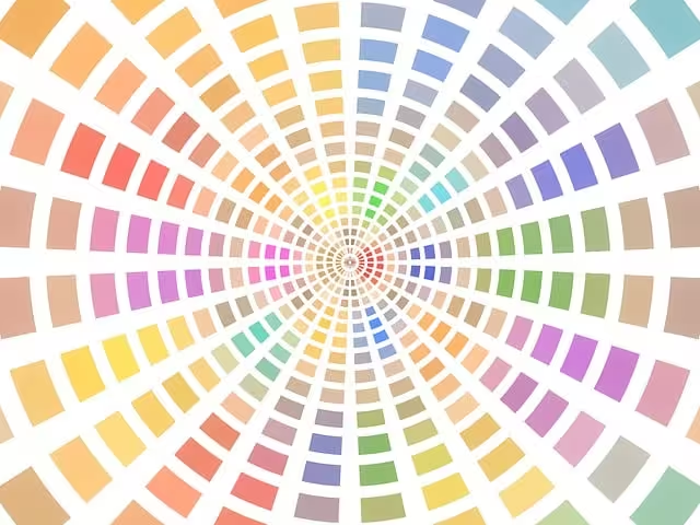
Color is the physical body of your room’s atmosphere. It is the most dominant visual element, capable of making a space feel larger, smaller, warmer, or cooler. To use it effectively, you must understand its three main properties: its temperature (warm or cool), its saturation (intensity), and its value (lightness or darkness).
Warm vs. Cool Palettes: The Emotional Temperature of a Room
Colors are generally divided into two categories: warm and cool. This distinction is the primary driver of a room’s emotional atmosphere.
Warm colors include reds, oranges, yellows, and any color with these undertones, like beige or creamy off whites. These colors are often described as “advancing” because they appear to come forward, making a space feel cozier and more intimate. They are excellent for creating a social, welcoming, and energetic atmosphere. A dining room painted in a warm terracotta or a deep gold can feel lively and inviting, encouraging guests to gather and talk. A living room with warm wood tones and a rich, rust colored accent wall creates an atmosphere of comfort and security, a perfect place to relax.
Cool colors, on the other hand, include blues, greens, and purples. These colors are “receding,” meaning they tend to make a space feel more open, airy, and larger than it actually is. They are ideal for crafting a calm, serene, and focused atmosphere. A bedroom painted in a soft, dusty blue can promote restfulness and tranquility. A bathroom in a pale seafoam green can feel clean, fresh, and spa like. An office with cool gray walls can provide a clean, non distracting background conducive to concentration. The choice between a warm or cool palette is the first and most important decision you will make in defining the overall atmosphere of the room.
Saturation and Value: The Volume Controls for Color
The temperature of a color sets the general mood, but its saturation and value fine tune the atmosphere. Saturation refers to the intensity or purity of a color. A highly saturated color is vibrant and bold, like a fire engine red. A desaturated, or low saturation, color is more muted and subtle, like a dusty rose. High saturation colors inject energy and excitement into a space, but they can be overwhelming if used too broadly. They are best used as accents to create a dynamic atmosphere. Low saturation colors, however, are perfect for creating a soft, sophisticated, and peaceful atmosphere.
Value refers to the lightness or darkness of a color. A light value color, like pale yellow, reflects more light and can make a room feel brighter and more spacious. A dark value color, like navy blue, absorbs more light and can make a room feel more dramatic, intimate, and secure. A room with dark walls and deep colors creates a cozy, enveloping atmosphere, often described as a “jewel box.” This can be perfect for a library, a den, or a media room where you want the atmosphere to be immersive and focused inward.
Developing a Cohesive Palette: The 60-30-10 Rule
To prevent a room from feeling chaotic, designers often use a simple framework called the 60-30-10 rule. This provides a balanced way to distribute color and build a harmonious atmosphere.
- 60% is your dominant color. This is the main color for the space, likely used on the walls. It sets the foundation for the room’s atmosphere.
- 30% is your secondary color. This color should support the dominant color. It is typically used for furniture, curtains, or an accent wall.
- 10% is your accent color. This is the boldest color, used sparingly on things like pillows, artwork, or decorative objects. It adds personality and visual interest.
For example, to create a calm and natural atmosphere in a living room: 60% might be a soft, desaturated green on the walls. 30% could be a neutral beige for the sofa and chairs. The final 10% might be a deep rust or ochre color used in throw pillows and a piece of art to add a pop of warmth and visual energy. This simple rule ensures that the color palette feels intentional and contributes effectively to the desired atmosphere.
The Medium of Light: Illumination as a Design Tool
If color is the body of a room’s atmosphere, light is its lifeblood. Light brings color to life, defines shapes, and dictates how we function within a space. Without a proper lighting plan, even the most perfectly chosen color palette will fall flat. A truly effective lighting scheme is not about a single, bright overhead fixture. Instead, it involves using three distinct layers of light that work together to create a functional, flexible, and compelling atmosphere.
1. Ambient Lighting: The Foundation of Light
Ambient light is the general, overall illumination of a room. It is the base layer upon which everything else is built. Its purpose is purely functional: to provide enough light to see and move around safely. This light typically comes from ceiling fixtures like chandeliers or flush mounts, recessed pot lights, or even natural light from windows during the day. While its main job is function, the quality of the ambient light sets the baseline for the room’s atmosphere. A harsh, fluorescent overhead light creates a sterile, institutional atmosphere, while a warm, diffused light from a central fixture creates a much more welcoming background atmosphere.
2. Task Lighting: Light for a Purpose
Task lighting is exactly what it sounds like: focused light directed at a specific area to help you perform a task. This is the most practical layer of lighting. Examples include a desk lamp for working, under cabinet lights in a kitchen for food preparation, a reading lamp beside a chair, or vanity lights around a bathroom mirror. Task lighting should be brighter and more focused than ambient light, but it should not create harsh glare.
The key is to illuminate the task area without creating uncomfortable bright spots in the person’s field of vision. A well placed task light not only improves functionality but also contributes to the room’s atmosphere by creating focused pools of light, which adds a sense of purpose and intimacy to a specific zone within the larger space.
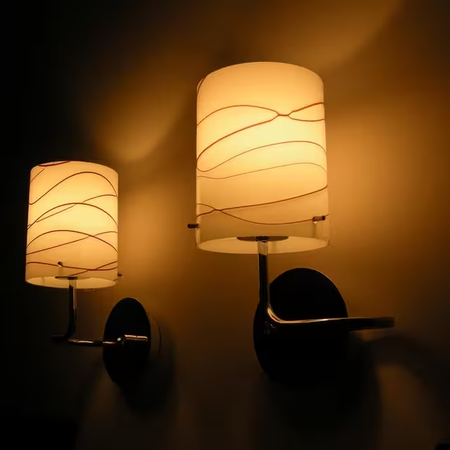
3. Accent Lighting: The Artistic Layer
Accent lighting is the layer that creates drama, sophistication, and visual interest. This is where you truly shape the atmosphere of a room. The purpose of accent lighting is to highlight specific features: a piece of artwork, a textured stone fireplace, an architectural detail, or even a houseplant. It is typically at least three times brighter than the ambient light around it to create a noticeable contrast. This can be achieved with track lighting, wall mounted picture lights, or uplights placed on the floor behind a plant or piece of furniture.
Accent lighting works by drawing the eye and creating a hierarchy of importance in the room. It guides a person on what to look at and adds depth and dimension. A room with only flat, ambient light can feel boring and one dimensional. Adding accent lighting introduces shadows and highlights, which are essential for a rich and dynamic atmosphere.
Technical Specifications That Matter
To choose the right lighting, you need to understand two key technical terms: the Color Rendering Index (CRI) and Lumens.
The Color Rendering Index (CRI) is a scale from 0 to 100 that measures how accurately a light source reveals the true colors of objects. Natural sunlight has a CRI of 100. For interior spaces, you should always look for light bulbs with a CRI of 90 or higher. A low CRI light can make colors look dull, washed out, or even change their hue entirely. That beautiful deep blue paint you chose might look muddy and gray under a low CRI light. A high CRI is essential for creating a natural, vibrant, and pleasing atmosphere where colors appear as they were intended.
Lumens measure the total amount of visible light produced by a source. In simple terms, it is a measure of brightness. Different areas require different lumen levels. A kitchen work area might need high lumens for safety and visibility, while a living room generally requires lower lumens to create a more relaxed atmosphere. The advantage of modern lighting is that many fixtures and bulbs are dimmable, allowing you to adjust the lumen output to change the atmosphere of the room on demand.
Synthesis: The Dynamic Interaction of Color and Light
The true artistry of creating an atmosphere lies not in choosing color or light independently, but in understanding how they interact. A light source does not just illuminate a color; it fundamentally changes it. The color temperature of your light bulb, measured in Kelvin (K), is the critical variable in this interaction.
A warm light bulb (around 2700K) emits a yellowish glow. When this light hits a warm colored wall, like a beige or yellow, it enhances its warmth and richness, creating a very cozy atmosphere. However, if that same warm light hits a cool blue wall, it can neutralize the blue, making it appear slightly greenish or even dull. Conversely, a cool light bulb (4000K or higher) emits a crisp, white or bluish light. This light will make cool colors appear vibrant and true, but it can make warm colors look washed out and stark.
This is why you must always test paint colors in the room they will be used in, under the exact lighting conditions you plan to have. Here is how to apply this synthesis to create a specific atmosphere in different rooms:
Crafting a Welcoming Living Room Atmosphere
The living room is a multi functional space, so its atmosphere should be flexible. Start with a foundation of warm ambient light (around 2700K-3000K) from dimmable ceiling fixtures. This creates a comfortable and inviting base atmosphere. For color, consider a mid-tone neutral on the walls, like a warm gray or beige, which provides a versatile backdrop. Layer in task lighting with floor lamps or table lamps beside seating areas for reading. Finally, use accent lighting with a slightly higher CRI to highlight artwork or architectural features. This layered approach allows you to adjust the lighting to create an intimate atmosphere for a quiet evening or a brighter, more social atmosphere for entertaining guests.
Building a Functional and Social Kitchen Atmosphere
A kitchen requires a balance between a functional and a social atmosphere. The primary need is for clear, bright light in work areas. Use high CRI, neutral-to-cool task lighting (around 3500K-4000K) under cabinets and over the island. This ensures you can see colors accurately when cooking. For the general ambient light, you can use a slightly warmer temperature to make the space feel less clinical.
If the kitchen includes a dining area, use a separate, dimmable pendant light with a warm bulb over the table to create a more intimate dining atmosphere, distinct from the functional work zones. The color palette should be durable and clean, but you can add warmth with a backsplash tile or cabinet color to enhance the welcoming atmosphere.
Designing a Serene Bedroom Atmosphere
The atmosphere of the bedroom should be dedicated to rest and relaxation. This is where controlling light to support your circadian rhythm is most important. All lighting should be warm (2700K or lower) and dimmable. Avoid any cool-toned lights, as they can interfere with sleep. For colors, choose desaturated and calming tones like soft blues, greens, or muted earthy colors. Bedside lamps for reading provide necessary task lighting, but they should have shades that diffuse the light softly. The goal is to create a peaceful, cave like atmosphere that signals to your body that it is time to unwind. A dark, low contrast atmosphere is ideal for promoting sleep.
Advanced Strategies: Dynamic Lighting and Textural Play
Once you have mastered the basics, you can introduce more sophisticated techniques to further refine your room’s atmosphere.
Modern technology has made dynamic lighting more accessible. “Tunable” or smart lighting systems allow you to change both the intensity (lumens) and the color temperature (Kelvin) of your lights throughout the day using an app or a schedule. You can program your lights to be cool and bright in the morning to help you wake up, and then gradually warm and dim throughout the evening to prepare you for sleep. This is the ultimate way to create an atmosphere that is perfectly aligned with your natural biological rhythms.
Furthermore, do not be afraid of shadows. A common mistake is to try to eliminate all shadows with flat, even lighting. This creates a boring and sterile atmosphere. A sophisticated atmosphere uses contrast. By carefully placing accent lights, you can create deliberate shadows that add depth, mystery, and visual interest to a room. Think of how a spotlight on a sculpture creates dramatic shadows behind it; this same principle can be applied to your home.
Finally, consider how light interacts with the materials and textures in your room. A glossy surface will reflect light sharply, creating bright highlights and a more energetic atmosphere. A matte surface, like a linen curtain or a flat paint finish, will diffuse light softly, contributing to a calmer, more gentle atmosphere. A rough texture, like a stone wall or a thick rug, will catch the light in interesting ways, creating subtle patterns of light and shadow when grazed by an accent light. Using a variety of textures is a subtle but powerful way to enrich the visual atmosphere of any space.
Conclusion: Your Space as a Curated Experience
Creating a memorable atmosphere is not a result of chance; it is the result of intentional design choices rooted in science. By understanding the core principles of human perception, you can transform any space from a simple container for furniture into a curated experience. Remember the foundational pillars: use color and light to appeal to our innate psychology and biology, build your illumination in three distinct layers (ambient, task, and accent), and always consider the critical interaction between the color of your light and the color of your surfaces.
Your actionable takeaway is this: choose one room in your home and analyze it tonight. Identify the existing layers of light. What is providing the ambient light? Is there any task lighting? Is anything being accented? Consider how a single, simple change—perhaps swapping a cool, bright bulb for a warm, dimmable one, or adding a small, inexpensive uplight behind a plant—could fundamentally shift the entire atmosphere of that space. You hold the power to engineer not just how your home looks, but how it feels. A truly successful space has an atmosphere that supports and enhances your life, creating a background of comfort, focus, or tranquility.