It is a well-documented observation that color can improve brand recognition by up to 80%. This figure presents a critical question for any organization: is the selection of a brand’s color palette an arbitrary aesthetic choice, or is it a calculated strategic decision? Far too often, organizations select their core colors based on the subjective preferences of leadership, failing to leverage the predictable psychological impact that it has on consumer perception, emotion, and ultimate purchasing decisions.
This article provides a systematic framework to deconstruct this phenomenon. We will analyze the psychological, cultural, and deep biological drivers; including the essential principles of biophilic design that govern how color choices for branding and consumer behavior are inextricably linked. The objective is to move beyond preference and into a methodology for building a more resonant and effective brand identity.
Table of Contents
The Neuro-Psychological Foundation of Color Perception
Before one can strategically apply color, it is necessary to understand how it functions as a form of non-verbal communication. The human response to it is not a modern invention; but is rather a deeply ingrained system of survival and interpretation that has been refined over millions of years of evolution. Our reactions are immediate, subconscious, and incredibly powerful.
The Biology of Sight
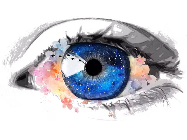
Our perception of color begins in the eye. The back of the eye, called the retina, is lined with millions of specialized nerve cells. There are two main types: rods and cones. Rods are excellent at detecting light and shadow, helping us see in dim conditions. Cones are the cells that detect color. Most humans have three types of cones, each one sensitive to a different wavelength of light: red, green, and blue. When light from an object hits our eyes, these cones send a complex signal to our brain, which then interprets that signal as a specific color. This entire process happens almost instantly, without any conscious thought.
The Brain’s Interpretation
That signal does not just stop at identifying “blue” or “red.” It travels to different parts of the brain, most notably the limbic system. The limbic system is often called the “emotional brain” because it’s responsible for our feelings, memories, and basic drives. This is why color can trigger an emotional response before our logical brain, the neocortex, even has a chance to process it. Red might make us feel a rush of excitement or a sense of alarm, while a soft blue can have a calming effect. These reactions are tied to a lifetime of learned associations and, more profoundly, to the evolutionary programming that helped our ancestors survive.
Evolutionary Psychology & Biophilia
Biophilia is the concept that humans possess an innate tendency to seek connections with nature and other forms of life. Our brains evolved in the natural world, and for millennia, correctly interpreting the colors of our environment was a matter of life and death. This ancient “software” is still running in our modern brains.
- Green and Brown: Green and brown signal the presence of life, vegetation, water, and shelter. A lush green landscape meant food and safety. This is why these colors often make us feel a sense of peace, health, and security. It is the color of prospect and refuge.
- Blue: The blue of a clear sky meant good weather and the color of a clean water source meant survival. This creates a deep-seated association between blue and feelings of stability, openness, and calm reliability.
- Red and Yellow: These were nature’s high-alert colors. They signaled ripe fruit and nutritious flowers, a valuable source of energy. However, they also signaled danger: fire, the markings of venomous animals, and the color of blood. This dual association is why red can mean both passion and excitement, but also warning and urgency.
Key Academic Concepts
Science has given names to some of these predictable effects. Understanding them allows us to apply color with greater precision.
- The Isolation Effect (Von Restorff effect): This principle states that an item that stands out is more likely to be remembered. In design, this means that if you have a webpage that is mostly blue and gray, a bright orange “Buy Now” button will not only draw the eye but will also be more memorable. The color isolates the item from its surroundings, signaling its importance to the brain.
- Affective-Congruence Theory: This concept suggests that we feel more positive about a product when its color “makes sense” for what it is. For example, a cleaning product packaged in a clean, crisp white or blue bottle feels more appropriate and trustworthy than one in a muddy brown bottle. A brand promising an all-natural, organic product aligns with consumer expectations when it uses earthy greens and browns, reinforcing its message of authenticity.
A Chromatic Analysis of Primary and Secondary Colors in Branding
With a foundational understanding of why colors affect us, we can now examine the specific meanings and applications of the most common colors used in branding. Each one carries a distinct portfolio of associations that can be leveraged to shape consumer behavior.
Blue: Trust and Stability

- Psychological Associations: Competence, logic, security, trust, calmness, integrity.
- Consumer Behavior Impact: Blue is not impulsive. It makes consumers feel secure and encourages high-consideration purchases. It suggests that a company is reliable and professional. Because it is calming, it can make a user’s experience on a website feel less stressful.
- Industry Applications: Technology (Dell, IBM, Intel), Finance (American Express, Chase, PayPal), Healthcare (Blue Cross Blue Shield), and large corporations (Ford, General Electric). These industries rely on establishing long-term trust with their customers.
- Biophilic Connection: Blue is an element of the two most vast and constant parts of our world: the sky and the ocean. These elements represent stability, infinite possibility, and life-giving resources. This connection gives it an innate sense of dependability and clarity.
Red: Energy and Urgency

- Psychological Associations: Passion, energy, excitement, action, love, but also danger, warning, and aggression.
- Consumer Behavior Impact: Red creates a sense of urgency. It is highly visible and has been shown to increase heart rate. This makes it extremely effective for clearance sales, impulse buys, and calls-to-action like “Order Now” or “Click Here.” It is also known to stimulate appetite.
- Industry Applications: Food and Restaurant (Coca-Cola, McDonald’s, KFC, Lay’s), Entertainment (Netflix, YouTube), and Retail (Target, CVS) for sales and promotions.
- Biophilic Connection: In nature, red acts a primary signal. It is the color of ripe, energy-rich berries and fruits, attracting us to a food source. It is also the color of fire and blood, universal signals for immediate attention and caution. Our brains are hardwired to notice and react to red above almost any other color.
Green: Growth and Health

- Psychological Associations: Nature, health, growth, harmony, freshness, wealth, restoration.
- Consumer Behavior Impact: Green is the easiest color for the eye to process, creating a sense of balance and calm. It is used to relax customers. In marketing, it strongly implies that a product is natural, healthy, or environmentally friendly. It is also associated with money and affluence.
- Industry Applications: Health and Wellness (Whole Foods, Herbal Essences), Environmental/Energy (BP, Animal Planet), and Finance (TD Bank, Fidelity).
- Biophilic Connection: Green is the color of life itself. It represents foliage, forests, and thriving ecosystems. A green environment signals to our ancient brain that resources are plentiful and the area is safe for life. This connection evokes deep feelings of well-being, peace, and restorative calm.
Yellow: Optimism and Attention

- Psychological Associations: Happiness, optimism, warmth, cheerfulness, intellect, but also caution and anxiety in large amounts.
- Consumer Behavior Impact: Yellow is excellent at grabbing attention. Like red, it’s highly visible. It can create a sense of fun and friendliness. However, too much yellow can create feelings of anxiety, as it is also used for warning signs. It should be used strategically as an accent color.
- Industry Applications: Food (McDonald’s arches, Denny’s), Automotive (Ferrari, Shell), and Logistics (DHL, Sprint). It is used to signal speed, affordability, and to catch the eye from a distance.
- Biophilic Connection: Yellow is the color of the sun, the ultimate source of life, light, and warmth. It is also the color of many flowers, which signal a healthy ecosystem and the coming of fruit. This connection gives yellow its powerful association with energy, positivity, and clarity.
Orange: Friendliness and Action
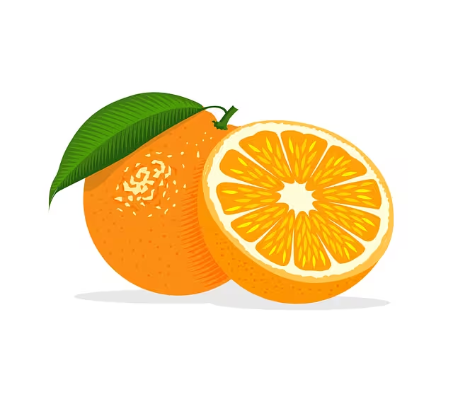
- Psychological Associations: Confidence, enthusiasm, friendliness, creativity, adventure. It combines the energy of red with the cheerfulness of yellow.
- Consumer Behavior Impact: Orange is a fantastic color for calls-to-action (CTAs). It suggests action, affordability, and confidence without being as aggressive as red. It makes a brand feel approachable and fun.
- Industry Applications: E-commerce (Amazon’s “Buy Now” button), Children’s Brands (Nickelodeon), and brands wanting to project a sense of vibrant energy (Fanta, Harley-Davidson).
- Biophilic Connection: Orange is the color of sunsets, citrus fruits, and autumn leaves. It signals change, vitality, and a source of nourishment and energy. It is a warm, inviting color that feels both comforting and stimulating.
Purple: Creativity and Wisdom

- Psychological Associations: Royalty, luxury, wisdom, creativity, spirituality, imagination.
- Consumer Behavior Impact: Purple suggests high quality and creativity. It is often used for high-end products or services that want to appear unique and imaginative. It can also be used to target a younger, more creative audience.
- Industry Applications: Luxury goods (Cadbury, Hallmark), Cosmetics (Urban Decay), and creative/tech platforms (Yahoo!, Twitch).
- Biophilic Connection: Historically, purple dye was rare and expensive, made from a specific type of sea snail, which is why it became associated with royalty. In nature, purple is found in exotic flowers like orchids and lavender, and in the twilight sky. These are rare, beautiful, and slightly mysterious phenomena, lending the color its sense of specialness and wonder.
Black: Sophistication and Power

- Psychological Associations: Power, elegance, authority, sophistication, luxury, mystery.
- Consumer Behavior Impact: Black is used to market luxury products and high-end brands. It creates a sense of drama and seriousness. A design that uses a lot of black feels weighty, important, and classic.
- Industry Applications: Luxury Fashion (Chanel, Prada), High-End Technology (Apple), and premium services.
- Biophilic Connection: Black is the color of the night sky, deep caves, and rich soil. It represents the unknown, the foundational, and the powerful forces of the universe. In design, it acts as a powerful contrast, making other colors appear brighter and more vibrant.
White/Gray: Simplicity and Modernity

- Psychological Associations: Cleanliness, simplicity, modernity, neutrality, balance.
- Consumer Behavior Impact: White space is a critical element in design. It gives other elements room to breathe and creates a feeling of calm and order. It is associated with modern, minimalist brands. Gray is a mature, neutral color that can convey balance and professionalism.
- Industry Applications: Technology (Apple), Healthcare (for its association with cleanliness), and any brand aiming for a minimalist and sophisticated aesthetic.
- Biophilic Connection: White is the color of clouds, snow, and bright sunlight, suggesting purity, clarity, and new beginnings. Gray is the color of stone, rock, and stormy skies—elements that are enduring, solid, and balanced.
Brown: Earthiness and Reliability
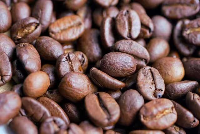
- Psychological Associations: Earth, nature, ruggedness, reliability, comfort, simplicity.
- Consumer Behavior Impact: Brown conveys a sense of being down-to-earth, honest, and durable. It is perfect for brands that want to be seen as organic, natural, or dependable.
- Industry Applications: Organic Foods, Outdoor/Rugged Brands (Carhartt), and Delivery Services (UPS, which built its brand around brown’s reliability).
- Biophilic Connection: Brown is perhaps the most biophilic color, making up earth, wood, and soil. It is the foundation of life and growth. This gives it an unparalleled sense of stability, authenticity, and natural comfort.
Strategic Implementation – Building a Cohesive Brand Palette
Knowing the meaning of individual colors is only the first step. The true mastery lies in combining them into a strategic palette that tells a cohesive brand story.
Context is Determinative
There is no single “best” color for branding. The right choice is entirely dependent on context.
- Cultural Variance: Before choosing a color, you must understand your target market. In Western cultures, white is for weddings and purity. In many Eastern cultures, it is the color of mourning. Red is a color of luck and prosperity in China, while in South Africa it is associated with mourning.
- Demographic Targeting: Different age groups and genders can have different color preferences. A brand targeting young children might use bright, primary colors, while a brand targeting serious professionals would likely use a more subdued palette of blues, grays, and blacks.
- Competitive Analysis: Look at the color palettes of your direct competitors. You have two choices: align with the industry standard (e.g., using blue as a tech company to signal you are trustworthy) or deliberately choose a different color to stand out from the competition.
The 60-30-10 Rule in Digital Design
A simple and effective framework for creating a balanced color palette is the 60-30-10 rule, borrowed from interior design.
- 60% Dominant/Base Color: This is the main color of your brand and will take up the most visual space on your website or materials. It sets the overall tone.
- 30% Secondary/Accent Color: This color is used to create contrast and visual interest. It supports the dominant color but is different enough to be distinct.
- 10% Call-to-Action (CTA) Color: This is a complementary, high-contrast color used for the most important elements you want users to notice, like buttons, links, and key highlights.
The Biophilic Design Palette: Leveraging Nature’s Harmony
Instead of starting with a digital color wheel, a more intuitive and effective method is to draw inspiration directly from nature. Natural environments have color palettes that are inherently balanced and harmonious because they have evolved over millennia. This approach reduces the cognitive load on the viewer, making the design feel more natural and pleasant.
- Example 1: A Coastal Palette. For a spa or wellness brand, you could use a palette from a beach scene: soft sandy beige (60%), the deep blue of the water (30%), and the bright white of sea foam or a coral accent for your CTA (10%).
- Example 2: A Forest Palette. For an outdoor gear company, you could use a palette from a forest: the deep brown of tree bark (60%), the rich green of leaves (30%), and the bright yellow of a wildflower for your CTA (10%).
Digital Application, A/B Testing, and Accessibility
In the digital world, color is not just an aesthetic choice; it is a functional tool that directly impacts user experience and conversion rates.
Color Choices for Calls-to-Action (CTAs)
The goal of a CTA button is to get a user to perform a specific action.1 The most important factor for a CTA color is not a specific hue, but contrast. Your CTA button must stand out from the rest of the page. This is where the Isolation Effect is put into practice. If your site is predominantly green, a red or orange button will be far more effective than a slightly different shade of green or a muted blue.
A/B Testing and Data Validation
Never assume your color choices are optimal. The only way to know for sure is to test them. A/B testing is a simple method where you show two versions of a page to different groups of users to see which one performs better.
- Example: You could test a red “Sign Up” button against a green “Sign Up” button. After showing each version to 1,000 visitors, you might find that the red button resulted in 100 sign-ups (a 10% conversion rate) while the green one resulted in 80 sign-ups (an 8% conversion rate). This data provides clear evidence that red is the more effective color for that specific action on your site.
Accessibility is Non-Negotiable (WCAG)
A brand’s color choices reflect its values. A website that is difficult to use for people with visual impairments, such as color blindness, is not only losing customers but is also sending a message that it is not inclusive. The Web Content Accessibility Guidelines (WCAG) provide clear standards for color contrast. The text on your site must have enough contrast with its background to be easily readable. Using online contrast checkers is a simple but critical step in ensuring your website is usable by everyone. This is not just a compliance issue; it is a mark of a competent, professional, and empathetic brand.
Conclusion: Color as a Conscious, Data-Informed Decision
The journey from the biological perception of light to a customer clicking “buy” is deeply influenced by the silent language of color. We have seen that the most powerful color choices for branding and consumer behavior are never accidental. They are born from an understanding of human psychology, they are validated by measurable data, and for maximum innate appeal, they are grounded in the biophilic patterns our brains have been wired over millennia to recognize, trust, and appreciate. By moving beyond simple preference and adopting a strategic, systematic approach, color can be transformed from a mere decorative element into one of the most powerful tools in building a resonant, memorable, and effective brand.