Take a quick scroll through a few of your favorite websites. What do you see? A whole lot of boxes, right? Buttons, search bars, content blocks… it’s a world of sharp, predictable rectangles that all looks the same from site to site. While functional, there’s something inherently sterile about it all. It can create this low-grade, nagging feeling that you’re interacting with a machine, not a space built for a human. That subtle disconnect is what we’re here to discuss and fix.
Now consider, when most people hear “biophilic design,” their minds jump to the big stuff: sprawling forest backgrounds, leafy green color schemes, or maybe a nice photo of a plant. That’s all part of it, but the real magic often happens on a much smaller scale. Here we are going to zoom way in, past the general layout, and focus on the single most important point of interaction on any page: the button. This is say we are sweating the smaller stuff.
Forget what you think you know about just rounding the corners. This is your complete guide to the why, the what, and the how of nature-inspired buttons. We’ll dig into the psychology of why organic shapes simply feel better to us, explore concrete design concepts, and even get into the code that brings it all to life. My goal is to show you how transforming this tiny element can fundamentally improve your website’s user experience and, yes, even get more people to click, literally.
Table of Contents
The ‘Why’: The Psychophysiological Impact of Natural Forms
To begin, why do we want to design buttons following a natural theme. To answer, we must understand the subconscious human response we are leveraging, which has its roots in biophilia. If you have read previous posts, you should be well familar with this term, and is an integral part of the websites we design here at Silphium. However, if you are just learning about his concept, a brief definition is below, and how it can be applied to buttons.
The Biophilia Hypothesis: Our Innate Need for Nature
The term “Biophilia,” popularized by biologist Edward O. Wilson, posits that humans possess an innate, genetically determined tendency to seek connections with nature and other forms of life. For hundreds of thousands of years, our survival depended on interpreting natural patterns. This deep-seated programming doesn’t vanish when we look at a screen. A website filled with hard, artificial geometry is, on a subconscious level, an environment devoid of life. By incorporating natural forms, even in a micro-element like a button, we are satisfying a deep-seated psychological need, making the user feel more comfortable, secure, and at home in the digital space.
Cognitive Fluency & Reduced Digital Stress
Cognitive fluency is the ease with which our brains process information. Environments and objects that are easy to process feel safer and more pleasant. In nature, sharp, geometric lines often signify danger—a shard of rock, a thorn, the teeth of a predator. Conversely, soft, organic curves and patterns signal safety and non-threats—a smooth river stone, a gentle hill, the edge of a leaf.
A standard rectangular button requires more cognitive effort to process as a “safe” element than one with softened, organic edges. By designing buttons that align with these natural archetypes, we reduce the user’s subconscious cognitive load. This lowers digital fatigue and creates a more seamless, less stressful user experience.
From Psychology to Performance: The Data-Driven Case
The benefits are not merely theoretical; they translate directly into key performance indicators (KPIs).
- Increased Engagement: A visually intriguing, natural-feeling button invites curiosity and interaction. It stands out from the sea of uniformity, encouraging users to engage with it, leading to increased time on page and deeper exploration of the site.
- Higher Click-Through Rates (CTR): A button is a call-to-action. An action is more likely to be taken if the prompt is appealing. By reducing subconscious friction and increasing visual appeal, a biophilic button is fundamentally more persuasive, which can be measured through A/B testing as a direct uplift in CTR.
- Improved Brand Perception: A website that utilizes biophilic design communicates a specific set of values. The brand is perceived as more thoughtful, human-centric, authentic, and potentially more sustainable or ethical. This builds brand equity and trust with the user.
The ‘What’: A Taxonomy of Nature-Influenced Buttons
So far we have talked about the theory. Now we get into the “what,” which is the application. Here, we will be deconstructing how natural elements can be translated into a design system for buttons.
Element 1: Form and Shape – Moving Beyond the Circle
The most immediate way to signal “natural” is through form. This requires moving beyond the simple border-radius property that creates pills and circles. Think instead of the imperfect symmetry found in nature.
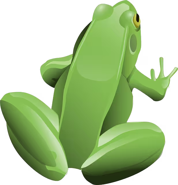
- Pebble/Stone: Asymmetrical, softly rounded shapes that feel smooth and weighted.
- Leaf: Shapes with a clear stem-side and tip, often with subtle curves or points. Excellent for dropdowns or tabbed navigation.
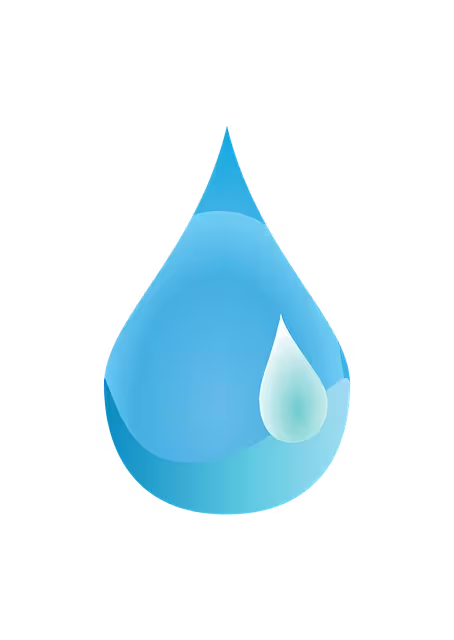
- Water Droplet: A combination of a curve and a soft point, creating a sense of fluidity and potential energy.
- Cellular/Honeycomb: Using hexagons or other tessellating organic shapes can create a structured yet natural-feeling grid of buttons or links.
These shapes can be achieved using advanced CSS like clip-path or by using SVG files as button backgrounds or masks.
Element 2: Texture and Materiality – Adding Tactile Depth
A flat color button feels digital. A button with texture feels like something you could touch. This simulated tactility adds a rich layer of realism. Using subtle CSS gradients, noise filters, or background images, we can evoke:
- Stone or Slate: A matte finish with subtle variations in color and a fine-grained texture.
- Wood Grain: Achieved with linear gradients that mimic the lines and rings of wood.
- Water Surface: Translucent effects, soft highlights, and subtle distortion can make a button feel like a pool of water.
- Leaf Veins or Parchment: Fine, organic lines overlaid on a base color to give a sense of internal structure or aged material.
Element 3: Color and Light – Painting with a Natural Palette
Biophilic color is not just shades of green and brown. It is about studying and replicating the complex color relationships found in nature.
- Natural Palettes: Draw inspiration from specific biomes: the muted earth tones of a desert, the vibrant blues and corals of a reef, the deep greens and ochres of a forest floor.
- Gradients Over Flat Color: Very few things in nature are a single, flat color. Use subtle
linear-gradientorradial-gradienteffects to show how light interacts with the object, giving it volume and life. - Dappled Light and Soft Shadows: Instead of a harsh, black
box-shadow, use soft, colored shadows to suggest the button is being lit by a natural light source. An overlay of a low-opacity, blurred pattern can mimic the effect of dappled light filtering through leaves.
Element 4: Animation and Feedback – Creating Living Micro-interactions
Animation is how you make a button feel alive. The hover and click states are opportunities to provide feedback that reinforces the natural metaphor.
- :hover State: The user’s cursor approaching the button can trigger a gentle, anticipatory effect. A slow “pulse,” a soft glow, or a slight lift (via
transform: translateY) as if the object is floating up to be picked. - :active State: The moment of the click should provide satisfying confirmation. A “ripple” effect emanating from the click point is a perfect biomimetic response. Alternatively, the button could appear to press down into the page with a darker, inset shadow.
The ‘How’: Technical Implementation and Code

This section provides the technical framework for developers to execute the designs discussed above.
Foundational HTML: The Semantic <button>
Always begin with the correct semantic element. For any action that triggers a change within the current page (e.g., submitting a form, opening a modal, playing a video), use <button>. For navigation to a new URL, use an <a> tag styled as a button. Using <button> ensures built-in accessibility for screen readers and keyboard navigation.
CSS for Organic Buttons: The Core Techniques
- Asymmetrical
border-radius: To create a pebble shape, use the multi-value syntax:border-radius: 40% 60% 70% 30% / 50% 70% 30% 50%;. This defines the horizontal and vertical radii for each corner independently. clip-pathfor Complex Shapes: For a leaf or wave shape, theclip-pathproperty is superior. It creates a mask around your element. Example:clip-path: polygon(0% 20%, 60% 0%, 100% 40%, 80% 100%, 20% 80%);.- Shadows & Gradients for Texture: Combine multiple
box-shadowvalues (includinginsetshadows) to create soft depth. Uselinear-gradientwith multiple color stops to simulate texture and lighting. transform&transitionfor Animation: Smoothly animate the hover and active states. Apply atransition: transform 0.3s ease-in-out;to the base button class, then change thetransformproperty on hover, for example:.btn:hover { transform: scale(1.05); }.
The SVG Advantage: For Ultimate Control and Scalability
When CSS becomes too restrictive for the desired shape, Scalable Vector Graphics (SVG) is the optimal solution. An SVG can be created in any vector editor (like Illustrator or Inkscape) to be the exact organic shape you need. It can then be used as a background image, an inline element, or a mask. SVGs are infinitely scalable without losing quality and their internal paths can be animated, offering the highest degree of creative control. In short, SVGs offer design freedom and performance that you cannot get from standard CSS or pixel-based images like PNGs.
What Exactly is an SVG?
An SVG is an image format, but unlike a JPG or PNG, which are made of pixels (a grid of tiny dots), an SVG is made of code. It’s an XML-based markup language that describes shapes using mathematical points, lines, and curves. Another to think of it is:
- A PNG is like a photograph. If you zoom in too far, you see the individual pixels and resulting in a blur.
- An SVG is like blueprint. It contains instructions like “draw curve from this point to that point.” Because of it being an instruction set, you can scale it to any size, from a tiny icon to a giant billboard, and it will remain perfectly sharp and clear. You can also more accurately portray the shape you want.
Why SVGs are Ideal for Biophilic Buttons
For creating organic shapes like leaves, stones, or water splashes, SVGs offer several distinct advantages over other methods including:
- Unlimited Shape Complexity: While CSS tools like, clip-path, are useful for simple polygons, they become incredibly complex for detailed, curved shapes. With an SVG, any shape you can draw, you can use. You can create a button that looks like a detailed oak leaf, a spiraling seashell, or a jagged crystal, with a level of precision that CSS can’t match.
- Perfect Scalability and Responsiveness: This is the key feature of SVGs. A biophilic button made from an SVG will look amazingly crisp on any screen. Whether it’s a small mobile device or a large 4k desktop monitor, the image will never appear pixelated to lose quality. This guarantees that your website look its best on any size screen.
- Small File Sizes and Performance: Because SVGs are just text based code, they often have very small file sizes, compared to a high-resolution PNG or JPG of the same visual complexity. The result, is that smaller files sizes have faster page load times, which are essential for user experience and search engine optimization (SEO).
- SVGs Can Still be Styled and Animated with CSS: When SVG code is placed directly in HTML (inline SVG), you can target parts of the SVG with CSS just like any other HTML element. This opens up a world of creative possibilities for micro-interactions. For instance:
- You could make the veins of a leaf button glow on hover.
- You could make a water-droplet ripple with a gradient animation on click.
- You could change the fill (color), stroke (outline), and opacity based on user interaction (:hover, :focus).
A Practical Workflow for Using an SVG Button
Below is an easy process to create and implement an SVG button.
- Create the Shape: Use a vector design program like Adobe Ilustrator, Figma, or the free alternative, Inkscape to draw your desired organic shape (e.g. a smooth, asymmetrical pebble). Export the final design as an .svg file.
- Optimize the SVG: Raw SVG code from design programs often contains unnecessary metadata and junk code. It is critical to clean it up. Use a free online tool like SVGOMG to optimize the file, which will make it smaller and cleaner.
- Implement as an Inline SVG: This is the most flexible method. Open the optimized .svg file in a code editor, copy the code, and paste it directly inside a <button> tag in your HTML. This allows CSS to directly style it. The code below is an example of a pebble-shaped button:
Here is a simplified code example of a pebble-shaped button:
HTML
<button class="biophilic-btn" aria-label="Submit">
  <svg viewBox="0 0 106 38" fill="none" xmlns="http://www.w3.org/2000/svg">
    <path d="M96.953 37.194C84.734 40.21 44.48-3.004 22.12 1.057 4.14 4.52-6.52 26.66 6.13 32.894c12.65 6.233 78.024 7.32 90.823 4.3z" fill="#A3B18A"/>
  </svg>
  <span class="btn-text">Submit</span>
</button>
CSS
/* CSS for styling and interaction */
.biophilic-btn {
  background: none;
  border: none;
  cursor: pointer;
  position: relative; /* Needed to position text over the SVG */
  padding: 0;
  width: 150px; /* Example width */
}

.biophilic-btn svg {
  width: 100%;
  height: auto;
  transition: transform 0.2s ease-out;
}

.biophilic-btn:hover svg {
  transform: scale(1.05); /* Button grows slightly on hover */
}

/* You can even change the SVG's fill color on hover! */
.biophilic-btn:hover path {
  fill: #588157;
}

.btn-text {
  position: absolute;
  top: 50%;
  left: 50%;
  transform: translate(-50%, -50%);
  color: white;
  font-family: sans-serif;
  pointer-events: none; /* Allows clicks to go through to the button */
}
Practical Application & Best Practices
Theory and technique must be tempered with practical wisdom and a commitment to inclusivity.
Case Study Analysis: Biophilic Buttons in the Wild
- Example 1: A Wellness App – This app could use soft, stone-like buttons for its primary actions (“Begin Meditation,” “Log Entry”). The gentle shape and matte texture would reinforce the brand’s message of calm, grounding, and mindfulness. The hover state could be a slow, soft glow, like a candle being lit.
- Example 2: An Environmental Non-Profit – For their “Donate” and “Get Involved” CTAs, this organization could use buttons shaped like asymmetrical leaves. The click animation could be a quick ripple, symbolizing the donor’s impact. This directly connects the user’s action to the organization’s natural mission.
The Accessibility Imperative: Nature That Includes Everyone
A beautiful design that is unusable is a failed design. Biophilic principles must not compromise accessibility.
- Color Contrast: Natural palettes can be subtle, but text and essential graphics must meet WCAG 2.1 AA contrast ratios (4.5:1 for normal text). Always check your color combinations with a contrast tool.
- Focus States: Keyboard navigators must be able to see where they are. Ensure that the
:focus-visiblestate is clear and robust—a distinct outline or a significant change in the button’s appearance is not optional. - Legibility: If you apply a texture to a button, ensure it is subtle enough that it does not interfere with the readability of the text label on top of it. When in doubt, prioritize legibility.
Context is Key: Matching the Button to the Brand
Finally, these techniques are not a one-size-fits-all solution. The chosen biophilic metaphor must align with the brand’s identity. The playful, pebble-like buttons appropriate for a children’s museum website would feel out of place and unprofessional on the website for a financial consulting firm. The design must always serve the content and the core brand message. A law firm might opt for a very subtle nod to nature, like a button with a texture resembling fine paper or slate, rather than a whimsical leaf shape.
Conclusion: Cultivating a Digital Ecosystem
We have journeyed from the foundational psychology of E.O. Wilson’s Biophilia Hypothesis to the practical syntax of a CSS clip-path. We have deconstructed the elements of the natural world—shape, texture, color, and motion—and explored their translation into the digital medium. The button, therefore, ceases to be a mere functional rectangle; it transforms into a point of connection, a micro-interaction that satisfies a deep-seated human need for the patterns of the living world.
This is not an exercise in ornamentation. It is a strategic decision to build more humane, intuitive, and compelling digital environments. The evidence suggests that by reducing cognitive friction and enhancing visual appeal through these natural forms, we can directly influence user engagement, improve conversion rates, and build a stronger, more authentic brand identity.
The ultimate goal is not to perfectly replicate a stone or a leaf, but to capture its essence—its non-uniformity, its response to light, its inherent lack of sterile perfection. I encourage you to see the web not as a canvas for rigid grids, but as a potential ecosystem. Begin with one element on one project. Change a shape. Soften a shadow. Introduce an organic micro-interaction.
By doing so, we move beyond simply building pages and begin to cultivate digital spaces that feel, fundamentally, more alive.