Beyond Flatland: Creating Digital Prospect & Refuge
There is a fundamental human impulse, an echo from our species’ formation, that quickens the pulse when we stand at the edge of an unknown space. It is the feeling of peering into the deep shade of a forest from a sunlit meadow, the quiet thrill of discovering a hidden cove along a coastline, entering a cave, or the specific curiosity evoked by a geode—a plain, unassuming stone that promises a crystalline cavern within.
This feeling is not mere whimsy; it is a deep-seated cognitive reward for seeking information, finding shelter, and exploring potential. For millennia, our survival depended on our ability to parse such spaces. What if we could translate this ingrained and innate satisfaction into the flat, luminous rectangles that govern so much of our modern lives?
This is the central premise and power of what is known as the ‘cavern reveal’ hover effect in web design. More than a decorative animation; it is a sophisticated technique for manufacturing spatial depth on a two-dimensional plane. A technical definition is required for clarity: the cavern reveal is a user-initiated animation where content layers appear to recede or emerge along a Z-axis, creating an illusion of three-dimensional depth, much like peering into a hollow or chamber. This is functionally and psychologically distinct from a simple fade or slide. Its defining characteristic is the deliberate manipulation of perspective and scale to create a tangible sense of space that invites interaction.
This article will not merely list examples of this trend. Instead, we will dissect ten exemplary cavern reveal effects, analyzing their precise technical execution and, more critically, their profound effectiveness through the integrated lenses of biophilic design and cognitive psychology. We will explore how a few lines of code can tap into millions of years of evolutionary preference to create more engaging, intuitive, and satisfying digital experiences.
Table of Contents
The ‘Why’: Biophilic Principles and UX of the Cavern Effect

Before we analyze specific implementations, we must first establish a theoretical framework. Why is this effect so compelling? The answer lies not in novelty, but in its deep resonance with hardwired human preferences for certain spatial configurations, principles well-documented in the field of biophilic design. The success of the cavern reveal is not accidental; it is a direct consequence of satisfying ancient psychological needs.
Prospect-Refuge Theory in UI
First articulated by the English geographer Jay Appleton in 1975, Prospect-Refuge theory posits that humans have an innate preference for environments where they can see without being seen. ‘Prospect’ refers to an unimpeded view over a landscape, offering access to information and advanced warning of opportunities or threats. ‘Refuge’ refers to a safe, enclosed, and protected space from which to observe that prospect. A cliffside cave overlooking a valley is the archetypal example.
In user interface design, the stable, non-hovered state of a web page is the refuge. It is a known quantity, safe and predictable. The cavern reveal effect, initiated by the user’s cursor, opens a window of prospect. The user, from their position of control (refuge), can peer into a new layer of information (prospect) without committing to a full page load or navigational change. The animation of depth itself—the receding of planes—is a digital metaphor for looking out over a new vista.
This dynamic provides a powerful feeling of control and safety, reducing the cognitive load associated with exploring a website and thereby encouraging deeper engagement. The user is not thrown into a new environment; they are invited to look into it from a secure position.
The Allure of Mystery & Information
A closely related biophilic pattern is ‘Mystery.’ Environments that promise more information, that entice us forward with partially obscured views, are intrinsically more appealing than those that reveal everything at once. A straight, open road is efficient, but a winding path that disappears around a bend is far more alluring. It triggers our exploratory instincts and the promise of discovery.
The cavern reveal is a masterful digital execution of this principle. The content revealed on hover is often partially visible or hinted at, framed by the receding layers of the interface. It doesn’t present a flat data table; it offers a glimpse into a new context. This partial reveal is a promise. It suggests that more valuable information is available just one step further—a click away. This creates a powerful information gradient that pulls the user deeper into the site’s architecture. By not showing everything at once, the design respects the user’s intelligence and engages their curiosity, transforming a simple interaction into a small act of discovery.
Complexity & Order
Finally, the effect leverages the principle of ‘Complexity & Order.’ Humans are drawn to environments that are visually rich and complex, but which also possess an underlying, discernible structure. Think of the complex yet ordered branching of a fern, the intricate patterns of a frost-covered window, or the organized chaos of a forest floor. This combination provides stimulation without inducing the stress of pure chaos.
A well-executed cavern reveal introduces visual and spatial complexity. Multiple layers move at different speeds and settle at different depths, creating a rich visual hierarchy. However, this complexity is contained within a highly ordered system. It is triggered by a simple, predictable user action (the hover) and animates in a smooth, logical manner. The underlying grid or structure of the page remains intact. The effect therefore provides a moment of delightful complexity within a framework of reassuring order. This balance satisfies the brain’s dual desire for stimulation and coherence, making the interaction feel both engaging and intuitive.
The ‘How’: Core Technologies Behind the Illusion
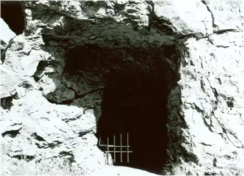
Cave Entrance
Inside the Cave
Learn more about Jewel Cave in South Dakota.
Understanding the psychological appeal is essential, but for the practitioner, a grasp of the underlying technology is paramount. The cavern reveal effect is primarily a feat of Cascading Style Sheets (CSS), leveraging a specific set of properties that allow developers to create a 3D space within the browser’s 2D viewport.
The Foundation: HTML Structure
The illusion of depth is impossible without a proper layering of elements. The required HTML structure is straightforward but non-negotiable. It involves a parent container and at least one child element.
HTML
<div class="card-container">
  <div class="card-content">
    </div>
  <div class="card-reveal">
    </div>
</div>
This nested structure provides the distinct layers that will be manipulated in 3D space. The .card-container will act as the stage, defining the boundaries and perspective of our miniature 3D world.
The Engine: CSS Properties
The magic happens in the CSS. Several key properties work in concert to build the illusion.
$transform-style: preserve-3d;: This property is applied to the parent container (.card-container). It is the foundational switch that tells the browser that the children of this element should be positioned in 3D space, not flattened onto the parent’s plane. Without this, any Z-axis transformations on the children would have no visible effect.$perspective: [value];: Also applied to the parent container, this property defines the “viewer’s” distance from the Z=0 plane. It’s analogous to the focal length of a camera lens. A smaller value (e.g.,$perspective: 500px;) creates a more extreme, distorted perspective, as if the viewer is very close. A larger value (e.g.,$perspective: 1200px;) results in a more subtle, less distorted effect. The choice of value is a critical design decision that dictates the intensity of the illusion.$transform: translateZ([negative value]);: This is the primary tool for creating depth. Applied to a child element (.card-reveal), a negativetranslateZvalue pushes that element away from the viewer along the Z-axis, deeper into the screen. For example,$transform: translateZ(-150px);makes an element appear smaller and further away. It can be combined with other transforms, such as$transform: rotateX(45deg) translateZ(-100px);, to create tilting and receding effects simultaneously.$transition: To prevent the change from the initial to the hovered state from being instantaneous and jarring, thetransitionproperty is used. It animates the changes in thetransformandopacityproperties over a specified duration, creating the smooth, fluid motion that makes the effect feel polished and natural. A typical declaration might be$transition: transform 0.4s ease-in-out;.
Enhancements with JavaScript
While pure CSS can achieve stunning results, JavaScript is often employed for more sophisticated interactions. For effects that respond to the precise X/Y coordinates of the cursor within an element—creating a dynamic tilting effect—JavaScript is necessary. It listens for mouse movement events and dynamically updates CSS custom properties (--var-name) that in turn control the rotateX() and rotateY() transform values. Furthermore, for highly complex, sequenced, or physics-based animations, libraries like the GreenSock Animation Platform (GSAP) offer a more robust timeline and greater control than CSS transitions alone, allowing for the orchestration of multiple elements moving at different rates and with different easing functions.
The Showcase: 10 Exemplary Cavern Reveal Implementations
Theory and technical knowledge are the foundation, but seeing these principles in action provides true insight. Here, we dissect ten distinct conceptual examples of the cavern reveal, analyzing their mechanics and biophilic resonance.
1. The “Geode Card” Reveal
- Visual Description: A grid of visually simple, monochromatic cards. Upon hovering, the card’s surface appears to crack down the middle and pull apart, rotating on the Y-axis. The revealed interior is a vibrant, textured image, located on a plane much deeper within the container. Textual information appears on yet another layer, even further back.
- Technical Analysis: This uses
$transform-style: preserve-3d;on the container. The “front” of the card is two separatedivelements that, on hover, receive a$transform: rotateY(±70deg) translateZ(50px);to give them thickness and pull them forward. The inner image layer has a static$transform: translateZ(-80px);, placing it deep inside. - Biophilic/UX Rationale: This is a direct metaphor for discovery and hidden value, mimicking the cracking of a geode. The initial plainness creates low expectation, so the vibrant reveal delivers a strong dopamine response. It leverages the principle of Mystery to an extreme, rewarding the user’s curiosity with unexpected beauty and information.
2. The “Forest Canopy” Text Reveal
- Visual Description: A large, full-bleed hero image of a dense forest canopy. As the user hovers over the image, foreground leaves and branches subtly move forward and to the sides, gaining a slight blur. This “parts the foliage,” revealing a block of crisp, clear text on a dark, semi-transparent background that seems to be situated deep within the forest scene.
- Technical Analysis: This is an advanced execution. It uses multiple PNG layers for the foliage. The foreground layers have a higher positive
translateZvalue. On hover, JS adds a class that slightly increases theirtranslateZand applies atranslateX/Y, creating a parallax effect. The text block has a negativetranslateZ. - Biophilic/UX Rationale: A perfect embodiment of Prospect-Refuge. The user “parts the leaves” from a safe vantage point to gain a clearer prospect of the information within. The depth and layering create a powerful sense of immersion, transforming a simple heading into an integrated part of a natural scene.
3. The “Architectural Model” Grid
- Visual Description: A portfolio page displays projects in a strict, flat grid. When the cursor hovers over one project card, that card remains stationary, but all its surrounding sibling cards are pushed back on the Z-axis and tilted slightly away from the hovered card, as if on a physical model board.
- Technical Analysis: This requires JavaScript to detect the hover on one element and apply a class to all its siblings. The sibling class would have a transform like
$transform: translateZ(-200px) rotateX(10deg);. The transition on the siblings is key to making this feel fluid. - Biophilic/UX Rationale: This brilliantly uses spatial depth to manage Complexity & Order. The grid is the order. The hover interaction creates complexity that immediately clarifies the information hierarchy. The recession of other elements is a powerful visual cue that says, “Focus here.” It creates a temporary clearing in the information landscape.
4. The “Subterranean Menu” Navigation
- Visual Description: A minimalist header with a simple navigation bar. Hovering over a primary menu item like “Services” causes the entire page content below the header to recede into the background, becoming slightly darker and smaller. Simultaneously, a large mega-menu with sub-links animates into the newly created space, appearing on a plane between the header and the now-distant page content.
- Technical Analysis: The
.main-content-areaof the page receives a$transform: translateZ(-500px);and a brightness filter on hover of a nav item. The mega-menu, initially hidden ($opacity: 0;), animates to$opacity: 1;with a$transform: translateZ(-250px);. A highperspectivevalue on thebodyis crucial. - Biophilic/UX Rationale: This interaction maps directly onto the mental model of “drilling down” into a site’s structure. It uses depth to visually separate navigational context from content context, reducing cognitive load. It’s a form of digital spelunking, descending to a new level of the information architecture.
5. The “Tilted Perspective” Product Card
- Visual Description: A product card displays an item. As the user moves their cursor across the card, the card itself tilts in 3D space, as if it’s balancing on a point in its center. The side of the card closest to the cursor lifts towards the viewer. A shadow underneath becomes more pronounced and shifts realistically.
- Technical Analysis: This is a classic JS-driven effect. A
mousemoveevent listener on the card calculates the cursor’s position relative to the card’s center. These values are then mapped to CSS Custom Properties that control$rotateX()and$rotateY()values in a transform. - Biophilic/UX Rationale: This is a form of Biomimicry—it mimics how we would interact with a physical object. The instant, one-to-one feedback creates a tactile, tangible connection with the digital element. It’s highly engaging because it provides a rich, responsive stream of information based on the user’s micro-movements, satisfying the brain’s desire for responsive environments.
6. The “Iris” Image Reveal
- Visual Description: A circular image thumbnail has a solid color overlay with a text label. On hover, the overlay doesn’t fade; it recedes into the Z-depth while its circular boundary rapidly shrinks to a point in the center, like the iris of an eye dilating in reverse. This reveals the full image beneath in a dynamic, focusing motion.
- Technical Analysis: The overlay element uses
$clip-path: circle(50% at 50% 50%);. On hover, this is transitioned to$clip-path: circle(0% at 50% 50%);while simultaneously applying$transform: translateZ(-50px);. - Biophilic/UX Rationale: This leverages our innate fascination with natural, organic forms and movements (Biomorphic Forms & Patterns). The iris-like motion is potent because it’s associated with eyes, focus, and attention. It’s a non-linear, captivating way to transition between states that feels more alive than a simple geometric wipe.
7. The “Sliding Depths” Testimonial
- Visual Description: A customer testimonial is displayed with the quote text and the author’s name/photo on separate visual planes. When hovered, the main quote text slides slightly up and back, while the author’s attribution slides in from the side on a plane that appears closer to the viewer.
- Technical Analysis: This involves careful orchestration of transforms. The quote block gets
$transform: translateY(-10px) translateZ(-40px);. The author block, initially positioned off-screen, animates to$transform: translateX(0) translateZ(20px);. The differenttranslateZvalues are what sell the effect. - Biophilic/UX Rationale: This interaction uses depth to parse and present information in a sequence. It separates the ‘what’ (the testimonial) from the ‘who’ (the source), improving readability and impact. It’s a simple application of Complexity & Order, using spatial layering to structure information effectively.
8. The “Receding Door” Call-to-Action
- Visual Description: A bold Call-to-Action (CTA) button with solid background color and text. On hover, the text remains fixed, but the background of the button rapidly recedes deep into the page, creating an illuminated “tunnel” or “doorway” effect. The text now appears to float at the entrance to this space.
- Technical Analysis: The text is in a
<span>, and the background is a::beforepseudo-element. On hover, the pseudo-element gets a$transform: translateZ(-100px) scale(3);. The scaling makes the tunnel appear to widen as it recedes. - Biophilic/UX Rationale: This is a direct and powerful application of Mystery and Prospect. The button is transformed from a simple statement into a portal. It’s a compelling visual invitation to “enter” the next stage of a process (e.g., a checkout, a sign-up form). The psychology is almost irresistible: it creates a space and dares the user not to step through it.
9. The “CodePen Abstract” Animation
- Visual Description: An abstract, generative art piece fills the screen, perhaps a field of particles or shifting geometric shapes. As the user hovers, a “wake” is created behind the cursor, pushing the elements away not just in 2D but deep into the Z-axis, creating swirling, temporary tunnels of depth that collapse back to flatness once the cursor leaves.
- Technical Analysis: This is beyond simple CSS. It requires JavaScript, likely using WebGL via a library like Three.js, to efficiently handle the real-time transformation of hundreds or thousands of individual elements in 3D space.
- Biophilic/UX Rationale: This demonstrates the artistic and experiential potential of the principle. It connects to the biophilic pattern ‘Dynamic & Diffuse Light,’ mimicking phenomena like light filtering through water or wind moving across a field of grass. It provides a sensory-rich, non-utilitarian experience of depth that is captivating simply for its own beauty.
10. The “Minimalist Focus” Effect
- Visual Description: In a clean, minimalist design with ample white space, only the most critical interactive elements (e.g., “Download” or “Contact Us”) exhibit a cavern effect. When hovered, the element itself may lift slightly forward (
$translateZ(10px);), while the entire section or content block it resides in subtly pushes back just a few pixels ($translateZ(-20px);). - Technical Analysis: Requires very small, subtle
translateZvalues and a gentleperspective. The effect is barely perceptible consciously but felt subconsciously. The transition timing must be perfect—quick, but not instant. - Biophilic/UX Rationale: This showcases restraint and sophistication. In a design that is intentionally simple, a large, dramatic effect would be jarring. This subtle application uses depth not for spectacle, but as a scalpel-precise tool to guide attention. It affirms the user’s intended action by making the target “come forward” to meet them, a classic example of using Complexity & Order to enhance usability.
Implementation Best Practices & Considerations
Creating a beautiful and engaging cavern reveal effect is only half the battle. A professional implementation requires a holistic approach that considers performance, accessibility, and responsiveness. Neglecting these areas can transform a delightful interaction into a frustrating user experience.
- Performance: The illusion of depth can be computationally expensive. The golden rule is to primarily animate the
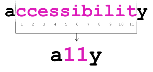
transformandopacityproperties. These can be handled by the browser’s compositor thread, which is separate from the main thread that handles layout and paint. This means they can be GPU-accelerated, resulting in silky-smooth animations. Avoid animating properties likewidth,height, ormargin, as they trigger a “layout reflow,” forcing the browser to recalculate the position of all affected elements, which can lead to stuttering and jank. Thewill-change: transform;property can be used as a hint to the browser, but it should be applied sparingly, ideally only just before the animation starts. - Accessibility (a11y): A significant portion of users navigate the web without a mouse, using keyboards, screen readers, or other assistive technologies. A hover-based effect is useless to them. Therefore, it is critical to ensure that the same visual change is triggered by keyboard focus. The
:focus-visiblepseudo-class is the modern standard for this, applying focus styles only when the user is actually navigating via keyboard. Furthermore, all information revealed by the effect must be present in the DOM and accessible to screen readers, even in the non-hovered state (it can be visually hidden, but not removed withdisplay: none;). - Responsiveness: The concept of “hover” does not exist on touch devices. An effect tied exclusively to
:hoverwill either not work or will trigger only after a tap, often just before the link is followed, making the animation pointless. A proper fallback is essential. The interaction can be redesigned for touch, perhaps triggering on a tap to reveal the information, with a second tap to follow the link. Alternatively, for smaller screens, the information can be displayed by default, sacrificing the reveal effect in favor of clarity and usability in a different context.
Conclusion – The Synthesis of Nature and Code
We have seen that the cavern reveal effect, when designed and implemented with intention, is far more than a transient aesthetic. It is a potent UI pattern that works because it synthesizes modern technology with timeless, evolved human psychology. It transforms the cold, flat plane of the screen into a space with perceived depth, a landscape that invites exploration and rewards curiosity. By leveraging the biophilic principles of Prospect-Refuge, Mystery, and Complexity & Order, we can craft digital interfaces that feel less like sterile tools and more like intuitive, responsive, and intrinsically satisfying environments.
The future of the interface is spatial. As we move towards augmented and virtual reality, our understanding of how to build and navigate three-dimensional information spaces will become paramount. The humble cavern reveal effect, in its clever manipulation of perspective on a 2D screen, is an important evolutionary step in that journey. It serves as a powerful reminder that the most successful code is often that which resonates most deeply with our own.