Table of Contents
The world of green technology is growing very fast. Every day, clean energy companies, carbon trackers, and environmental groups gather billions of data points. They track wind speeds, solar power outputs, and carbon emissions. But how do we look at this data? Most software uses old, mechanical charts. They use flashing red alerts and rigid gray grids. This style of design causes massive screen fatigue. It treats our brains like computers instead of living organs.
At Silphium Design LLC, we see this problem constantly. We need a major shift in how we build green tech interfaces. We must move past superficial greenwashing, which just means painting an interface with green colors to look eco-friendly. Instead, we must build systems based on digital biophilia. This means we bring the patterns of nature directly into our software design. The ultimate answer to this challenge is biophilic data visualization.
This new design method merges heavy data density with human biology. It takes the complex numbers of climate telemetry and structures them into visual systems that our minds are built to understand. By using biophilic data visualization, we can make software that reduces stress, stops cognitive fatigue, and helps people make better decisions for our planet.
When we use biophilic data visualization, we are not just making things look pretty. We are solving a deep biological problem. Human beings evolved over millions of years in forests, plains, and near oceans. Our eyes and brains are highly optimized to process natural shapes, moving shadows, and shifting colors. We are not evolved to stare at flat boxes and neon grids for eight hours a day. When green tech workers sit in front of traditional dashboards, their brains work extra hard to decode abstract charts. This causes mental burnout.
The essential goal of biophilic data visualization is to remove this friction. By encoding numbers into natural systems, we make data consumption feel natural. We can turn a stressful energy dashboard into a calm, living digital ecosystem. This article will show you exactly how to design and build these systems. We will explore the shapes, colors, and technical tools required to bring biophilic data visualization into the next generation of green technology.
The Main Architectural Principles: Translating Biophilia to the Screen
To build an effective biophilic data visualization system, you must understand how to translate natural laws into digital pixels. Nature is never perfectly rigid, yet it is highly organized. It uses specific geometric laws to grow plants, distribute water, and organize communities of cells. When we bring these laws into software, we create a strong sense of digital biophilia. This section breaks down the main design patterns you need to use to make your biophilic data visualization look and feel like the natural world.
Visual and Non-Visual Connections with Nature
The first step in biophilic data visualization is creating a true connection with natural systems. In web design, this is often done with static background images of trees or rivers. That is not enough for complex green tech software. We must use what is called isomorphic data mapping. This means we take a live data stream and map its behavior directly to a natural movement profile.
For example, imagine a dashboard tracking wind turbine power outputs. Instead of using a jumping line graph, a biophilic data visualization might show a digital field of grass or a cluster of leaves. As the wind power increases, the digital leaves ripple faster. The movement uses fluid dynamics equations that match real wind. The user can look at the screen and instantly feel the state of the wind farm without reading a single number. This type of biophilic data visualization talks to the ancient parts of our brain. It gives us an instant, ambient understanding of data trends.
We can also use subtle kinetic feedback in our biophilic data visualization tools. When a user hovers over a data point, the menu should not just pop open instantly with a harsh drop shadow. It should glide open using an organic ease-in and ease-out motion curve. It should mimic the way a tree branch bends under weight and springs back. This gentle animation style prevents the small startle responses that cause long-term office stress. By building these natural motions into your biophilic data visualization, you make the software feel alive and cooperative.
Biomorphic Forms and Algorithmic Layouts
Standard web design relies heavily on rectilinear grids. We love squares, boxes, and straight lines because they are easy to program. But straight boxes do not exist in nature, and they force our eyes to work harder to find boundaries. A advanced biophilic data visualization replaces these sharp grids with organic shapes and bio-inspired spatial layouts.
One of the best tools for this is the Voronoi tessellation. A Voronoi diagram is a mathematical way of dividing space into cells based on distances to specific points. You see this pattern everywhere in the physical world. It is the shape of dried mud cracks, the pattern on a giraffe’s coat, and the structure of dragonfly wings.
Plaintext
Traditional Grid Layout       Voronoi Space Layout
+-----+-----+-----+-----+     /---\_/---\_/---\
| Box | Box | Box | Box |    / Cell \ Cell \   \
+-----+-----+-----+-----+   |  Data  | Data  |  |
| Box | Box | Box | Box |    \  One  /  Two /  /
+-----+-----+-----+-----+     \---/\_---/\_---/
[High Stress / Rigid]       [Organic / Low Stress]
When you use Voronoi patterns in a biophilic data visualization dashboard, you group data naturally. If you are showing carbon emissions across different factories, each factory gets a cell. The size of the cell changes based on the emission volume. Because the cells touch each other along natural, organic lines, the human eye can scan thirty or forty distinct data points without feeling overwhelmed. The interface looks like a leaf section under a microscope. This is the power of biophilic data visualization done right.
Another critical concept is fractal geometry. Fractals are shapes that repeat themselves at different scales. A fern leaf is a classic example. The whole leaf is made of smaller leaves, which are made of even smaller leaves. In a biophilic data visualization system, fractals allow us to hide immense data density. You can show a large macro-indicator shaped like a fractal network.
When the user clicks into it, the sub-metrics reveal themselves using the exact same geometric layout on a smaller scale. The user does not have to learn a new chart layout when they dig deeper into the data. The design rules stay completely consistent from top to bottom. This use of fractals makes your biophilic data visualization highly scannable and beautifully organized.
The Chromatic and Luminance Engine: Designing for the Circadian Cycle
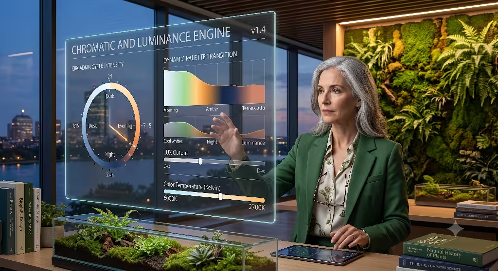
Color and light are the most direct ways to influence human mood and focus. Unfortunately, most software uses colors that harm our eyes. Bright blue lights, glowing neon reds, and harsh stark whites are everywhere. If we want to build a true biophilic data visualization, we have to rethink our color systems completely. We must design a color engine that honors our evolutionary history and matches our daily biological rhythms.
Evolutionary Color Palettes
When we design a biophilic data visualization for green tech, we must throw away the high-saturation neon palette. Many green tech tools use an incredibly bright neon green to mean good and a flashing neon red to mean bad. These colors trigger our body’s fight-or-flight response. Over an eight-hour shift, looking at these alerts keeps an operator in a constant state of low-level anxiety.
Instead, a proper biophilic data visualization uses muted earth tones. We look to colors found in healthy landscapes: terracotta, sage green, deep forest green, and ocean slate. These colors have lower saturation levels. They are gentle on the optic nerve.
But how do we show errors or data anomalies without neon red? We use natural warning signs. In nature, a drought or an illness is often signaled by a transition to yellow, brown, or deep clay colors. A biophilic data visualization can use a sun-kissed yellow or a rich copper tone to show that a data point needs attention. These earth-derived warning colors still draw the eye effectively, but they do not cause a spike in cortisol. They allow the user to stay calm while they troubleshoot a critical problem in a power grid or carbon system.
Dynamic Circadian Interface Adaptation
Our bodies change throughout the day based on the sun. This is called our circadian cycle. When we sit in a dark room staring at a screen that outputs 6000 Kelvin blue light, we break this cycle. This leads to poor sleep, headaches, and low focus. A truly adaptive biophilic data visualization system fixes this by changing its light output based on real time.
The software should detect the user’s geographic location. As the sun moves across the sky outside, the biophilic data visualization shifts its background luminance and color temperature. In the morning, the dashboard can feature crisp, clear light tones that match the early sun, helping the brain wake up naturally. By noon, the contrast peaks to handle the bright mid-day energy. As evening approaches, the biophilic data visualization automatically drains the harsh blue lights. The background transitions into soft, warm clay tones, amber hues, and deep forest grays.
Furthermore, the transparency and depth of the UI elements can shift. In the afternoon, shadows can be short and sharp, mimicking direct overhead sunlight. In the evening, shadows grow long, soft, and diffuse. This deep level of biophilic data visualization keeps the user connected to the outdoor world, even if they are working inside a windowless data center. It reduces retinal strain and honors human biology.
Practical Frameworks: Green Tech and ESG SaaS Applications
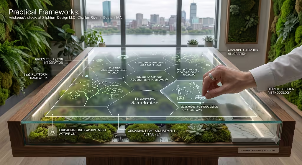
Now let us look at how to apply biophilic data visualization to actual business applications. Green technology is not a theoretical concept. It is a massive industry filled with carbon accounting platforms, corporate environmental, social, and governance dashboards (ESG), and renewable energy managers. Let us look at two main use cases where biophilic data visualization can transform how corporate users interact with complex ecological data.
Carbon Accounting and ESG Dashboards
Tracking carbon emissions is an incredibly messy job. A single corporation has to monitor Scope 1 emissions from their own buildings, Scope 2 emissions from the electricity they buy, and Scope 3 emissions from their entire supply chain. This involves thousands of spreadsheets, shipping manifests, and utility bills. When you dump this data into a standard pie chart, it becomes unreadable.
With biophilic data visualization, we can use a branching L-system to display this information. An L-system is a mathematical formula used to model the growth of plants and trees. We can represent the corporation as a digital tree trunk. Scope 1 emissions become the primary thick branches. Scope 2 emissions become secondary limbs. Scope 3 emissions become the outer twigs and leaves.
Plaintext
        Corporate Carbon Tree (L-System)
                 \  /  /
               \  \/  /  (Scope 3: Twigs & Leaves)
                \/ \ /
                 \  /    (Scope 2: Secondary Branches)
                  ||
                  ||     (Scope 1: Main Trunk)
                 /  \
If a supplier in another country suddenly increases their carbon footprint, the corresponding twig on the digital tree turns brown or starts to wither. The user can see the entire health of their global supply chain at a single glance. They do not have to dig through endless rows of text. They look at the tree, see which branch is unhealthy, and click on it to zoom in. This biophilic data visualization saves hours of analytical work. It turns cold corporate tracking into an intuitive exercise in digital gardening.
Renewable Energy Grid Infrastructure Telemetry
Managing a clean energy grid is a game of constant balance. Wind and solar power fluctuate wildy based on the weather. Engineers must constantly balance this changing supply with the power demand of cities. Traditional grid management screens look like terrifying wall-sized spiderwebs of glowing lines, numbers, and alarms.
By using biophilic data visualization, we can map this electrical grid as a fluid dynamic system. We can use moving vector fields to represent the flow of electricity. If a solar array is producing an abundance of clean energy, the digital vectors glide smoothly like a clear, fast-moving river. If a section of the grid experiences a bottleneck or a failure, the fluid flow begins to swirl and create digital eddies or stagnant pools.
The operator can instantly see where the energy is pooling or blocking by watching the flow patterns. This biophilic data visualization approach relies on our natural ability to understand water and weather movements. Instead of reading hundred-page error logs, the engineer adjusts grid loads until the digital river flows smoothly again. It makes high-risk infrastructure work much safer and infinitely less exhausting.
Frequently Asked Questions about Biophilic Data Visualization
When I speak about these concepts at web design conferences or work with engineering teams at Silphium Design LLC, developers always have a lot of questions. They want to know the science behind these ideas and how they can justify using them to project managers. Let us walk through the four most common questions that arise when teams start planning a biophilic data visualization project.
What is biophilic data visualization?
It is a specialized method of user interface design that takes complex digital data and encodes it using the structures, geometries, colors, and motion behaviors found in the natural world. It stands directly opposite to traditional mechanical web design. Instead of forcing a human operator to act like a computer to read data, biophilic data visualization forces the computer to present data in a way that matches human evolutionary biology. It is built to reduce visual stress, increase data scanning speeds, and make complex green tech platforms easier to use over long periods of time.
How can green tech companies integrate biophilic design into software?
Integration requires moving away from static design kits and adopting mathematical, generative algorithms. Instead of drawing a fixed dashboard layout in a static mockup tool, software teams write code that generates layouts dynamically. They map live API data streams to geometric parameters like Voronoi space splits, fractal branch counts, or organic color shifts.
For example, a green tech startup can use open-source graphics libraries to create dashboards where chart boundaries bend and adjust like cell walls based on data volume. They can implement color systems that automatically pull from localized nature photos. By embedding biophilic data visualization directly into their front-end development workflow, they build interfaces that adapt beautifully to changing datasets.
Does nature-inspired UI reduce cognitive fatigue or screen fatigue?
Yes, there is strong scientific evidence from environmental psychology that proves this effect. When humans look at complex, repetitive, artificial patterns like endless grids of square boxes, our visual cortex has to work incredibly hard to find contrast lines and maintain focus. This causes a type of mental exhaustion known as cognitive fatigue.
When we interact with nature-inspired shapes like fractals or organic curves, our brains experience a state called soft fascination. Nature holds our attention effortlessly because our neural pathways are pre-programmed to read those shapes. A biophilic data visualization taps into this soft fascination. Studies show that when operations personnel use biomimetic interfaces, their heart rates drop, their eye blink rates normalize, and they can catch critical system errors much faster than those staring at traditional spreadsheet grids.
What are the 14 patterns of biophilic design in digital interfaces?
The 14 patterns were originally created by an environmental consulting firm named Terrapin Bright Green to guide physical architecture. However, we can translate these principles perfectly into digital software design. When building a biophilic data visualization system, we focus on four primary patterns:
- Material Connection with Nature: Using textures, motion profiles, and color engines that are directly derived from real-world natural elements.
- Biomorphic Forms and Patterns: Implementing mathematical layouts like the Fibonacci sequence, fractals, and Voronoi cells to organize data clusters.
- Dynamic and Diffuse Light: Setting up user interfaces that automatically shift their brightness, contrast, and color temperatures to match the natural daily sun cycles.
- Connection with Natural Systems: Making data dashboards feel like evolving ecosystems, where data updates occur as smooth, continuous natural cycles rather than harsh, instant text jumps.
The Technical Execution Layer
To make biophilic data visualization work in production software, you must know how to build it with modern code. This is where my background in computer science comes in handy. You cannot build high-performance organic layouts using simple HTML boxes and basic CSS. You need a modern render pipeline that can handle complex mathematics in real time without lagging the browser.
Front-End Implementations and Render Pipelines
The secret to rendering smooth biophilic data visualization interfaces is leveraging the power of the computer’s graphics hardware. We do this by using Scalable Vector Graphics (SVG) for simpler structural layouts and WebGL shaders for high-density, real-time animations.
SVGs are fantastic for creating biomorphic forms like fractal trees or Voronoi grids. Because SVGs are based on pure mathematical paths rather than fixed pixels, they can scale up or down smoothly to any screen size. You can use JavaScript to modify the SVG path strings on the fly. If your carbon accounting metrics change, you can instantly recalculate the math for your L-system tree branches and let the browser redraw the vector lines smoothly.
For more complex applications, like a renewable energy grid mapped as a moving river of energy, you must use WebGL. WebGL allows you to run code directly on the user’s graphics processor. This means you can animate millions of independent data particles simultaneously.
You can write custom vertex and fragment shaders that simulate natural fluid dynamics or wind currents. Your live data feed feeds parameters directly into these shaders. The result is a highly responsive biophilic data visualization that runs at sixty frames per second. The dashboard looks as organic and smooth as water rippling over stones, even when processing millions of data points every second.
Maintaining Accessibility (WCAG Compliance)
When developers hear about using muted earth tones and organic shapes for biophilic data visualization, they often worry about accessibility. They fear that soft color palettes will make the software impossible to read for users with visual impairments or color blindness. This is a valid concern, but it is entirely possible to maintain strict accessibility while embracing digital biophilia.
The Web Content Accessibility Guidelines (WCAG) require software interfaces to hit specific color contrast ratios. To make an accessible biophilic data visualization, you simply must ensure that your background colors and foreground text maintain a contrast ratio of at least 4.5-to-1 for normal text, or 3-to-1 for large text.
You do not need neon colors to achieve these ratios. A deep charcoal gray background combined with a clean, light sage green text creates a beautiful, nature-inspired look while easily passing WCAG compliance rules. Furthermore, you should never rely on color alone to convey data states.
If a cell in your Voronoi biophilic data visualization changes state because of an error, you should change its texture or shape alongside its color. You can introduce a natural hatch pattern or alter the thickness of its cell border. This multi-layered design approach ensures that your biophilic data visualization remains completely useful for color-blind operators while still providing all the biological benefits of biophilic design.
The Future of Green Tech Interfaces
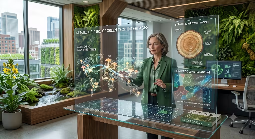
As we look toward the future of climate technology and ESG software, it is clear that data density will only continue to increase. We cannot expect humans to successfully manage global environmental grids or complex carbon supply chains using outdated software tools. Monotonous, high-stress interfaces are a liability. They lead to operator error, burnout, and disengagement from the vital environmental missions these companies are trying to achieve.
Implementing biophilic data visualization is more than an aesthetic upgrade. It is a long-term strategic decision. By building digital systems that cooperate with human biology rather than fighting against it, green tech companies can unlock massive gains in operational efficiency.
We can build tools that feel like extensions of our natural environments. When a data dashboard looks like an ecosystem, our work feels less like staring into a cold machine and more like tending a digital garden. By embracing biophilic data visualization, we bridge the gap between human informatics and planetary health, creating a more sustainable world both on and off the screen.
Summary of Design Parameters
To help your team get started with this methodology, here is a quick reference table outlining how to convert traditional, stressful UI components into optimized biophilic data visualization equivalents.
| Traditional UI Component | The Biophilic Data Visualization Equivalent | Biological Advantage |
| Rigid Square Grid | Voronoi Tessellations / Organic Space Splits | Reduces boundary-finding stress in the visual cortex |
| Neon Red/Green Alerts | Muted Earth Tones (Terracotta, Sage, Slate) | Lowers cortisol spikes and panic responses |
| Instant Text Jumps | Smooth Fluid Dynamics & Organic Motion Curves | Eliminates small startle responses during data shifts |
| Fixed Brightness Themes | Circadian Adaptation Engine (Syncs with the sun) | Protects user sleep cycles and cuts eye strain |
| Abstract Pie Charts | Algorithmic Fractal Tree Hierarchies (L-Systems) | Enhances natural scannability of deep datasets |
By keeping these parameters at the center of your software design process, your development team can successfully build tools that are highly optimized for human performance. The future of software is not mechanical. The future of software is living, adaptive, and deeply connected to the natural laws that govern us all.