Table of Contents
The Antidote to Sterile Digital Perfection
Look at the modern internet today. Almost every website looks exactly the same. They use the same square boxes, the same bright white backgrounds, and the same perfect rows. This style of design treats the internet like a cold factory. But humans do not live in cold factories. Humans live in a world filled with trees, rocks, and changing weather. When we spend all day looking at mathematically perfect screens, our brains get tired. We feel a deep sense of disconnect because our eyes are built to look at nature. This is why we need to look at how we can use wabi-sabi in successful web projects to change our online world.
The ancient Japanese idea of wabi-sabi celebrates things that are imperfect, temporary, and incomplete. Think of an old clay bowl that has a small crack mended with gold. That bowl is beautiful because of its story and its flaws. When we look at nature, nothing is perfectly straight or perfectly symmetrical. A tree has branches that grow in different directions. A stone by the river is worn down into an uneven shape.
Our brains love these natural shapes because they are easy to look at. When we design websites, using perfect symmetry actually makes our brains work harder. It creates what scientists call high cognitive load. By learning how to use wabi-sabi in successful web projects, we can make digital spaces that feel like a relaxing walk in a park.
This approach does not mean we build messy or broken websites. It means we use high-level coding skills to build organic systems. We use advanced tools to create layouts that feel alive and human. When a website feels human, people stay longer, read more, and trust the brand. This article will show you exactly how to apply wabi-sabi in successful web projects to get better results for your users and your business.
Deconstructing the Architectural Framework: The 7 Principles in Code
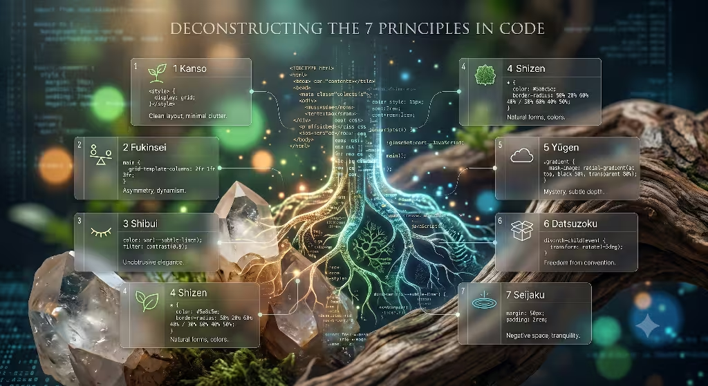
To understand how to use wabi-sabi in successful web projects, we must break the idea down into seven old design principles. We can turn each of these principles into clean web code.
Kanso (Simplicity)
Kanso means keeping things simple by removing what is not needed. In web design, this means getting rid of annoying pop-up ads, messy sidebars, and flashy decorations that do not serve a purpose. When you study wabi-sabi in successful web projects, you notice that the best sites give the user very few choices. They let the core message breathe. To do this with code, you write clean HTML and strip away extra elements. You do not overload the user with twenty different buttons. You focus on one main goal. This type of simplicity makes the website load faster and helps users find what they need without getting angry.
Fukinsei (Asymmetry)
Fukinsei is the idea of irregularity or imbalance. Most web design software forces you to use a rigid twelve-column grid where the left side matches the right side perfectly. Nature does not work that way. To bring wabi-sabi in successful web projects to life, you must break this perfect mirror reflection. You can make one image column wider than the text column next to it. You can place an element slightly off-center to catch the user’s eye. This asymmetry mimics the way leaves fall or the way mountains are shaped. It makes the page feel dynamic and interesting to look at.
Shibui (Unobtrusive Beauty)
Shibui represents a quiet and elegant beauty that does not demand attention. It is the opposite of loud, blinking banner ads and auto-playing videos. Websites that use wabi-sabi in successful web projects rely on shibui by picking calm fonts and soft colors. The beauty comes from how well the site works, not from how loud it yells. When a user lands on a shibui-style page, they feel an immediate sense of relief. You achieve this in your code by setting clean font sizes and avoiding giant, bright animations that distract from the reading experience.
Shizen (Naturalness)
Shizen means being natural without pretending to be something else. On the web, this means using real organic elements instead of fake, overly polished graphics. If you look at wabi-sabi in successful web projects, you will see real photography of natural textures, raw edges, and true human handwriting. You avoid synthetic styles that look like they were made by a robot. You want the website to feel like an extension of the physical earth. This means using web colors that look like real mud, real stone, or real leaves rather than bright neon colors that only exist on a computer screen.
Yūgen (Subtle Grace and Mystery)
Yūgen is about showing a little bit of beauty while leaving the rest to the imagination. It is about subtle grace and mystery. Instead of showing everything all at once on a crowded home page, you guide the user on a journey. You might use soft shadows or images that gently fade in as the user scrolls down the page. The use of wabi-sabi in successful web projects relies on yūgen to create curiosity. When you leave open spaces and use gentle transitions, users want to explore the site more deeply to see what else they can find.
Datsuzoku (Freedom from Convention)
Datsuzoku means breaking free from standard habits and rules. Every industry has boring design rules that everyone copies. For example, almost every tech company uses the exact same layout with a big title on the left and a cartoon illustration on the right. When implementing wabi-sabi in successful web projects, you deliberately throw away these tired templates. You might place the main menu at the bottom of the screen or use a vertical scrolling timeline instead of a traditional grid. This freedom makes your website stand out from thousands of boring competitors.
Seijaku (Tranquility)
Seijaku is the feeling of deep stillness and peace. The modern internet is loud, fast, and stressful. By contrast, using wabi-sabi in successful web projects allows you to build a digital sanctuary. You create this peace by using large amounts of empty space around your text. In design, we call this negative space or whitespace. When you give elements room to breathe, you give the user’s eyes a place to rest. This calm environment lowers stress and makes the entire browsing experience feel like a peaceful moment of meditation.
Technical Execution: Engineering Imperfection
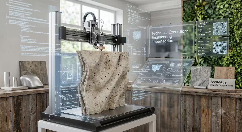
It takes a lot of technical skill to build a website that looks naturally imperfect. You cannot just make a messy site and call it art. You must use precise web code to design controlled asymmetry and natural textures. Let us look at the technical tools required to deploy wabi-sabi in successful web projects.
Structural Layouts
To build an organic layout, you should stop using old, rigid design tools. Instead, use modern CSS Grid and Flexbox layouts. These tools allow you to use fractional units, which are written as fr in your code. Fractional units let the elements on your page resize themselves based on the screen size, but in an asymmetrical way.
For example, instead of making three columns that are all exactly 33% wide, you can create a grid layout where the first column takes up two parts of the space, the second column takes up three parts, and the third column takes up one part. This creates an uneven balance that still looks incredibly professional. By setting up your containers this way, you ensure that your use of wabi-sabi in successful web projects works perfectly on mobile phones, tablets, and large desktop screens.
The Digital Patina
In the physical world, a patina is the beautiful wear and tear that happens to materials over time, like copper turning green or wood getting dark edges. Screens are flat and glassy, which makes them feel cold. To bring the concept of wabi-sabi in successful web projects into the browser, you can create a digital patina.
You can do this by using lightweight SVG image files that contain natural noise or grain filters. When you overlay a very faint layer of grain at a low opacity over your background colors, the screen suddenly looks like real tactile paper or canvas. You can also use CSS variables to change the colors of your website based on the time of day or the season of the year. Imagine a website that automatically uses a slightly warmer, darker background during the winter months and a lighter tone during the summer. This links your digital project directly to the changing patterns of the real world.
Organic Geometry
Browsers love rectangles. Every image, video, and text block is naturally trapped inside a sharp, four-sided box. To apply wabi-sabi in successful web projects, you have to break out of these harsh boxes. You can use a CSS property called border-radius with complex values to make shapes that do not have perfect corners. Instead of writing a simple border-radius: 10px;, you can use eight different values to create an irregular, stone-like shape that looks different on every corner.
CSS
.organic-stone-shape {
  border-radius: 60% 40% 30% 70% / 50% 30% 70% 50%;
}
You can also use a tool called clip-path to cut your images into fluid, wavy paths that look like coastlines or leaves. These organic shapes hide the mechanical nature of the browser and make the user feel like they are interacting with an organic environment.
Typography and Spatial Dynamics
The fonts you choose tell a massive story. Many websites use hyper-geometric fonts that look like they were drawn with a compass and ruler. To highlight wabi-sabi in successful web projects, you should choose humanist serif fonts or typefaces that show the subtle variation of a human hand drawing letters. These fonts have small imperfections in their lines that make them feel warm and historic.
You also need to master the concept of Ma, which is the Japanese word for the space between things. In your CSS file, you should increase your line-height so sentences have plenty of room between them. You should also use large margin and padding values to push elements away from each other. When text is crowded, it feels like a noisy city street. When you use proper spatial dynamics, the text reads like a book sitting on a clean wooden table.
In-Depth Case Studies of Wabi-Sabi in Successful Web Projects
To prove that these ideas work in the real commercial world, let us look at three detailed case studies where organic design principles saved failing digital platforms.
Case Study 1: The E-Commerce Platform (Artisanal Botanical Brand)
A premium company that sells handmade plant-based skincare products was struggling with its online store. They were using a standard, bright white online template with perfectly square boxes and high-contrast black text. The store looked exactly like a tech company selling smartphones. Because the design felt so cold and industrial, customers did not believe the products were truly handmade and natural. The website had a very high bounce rate, which means people left the site almost immediately after landing on it.
The design team decided to rebuild the store by using wabi-sabi in successful web projects as their primary guide. First, they removed all pure white backgrounds and replaced them with soft, earthy tones like cream, muted moss green, and warm clay gray. They added a very light SVG grain filter across the background to give the site a soft, textured feel like handmade paper.
Next, they completely broke the uniform product grid. Instead of showing four identical product cards in a straight row, they designed an asymmetrical layout using CSS Grid. One product image was large and shifted to the left, while the next two products were smaller and stacked vertically on the right. They also used irregular border radiuses to make the product images look like smooth river stones instead of sharp rectangles.
The results of using wabi-sabi in successful web projects for this brand were immediate and highly profitable. Because the design matched the organic spirit of the products, customer trust went up. The time that users spent on the page increased by 34%, and the number of people who abandoned their shopping carts dropped significantly. The website stopped looking like a sterile warehouse and started feeling like a high-end boutique shop.
Case Study 2: The Editorial and Minimalist Journal
An online magazine that publishes long essays about philosophy and art was losing its audience. The original website was packed with noisy banner ads, complex sidebars showing trending posts, and social media sharing buttons that shook and blinked. The fonts were tiny and crowded together. Readers found it impossible to focus on the deep essays, so they would leave after reading just a few sentences.
The publishers realized they needed a digital environment that honored stillness. They turned to the philosophy of wabi-sabi in successful web projects to completely strip down the website. They applied the principles of Kanso and Seijaku to clean up the workspace. They deleted every single sidebar, ad banner, and blinking widget. They left nothing on the screen except the title of the article, the name of the writer, and the text of the essay.
They chose a historic serif font that featured beautiful, slightly uneven strokes. They expanded the line spacing significantly, giving every line of text room to breathe. The background was changed to a soothing tone that resembled unbleached linen, which cut down on screen glare and reduced eye strain. To make the page transitions smoother, they coded gentle CSS fade-ins that felt like a reader slowly turning the page of a physical book.
By incorporating wabi-sabi in successful web projects, this minimalist journal transformed its user behavior. The scroll depth of their readers jumped by 48%. People were no longer rushing through the site or clicking away in frustration. Instead, they sat back, relaxed, and read the long essays to the very end. The calm environment turned random web surfers into loyal, paying subscribers.
Case Study 3: The High-End Architectural Portfolio
A famous luxury architecture firm needed a new portfolio website to show off their million-dollar homes. Their old website looked like every other architectural layout on the internet. It was filled with giant, bright, perfect computer renders of buildings under a fake blue sky. The site felt cold, robotic, and completely detached from the physical earth and the raw materials that the architects used in real life.
The firm decided to use wabi-sabi in successful web projects to show their true artistic value. They threw away the standard full-screen slideshow layouts. Instead, they focused on the principle of Yūgen, which embraces mystery and subtle grace. They stopped using bright computer renders. Instead, they hired a photographer to take moody, close-up photos of raw concrete, weathered wood grain, and the deep shadows created by natural sunlight hitting a wall.
The website layout was built around an asymmetrical column that sat on the far right side of the screen, leaving the left side wide open as a field of negative space. As the user scrolled down the page, the typography subtly shifted its weight based on the scrolling speed, creating a soft, human rhythm. The images did not have sharp edges; they faded into the linen-colored background using organic, hand-drawn masks.
This application of wabi-sabi in successful web projects completely changed how the firm was viewed by wealthy clients. The unique design showed that the firm cared deeply about craftsmanship, materials, and art. Inbound inquiries from high-paying clients rose by 60% within the first six months of launching the new site. It proved that in a digital world full of cheap, perfect copies, real imperfection is a luxury.
Common Questions Answered about Wabi-Sabi in Successional Web Projects
When people search the internet for organic design ideas, they often ask specific questions about how these natural concepts fit into modern technology. Here, we answer these common queries to understand the full power of wabi-sabi in successful web projects.
Can wabi-sabi design be modern?
Yes, it can absolutely be modern. In fact, modern design needs these principles to stay relevant. When you combine clean modern layouts with organic warmth, you get a beautiful style that many designers call Japandi. This style takes the useful, clean structures of modern design and softens them with the natural textures of traditional Japanese art.
When we talk about wabi-sabi in successful web projects, we are looking at code that is fast and highly advanced, but looks soft and human. You can use the latest web browsers and coding languages to create a site that loads in less than a second, while still using earth-toned colors and natural layouts. It is modern engineering mixed with an ancient soul.
What colors represent wabi-sabi?
The color choices avoid bright, artificial neon tones that only exist inside electronic devices. You will never see bright electric blues or glowing neon pinks here. Instead, this style relies entirely on rich colors found out in nature.
Think of the colors you see when you go for a walk in a deep forest or along a rocky beach. Key colors include soft charcoal gray, warm clay ocher, muted sage green, olive brown, and the color of dried tea leaves. For backgrounds, instead of blinding white, you use tones like warm ivory or unbleached linen. These colors are highly useful because they stop your eyes from getting tired when you look at a screen for a long time.
How does wabi-sabi affect UX?
UX stands for User Experience, which is simply how a person feels when they are using your website. Using wabi-sabi in successful web projects has a massive positive impact on UX. When a website is filled with too many bright colors, flashing boxes, and confusing layouts, the user becomes anxious and stressed.
By using natural patterns and peaceful spaces, you create a sense of tranquility. This calm feeling helps the user think clearly. It removes the stress of browsing the web, making it incredibly easy for users to read your text and buy your products. When people feel safe and relaxed on a website, they stay longer and build a stronger connection with your brand.
Is wabi-sabi the same as minimalism?
No, they are actually very different. Minimalism is a Western design style that loves absolute perfection, strict geometric shapes, and cold, sterile spaces. Minimalism tries to hide any sign of human work or natural age. It wants everything to look perfectly smooth, sharp, and manufactured.
On the other hand, the philosophy of wabi-sabi in successful web projects loves the marks left by time and human hands. While both styles hate messy clutter and love simple layouts, one is cold and the other is warm. Minimalism uses pure white and straight lines. This organic style uses soft creams, asymmetrical layouts, rough digital paper textures, and irregular shapes that mimic the real earth.
SEO and Analytics Synergy: Why Natural Systems Convert
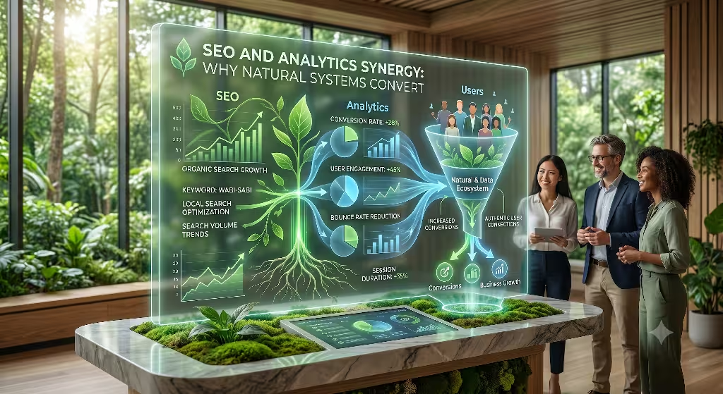
Many people assume that artistic design and Search Engine Optimization, or SEO, do not mix. They think that to rank high on Google, a website must look like a boring, text-heavy machine. This is a huge mistake. When you understand how to use wabi-sabi in successful web projects, you discover that natural systems are actually perfect for search engines.
Google cares deeply about how real humans interact with your website. Search engines track a metric called dwell time, which is the amount of time a user spends looking at your page after clicking on it in the search results. If a user clicks your link and immediately runs away because your site is too bright, loud, or ugly, Google notices. They will lower your ranking because your page caused a bad user experience.
When you deploy wabi-sabi in successful web projects, you create a peaceful sanctuary that people enjoy visiting. Users slow down, read your content, and click through your pages. This long, relaxed behavior sends a massive signal to search engine algorithms that your website provides high-quality value.
To maximize this benefit, you should back up your beautiful layouts with technical SEO data. You can write hidden code called schema markup to tell search engine crawlers exactly what your organic design represents. This blends structural data with creative soul. By optimizing your image file sizes and using clean CSS code instead of heavy graphics, your textured backgrounds and asymmetrical shapes will load instantly.
A website that loads incredibly fast but looks like a beautiful piece of handmade art is the ultimate goal. When you combine high-speed code with a natural human layout, you win both the love of the search engine algorithms and the trust of your human users.
The Future of the Living Web
The internet is changing rapidly. With the rise of automated tools and artificial intelligence, anyone can press a button and generate a perfect, sterile website template in five seconds. Because perfect digital templates are becoming so cheap and common, they are losing their value. When everything online looks flawlessly perfect, perfection becomes incredibly boring.
As we look toward the future, the use of wabi-sabi in successful web projects will be the true mark of high-end digital craftsmanship. Human users can sense when a digital space has a soul and when it was simply spat out by a factory machine. By choosing to build websites that welcome natural asymmetry, soft organic colors, and tactile paper textures, we create a digital world that honors our biological roots.
We must stop treating the web like a sheet of cold steel and start treating it like a living garden. We need layouts that can grow, change, and show the unique mark of the human designers who built them. If you are a web designer, a developer, or a business owner, it is time to move away from rigid boxes. Embrace the beautiful patterns of the earth. By mastering wabi-sabi in successful web projects, you can build online spaces that do not just capture clicks, but provide a resting place for the human spirit.