Look closely at a leaf on a tree. You will notice that it is not a perfect geometric shape. One side might be slightly wider than the other side. The veins do not follow perfectly straight lines. Yet, the leaf is beautiful, healthy, and works exactly the way it should. Now, open a standard website on your computer or phone. What do you see? You see perfectly straight lines, identical boxes, and sharp grid layouts. It looks clean, but it also looks cold. It looks like a sterile hospital room instead of a living environment. This contrast shows us why we need to think about imperfection in digital design.
As the design expert for Silphium Design LLC, my work brings together the worlds of biology, web design, and art. Human brains are not made for absolute perfection. When everything on a screen is completely symmetrical and flawless, our eyes get tired. Our minds start to drift. We feel disconnected from the screen because nothing in our natural world is perfectly straight or completely smooth.
By understanding the value of imperfection in digital design, we can build websites that feel more human. We can create digital spaces that feel alive, comfortable, and easy to use. This approach is called biophilic web design, which simply means designing digital tools that connect people with the natural world. When we include natural variety and small flaws in our online layouts, we are not making mistakes. Instead, we are using a smart strategy to match human biology.
This examination into imperfection in digital design will show you how small variations can improve user experiences. We will explore how organic textures build trust with your customers. We will look at the math behind natural randomness. We will also look at how these techniques can help your business stand out in search engine rankings. Our goal is to move past the boring, uniform layouts of the past and build a web that feels real.
Table of Contents
The Cognitive Load Problem: Why Humans Reject Sterile Interfaces
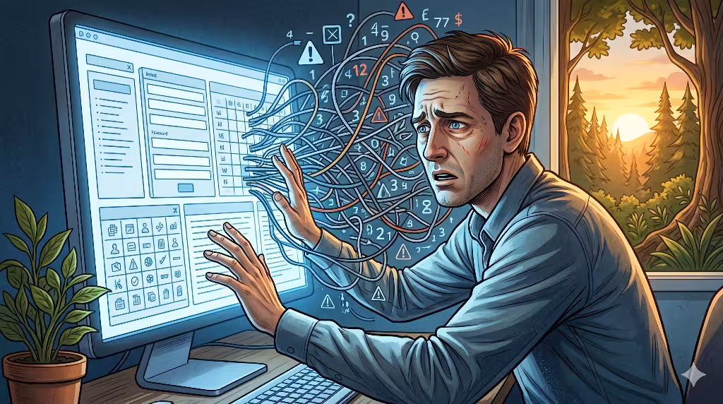
Cognitive load is a term that describes how hard your brain has to work to process information. When you visit a website, your brain immediately starts analyzing colors, shapes, text, and buttons. If a website uses too much imperfection in digital design, it can become messy and hard to read. But if a website is completely perfect and rigid, it creates a different kind of mental strain. This strain happens because perfect grids do not give your eyes a natural place to rest.
In nature, our vision evolved to spot movement, depth, and changes in texture. When you look at a forest, your brain uses processing fluency, which is the ease with which our minds understand what we are seeing. A natural scene has high processing fluency for humans because our visual systems are built for it. We can easily tell the difference between a tree trunk, a rock, and a river because they all have unique, imperfect shapes.
When you look at a website that rejects all imperfection in digital design, your brain has to work harder. Every box looks exactly like every other box. Every line is perfectly straight and spaced at identical intervals. Because there are no natural variations, your eyes have to struggle to find the most important information on the screen. This struggle causes eye strain and mental fatigue. Users often leave a website quickly when this happens, and they might not even know why they feel tired.
By using intentional imperfection in digital design, you can guide the user’s eyes naturally down the page. A edge that is slightly curved by hand or a background that has a soft texture gives the brain a visual anchor. These anchors break up the boring pattern of a standard layout. They make the screen feel less like a cold machine and more like a helpful map. When the brain does not have to fight against hyper-perfect grids, it can focus on reading your content and understanding your message.
Translating Wabi-Sabi into UI: The Mechanics of Asymmetry
Wabi-Sabi is a beautiful philosophy from Japan that celebrates things that are imperfect, impermanent, and incomplete. It reminds us that there is a deep sense of peace and beauty in objects that show age, wear, and unique character. A handmade clay bowl with a slight tilt or an uneven glaze is often valued much more than a factory-made glass bowl that is completely flawless. We can bring this traditional philosophy into the modern world by using imperfection in digital design.
Translating this idea into a user interface, or UI, does not mean making a website look sloppy or broken. It means replacing rigid digital elements with features that feel organic and human. For example, instead of using a standard CSS border that creates a perfect vector box, a designer can use a unique SVG path. This path can look like a line drawn lightly with a pencil or a piece of paper that was torn gently by hand. These tiny variations bring warmth to the screen.
Asymmetry is another powerful tool when applying imperfection in digital design. Most web layouts use perfect symmetry, where the left side of the screen mirrors the right side exactly. While symmetry can feel orderly, it can also feel lifeless. Organic asymmetry involves creating balance without using exact matching measurements. Think of a large tree branch balanced by several smaller groups of leaves on the opposite side. The two sides are not identical, but the overall picture feels stable and comfortable to look at.
You can also use natural textures to introduce imperfection in digital design. A solid white background can feel bright and harsh, like an electric light shining in your eyes. By adding a very soft texture that looks like recycled paper or fine sand, you soften the layout. This texture should be quiet and subtle so it does not make the text hard to read. It gives the digital surface a physical quality that reminds the user of the tangible world outside their screens.
Algorithmic Randomness: Simulating Nature via Code
Many people think that computers can only create perfect shapes and exact lines. After all, code is based on math, logic, and absolute values. However, as a computer scientist, I know we can use code to build natural variation. We can use smart algorithms to introduce controlled imperfection in digital design. This allows us to create websites that feel organic while keeping the code clean, fast, and organized behind the scenes.
One of the best tools for this work is Perlin noise, an algorithm invented by Ken Perlin to create natural-looking textures and shapes in computer graphics. Standard computer randomness can look chaotic and messy, like static on an old television screen. Perlin noise is different because it creates smooth, flowing changes that mimic waves, clouds, or mountain ranges. By using this math in your website code, you can generate shapes that curve gently and uniquely every time a page loads.
Another way to use code for imperfection in digital design is through CSS jitter or minor layout offsets. Instead of forcing every icon to sit at an exact pixel coordinate, you can use code to shift things by just one or two pixels in a random direction. You can also rotate an illustration by a fraction of a degree. These shifts are so small that the average user will not notice them consciously. However, their subconscious mind will perceive that the page feels lighter, more creative, and less robotic.
HTML
<!-- Example of a biophilic SVG button path with organic imperfection -->
<button class="biophilic-btn">
  <svg viewBox="0 0 200 60" xmlns="http://www.w3.org/2000/svg">
    <!-- The path uses slightly uneven coordinates instead of a perfect rectangle -->
    <path d="M10,12 C25,8 75,14 125,10 C165,8 185,14 192,11 C198,15 194,35 191,48 C185,54 135,50 85,53 C35,55 15,49 8,47 C12,35 6,18 10,12 Z" fill="none" stroke="#2d4a22" stroke-width="2"/>
  </svg>
  <span>Explore Nature</span>
</button>
When you use code to create imperfection in digital design, you must always maintain control over the variations. The goal is to simulate nature, not to create errors or break the layout. The math must be bounded by strict rules. For instance, a box can have a slightly wavy edge, but it must never overlap with the text inside it. By setting clear limits within your code, you ensure that the website remains fast, responsive, and completely functional on all devices.
Quantifying Trust: How Organic Flaws Boost Conversion Metrics
In the business world, a website has a primary job, which is to turn visitors into customers. This process is called conversion, and it relies heavily on trust. If a user does not trust your website, they will not enter their credit card information or share their email address. Interestingly, too much perfection can actually lower trust. This is a critical reason why understanding imperfection in digital design is so important for modern business owners.
Think about how people view the world today. We are surrounded by automated phone calls, generic emails, and fake social media accounts. When a user lands on a website that is hyper-polished and looks exactly like ten other corporate templates, they become suspicious. They might feel like the site was generated by a bot or built by a giant company that does not care about individual people. A flawless layout can feel distant, cold, and dishonest.
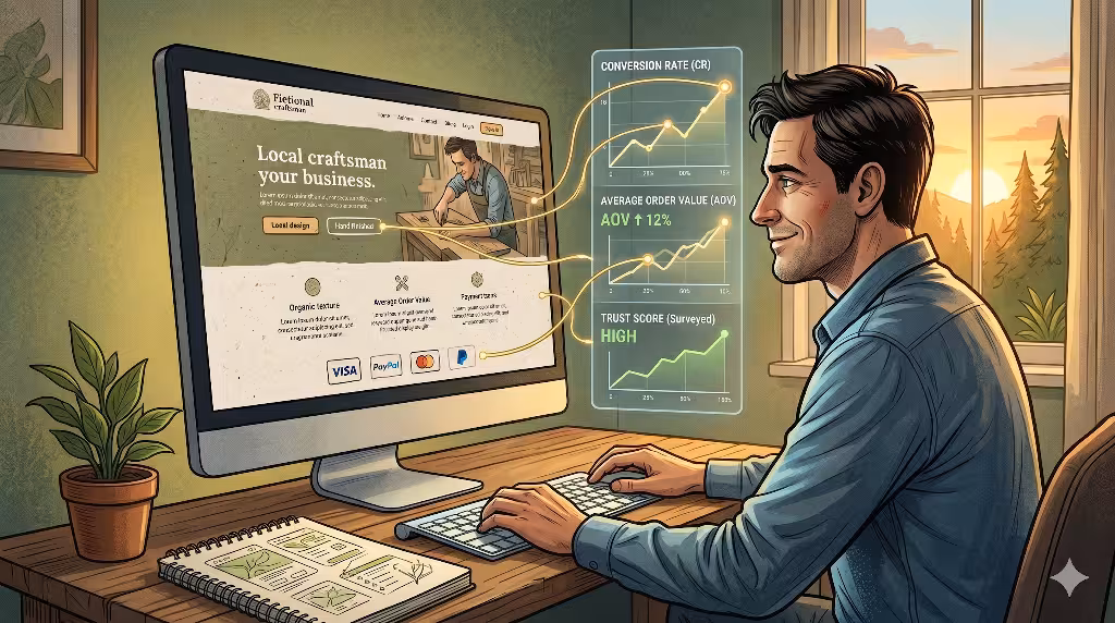
When you include thoughtful imperfection in digital design, you show the user that real human beings are working behind the screen. A hand-drawn icon, a unique font choice, or an off-center image layout acts like a human signature. It signals authenticity. Visitors feel like they are interacting with a real craftsman or a dedicated local team. This sense of honesty makes them feel safe, which directly improves conversion rates and encourages people to stay on your site longer.
Data shows that users connect more deeply with brands that show their human side. When a website feels approachable and warm, users are more likely to read the content, click on buttons, and fill out forms. By using imperfection in digital design, you remove the wall between your business and your audience. You turn a standard online transaction into a meaningful human connection, which helps your brand build long-term customer loyalty.
Resolving the Perfection Paradox in Modern Web Layouts
The perfection paradox describes a strange situation in modern web engineering. Designers spend thousands of hours trying to make everything completely flawless, yet the result is often a boring website that users want to avoid. To fix this problem, we need to balance structure with variance. We must explore how imperfection in digital design can solve this issue without causing new technical challenges.
Why is absolute perfection avoided in modern digital design?
Absolute perfection is avoided because it removes the character and emotional warmth from an interface. When every digital product uses the exact same geometric rules, brands lose their identity and look completely identical. Furthermore, a perfectly uniform screen does not match how our eyes work in the real world, leading to visual boredom and lower engagement. By avoiding absolute perfection and embracing imperfection in digital design, creators can build memorable spaces that capture attention and stand out from the crowd.
How does organic asymmetry affect digital accessibility?
Organic asymmetry does not have to harm web accessibility if it is done correctly. True imperfection in digital design focuses entirely on the visual layer, such as background shapes, textures, and line styles, while keeping the structural code clean and standard. This means you can use an organic, wavy shape for a button background while keeping the actual HTML code completely standard and easy for screen readers to read. Accessibility and beautiful, natural variation can easily live together on the same page.
To resolve the perfection paradox completely, think of a website like a modern timber-frame house. The main support beams must be perfectly strong, level, and square so the roof does not fall down. However, the surface of the wood can show natural grain, knots, and unique textures. You can apply this same rule to imperfection in digital design by keeping your underlying grid system highly reliable while allowing the surface elements to show beautiful, natural variations.
Core Semantic Elements of an Effective Imperfect Layout
To build a website that uses imperfection in digital design successfully, you must know which parts of the interface can be modified. You cannot simply randomize every element on the screen, or the layout will become confusing. You need to choose specific visual assets that will benefit from natural variation. This ensures that the site remains easy to read while offering a refreshing, organic experience.
The best approach is to target elements that interact directly with the user’s vision and feelings. This includes things like the backgrounds of sections, the style of the lines used to separate text, the color choices, and the typography. By carefully applying imperfection in digital design to these specific areas, you can transform a boring template into a rich experience.
The following table breaks down how you can shift different UI assets from a sterile style to an organic style, along with the benefits of making that change.
| UI Asset Category | Rigid Execution (Sterile) | Imperfect Execution (Biophilic) | Cognitive/SEO Benefit |
| Typography | Perfectly linear sans-serif grids | Custom kerning offsets, hand-finished display fonts | Increases visual anchoring and dwell time. |
| Color Palettes | Pure hex extremes like #000000 or #FFFFFF | Attenuated, earth-inspired hues with micro-gradients | Reduces optical strain; increases time-on-page. |
| Component Borders | 90-degree boxes or uniform border-radius | Variable path SVGs resembling natural terrain | Guides the user’s eye naturally to CTAs. |
When you study typography, you see that perfectly rigid letters can blend together when a person reads long paragraphs. By choosing fonts with slight variations or using custom spacing between letters, you give each word a unique shape. This helps the reader stay focused. The same rule applies to colors. Pure white screens can hurt the eyes after a few minutes. Using softer, natural tones creates a relaxing environment that encourages people to stay and read your content.
Borders and boxes are also great places to show imperfection in digital design. A standard box with perfectly sharp corners feels cold and rigid. If you change that box to have a slightly uneven border that looks like it was drawn by a human hand, the whole section feels friendlier. It draws attention to the content inside the box without feeling loud or aggressive, making it a wonderful way to highlight important calls to action, or CTAs.
The Local SEO Advantage: Differentiating Your Regional Brand
Search Engine Optimization, or SEO, is the practice of making your website easy for search engines like Google to find and understand. Many business owners focus entirely on keywords and links when they think about SEO. However, modern search engines also look closely at user behavior signals. This is where using imperfection in digital design can give your local business a major competitive advantage.
When someone searches for a local service, such as a bakery, a landscaper, or a boutique design firm, they are looking for a real business in their community. If they click on a search result and find a generic website that looks like a cold corporate portal, they will often click the back button immediately. This quick exit is called a bounce, and it tells search engines that your page was not helpful. A high bounce rate can lower your search rankings over time.
By using imperfection in digital design, you can create a unique website that instantly captures a visitor’s interest. When a page looks warm, artistic, and tied to the local culture, people want to stay and explore. They scroll down the page, read your story, and look at your photos. This extra time spent on your site is called dwell time. Search engines track dwell time because it is a clear sign that your website provides a high-quality experience.
+--------------------------------------------------------+
|              Modern Local SEO Strategy                 |
+--------------------------------------------------------+
|                                                        |
|   [ Imperfection in Digital Design ]                   |
|                   │                                    |
|                   ▼                                    |
|   [ Increased User Engagement & Delight ]              |
|                   │                                    |
|                   ▼                                    |
|   [ Longer Dwell Time (Users stay on page) ]           |
|                   │                                    |
|                   ▼                                    |
|   [ Positive Signals sent to Search Crawlers ]         |
|                   │                                    |
|                   ▼                                    |
|   [ Higher Local Search Engine Rankings ]              |
|                                                        |
+--------------------------------------------------------+
You can also connect these unique design choices with your local schema markup, which is special code that helps search engines understand your location and services. When your underlying code tells a clear story about your local presence, and your visual layout reflects that same human care through imperfection in digital design, you create a powerful combination. You stand out from the ocean of generic online templates and build a strong connection with your local community.
Strategic Friction: When Imperfection Improves Product UX
For many years, web designers believed that a website should be as smooth and seamless as possible. They wanted to eliminate every click, every pause, and every moment of effort for the user. While this smooth approach is helpful for simple tasks like resetting a password, it can sometimes backfire. There are times when introducing small amounts of imperfection in digital design creates helpful friction that improves the overall user experience, or UX.
Strategic friction is the practice of intentionally slowing a user down for a specific reason. Think about walking down a flat, straight concrete sidewalk. You walk quickly, but you do not look at the ground or notice your surroundings. Now, think about walking down a winding stone path in a beautiful garden. The uneven stones force you to slow down, watch your step, and pay attention to where you are going. You become fully present in the moment.
You can use imperfection in digital design to create a similar experience on a screen. When a layout has unique elements, such as a text box with a slightly off-center background or a menu that opens with an organic movement, it forces the user to pause for a microsecond. This tiny pause breaks their automatic scrolling habit. It encourages them to actually read the words on the screen instead of blindly flicking their thumb past your important messages.
This technique is especially useful when users need to make important choices, like reviewing an order before checking out or reading a safety agreement. If the interface is too smooth, people will click through without thinking, which can lead to mistakes and complaints later on. By using imperfection in digital design to create gentle visual speed bumps, you help your users make better, more deliberate choices. This leads to fewer errors, higher satisfaction, and a much more rewarding interaction with your brand.
Defending Against the AI Monoculture
We are currently living through a massive shift in how technology is created. Artificial intelligence tools can now generate complete websites, write code, and create graphics in a matter of seconds. While these tools are incredibly powerful, they also create a new challenge, which is the rise of the AI monoculture. This monoculture means that because everyone is using the same algorithms, the internet is rapidly becoming flooded with websites that look exactly the same.
AI models are trained on existing data, which means they look for averages and patterns to create their designs. They excel at building layouts that follow every standard rule of symmetry, alignment, and spacing perfectly. As a result, AI-generated sites are often the definition of sterile perfection. If every business uses these automated tools, then every website in your industry will soon share the same clean, uninspiring look.
Embracing imperfection in digital design is your best defense against this wave of uniformity. Human designers have something that algorithms do not, which is the ability to make intentional, creative mistakes that feel full of life. A human knows how to break a rule beautifully to express a specific emotion or tell a personal story. These unique choices cannot be easily copied by a machine that only cares about averages and mathematical perfection.
When you choose a biophilic approach that values imperfection in digital design, you make your brand future-proof. You stand out instantly in a digital world full of computerized perfection. Visitors will recognize the human heart and care behind your layout, and they will naturally prefer your authentic brand over a cold, AI-generated competitor. Your unique variations become your greatest strength, showing people that your business is run by real humans who value true quality.
Implementation Playbook: Introducing Natural Elements Without Breaking Code

Now that you understand the many benefits of natural variation, you might be wondering how to start using these ideas on your own website. It is important to approach this process carefully. You want to introduce beautiful imperfection in digital design without hurting your site speed, breaking your layout, or confusing your visitors. Here is a practical playbook to help you upgrade your digital presence safely and effectively.
Step 1: Start with the Background Textures
Do not try to change your entire website all at once. Start by replacing your flat, solid backgrounds with soft, organic textures, such as that used on the Landscape Design Studio website. You can use a very light image file that looks like linen, canvas, or handmade paper. Make sure the texture is faint so it does not interfere with the readability of your text. This simple change instantly removes the cold, sterile feel of a standard screen.
Step 2: Use Unique SVG Elements
Replace a few of your standard rectangular boxes with custom SVG shapes that have slightly wavy or hand-drawn edges. You can use these organic paths for section dividers, button backgrounds, or frames around your photos. Because SVGs are based on code rather than large image files, they will load incredibly fast and look perfectly sharp on every screen size.
Step 3: Introduce Muted, Natural Colors
Review your color palette and move away from extreme digital colors. Replace pure black text with a deep, warm charcoal grey. Replace bright, electric blues and greens with softer tones found in nature, such as olive green, slate blue, terracotta, or warm sand. These colors reduce eye strain and make your website feel grounded and peaceful.
Step 4: Keep the Code Clean and Standard
Always remember that imperfection in digital design is a visual styling choice, not an excuse for messy development. Your underlying HTML code must remain completely standard, orderly, and accessible. Use clean semantic tags, keep your CSS well-organized, and make sure your navigation remains simple and easy to understand. The visual layer can play with natural variations, but the structural foundations must always be strong and dependable.
In our modern digital world, absolute perfection is a metric for machines. True imperfection is a metric for humans. When we build websites that ignore our natural connection to the living world, we alienate the very people we want to reach. By bringing the warmth, variance, and beauty of nature back to the screen, we can build a friendlier, more successful internet for everyone.