At Silphium Design our work is rooted in the belief that our digital lives do not have to be disconnected from the natural world. Most people spend hours every day looking at a flat, glowing piece of glass. This glass is smooth, cold, and sterile. The human brain did not evolve to look at perfect, flat surfaces. We evolved in the forest, among the mountains, and near the soil.
When we use earthy textures in our website designs, we are trying to give the brain what it actually wants. We are adding a sense of touch to a medium that is usually untouchable. This article will guide you through the technical and emotional ways we use earthy textures to make the internet feel like a more natural, healthy place to be.
Table of Contents
The Illusion of Tactility
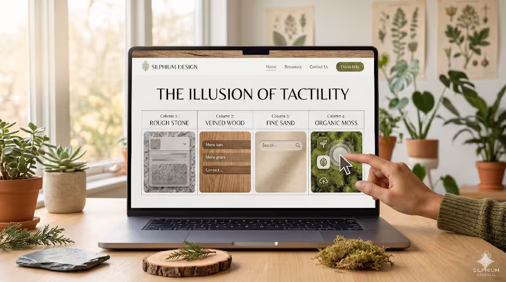
When we talk about digital design, we often think about things that are perfect. We think about straight lines and flat colors. However, earthy textures are the opposite of that. In the world of computers, a texture is a special kind of image or code that makes a surface look like it has a feel to it. If you look at a brick wall, you can see the tiny holes and the rough spots. In digital design, we use bits and bytes to mimic those tiny holes.
We use these earthy textures to break the “uncanny valley” of the web. This is a term we use when something looks almost real but feels a little bit “off” or creepy because it is too perfect. By adding the grit of sand or the grain of a piece of wood, we make a website feel more honest. These earthy textures are often made using small files called bitmaps or by using math. When we use math to make a texture, we call it a generative texture. This means the computer calculates where the bumps and shadows should be.
Even though you cannot actually feel the screen, your brain sees the earthy textures and remembers what it feels like to touch the ground. This creates a bridge between your physical body and the digital world. It makes the website feel like a place you can inhabit rather than just a bright light you are staring at.
The Biophilic Connection: Material Connection with Nature
In my graduate work at the Rhode Island School of Design, I focused heavily on biophilic design. This is the practice of bringing nature into the places we build. There are 14 main patterns of this design style. Pattern number eight is called the Material Connection with Nature. It tells us that humans feel better when they are surrounded by materials that look like they came from the earth.
When you use earthy textures, you are following this biological rule. Think about why people like the look of wood floors or stone counters. It is because those materials have patterns that never repeat perfectly. These are called fractal patterns. Your brain is very good at recognizing these patterns. When it sees earthy textures that look like wood grain or stone veins, it tells your body to relax.
Science shows that looking at these earthy textures can actually lower your heart rate. It can lower a hormone called cortisol, which is what makes you feel stressed. In a world where the internet can often make people feel anxious or rushed, using earthy textures is a way to provide a moment of peace. It turns a standard webpage into a digital garden. This is why at Silphium Design LLC, we prioritize these natural elements. We want the user to feel safe and grounded.
Handmade vs. Generative Textures
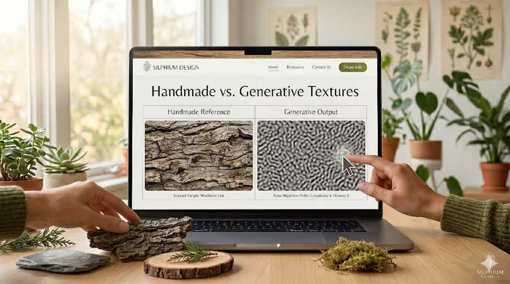
There are two main ways we get these earthy textures into a design. The first way is the handmade approach. This is where I often use my background in botany. I might go out into the woods near Burlington or Boston and find an interesting piece of bark or a flat stone. I use a high-quality scanner or a camera to turn that physical object into a digital file. These handmade earthy textures are wonderful because they carry the true randomness of nature. You can see the tiny imperfections that only a living thing can create.
The second way is using generative math. As someone with a PhD in Computer Science, I find this part fascinating. We use things called noise functions, such as Perlin noise. This is a fancy way of saying we tell the computer to make a “messy” pattern that follows certain rules. We use this to create earthy textures that look like clouds, dirt, or moving water.
The benefit of using math to create earthy textures is that the patterns can go on forever without ever repeating. If you see a pattern repeat on a website, your brain quickly realizes it is fake. But with generative earthy textures, the experience feels fresh and real. It allows us to build websites that feel like they are alive and growing.
The Psychology of Color and Earth Tones
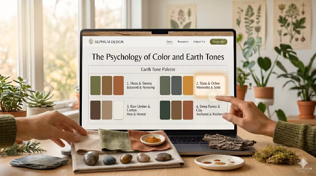
You cannot talk about earthy textures without talking about color. People often ask: What are earthy colors? To an expert, earthy colors are the ones you find when you look down at the soil or up at a mountain. We are talking about browns like umber and sienna. We are talking about soft greens like moss and sage. We also include the greys of wet slate and the deep oranges of clay.
These colors work perfectly with earthy textures because they are “desaturated.” This means they are not too bright or neon. They are calm. When you combine a rough texture with a calm color, you create a sense of weight. In digital design, “weight” is a good thing. It makes a button feel like it is made of something solid. It makes a background feel like a sturdy wall.
Using these colors within your earthy textures helps tell a story. If I use a sandy texture with a light beige color, the website might feel like a beach or a desert. If I use a dark, grainy texture with a deep brown, it feels like rich forest soil. These choices change how a user feels about a brand before they even read a single word on the page.
Semantic Elements of Earthy UI
When we build a user interface, or UI, we use different types of earthy textures for different jobs. One of the most common is grain or grit. This looks like tiny speckles on the screen. It is very useful for backgrounds because it makes the screen look like paper or stone instead of just a flat white box. This “tooth” in the design gives the eye something to hold onto.
Another type is fibrous textures. These look like they are made of tiny threads or hairs. Think about the way a piece of linen or handmade paper looks. These earthy textures are great for websites that want to feel organic and eco-friendly. They suggest that the brand cares about how things are made and where they come from.
Finally, we have mineral textures. These look like hard surfaces like granite or clay. We use these when we want a website to feel very strong and permanent. By using shadows and highlights on these earthy textures, we can make it look like parts of the website are carved out of rock. This adds a sense of 3D depth that is very pleasing to the eye.
Strategic Implementation: CSS and SVG Techniques
How do we actually put these earthy textures onto a website without making it slow? This is where the technical work comes in. We do not always want to use big, heavy image files. Instead, we use code. There are tools in web design called SVG filters. We can use a specific bit of code called feTurbulence. This tells the browser to create a grainy look right there on the user’s screen.
By using these code-based earthy textures, we keep the website fast. We can also use CSS, which is the language that tells a website how to look. We can use CSS to layer different earthy textures on top of each other. For example, we might have a solid green color and then put a semi-transparent layer of “grit” on top of it.
We also use something called backdrop filters. This allows us to blur the background in a way that looks like frosted glass or misty air. When you mix these effects with earthy textures, you get a very rich, professional look. It makes the website feel like a high-end physical object rather than a cheap digital one.
SEO and Performance Optimization
When it comes to SEO, a website must be fast to show up on Google. If we use too many heavy earthy textures, the site will take a long time to load. People will leave, and Google will rank the site lower. To fix this, we use new image formats like WebP or AVIF. These formats allow us to have very detailed earthy textures that are very small in file size.
We also make sure that our earthy textures match our keywords. If we are writing about sustainable design, we want our images to be named things like “organic-soil-texture.webp.” This helps search engines understand what the page is about.
When people search for terms related to natural design, having a site that actually looks and feels natural helps. It increases the time people spend on the site. Google sees that people are staying and looking around, and it decides that the site is high quality. So, using earthy textures is not just a design choice; it is a smart business choice for local search and overall ranking.
Accessibility in Textured Environments
One thing we take very seriously at Silphium Design LLC is making sure everyone can use our websites. This is called accessibility. Sometimes, when you use a lot of earthy textures, it can make it hard to read the text. If the background is too “busy” with wood grain or stone patterns, the letters might disappear into the texture.
To solve this, we use high contrast. If we have a dark, earthy texture for a background, we make sure the text is very bright and clear. We also use a rule called WCAG 2.1. This is a set of guidelines that tells us exactly how much contrast we need so that people with low vision can still read everything.
We also tell the computer that these earthy textures are just for decoration. We use a special code called aria-hidden. This tells screen readers (which are used by people who are blind) to skip the textures and just read the important information. This way, our earthy textures make the site beautiful for those who can see it, without making it broken for those who cannot.
Common Questions Answered about Earthy Textures
People often have questions when they first start learning about this. One common question is: How do digital artists create texture? Most artists use programs like Adobe Photoshop. They use digital brushes that act like real charcoal or paint. They layer these to build up earthy textures from scratch.
Another question is: Why use natural textures in web design? The answer is about trust. We trust things that feel real. When a website uses earthy textures, it feels more like a real-world shop or office. It builds a bridge of authenticity between the business and the customer.
People also ask: What is the difference between visual and tactile texture? This is a great question. Visual texture is what you see on the screen. It is an illusion. Tactile texture is what you feel with your fingers. In digital design, we use visual earthy textures to trick the brain into thinking it is having a tactile experience. It is a form of digital magic that makes the user feel more connected to the content.
Future Trends: Responsive Materiality
As we look to the future, earthy textures are becoming even more advanced. We are starting to see “responsive materiality.” This means the earthy textures on a website might change based on how you move your mouse or scroll the page. Imagine a stone background that catches the light differently as you move, just like a real piece of granite would.
We are also seeing more websites use earthy textures that change based on the time of day. A site might look like bright, dry sand in the morning and damp, dark soil at night. This makes the digital world feel like it is part of the real passage of time.
At Silphium Design LLC, we are excited to keep pushing these boundaries. We believe that earthy textures are the key to making the internet a more human place. By moving away from the cold, flat designs of the past and embracing the beautiful mess of the natural world, we can create websites that truly nourish the people who use them. We are moving from simply making “web sites” to creating “digital environments” where humans can thrive.
Using earthy textures is a commitment to quality. It shows that you have taken the time to think about the human on the other side of the screen. Whether it is the grain of a leaf or the grit of a mountain, these earthy textures remind us all that even though we are using high-tech tools, we are still part of the earth.
I hope this guide has helped you understand the depth and importance of earthy textures in the modern digital landscape. By combining biology, web design, and inherently good design, we can build a web that feels just as good as a walk in the Pennsylvania woods.