At Silphium Design LLC, we strive to incorporate nature into our web designs. Our work is rooted in the belief that our screens should not feel like cold, sterile pieces of glass. Instead, they should reflect the vibrant, living world outside our windows. This philosophy leads us to a major shift in how we create interactive elements.
We are moving away from the rigid, industrial layouts of the past and toward a style called distilled nature. This is a phyllotactic shift, named after the way leaves are arranged on a stem. In 2026, the modern user is tired of flat, boring shapes. They want quiet tech that lowers their stress. By using nature-inspired button design, we can create a web experience that feels like a walk through a forest rather than a trip through a factory. This approach combines biomorphism, which means using shapes from life, with haptic-visual feedback to make every click feel like a natural event.
Table of Contents
The Human Connection to Natural Shapes
To understand why a nature-inspired button design works, we have to look at how the human brain evolved. For millions of years, our ancestors looked at trees, rocks, and water. They did not look at perfect squares or neon rectangles. When we see organic shapes, our brains relax. This is why biophilic design is so important for the modern internet. People spend hours every day looking at websites. If those websites are filled with sharp edges and harsh colors, it creates a small amount of mental fatigue.
By choosing a nature-inspired button design, we give the user a sense of relief. We call this the quiet tech movement. It is about making technology feel like it belongs in our world. When a button looks like a smooth pebble or a soft leaf, it feels safer to click. This is not just a trend for the sake of looking pretty. It is a functional choice. Good button design should help a person find their way without causing them stress. In 2026, we see that users stay on websites longer when the interface feels organic. They are more likely to interact with a site that mimics the textures and patterns of the natural world.
Biomorphic Geometries: Using Math from Nature
One of the most exciting parts of nature-inspired button design is the use of complex math to create simple shapes. In the past, we used basic circles or squares. Now, we use the Fibonacci sequence and Voronoi patterns. The Fibonacci sequence is a series of numbers where each number is the sum of the two before it. It looks like this:
Fn = Fn-1 + Fn-2
We see this math in the way seeds grow in a sunflower or how shells spiral. When we apply this math to button design, the proportions feel “right” to the human eye. It creates a sense of balance that a standard rectangle cannot match. We also look at Voronoi patterns. These are the shapes you see on the skin of a giraffe or the cells of a leaf. By using these patterns, we can create button design layouts that feel like they grew into place rather than being placed there by a machine.
To make these shapes work on a website, we use technical tools like CSS clip-path and SVG filters. This allows us to create buttons with soft, irregular edges. Imagine a button that is not a perfect oval but has the gentle curves of a river stone. This type of button design is much more inviting. It tells the user that the website is a flexible, living thing. It breaks the “grid” that has made the internet look the same for the last ten years. When we use these biomorphic shapes, we are speaking the language of nature through our code.
Stomata-Inspired Toggles and Functional Growth
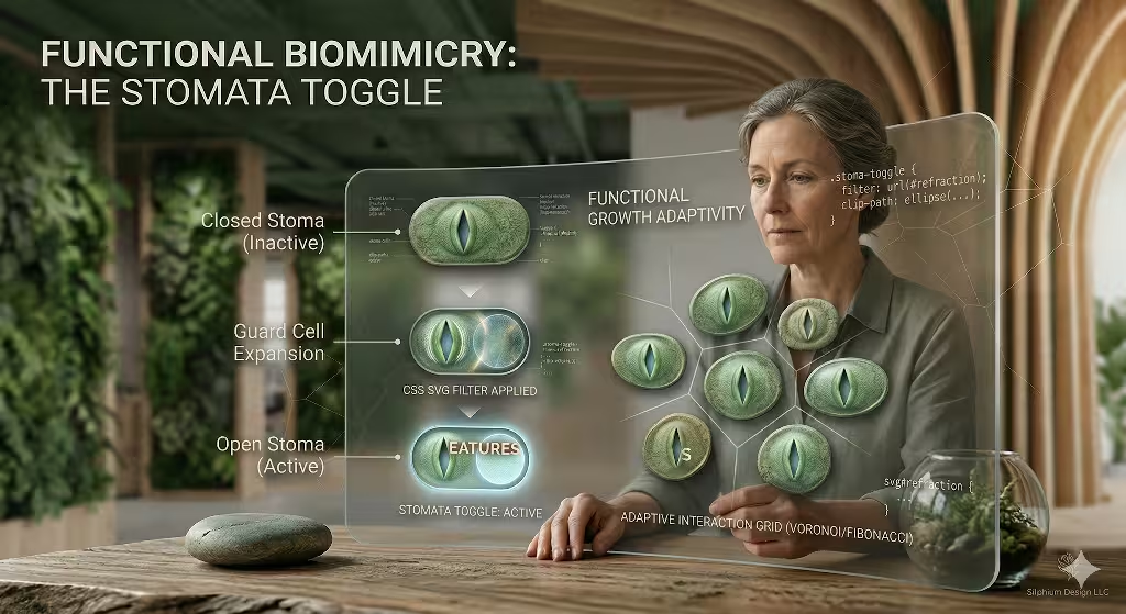
We can also look at specific biological functions to improve button design. Consider the stomata on a leaf. These are tiny pores that open and close to let the plant breathe. In our 2026 web projects, we are seeing toggles that mimic this movement. Instead of a simple sliding switch, the toggle might expand and contract with a soft, organic motion. This is a form of functional biomimicry.
When a user interacts with a nature-inspired button design, the button should respond like a living organism. If you press it, it might slightly change shape, just as a real leaf would if you touched it. This creates a deep connection between the user and the interface. It makes the act of navigating a website feel less like a chore and more like an exploration. At Silphium Design LLC, we focus on these tiny details because they add up to a much larger feeling of harmony.
Digital Tactility and Texture Mapping
The next big trend in nature-inspired button design involves how the surface of the button feels to the eye. We call this digital tactility. We want users to feel like they could reach out and touch the buttons on their screen. To do this, we use texture mapping. This means adding digital details that mimic things like lichen, weathered stone, or cellulose fibers from wood.
In the early days of the web, we had skeuomorphism, which tried to make things look like plastic or metal. Now, we have Skeuomorphism 2.0. This version is more subtle. It uses noise textures and light effects to create a sense of physical weight. A button design might have a tiny bit of “grit” on it, making it look like it was carved from a piece of slate. We also use micro-refraction. This is how light bends when it hits a surface. By making a button design react to the “light” of the screen, it gains a 3D quality that makes it stand out.
This level of detail is important for creating a brand identity. If a company wants to show they care about the environment, their button design should reflect that. Using textures like recycled paper or soft moss sends a message without saying a word. It creates a sense of trust. The user feels that the company is grounded and real. In a world of AI and virtual reality, these tactile touches keep us connected to the physical earth.
Kinetic Biomimicry: Buttons That Breathe
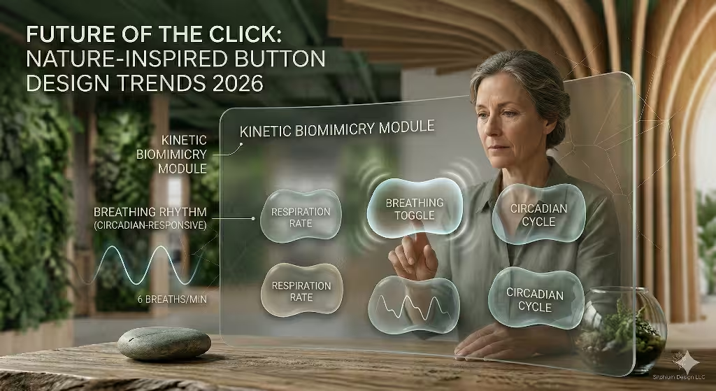
Nature is never perfectly still. Even a tree that looks still is slowly moving with the wind or growing toward the sun. We can bring this life to the web through kinetic biomimicry. This involves making a nature-inspired button design that has its own “resting state.” A button might pulse very slowly, like a heart beating or a person breathing. This subtle movement shows the user that the button is active and ready for a click.
We also use something called thigmotropism. In biology, this is how a plant grows in response to touch. In a modern button design, we can make the button turn or tilt slightly toward the user’s cursor. It is as if the button is reaching out to be clicked. This type of micro-interaction makes the user feel noticed. It turns the website into a partner in the conversation.
Another concept we use is the refuge principle. In nature, animals look for a safe place to hide, called a refuge. We can apply this to button design by placing buttons in “visual nooks” that have soft shadows. This makes the button feel protected and easy to find. It creates a focal point that draws the eye without being loud or annoying. It is a gentle way to guide the user through a website.
Haptic Integration and the Sense of Touch
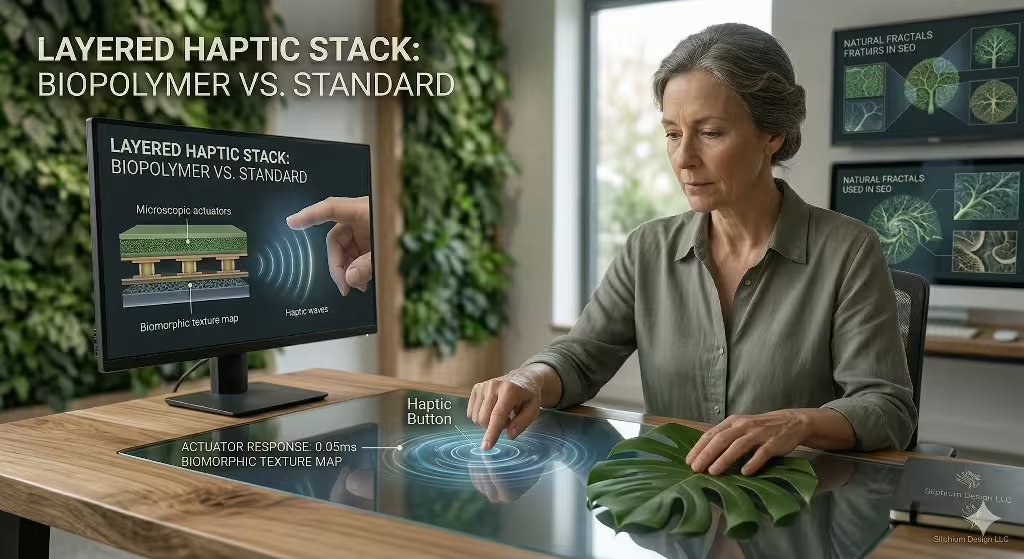
On mobile devices, we can go even further with nature-inspired button design. We use haptic feedback to mimic the sounds and feelings of nature. When a user clicks a button, the phone might give a tiny vibration that feels like a dry twig snapping or a soft squish like walking on moss. This bridge between the visual and the physical is very powerful.
When the haptic feel matches the nature-inspired button design, the brain is fully convinced. If a button looks like a stone and feels heavy when you press it, the experience is complete. This reduces the “digital gap” that often makes people feel disconnected from their devices. At Silphium Design LLC, we study these physical sensations to ensure that every button design we create is satisfying to use. We want the user to enjoy the click as much as the content they find after the click.
The Biophilic Color Engine and Circadian UI
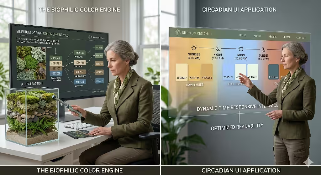
Color is a huge part of any nature-inspired button design. In 2026, we are moving away from the bright, neon colors that used to dominate the web. Instead, we use earth-driven palettes. We look at colors like Cloud Dancer, which is a soft, off-white, or deep mossy greens and clay terracottas. These colors are easier on the eyes and help the user stay calm.
We are also implementing circadian-responsive UI. This means the colors of the button design change based on the time of day for the user. In the morning, the buttons might have a soft golden glow like the sunrise. In the evening, they might shift to a deep blue or a warm charcoal. This helps the user’s body stay in sync with the natural day. It is a way of making technology respect our biological needs.
However, we must also think about accessibility. A good nature-inspired button design must be easy for everyone to see. We use the WCAG 2.2 guidelines to make sure there is enough contrast. Even with earthy colors, we can ensure that the button design stands out enough for people with low vision. It is about finding the balance between beauty and function.
Common Questions About Natural UI in Button Design
People often ask how these nature-inspired buttons improve the user experience. The answer is simple: they reduce cognitive load. Our eyes are trained to recognize organic shapes very quickly. In fact, research shows that the human eye processes organic shapes about 22% faster than rigid geometric shapes. This means a nature-inspired button design helps a user find what they need with less effort.
Another common question is whether traditional buttons are going away. They are not going away, but they are changing. In 2026, we see more “agentic” button design. This means the buttons only appear when they are needed. They might grow onto the screen when you hover over an area and then fade away like a mist when you are done. This keeps the website clean and focuses on the beauty of the design.
Finally, people ask about the difference between skeuomorphism and biomorphism. Skeuomorphism mimics man-made objects, like a button that looks like a plastic light switch. Biomorphism mimics living things, like a button design that looks like a leaf or a drop of water. Biomorphism is usually more effective for biophilic design because it connects to our biological roots rather than just our familiarity with old machines.
SEO and Performance: Nature vs. The Machine
You might think that all these textures and movements would make a website slow. But in 2026, we have the tools to keep things fast. We use WebGL and Lottie animations to create complex button design elements without using too much data. This is vital for SEO. Google cares about speed, specifically the Largest Contentful Paint (LCP). We make sure that our nature-inspired button design is lightweight and loads in under 2.5 seconds.
Google also looks at user delight as a ranking factor. If people enjoy using your site because the button design is intuitive and beautiful, they will stay longer. This lower bounce rate tells the search engine that your site is high quality. Therefore, a nature-inspired button design is not just a visual choice; it is a smart SEO strategy. It helps your site rank better by making it a place where people want to spend their time.
We also focus on interaction smoothness. If a button feels laggy, the nature-inspired effect is ruined. We use clean code and modern browser features to ensure that every nature-inspired button design reacts instantly. This creates a seamless flow between the user’s intent and the website’s response. It is like the smooth flow of a river.
The Future of the Living Web
As we look toward the future, the line between botany and coding will continue to blur. At Silphium Design LLC, we are leading the way in this field. We believe that every website should be a digital garden. A nature-inspired button design is the first step in creating that garden. It is a small detail, but it has a huge impact on how we feel when we use the internet.
By focusing on biomorphic geometries, digital tactility, and kinetic movement, we can create a web that feels alive. We can move away from the cold, square world of the past and into a future that is soft, green, and human. The trends in nature-inspired button design are not just about style. They are about building a better, healthier digital world for everyone.
| Feature | Industrial Button Design | Nature-Inspired Button Design |
| Shape | Perfect squares and circles | Fibonacci spirals and Voronoi cells |
| Texture | Flat or plastic-like | Moss, stone, and wood textures |
| Movement | Instant snap or slide | Breathing pulses and organic growth |
| Color | Neon or high-contrast primary | Earth tones and circadian shifts |
| Human Impact | High cognitive load | Lower stress and faster recognition |
Designing with Intent
When you start your next project, think about the buttons. Do they feel like they belong in a machine, or do they feel like they belong in a forest? Choosing a nature-inspired button design is a way to show your users that you care about their well-being. It is a way to make the internet a more beautiful place, one click at a time. We invite you to explore these trends and see how they can transform your digital space.
At Silphium Design LLC, we are always monitoring the best keywords and trends in natural design to ensure our designs are both beautiful and effective. The evolution of the click is here, and it is green, organic, and full of life. By embracing nature-inspired button design, we are not just designing websites; we are nurturing ecosystems. This is the hallmark of competent, innovative, and creative design in 2026.