As the design expert for Silphium Design LLC, I look at the digital world through the lens of biology and architecture. My work often asks a simple question: why do we build websites like stiff, gray boxes when our brains crave the flow of the natural world?
The answer lies in the legacy of a man who changed how we see space itself. By applying Frank Lloyd Wright principles in UX design, we can stop treating the internet like a filing cabinet and start treating it like an ecosystem.
Table of Contents
The Death of the Box in Digital Design
When Frank Lloyd Wright began his career, houses were sets of cramped, dark rooms. He called this the “box.” He spent his life trying to break those boxes apart to let light and air move through them. In the world of web design, we have fallen into the same trap. Most websites are made of rigid squares and rectangles that feel like they are trapping the user.
At Silphium Design, we believe that a website should not be a container. It should be a place where a user feels at home. When we use frank lloyd wright and his ideas, we move away from static grids. We look for ways to make the screen feel open. This is called biophilic UX. It means using the rules of nature to make a digital space feel better for humans. By breaking the box, we allow for a more natural way to browse and explore.
Form and Function Are One (Not Separate)
Many people get stuck on the old idea that beauty is just a layer of “paint” you put on a website after it is built. In my work, I look back to the philosophy of Frank Lloyd Wright to prove that this is a mistake. To him, the idea that form and function were separate was a “box” that needed to be broken. He believed they were one and the same.
The Soul of the Interface: Why Form and Function Are One
In the early days of building, an architect named Louis Sullivan said “form follows function.” This meant that if you knew what a building was for, you would know what it should look like. But Frank Lloyd Wright was Sullivan’s student, and he eventually disagreed. He felt that saying one “follows” the other made them sound like two different things. He argued that they should be born at the same time, like the roots and the leaves of a single tree.
In UX design, we often see teams split into two groups: the “coders” who make the site work (the function) and the “designers” who make it look pretty (the form). This is exactly what Frank Lloyd Wright warned against. When these two things are split, the website feels “broken.” It might work fast, but it feels cold and robotic. Or, it might look like a piece of art, but it is impossible to navigate.
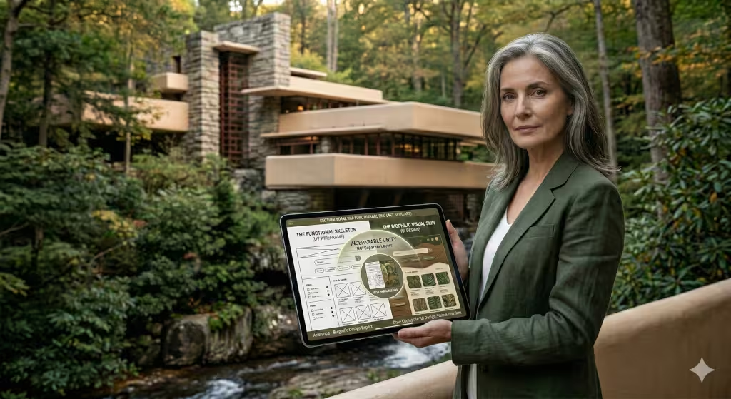
At Silphium Design, we use the Frank Lloyd Wright approach by creating a “unified theory” for every project. This means the visual “skin” of the site and the functional “skeleton” of the code are inseparable. If we design a button that looks like a smooth river stone, it is not just because we like stones. It is because the “function” of that button is to feel natural and inviting to the human hand. The beauty is the function, and the function is the beauty.
Technical Unity: The “Skin” and the “Skeleton”
When we look at a building like the Guggenheim Museum, we see a giant white spiral. That spiral is the “form,” but it is also the “function.” The shape of the building tells the visitor exactly how to move through the art gallery. You don’t need a map or a sign because the building itself is the map.
We apply this Frank Lloyd Wright principle to web navigation. Instead of a messy menu with fifty links, we create a flow where the visual cues guide the user’s eye exactly where it needs to go. This is what we call “functional aesthetics.” We use things like:
- Visual Weight: Making important buttons larger or brighter, so the “form” tells the user what the “function” is without using words.
- Micro-interactions: When you hover over a link and it moves slightly, like a leaf in the wind. This “form” tells you that the link is “alive” and ready to be clicked (the function).
- Information Architecture: Arranging the data on a page so it feels like a natural path through a forest, rather than a wall of text.
The Biological Connection
Because I have a background in Biology, I see this unity everywhere in nature. A bird’s wing is beautiful, but every feather is also shaped perfectly for flight. The “form” of the wing is the “function” of the flight. By using Frank Lloyd Wright as our guide, we try to make websites that have this same biological truth.
When a user visits a site that follows these rules, they don’t feel like they are using a machine. They feel like they are interacting with a living thing. This reduces the stress of using technology and makes the experience much more memorable. We don’t just want people to use our sites; we want them to feel a connection to them. That is the power of making form and function one.
The Digital Prairie: Horizontal Flow and Spatial Continuity
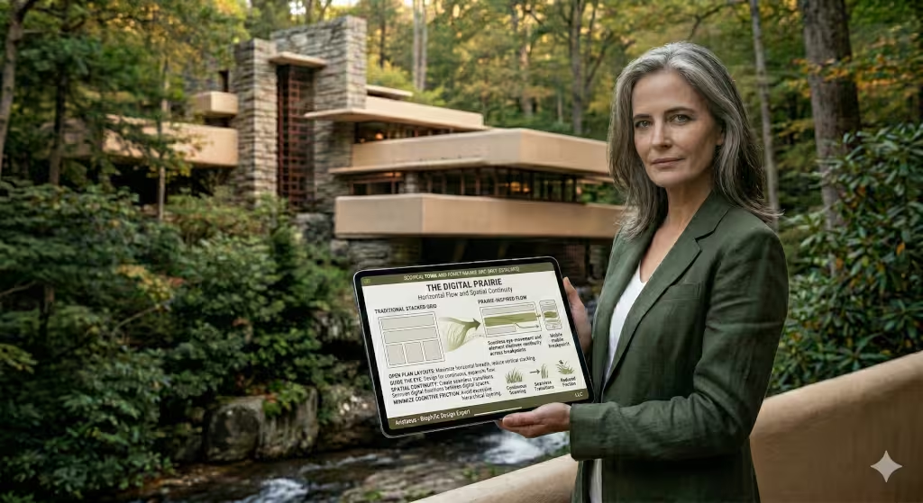
The American prairie is wide and flat. It has a long horizon that feels peaceful. This inspired the Prairie School of architecture led by Frank Lloyd Wright. He used long horizontal lines to make buildings feel like they belonged to the ground.
In a world where we spend all day scrolling down, horizontal flow is a powerful tool. We can use wide layouts and open whitespace to give the user a sense of “spatial continuity.” This means the user feels like they are moving through a single, large space rather than jumping from page to page. This reduces the work the brain has to do, which we call “cognitive load.” When a site feels like a wide, open landscape, people want to stay longer. They feel less stressed. This is a key part of how Frank Lloyd Wright can help us design better for people.
Integrity of Materials: Authenticity in Pixels
One of the most important rules for Frank Lloyd Wright was to be honest with materials. If you use stone, it should look and act like stone. You should not paint wood to look like metal. This is called the “integrity of materials.”
In the digital world, our materials are pixels, colors, and shadows. For a long time, designers used “skeuomorphism.” This means making digital buttons look like real 3D plastic buttons. Later, everyone switched to “flat design,” which removed all texture. At Silphium Design, we follow Frank Lloyd Wright by seeking a middle ground. We use shadows only when they help show that something can be clicked. We use textures only if they add a real feeling of depth. We want the user to trust that what they see is “true” to what it does. Honesty in design builds trust with the user.
Biophilic Design: The Biological Imperative of UX
As a biologist, I know that humans are hard-wired to love nature. This is called biophilia. When we see patterns that look like trees or clouds, our heart rate goes down. Frank Lloyd Wright knew this instinctively. He used shapes like the spiral of a shell or the radial lines of a spider web in his buildings, particularly the Guggenheim Museum.
We can use these same patterns in UX design. We can use “fractals,” which are patterns that repeat at different sizes, to guide a user’s eye. We can use colors found in the woods or the fields instead of harsh, neon lights. When we use these Frank Lloyd Wright inspired patterns, we create a “biological imperative” for the user to stay on the page. It feels good to be there. This is not just art; it is science. It makes websites more effective by making them more human.
Case Study: Fallingwater as a Navigation Model
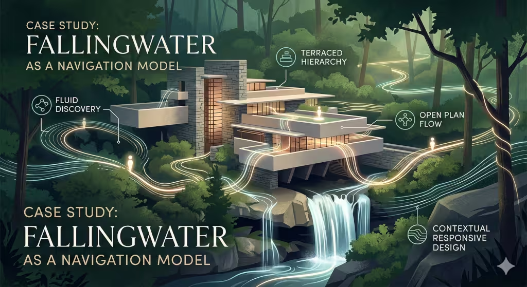
At Silphium Design LLC, we do not view a website as a collection of separate pages. We view it as a single, flowing experience. To understand how to do this well, we must look at the one of the most famous houses in the world. Fallingwater was designed by Frank Lloyd Wright in 1935. It is built over a waterfall in the woods of Pennsylvania. This house is the best example of what we call organic navigation. When we look at how Frank Lloyd Wright built this home, we find the perfect map for how to guide people through a website.
The Waterfall as the Core Value
In web design, every site has a core piece of value. This might be a product, a story, or a service. In the case of Fallingwater, the core value is the waterfall itself. Most architects would have built the house next to the water so the owners could look at it. But Frank Lloyd Wright decided to build the house right on top of it. He wanted the people in the house to live with the sound and the feel of the water.
When we build a website, we should treat our main content the same way. The navigation should not just point to the content from far away. The navigation should be part of the content. In a site inspired by Frank Lloyd Wright, you do not feel like you are leaving one place to go to another. Instead, you feel like you are moving deeper into the heart of the site. We call this contextual navigation. It means the menus and buttons change and flow based on where you are and what you are doing.
The Path of Discovery
When you visit Fallingwater, you do not just walk through a front door and see everything at once. Frank Lloyd Wright used a technique called the path of discovery. You have to walk along a wooded path, cross a bridge, and turn corners before you see the main entrance. This makes the journey feel like an adventure.
In UX design, we often try to show the user everything at once. We put fifty links in a giant menu at the top of the page. This is like a house with no walls. It is overwhelming. By using the ideas of Frank Lloyd Wright, we use something called progressive disclosure. This is a technical way of saying we show the user only what they need to see at that moment. We lead them down a path. As they click and scroll, more of the site is revealed to them. This keeps the user interested and prevents them from feeling confused. A good website should feel like a story that unfolds as you move through it.
Compression and Release
One of the most brilliant tools used by Frank Lloyd Wright was compression and release. He would make the hallways and entryways of his houses very small and dark. This is the compression. Then, you would walk into a big living room with giant windows and lots of light. This is the release. This change in space creates a strong emotional reaction. It makes the big room feel even more grand and beautiful.
We can use this same trick in digital design. We use compression in our loading screens, intro animations, or small “teaser” sections. These areas are simple and focused. They prepare the user for the release, which is the main content page. When the main page opens up with beautiful images and clear text, it feels like a breath of fresh air. At Silphium Design, we study how Frank Lloyd Wright used space to control how people felt. We use whitespace and layout sizes to give users that same feeling of excitement and relief as they move through a site.
Vertical and Horizontal Planes
Fallingwater is famous for its long, floating floors that stick out over the water. These are called cantilevers. Frank Lloyd Wright used these horizontal lines to match the lines of the rocks and the earth. He also used vertical stone towers to hold everything up.
In a website, we have a similar structure. We have the horizontal flow of the layout as you scroll across a screen. We also have the vertical depth, which we call the z-index. This is how items are layered on top of each other. By following the lead of Frank Lloyd Wright, we create layers that feel natural. We might have a background that stays still while the text moves over it. This creates a sense of depth and 3D space. It makes the website feel like a real place you can step into. When the horizontal and vertical planes work together, the site feels stable and strong.
Wayfinding without Labels
If you are in a house built by Frank Lloyd Wright, you rarely need a sign to tell you where to go. He used light and materials to guide you. A bright window at the end of a hall draws you forward. A change in the floor material from stone to wood tells you that you have entered a new kind of room.
In modern UX, we rely too much on text labels like “Click Here” or “Go to Gallery.” While these are helpful, they can be boring. A site inspired by Frank Lloyd Wright uses visual cues for wayfinding. We might use a splash of color to draw the eye to a button. We might use a subtle animation to show that a section can be expanded. If we design the “space” of the website correctly, the user will know exactly where to go without having to read a manual. This makes the experience feel much more intuitive and “organic.”
The Hearth: The Home Page as the Center
For Frank Lloyd Wright, the fireplace or the hearth was the heart of the home. Every house he built had a strong center point where the family could gather. All other rooms branched out from this central spot.
In our work at Silphium Design, we treat the home page as the hearth. It is the center of the digital ecosystem. Every link that leads away from the home page is like a hallway leading to a new room. But the user should always be able to feel the “warmth” of the home page. They should always know how to get back to that center point. By using the Frank Lloyd Wright model, we ensure that the navigation structure is a hub-and-spoke system. This gives the user a sense of security. They know they can explore the “woods” of the sub-pages because the “fire” of the home page is always nearby.
Indoor and Outdoor Integration
The most famous thing about Fallingwater is how the inside and outside are joined. The glass walls meet the stone without heavy frames. The stone floor of the living room continues out onto the terrace. It is hard to tell where the house ends and nature begins.
In the world of the internet, we have the “inside” of our website and the “outside” of the rest of the web. This includes social media, search engines, and other sites. A Frank Lloyd Wright style design tries to blur these lines. We make it easy for users to move from a social media post into the site without a “jarring” change in look or feel. We make sure the site works well on all devices, so the digital experience fits into the user’s real-world environment. Whether they are on a phone in a park or a desktop in an office, the site should feel like it belongs there.
Sustainable Navigation
Finally, Frank Lloyd Wright believed in architecture that would last. He used materials that would age well and designs that would not go out of style. He called this “organic” because it was part of a living, lasting system.
We apply this to how we build our site maps. We do not use “trendy” navigation styles that will be confusing in two years. We use the timeless rules of human movement and biology. We build navigation that is easy to update and grow. Just as Frank Lloyd Wright allowed his buildings to sit naturally in the changing seasons, we build websites that can handle new content and new technology without breaking. This long-term thinking is what makes a site truly successful for SEO and for the people who use it.
By studying Fallingwater, we learn that navigation is not just a list of links. It is a journey through a digital landscape. When we use the principles of Frank Lloyd Wright, we create websites that are more than just tools. They become experiences that stick with the user long after they have closed their browser. We invite you to think about your website as a house built over a waterfall. How does the water flow? How do people find their way? These are the questions that lead to great design.
Froebel Gifts and the Geometry of the Grid
When Frank Lloyd Wright was a small boy, his mother gave him “Froebel Gifts.” These were sets of wooden blocks in simple shapes like cubes, spheres, and triangles. He spent hours playing with them. He later said these blocks stayed in his fingers all his life. They taught him that everything in nature can be broken down into simple geometry.
Modern web designers use tools called CSS Grid and Flexbox to layout pages. These are just like the Froebel blocks. By using the geometric rules that Frank Lloyd Wright loved, we can create layouts that are perfectly balanced. We use triangles to show movement and direction. We use circles to show unity. We use squares for strength. This geometric foundation makes a website feel solid and well-built, even if the user does not know why.
The Usonian Web: Accessibility and Democracy
Later in his life, Frank Lloyd Wright wanted to build houses for the average person. He called these “Usonian” houses. They were small, easy to build, and beautiful. He believed that every person deserved to live in a great space. This was his “design for democracy.”
In our world, this means web accessibility. A website must work for everyone, including people who cannot see well or who use special tools to browse. Using Frank Lloyd Wright as an inspiration, we make sure our “Usonian” web is inclusive. We use high contrast so text is easy to read. We make sure buttons are big enough to tap. We believe that good design is not a luxury for a few people. It is a right for everyone who uses the internet.
Monitoring the Ecosystem: SEO and Natural Growth
A building by Frank Lloyd Wright was designed to grow and change over time. It was an organism. A website is the same way. It is never truly “finished.” It must grow with new content and new users. This is where SEO, or search engine optimization, comes in.
Google and other search engines now look for “user signals.” They want to know if people like being on your site. If your site is built using Frank Lloyd Wright principles, people will stay longer. They will click more things. They will not “bounce” away quickly. This tells the search engines that your site is valuable. By focusing on natural flow and biophilic design, we actually help the site rank higher. A site that feels natural to a human will also feel “right” to the computer programs that rank it.
Toward a Living Internet
The work of Frank Lloyd Wright was about more than just bricks and mortar. It was about a philosophy of life. He wanted us to live in harmony with our world. As we build more of our lives inside of digital screens, this message is more important than ever.
We can build a living internet. We can create sites that breathe, flow, and welcome us in. By following the path of Frank Lloyd Wright, we can turn the “box” of the web into a beautiful, organic landscape. This is the goal of Silphium Design. We don’t just build websites; we grow digital homes.