The way we build websites is changing. For a long time, the internet felt like a cold, plastic room with bright white lights. But as humans, we were not made to live in sterile boxes. We evolved in forests, near oceans, and on the open plains. This is where biophilic design comes in. A website is more than just code. It is a digital habitat. Using earthy backgrounds is not just a style choice. It is a biological mandate. When we use colors and textures from the natural world, we are speaking to the oldest part of the human brain. We are telling the user that they are safe, they are home, and they can relax.
In this guide, we will explore how to use earthy backgrounds to create a digital experience that feels as real and grounding as a walk through the woods.
Table of Contents
The Concept: Moving Beyond Flat Design
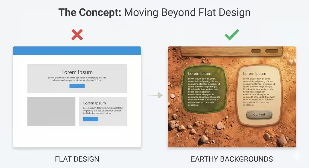
For many years, web designers loved something called flat design. This meant everything was very simple, very 2D, and often very white or gray. While this looked clean, it also felt empty. It lacked the soul that humans crave. Now, we are moving toward organic immersion. This means we want the user to feel like they are stepping into a real space when they click on a link.
Earthy backgrounds are the foundation of this movement. Instead of a flat blue, we might use the deep, shifting blue of a mountain lake. Instead of a plain brown, we use the rich, textured look of turned soil or oak bark. This shift matters because it changes how a person feels. A flat website feels like a tool. A website with earthy backgrounds feels like an environment. When a user feels like they are in a natural space, they stay longer. They click more. They trust the brand more. We are moving away from the “machine” look and moving toward the “living” look.
The Thesis: Digital Fatigue and Neural Recalibration
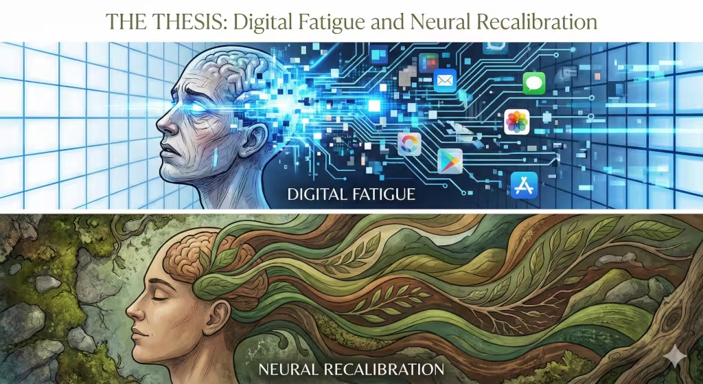
Have you ever felt tired after looking at your phone for too long? That is called digital fatigue. Our eyes and brains get tired of the harsh, artificial light and the sharp edges of modern apps. Earthy backgrounds act as a tool for neural recalibration. This is a fancy way of saying they help reset your brain.
When you see a background that looks like moss, stone, or sand, your brain relaxes. This is because these patterns are familiar to us. For thousands of years, these were the only things we looked at. By using earthy backgrounds, we give the user’s eyes a place to rest. This is vital for modern SEO. If a user feels relaxed on your site, they won’t “bounce” or leave quickly. They will stay and read. In my work, I combine the logic of computer science with the truth of biology to prove that a calm brain is a converting brain.
Expert Insight: The Biophilia Hypothesis and Perception
There was a famous scientist named Edward O. Wilson who talked about the “biophilia hypothesis.” He argued that humans have an actual genetic need to be connected to nature. As a designer, I take this very seriously. When I build a site, I think about how fast a user perceives a page. In computer science, we call this O(1) perception, it happens instantly.
Before a user reads a single word on your site, their brain has already decided if the environment is friendly or hostile. If you use earthy backgrounds, the brain signals “friendly” in a fraction of a second. This is the biological reality of web design. We are not just making things pretty. We are using the science of life to make the internet feel more human.
Defining the Palette: What Constitutes an Earthy Background?
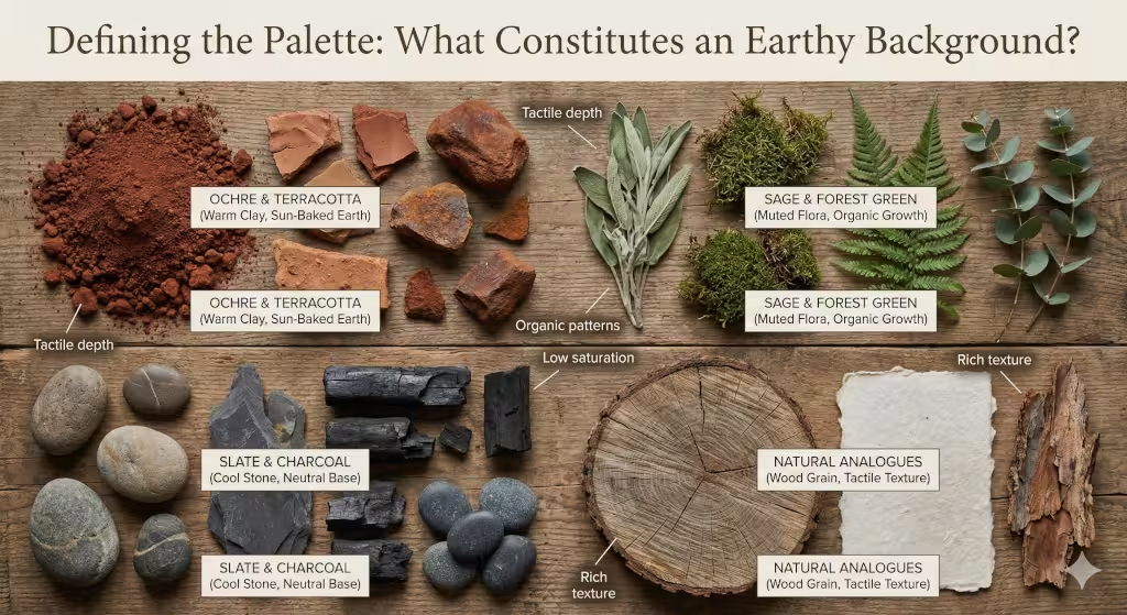
To use earthy backgrounds effectively, we have to understand what colors and textures actually come from the earth. It is a common mistake to think that “earthy” just means the color brown. While brown is important, the palette of the planet is much wider and more interesting than that.
Chromatics: Beyond the Basics
When we talk about colors for earthy backgrounds, we are looking for colors that have “depth.” Think about a handful of dirt. It isn’t just one color. It has bits of black, tan, red, and gold.
- Ochre and Terracotta: These are the colors of clay and sun-baked earth. They are warm and inviting. They make a website feel grounded and sturdy.
- Sage and Forest Green: These greens are not neon or bright. They are muted. They remind us of leaves and silence. Using these for earthy backgrounds helps create a sense of growth and health.
- Slate and Charcoal: These are the colors of stone. They provide a strong, neutral base that feels permanent and reliable.
The key to these colors is that they are rarely “pure.” They usually have a little bit of gray or brown mixed in to make them look like they were found outdoors.
Textural Depth: The Role of Natural Analogues
Texture is what makes earthy backgrounds feel real. A flat color is a start, but a texture is a finish. Natural analogues are things that look like nature but are made of pixels.
- Wood Grain: The swirls and lines in wood are very calming. They suggest craftsmanship and warmth.
- Weathered Paper: This gives a site a “tactile” feel, like you could reach out and touch it. It suggests history and wisdom.
- Topographical Contours: These are the lines you see on a map that show hills and valleys. Using these in earthy backgrounds creates a sense of adventure and movement without being distracting.
Semantic Integration: Science and Fidelity
In the world of high-end design, we talk about high-fidelity. This means the image looks very sharp and detailed. However, in the world of the internet, we have to worry about speed, or low-latency. The challenge is making earthy backgrounds that look incredibly real but don’t slow down the website.
If a background is too “busy,” it can be hard to read the text. The secret is to use earthy backgrounds that have a lot of detail but low contrast. This means the patterns are there, but they don’t jump out and hit the user in the face. They sit quietly in the back, doing their job.
Prime Examples of Websites Using Earthy Backgrounds Effectively
To really understand this, we should look at the leaders in the field. These companies use earthy backgrounds to tell a story and keep people engaged.
1. Patagonia: The Gold Standard of Authenticity
Patagonia is a company that sells outdoor gear. Their website is a masterclass in using earthy backgrounds. They don’t just use colors; they use raw, unedited landscape textures. Sometimes the background is a grainy photo of a granite cliff. Other times, it is the muted gray of a stormy sky.
Because they use these earthy backgrounds, the user immediately feels like they are part of the “outdoorsy” tribe. From an SEO perspective, this is genius. People spend a long time looking at these beautiful images, which tells Google that the site is very high quality.
2. Calm: Designing for the Nervous System
The Calm app and website are designed to help people meditate. Their use of earthy backgrounds is very scientific. They often use soft gradients that look like a sunset or a foggy morning. They also use “blurred nature” images.
By blurring the background, they keep the earthy backgrounds from being too distracting while still giving the user the “vibe” of being in a forest or by a lake. This helps lower the user’s heart rate. When your website makes someone feel physically better, they are going to come back to it again and again.
3. 1 Hotels: Bringing the Physical to the Digital
1 Hotels is a luxury hotel brand that focuses on nature. In their buildings, they use a lot of reclaimed wood and real moss. On their website, they translate this perfectly. They use very high-resolution earthy backgrounds that show the grain of wood and the texture of stone.
This creates a “seamless” experience. Whether you are standing in their lobby or looking at their website on your phone, you feel the same thing. This is a great example of how earthy backgrounds can be used to build a very strong brand identity.
4. NCX: Bridging Technology and Nature
NCX stands for Natural Capital Exchange. They are a tech company that helps people sell carbon credits from their forests. This is a very “techy” topic, but their website doesn’t look like a computer lab. They use deep forest tones and earthy backgrounds to remind the user that the data represents real trees.
This is a great lesson for any tech company. You can be high-tech and still use earthy backgrounds. It makes your data feel more important and more connected to the real world.
5. The Spheres: Botanical Motifs as Data Layers
The Spheres are part of Amazon’s headquarters, but their digital presence is also very focused on nature. They use organic shapes and botanical patterns in their earthy backgrounds. Instead of straight lines and boxes, they use curves that look like leaves or vines. This helps break up complex information and makes it easier for the brain to process.
The Technical Underpinnings: Balancing Texture with Speed
As a web designer, I know that big, beautiful images can be a problem. If your earthy backgrounds take ten seconds to load, the user will leave. This is why we have to be smart about the tech.
Performance Optimization: New File Formats
In the past, we used JPEGs or PNGs for everything. But for detailed earthy backgrounds, these files are too big. Now, we use formats like WebP and AVIF. These are special ways of saving images that keep all the detail but make the file size much smaller.
When you use these formats, your earthy backgrounds load instantly. This is vital for what Google calls “Core Web Vitals.” This is a set of scores that tells Google if your site is fast and easy to use. If you want to rank high in search results, you must optimize your images.
The CSS Factor: Blending and Accessibility
Sometimes, you don’t need a huge image file. You can use CSS code to create earthy backgrounds. There is a tool called background-blend-mode. This allows you to take a simple texture and blend it with a solid color.
This is great for accessibility. Accessibility means making sure everyone, including people who have trouble seeing, can use your site. By using code to manage your earthy backgrounds, you can make sure the contrast between the text and the background is always high enough for everyone to read easily.
Responsive Scaling: From Desktop to Phone
Nature is not a fixed size, and neither are screens. When you use earthy backgrounds, you have to make sure they look good on a giant monitor and a tiny smartphone. We use “responsive design” to make sure the textures don’t get stretched or blurry. A good earthy background should feel “infinite.” No matter how big the screen is, the texture should just keep going in a natural way.
What the World Wants to Know About Earthy Backgrounds
When people search for information on this topic, they often have specific questions. Let’s answer them in a simple way.
What is biophilic design in web design?
Biophilic design is the practice of bringing the outdoors in. In web design, this means using colors, shapes, and textures found in nature. It is more than just putting a picture of a tree on a page. It is about using earthy backgrounds, organic shapes, and natural light patterns to make the digital space feel like a living space. It’s about making technology feel less like a tool and more like an extension of the natural world.
How do you use earthy tones on a website without it looking outdated?
Some people worry that “earthy” means “1970s brown.” The way to keep it modern is to use plenty of “white space.” White space is the empty room around your content. If you pair a rich earthy background with clean, modern fonts and lots of empty space, it looks very high-end and expensive. It feels like a modern spa rather than an old basement.
Are dark green backgrounds good for SEO?
Yes, they can be! Dark green is one of the most popular earthy backgrounds because it represents life and growth. From an SEO perspective, the most important thing is “dwell time.” This is how long a person stays on your page. If a dark green background makes your site feel calm and professional, people will stay longer. Just make sure your text is a light color so it is easy to read. If people can’t read your site, they will leave, and that hurts your SEO.
Related Concepts and the Language of Nature
To really master the use of earthy backgrounds, we have to understand the related ideas.
- Natural Color Palettes: This refers to the specific set of colors you choose. A good palette for earthy backgrounds might include “sand,” “stone,” and “moss.”
- Organic UI: UI stands for User Interface. An organic UI uses curves and natural shapes instead of sharp squares.
- Digital Wellness: This is the idea that the internet should be good for our mental health.14 Using earthy backgrounds is a big part of digital wellness.
- Minimalist Nature Design: This is doing more with less. It is using one beautiful earthy background instead of ten different decorations.
We also look at “entities.” These are important people or organizations in the field. For example, “Terrapin Bright Green” is a group that writes about the “14 Patterns of Biophilic Design.” Understanding these patterns helps us use earthy backgrounds in a way that truly helps people.
The Psychology of the Earth-Tone Conversion
Why does any of this matter for a business? Because of “conversions.” A conversion is when a user does what you want them to do, like buying a product or signing up for a newsletter.
Trust Signals and Stability
Colors like deep brown, clay, and dark gray are “trust signals.” They remind us of the ground under our feet. When we see earthy backgrounds on a site, our brain thinks, “This company is stable. They aren’t going anywhere.” This is very different from bright, neon colors that can feel “fly-by-night” or cheap.
Reducing Blue Light Anxiety
Most screens put out a lot of blue light, which can make us feel anxious or keep us awake at night. While a website can’t change the screen, earthy backgrounds can help. By using warm tones, like oranges, soft greens, and browns, we reduce the overall “harshness” of the screen. This makes the user feel more relaxed, and a relaxed user is more likely to trust your message and take action.
From Pixels to Roots
Using earthy backgrounds is a journey from the digital world back to our roots. As we spend more of our lives online, the “look and feel” of the internet becomes our reality. We have a choice. We can build websites that look like cold machines, or we can build digital forests that feel alive.
By using the science of biology and the power of modern computer science, we can create earthy backgrounds that are fast, beautiful, and deeply human. Whether you are a small business or a giant tech company, bringing nature into your design is the best way to connect with your audience. It shows that you care about their well-being, their time, and their experience.
The internet does not have to be a stressful place. With the right use of earthy backgrounds, we can turn every website into a sanctuary. We can build a web that doesn’t just give us information but also gives us a sense of peace.