Design is not just about making things look good. It is about how our brains work. When you look at a forest, you feel calm. When you look at a concrete wall, you might feel nothing, or even a little bit of stress. This is because humans spent thousands of years living in nature. Our brains are wired to love organic shapes. This connection is called biophilia.
As a designer and a scientist, I see many brands trying to look “natural” by simply slapping a green leaf on their name. That is not enough. To create a true biophilic logo, you must dig deeper. You have to understand math, biology, and psychology. A real biophilic logo uses the hidden patterns of nature to make people trust your brand instantly.
In this article, we will explore the science behind organic branding. We will look at why your brain loves specific curves. We will look at the math that makes a flower look perfect. We will learn how to pick colors that lower stress. Whether you are a business owner or a designer, this guide will teach you how to create a biophilic logo that connects with people on a deep, instinctual level.
Table of Contents
The Psychology of Visual Comfort
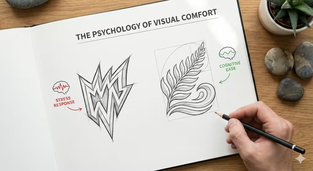
To understand how to make a biophilic logo, we first have to look at the human brain. There is a field of study called neuro-aesthetics. This is the science of how our brains react to beauty.
Research shows that sharp, jagged lines can trigger a small “fear” response in the brain. In nature, sharp things are often dangerous, like thorns or jagged rocks. On the other hand, curved and flowing lines signal safety. This is why a biophilic logo often uses soft curves rather than hard corners.
Fractal Fluency
One of the most important concepts in this field is called “Fractal Fluency.” A fractal is a pattern that repeats itself at different scales. Think of a fern leaf. The whole leaf looks like the smaller branches, and the smaller branches look like the tiny leaflets. Clouds, coastlines, and snowflakes are all fractals.
Your eyes are actually built to scan these patterns. When you look at a fractal, your visual system relaxes. It does not have to work hard to understand what it is seeing. This is called “cognitive ease.”
When you design a biophilic logo, you should try to use these repeating patterns. It does not have to be complex. A simple spiral or a branching line can have a fractal quality. When a customer sees a biophilic logo with these patterns, their stress levels can actually drop. This makes them feel good about your brand before they even read your name.
The Refuge Effect
In biophilic design, we often talk about “Prospect and Refuge.” This means humans like to have a view of their surroundings (prospect) but they also want to feel safe and enclosed (refuge).
A logo can create a sense of refuge. Think of a logo that has a heavy, stable bottom and a lighter top. Or think of a logo that uses a circle to frame the text. This creates a subconscious feeling of safety. A biophilic logo acts like a small visual home for the eye. It gives the viewer a place to rest their gaze.
Mathematical Foundations: The Geometry of Nature
Nature may look random, but it is actually full of math. To create a professional biophilic logo, you should use the same math that nature uses. This ensures your design looks “right” to the human eye.
The Golden Ratio
The most famous tool for this is the Golden Ratio. This is a special number found everywhere in nature. In mathematics, we often write it as the Greek letter phi (phi), which is approximately 1.618.
This number comes from the Fibonacci sequence. This is a list of numbers where each number is the sum of the two before it:
0, 1, 1, 2, 3, 5, 8, 13, 21, 34…
If you take squares with these side lengths and put them next to each other, you can draw a spiral through them. This spiral is found in seashells, hurricanes, and even the shape of galaxies.
When you are sketching a biophilic logo, you can use circles based on these numbers. For example, you might use a circle with a diameter of 8 units and another with a diameter of 5 units. When you overlap them, the proportions will feel naturally balanced.
Many famous logos, like the Apple logo or the Twitter bird, use circles based on the Golden Ratio. This is why they look so pleasing. They are not just drawings; they are geometry. A biophilic logo built on this grid will always look professional and stable.
Biomorphic Forms and Curves
In computer graphics, we use something called Bézier curves to draw lines. These are the mathematical lines you see in programs like Adobe Illustrator. However, a computer tends to make curves that are too perfect.
Nature is rarely perfectly symmetrical. A human face is not the same on both sides. A tree does not grow straight up. This “imperfect” symmetry is important for a biophilic logo. If a design is too perfect, it looks machine-made. If it has slight variations, it looks alive.
When you create your biophilic logo, try to avoid perfect geometric circles and squares. Tweak the curves slightly. Make one side a little thicker than the other. This mimics the growth patterns of living things. It makes the biophilic logo feel like it grew on the page, rather than being stamped there by a robot.
Biomimicry: Direct vs. Indirect Nature
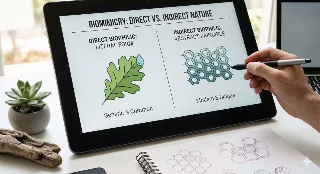
There are two main ways to use nature in your design: direct and indirect. Both can be used to make a great biophilic logo, but they work in different ways.
Direct Biophilia
Direct biophilia is when you use a literal image of something from nature. This could be a leaf, a tree, a water drop, or an animal. This is the most common type of biophilic logo.
However, you must be careful. Because so many companies use generic leaves, it is easy to look like everyone else. To stand out, you need to be specific. Do not just draw a “tree.” Draw an oak tree, or a willow, or a pine. Look at the specific shape of the leaves and the bark.
If you are a water company, do not just use a blue drop. Look at how water ripples when a stone hits it. Look at the shape of a wave as it crashes. Using specific, real-world details will make your biophilic logo unique and memorable.
Indirect Biophilia
Indirect biophilia is more subtle. This is when you use the principles of nature without showing a picture of nature. This is often a better choice for tech companies or finance firms who want a biophilic logo without looking like a gardening center.
For example, you might use a hexagon pattern. This reminds people of a honeycomb. Honeycombs represent efficiency and community. Or you might use a flowing, wave-like pattern to represent movement and adaptability.
You can also use “biomorphic” shapes. These are abstract shapes that look like cells or amoebas. They are soft and rounded. Even though they do not look like a specific plant or animal, the brain recognizes them as organic. An indirect biophilic logo works on a subconscious level. It gives the feeling of nature without being literal.
Spectral Nourishment: Color Theory Beyond Green
When people think of a biophilic logo, they almost always think of the color green. Green is great, but nature is full of other colors. Limiting yourself to green is a mistake.
The Myth of Green
While green represents plants, it is not the only color that signals “life.” Think of a sunset, a desert, the ocean, or a field of wheat. These are all natural environments.
If everyone in your industry uses green, your biophilic logo will disappear in the crowd. You can use other “earth tones” to stand out while still keeping that natural connection.
Seasonal Palettes
You can look to the seasons for inspiration.
- Spring: High energy. Bright yellow-greens, pinks, and light blues. A biophilic logo with these colors feels new, fresh, and exciting.
- Summer: Deep, saturated greens, bright yellows, and bold reds. This feels strong and established.
- Autumn: Rich ochres, burnt oranges, browns, and warm greys. These colors represent stability, harvest, and grounding. An autumn-themed biophilic logo feels trustworthy and mature.
- Winter: Cool blues, whites, and icy greys. These represent clarity, purity, and silence.
Blue Mind Theory
There is a concept called “Blue Mind.” It suggests that being near water puts our brains in a mildly meditative state. Blue is actually the most popular color in the world for logos. It signals trust and calm.
If you are creating a biophilic logo for a health company or a tech firm, consider using teals, aquas, and deep ocean blues. These colors tap into our biological love for water. They can be just as “biophilic” as green, but they feel more modern and clean.
Texture and Typography: The Tactile Illusion

We usually see logos on smooth screens or paper. But nature is full of texture. Bark is rough, stones are smooth, moss is soft. You can bring this sense of touch into your biophilic logo.
Haptic Visuals
“Haptic” refers to the sense of touch. In design, we can create a “haptic visual.” This means drawing something so that it looks like it has texture.
You can do this by adding a slight grain to your color. Or you can use negative space (the empty space around the design) to suggest a rough edge. For example, a biophilic logo for a coffee shop might use a font that looks like it was stamped on a burlap sack.
Even a clean, modern vector logo can have “texture” in its shape. A line that varies in width (thick to thin) feels like it was drawn with a brush or a pen. This feels more human and organic than a line that is the same width everywhere.
Typography Selection
The words in your logo matter just as much as the image. There are two main types of fonts: Serif and Sans Serif.27
- Serif fonts have little feet at the ends of the letters. These often feel more traditional and “bookish.” But there are “Humanist” serif fonts that look like handwriting. These work very well for a biophilic logo.
- Sans Serif fonts do not have the little feet. They look modern and clean. For a biophilic logo, look for a sans serif that has round, open curves. Avoid fonts that are too blocky or rigid.
You want the text to feel like it belongs with the icon. If your icon is soft and flowing, your text should be too. If your icon is strong and woody, your text should be bold and solid. The goal of a biophilic logo is harmony.
Technical Execution and Scalability
As a computer scientist, I know that a logo has to work in the digital world. It is not enough for a biophilic logo to look like a painting. It must be a functional piece of code.
Vector Mathematics
All professional logos must be created as vectors. A vector image uses math to draw lines, rather than pixels. This means you can resize it to be as big as a billboard or as small as a business card, and it will never get blurry.
When you design the curves of your biophilic logo, you will use “nodes” or anchor points. To keep the design flowing smoothly, you should use the fewest number of nodes possible. If you use too many nodes, the line will look bumpy. A smooth, clean curve mimics the efficiency of nature. Nature does not waste energy, and neither should your vector files.
Responsiveness
Today, your logo will be seen on tiny phone screens. A complex illustration of a tree with 1,000 leaves will look like a messy blob on a phone.
You need a responsive biophilic logo. This means you might have three versions of your logo:
- Full Version: The detailed logo with the name and slogan.
- Simplified Version: Just the name and the icon, with less detail.
- Favicon: A tiny, very simple icon (like just the leaf or the spiral) for the web browser tab.
The favicon is the hardest part. You have to capture the “feeling” of nature in just a few pixels. This is where simple geometry (like the Golden Ratio spiral) is very useful.
Green Coding
This is a detail many people miss. A complex file with lots of data takes more energy to load. If your website has a huge, heavy logo file, it uses more electricity.
By keeping your biophilic logo simple and clean, you actually lower the carbon footprint of your website. This is true biophilic design: design that respects nature not just in how it looks, but in how it works.
Step-by-Step Guide: How to Create a Biophilic Logo
Now that we understand the theory, let us look at the practical steps. Here is a workflow I use at Silphium Design LLC.
Step 1: Research and Foraging
Before you touch a computer, go outside. This is the “foraging” phase. If you want a biophilic logo related to forests, go to a forest. Take pictures of leaves, bark, and shadows.
If you are designing for a tech company, look for patterns in nature that represent connection, like a spider web or a river network. Gather these images into a “mood board.” This will be your visual library.
Step 2: Sketching the Skeleton
Put pencil to paper. Do not start on the computer. Your hand has a natural bio-rhythm that creates organic lines better than a mouse does.
Draw loosely. Try to find the “flow” or motion of the shape. A good biophilic logo often has a sense of movement. Does the shape point up (growth)? Does it flow to the right (progress)? Sketch hundreds of tiny ideas. Do not worry about details yet.
Step 3: The Grid
Now, pick your best sketch. Scan it into the computer. This is where we apply the math.
Set up a grid based on the Golden Ratio. Place circles of size 1, 2, 3, 5, 8, etc., over your sketch. Use these circles to refine your curves. Adjust your sketch so it aligns with this natural geometry. This will tighten up the design and make your biophilic logo look balanced.
Step 4: Vectorizing
Use a program like Adobe Illustrator or Inkscape. Trace your grid. Remember to keep your node count low for smooth curves.
Focus on the “negative space.” This is the white space between the shapes. In a biophilic logo, the space between the leaves is just as important as the leaves themselves.
Step 5: Coloring
Finally, add color. Refer back to our section on Spectral Nourishment. Choose a palette that fits the emotion of the brand.
Test your biophilic logo in black and white first. If it does not look good in black and white, it will not look good in color. Color should be an enhancement, not a crutch.
Case Studies and Entity Analysis
To learn how to create a biophilic logo, it helps to look at the masters.
Apple
The Apple logo is the perfect example of the Golden Ratio. It looks like a simple fruit, but the curves of the apple, the leaf, and the “bite” are all circles from the Fibonacci sequence. It is a biophilic logo because it represents a natural object, but it is executed with strict mathematical precision. This mix of nature and tech is why it works so well.
Twitter (X)
The original Twitter bird was a great biophilic logo. It was constructed from overlapping circles. The beak, the wing, and the head were all perfect curves. It felt friendly and alive.
The new “X” logo is the opposite. It is sharp, angular, and mathematical in a rigid way. It lacks the biophilic warmth of the bird. This change completely shifted the brand’s psychology from “social and friendly” to “industrial and precise.”
WWF (World Wildlife Fund)
The panda logo is a masterpiece of Gestalt psychology. The logo does not draw the whole panda. It only draws the black patches. Your brain fills in the white parts to complete the bear.
This engages the brain. It invites the viewer to participate in the image. A biophilic logo that uses this technique is very powerful because it creates an active connection with the viewer.
Questions about Biophilic Logo Design
What is the difference between eco-friendly and biophilic design?
Eco-friendly design focuses on sustainability (using recycled paper, low energy). Biophilic design focuses on the human connection to nature. You can have a biophilic logo that looks natural but is printed on plastic (though I would not recommend it!). Ideally, you want both.
Can a tech company have a biophilic logo?
Absolutely. In fact, tech companies need them the most. Technology can feel cold and alien. A biophilic logo helps humanize a tech brand. It makes the technology feel more approachable and intuitive.
How do I choose a color palette for a biophilic brand?
Do not guess. Look at photos of the environment you want to mimic. Use the eyedropper tool in your design software to pick the exact colors from a photo of a forest, a desert, or an ocean. Nature has already created the perfect palettes for your biophilic logo.
Is a biophilic logo expensive to design?
It can be. Because it requires a deep understanding of math and psychology, it takes more time than a generic design. However, the value it adds to your brand is immense. It is an investment in your company’s future image.
Conclusion
Creating a biophilic logo is a journey. It is about more than just aesthetics. It is about reconnecting the digital world with the physical world.
We are biological creatures living in a digital age. We crave nature. A well-designed biophilic logo acts as a bridge. It tells the customer, “This is safe. This is natural. This is good.”
By using the math of the Golden Ratio, the psychology of Fractal Fluency, and the colors of the natural spectrum, you can create a brand identity that truly resonates. It adds immense value because it does not just look good—it feels right.
If you follow these steps, your biophilic logo will stand the test of time, just like the nature that inspired it.