Have you ever noticed how looking at a forest or a calm ocean makes you feel relaxed? Now compare that to how you feel when you stare at a blank concrete wall or a messy spreadsheet. This difference is not just about what you like. It is about how your brain works. Scientists call this concept “Cognitive Fluency.” This fancy term simply means your brain prefers information that is easy to process. Because humans evolved in nature for millions of years, our brains are wired to understand natural patterns instantly.
The problem we face today is that the digital world does not look like nature. Most websites, logos, and apps use sharp corners, perfect grids, and unnatural bright colors. This is called Euclidean geometry. While it is neat and tidy, it is foreign to our biological history. When you look at these sterile designs for too long, your brain has to work harder. This causes hidden stress. It leads to what experts call cognitive fatigue. Users get tired, they stop paying attention, and they leave the website.
The solution to this digital burnout is biophilic branding. This approach is not just about pasting a picture of a leaf onto a logo. It is far more complex and interesting. Biophilic branding is the science of using nature’s laws in design. It uses math and psychology to create visuals that feel right to the human brain.
By using biophilic branding, companies can use shapes, colors, and patterns that lower stress. This method uses fractals, curves, and natural motions to grab attention without being annoying. This article will guide you through the deep science and practical steps of this design revolution. We will explore how biophilic branding creates a visual identity that people instinctively trust and enjoy.
Table of Contents
The Evolutionary Science Behind Biophilic Design
To understand biophilic branding, we first have to look at biology. In the 1980s, a biologist named Edward O. Wilson made the term “biophilia” famous. He argued that humans have a genetic need to connect with nature and other living forms. We are not meant to live in boxes. We are meant to live among trees, water, and changing sunlight. This is the biophilia hypothesis.
Stephen Kellert, another pioneer in this field, took this idea further. He looked at how we build our world. He showed that design that ignores nature can make us feel anxious. When we apply this to biophilic branding, we are using neuro-architecture. This is the study of how visual environments change our brain chemistry.
When a customer sees a design based on biophilic branding, their body reacts physically. Studies show that viewing organic forms can lower cortisol levels. Cortisol is the hormone your body makes when you are stressed. Lowering it helps the viewer relax. At the same time, these natural visuals activate the parasympathetic nervous system. This is the part of your nervous system that tells your body to “rest and digest.”
In the world of marketing, this is a superpower. If a brand can make a customer feel physically calm and safe, that customer is more likely to trust the brand. Biophilic branding uses 14 specific patterns of design to achieve this. These include things like “Complexity and Order” and “Biomorphic Forms.” While these were originally rules for buildings, they apply perfectly to screens and logos. By using biophilic branding, we bridge the gap between our ancient brains and our modern screens.
Core Elements of Natural Visual Identity
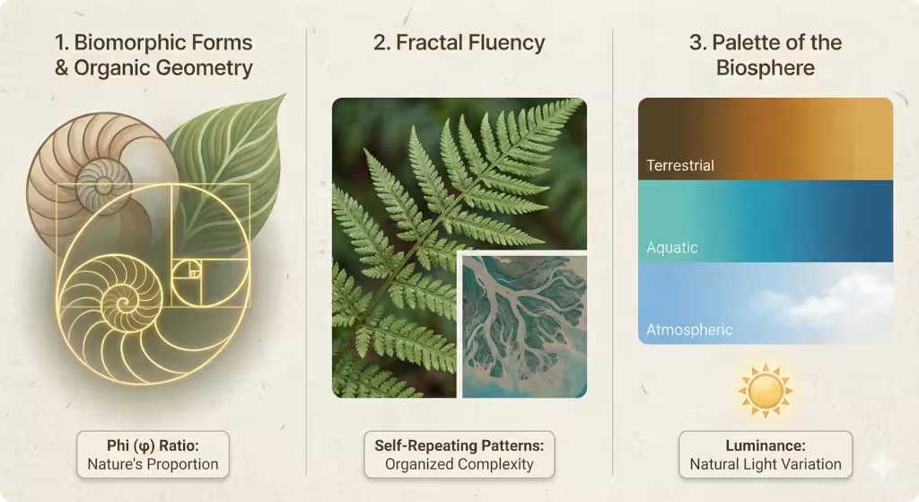
Biomorphic Forms and Organic Geometry
The most obvious tool in biophilic branding is the use of biomorphic forms. Most graphic design relies on squares, triangles, and perfect circles. These are rigid shapes. Nature rarely creates a perfectly straight line. Instead, nature uses curves and irregular shapes. These are biomorphic forms. Think of the shape of a kidney bean, a river rock, or the outline of a leaf.
When biophilic branding swaps out a sharp square for a rounded, organic shape, it feels softer to the eye. It implies life and growth. This does not mean every logo needs to look like a blob. It means balancing structure with flow.
A key part of this is the Golden Ratio. This is a mathematical number, approximately 1.618. It is often represented by the Greek letter Phi. You see this ratio everywhere in nature. It is in the spiral of a seashell, the arrangement of seeds in a sunflower, and the proportions of a human face. Humans are programmed to find this ratio beautiful.
In biophilic branding, designers use the Golden Ratio to size their logos and layout their websites. When a website uses these natural proportions, it feels balanced. The user might not know math, but their brain recognizes the pattern. It feels “right” because it follows the same rules as a flower or a pinecone. This is the subtle power of biophilic branding.
Fractal Fluency in Graphics
Our brains are excellent at processing fractals. In fact, looking at fractals can reduce stress by up to 60 percent. This is called “fractal fluency.” Biophilic branding uses this by creating backgrounds and textures that mimic this organized complexity.
Often, websites are either too plain (boring) or too messy (chaos). Biophilic branding finds the sweet spot in the middle. This is called “statistical fractals.” By using textures that look like wood grain, stone, or rippling water, a designer adds detail without clutter. This holds the viewer’s attention. It gives the eye a place to rest. A plain white background can actually cause eye strain because it is unnatural. A background with a subtle fractal noise is much easier on the eyes. This is a critical tactic in modern biophilic branding.
The Palette of the Biosphere
Color is the first thing a customer notices. In biophilic branding, color selection goes way beyond just picking “eco-friendly green.” While green is important, the natural world is full of other colors. We categorize these into three groups: Terrestrial, Atmospheric, and Aquatic.
Terrestrial colors are the colors of the earth. These are browns, ochres, warm grays, and deep rusts. They convey stability and grounding. Aquatic colors are the blues and teals of water. They signal calm and flow. Atmospheric colors are the soft whites, grays, and pale blues of the sky. They create a sense of openness.
Biophilic branding also considers luminance. Luminance is how bright or dark a color appears. In nature, light changes throughout the day. Morning light is soft and diffuse. Midday sunlight has high contrast and sharp shadows. Evening light is warm and golden.
A smart biophilic branding strategy might change the colors of an app based on the time of day. This is often called “Dark Mode” or “Night Shift,” but it can be more subtle. By mimicking the natural light cycle, a brand respects the user’s circadian rhythm. This is the body’s internal clock. Biophilic branding ensures that a bright blue light from a screen does not keep the user awake at night. It harmonizes the digital experience with the physical world.
Digital Biomimicry: Nature-Inspired UX/UI
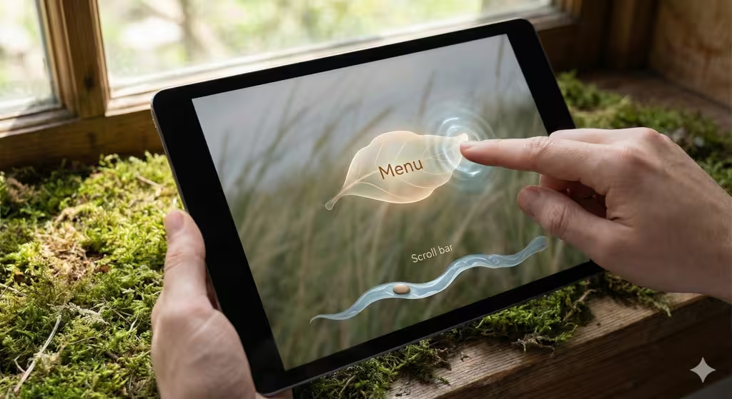
Organic User Interface (OUI)
User Interface, or UI, is the set of buttons and menus you use to control a website. Usually, these controls feel stiff. You click a button, and it switches instantly. Real life does not work that way. If you push a real button or move a book, there is physics involved. There is gravity, friction, and elasticity.
Biophilic branding introduces the concept of the Organic User Interface (OUI). This means designing digital objects that act like physical ones. When you scroll down a page, the movement should feel like it has weight. It should not stop instantly; it should slow down gradually, like a stone sliding on ice.
When you hover over a button in a biophilic branding system, it might grow slightly or wobble, like a jelly. This provides “haptic” or visual feedback that mimics a living thing. It makes the technology feel responsive and alive. It changes the relationship between the user and the machine. The machine stops being a cold tool and starts feeling like a helpful partner.
Motion Design as “Digital Wind”
Static images are rare in nature. Even when a landscape is still, there is movement. Leaves flutter in the wind. Clouds drift. Water ripples. Biophilic branding uses motion design to bring this life to websites.
We do not want things flying around everywhere. That is distracting. Biophilic branding uses slow, subtle motion. Imagine a background image where the grass sways very gently. Or imagine a menu that drifts in like a floating feather rather than sliding in like a metal gate.
This technique is useful for guiding the user’s eye. In the wild, our eyes are drawn to movement because it might be food or danger. Biophilic branding uses this evolutionary trait to guide users to the “Buy” button or the “Contact Us” form. By using a motion that mimics wind or water, the design directs attention naturally. It feels like a suggestion, not a demand.
Typography and the Human Hand
Even the text on a screen is part of biophilic branding. There are two main types of fonts: serif and sans-serif. Geometric sans-serif fonts are very popular in tech. They are made of perfect circles and straight lines. They look very modern, but also very cold.
Biophilic branding often prefers “Humanist” sans-serif fonts. These fonts look clean, but they have tiny variations. They mimic the stroke of a pen or a brush. The lines might get slightly thick and then thin, just like handwriting.
This small detail makes the text feel more human. It reduces the mechanical feel of the website. It creates a voice that sounds like a person talking, not a robot. In biophilic branding, every element, even the letters, must serve the goal of connecting with our biological nature.
Strategic Implementation for SEO and Web Performance
Green Hosting and Sustainable Web Design
Biophilic branding is not just about how things look. It is also about how they work. Nature is efficient. A tree does not waste energy. It grows exactly as much as it needs to. The internet should be the same.
The internet uses a massive amount of electricity. Data centers burn fossil fuels to keep servers running. Biophilic branding aligns with sustainable web design. This means writing code that is clean and light. A lighter website loads faster and uses less energy.
There is also the concept of “Green Hosting.” These are web hosting companies that run on renewable energy, like wind or solar power. For a brand that claims to value nature, using green hosting is essential. It proves that their biophilic branding is honest. Search engines like Google are starting to care about this too. Faster, more efficient sites rank higher in search results.
Image Optimization and Scalability
Images are heavy. They slow down websites. In the natural world, survival depends on speed and agility. In the digital world, user attention is the resource. If a site loads slowly, the user “dies” (leaves).
Biophilic branding often uses vector images, like SVGs (Scalable Vector Graphics). These are images made of math, not pixels. They are very small in file size but can be stretched to any size without getting blurry. This is perfect for biomorphic shapes and logos.
Using SVGs ensures the website is fast. It respects the user’s time and bandwidth. It is a technical application of the biological principle of efficiency. Biophilic branding means creating a visual ecosystem that is robust and lightweight.
Accessibility as Diversity
An ecosystem is healthy when it has diversity. A forest with many types of plants and animals is stronger than a farm with just one crop. The internet is the same. It has many types of users. Some are blind, some have low vision, some have motor difficulties.
Biophilic branding embraces accessibility. This means ensuring there is enough contrast between the text and the background. It means using fonts that are easy to read. It means making sure the site works for people using screen readers.
By making a site accessible, a brand reaches the widest possible audience. It mimics the inclusivity of nature. Nature finds a niche for every organism. Biophilic branding finds a way to welcome every user. This also helps with SEO, as search engines favor accessible websites.
Case Studies: Brands Successfully Using Biophilic Identity
Example A: Technology and the Super-Ellipse
Let us look at a major tech company like Apple. You might think of them as very sleek and industrial. But look closer. Their icons are not squares. They are “squircles” or super-ellipses. This is a shape that blends a square and a circle. It does not have a sharp corner. It is a continuous curve.
This is a subtle form of biophilic branding. It makes the technology feel friendly and approachable. They also use wallpapers that look like landscapes, colored smoke, or water. They use glass textures in their interface to mimic depth and light. This helps users understand the hierarchy of the screen. It mimics looking through layers of water or ice. Even a high-tech giant relies on biophilic branding to make their devices feel personal.
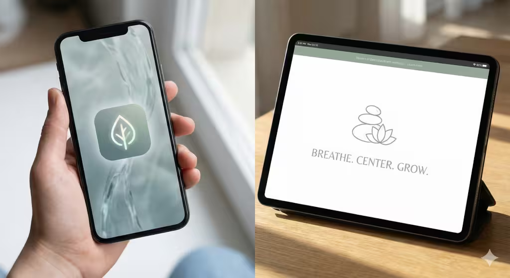
Example B: Wellness and Negative Space
Consider a high-end spa or a yoga brand. They often use a lot of empty white space in their design. In design terms, this is “negative space.” In biophilic branding, this mimics the concept of air and breath.
A crowded forest can feel scary. A clearing in the forest feels safe and open. Wellness brands use this “clearing” effect. They use simple, organic logos—perhaps a lotus or a stone stack—and surround them with space. This visual silence allows the user to focus. It signals relaxation before the customer even reads a word. This is biophilic branding working at a subconscious level to sell a feeling of peace.
Common Questions
What are the 3 pillars of biophilic design?
The three pillars are Direct Nature, Indirect Nature, and Space/Place Conditions. Direct nature means actual plants or water. Indirect nature means representations like photos or organic shapes. This is where biophilic branding lives. Space/Place means arranging elements to feel like a refuge or a prospect (a view).
How does nature-inspired design improve brand trust?
Humans are programmed to feel safe in nature when it is healthy. We feel stress in chaotic or sharp environments. When a brand uses biophilic branding, it signals safety to the primitive part of the brain.40 If a customer feels safe, they are more likely to trust the company with their money.
What is the difference between green marketing and biophilic branding?
Green marketing is talking about being eco-friendly. It is about the message. Biophilic branding is about the structure and visual form. You can have biophilic branding without selling “green” products. It is a design strategy, not just a content strategy.
Can tech companies use biophilic design?
Absolutely. In fact, they need it the most. Tech is abstract and can feel cold. Biophilic branding helps “humanize” the technology. It bridges the gap between the user and the code. It makes the digital product feel like a natural extension of the user’s life.
Conclusion: The Future is Symbiotic
As we move into the future, the internet is becoming more immersive. We are hearing about the Metaverse and Web 3.0. We are spending more time than ever staring at screens. This poses a risk to our mental health. If our digital world remains cold and sterile, our stress levels will rise.
Biophilic branding is the antidote. It is the necessary evolution of design. It suggests that the future of the internet must be symbiotic. This means the digital world and the human biological world must work together.
For business owners and designers, the message is clear. It is time to audit your visual identity. Look at your logo, your website, and your colors. Do they cause stress or calm? Do they mimic the machine or the living world? By adopting biophilic branding, you do not just make your brand look better. You make it perform better. You align your business with the millions of years of evolution that shaped your customers’ minds.
Nature is the ultimate designer. It has had billions of years to test what works. Biophilic branding is simply the wisdom to copy the master.