Biophilia is the technical term for the human brain’s innate connection to nature. We are hardwired, on a fundamental level, to respond to natural patterns, colors, and forms. No natural pattern is more dynamic or emotionally powerful than the annual color shift of an autumn forest. This event is a universal signal of change, harvest, and preparation for renewal. It triggers a deep, psychological response.
This guide serves as a technical bridge. It connects the physical, chemical reality of the autumn forest to the digital framework of your website. My objective is not simply to show you attractive colors. It is to provide a complete, functional system. Here, we will analyze real autumn forest color palettes and provide their precise HEX codes for immediate use.
More importantly, we will deconstruct the science behind why these colors exist. We will then demonstrate how to apply them effectively in biophilic web design. The goal is to create digital environments that feel more engaging, more natural, and more human.
When most designers conceptualize an “autumn forest,” they mistakenly default to a narrow palette of simple orange and brown. This is a fundamental error. A true autumn forest ecosystem is a complex, balanced system. Its complete palette must include the deep, stable greens of conifers, the muted blues of the sky, the rich plums of late-season berries, and the foundational grays of stone and bark. This guide examines the complete system. A functional autumn forest palette is not a trend; it is a balanced, high-performance design tool.
Table of Contents
🔬 The Science of Autumn Color: Understanding the Pigments
To use a system, you must first understand its rules. The colors of an autumn forest are not random; they are a predictable, chemical response to environmental change. The entire spectacle is the result of a few core pigments. Understanding these pigments allows you to build a palette that is authentic and balanced.
Why Do Leaves Change Color? The Core Pigments
Every leaf is a small factory. In spring and summer, it is dominated by one pigment. In autumn, that pigment fades, revealing the others and, in some cases, creating new ones.
Entity: Chlorophyll (The Greens)
Chlorophyll is the dominant pigment in a leaf for most of its life. It is a complex biological machine, and its primary job is photosynthesis—the process of turning sunlight into chemical energy (food) for the tree.
This pigment is what makes leaves green. It is also fragile. Chlorophyll requires constant sunlight and warm temperatures to be produced. As the days shorten and the nights become cooler in autumn, the tree slows and eventually stops its production. As the existing chlorophyll breaks down, the powerful green mask fades. This process reveals the colors that were hidden underneath all summer long. The fading green is the trigger for the entire autumn forest transformation.
Entity: Carotenoids (Yellows & Oranges)
This group of pigments is always present in the leaf, but they are completely overpowered by the intense green of chlorophyll. When the chlorophyll fades, the carotenoids are revealed. They are much more stable and do not break down as quickly. This group is split into two types:
- Xanthophylls (Yellows): These pigments are responsible for the clear, brilliant yellows. They are the primary color you see in the autumn forest leaves of trees like Birch, Hickory, Aspen, and Beech.
- Carotenes (Oranges): These are the exact same pigments that make carrots orange. They are also stable and hidden in the leaf. They are responsible for the vibrant, true orange found in many trees and are a key component of a warm autumn forest palette.
Entity: Anthocyanins (Reds & Purples)
Anthocyanins are the most dynamic and variable pigments. They are not present in the leaf during the summer. They are actively produced in the autumn, but only under specific conditions.
Here is the process: As autumn approaches, a layer of cells forms at the base of the leaf stem, slowly blocking the veins. Water can still get in, but the sugars (food) produced during the day get trapped in the leaf. The trigger for intense red is a specific weather pattern:
- Bright, sunny days (which allow the leaf to produce a large amount of sugar).
- Cool, crisp nights (which close the stem and trap those sugars).
This combination of sugar and cold triggers a chemical reaction that converts the sugars into red and purple anthocyanin pigments. This is why the Red Maple, Sugar Maple, Sumac, and Dogwood are so famously red. A cloudy, warm autumn forest will have far fewer reds and will be dominated by the yellow carotenoids.
Entity: Tannins (The Browns)
This is the final stage of the autumn forest color cycle. After all other pigments have broken down, the tannins are what remain. These are complex chemical waste products.
They create the deep, earthy, leathery brown tones. This is the “ground” of your autumn forest palette. Oak leaves are famous for their high tannin content, which is why they turn a deep russet brown and often hold onto the tree all winter. This final brown is an essential, stabilizing element for any autumn forest design. Without it, a palette feels incomplete and ungrounded.
🎨 Real Autumn Forest Palettes (With HEX Codes)
Theory is complete. Now, we move to application. I have analyzed five distinct autumn forest ecosystems from different North American biomes. These are not arbitrary “mood boards” pulled from a design tool. These are functional palettes derived from real, specific environments. Each includes five balanced colors with their exact HEX codes, ready for digital implementation.
Palette 1: The New England Maples
Description: This is the high-contrast, energetic autumn forest. It is world-famous for its Sugar Maples and Red Maples. The palette is dominated by the strong, fiery reds from anthocyanins, a direct result of the region’s bright, cold autumns.
Analysis: This palette is not “calm.” It is active, vibrant, and demands attention. It is balanced by the stable gold of nearby Birch trees and the dark, grounding green of the region’s White Pines. This is the visual equivalent of a cold, crisp morning. This autumn forest palette is technically a “warm” palette, but its high contrast gives it an electric energy. Use this palette for designs that need to convey energy, celebration, or a clear call to action.
Palette (with HEX codes):
- Fiery Red (Maple):
#BF211E - Golden Yellow (Birch):
#F9A602 - Deep Forest Green (Pine):
#2A3F34 - Burnt Orange (Oak):
#C55A13 - Twig Brown (Base):
#5A3F31
Palette 2: The Rocky Mountain Aspen Grove
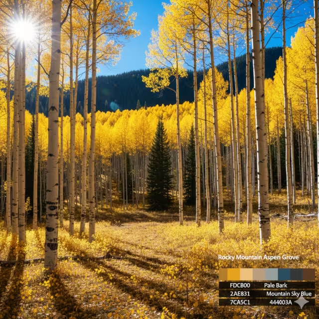
Description: This autumn forest palette is the functional opposite of New England’s. It is luminous, clear, and serene. In the high altitudes of the Rocky Mountains, the dominant deciduous tree is the Aspen.
Analysis: Aspen clones produce almost no anthocyanins (reds). Their entire autumn change is a pure, clean expression of carotenoids (xanthophylls). This results in a massive, uniform sea of brilliant, luminous gold. This gold is set against the pale, white-gray bark of the trees and the clear, thin-air blue of the mountain sky. The deep green is provided by the surrounding conifers like Spruce and Fir. This autumn forest palette is clean, minimalist, open, and has a high “value” (brightness).
Palette (with HEX codes):
- Aspen Gold:
#FDCB00 - Pale Bark:
#EAE8E1 - Deep Evergreen:
#22423D - Mountain Sky Blue:
#7CA5C1 - Shadow Brown:
#4A403A
Palette 3: The Appalachian Oak & Hickory
Description: This is the quintessential “soft autumn” palette. The Great Smoky Mountains and the greater Appalachian range create a different kind of autumn forest. The weather here is often warmer and more humid, with a famous “smoky” haze (which is technically vapor from the trees themselves).
Analysis: This environment mutes the light. It favors trees like Oaks and Hickories. Their colors are more muted, rich, and earthy. The palette is dominated by deep tannin browns, leathery oranges, and soft hickory yellows. The “smoke” or haze mutes the entire landscape, reducing overall contrast and softening the light. This is a mature, stable, and deeply calming autumn forest palette. It feels grounded, historic, and safe.
Palette (with HEX codes):
- Russet Oak (Tannin):
#8A3B12 - Hickory Yellow:
#D5890C - Moss Green:
#6B7436 - Faded Green-Gray (Haze):
#7F8D81 - Deep Umber (Earth):
#402E27
Palette 4: The Pacific Northwest Larch
Description: This is a unique and often overlooked autumn forest. The Pacific Northwest is dominated by massive evergreens. However, one specific tree, the Larch (also known as the Tamarack), is a deciduous conifer. This means it has needles like a pine, but in autumn, they turn a brilliant gold and fall to the ground.
Analysis: This biological feature creates a stunning, high-contrast palette. You have the electric, acidic gold of the Larch needles set against the deep, cool, blue-toned greens of the Douglas Firs and Western Red Cedars. The environment is wet and misty, so the palette is grounded by dark, wet stone grays and even deep plums found in the forest floor undergrowth. This autumn forest is cool, dramatic, and highly sophisticated.
Palette (with HEX codes):
- Larch Gold:
#F5B50A - Douglas Fir Green:
#1E3A33 - Misty Blue (Rain):
#93A6B4 - Wet Stone Gray:
#5A5D5A - Deep Plum (Undergrowth):
#4E3A4B
Palette 5: The Forest Floor (Macro View)
Description: No autumn forest palette is complete without its foundation. This is the “macro” or close up view. This palette is derived from the layer of humus, fallen leaves, wet earth, moss, and lichen.
Analysis: These are your essential grounding colors and rich accents. They provide the warm neutrals, the deep shadows, and the complex textures that make the brighter “hero” colors feel authentic. A design that uses only the bright hero colors (like red and yellow) will feel thin, artificial, and light. It lacks gravity. It needs the foundation of the forest floor to feel real. This palette supports all the others. A competent designer must understand how to use these deep, grounding tones from the autumn forest.
Palette (with HEX codes):
- Wet Earth:
#3B2D2C - Rust Red (Fallen Maple):
#9B3E22 - Dried Leaf (Tannin):
#7A6640 - Lichen Green (Moss):
#B2B49F - Shadow (Deep Shade):
#212121
🖥️ Color Theory: Using Autumn Palettes in Design

We have the raw pigments and the real-world palettes. Now, we must translate this information for brand strategy and user interface design. In fashion, these palettes are often categorized by “season.” In design, we use them to control user psychology and emotion. The “autumn” category is not one single thing. It is a spectrum. Understanding this spectrum is the key to using an autumn forest palette correctly.
The “Soft Autumn” Palette: Muted, Earthy, Trustworthy
- Keywords:
soft autumn color palette,muted tones,earthy tones - Analysis: This palette is defined by its low contrast and muted saturation. The colors are “softened,” as if they have been mixed with a small amount of gray or haze. Our Appalachian Oak palette is a perfect example. The colors are not bright, sharp, or shocking.
- Psychology: This palette is calming, sophisticated, and stable. It does not shout for attention. It feels trustworthy, organic, and timeless. It communicates history and reliability.
- Web Design Use: This is the ideal palette for brands in the health, wellness, or organic food spaces. It also works extremely well for high-end artisanal products, financial advisors, therapists, or any UI that needs to feel calm, safe, and non-intrusive. These soft autumn forest tones build user trust.
The “Warm (True) Autumn” Palette: Vibrant, Rich, Energetic
- Keywords:
warm autumn color palette,burnt orange,rich colors - Analysis: This is the “classic” autumn forest. The colors are highly saturated and unequivocally warm (yellow-based). There are no “cool” blues or grays in this palette; even the greens are warm, like moss. This is our New England Maple palette.
- Psychology: This palette is energetic, inviting, joyful, and abundant. It is associated with the harvest, with food, and with cozy comfort. It draws the eye and creates a strong, positive emotional response.
- Web Design Use: This is a powerful tool for consumer-facing brands. It is perfect for food blogs, agricultural companies, or any brand that wants to feel “close to home.” The bright, warm colors make excellent “Call to Action” (CTA) buttons because they create a sense of optimism and positive urgency. This is a very active autumn forest palette.
The “Deep Autumn” Palette: Strong, Dark, Luxurious
- Keywords:
deep autumn color palette,forest green,rich black - Analysis: This palette is defined by its dark values. The dominant colors are not bright oranges, but deep, rich, saturated tones. Think of our Pacific Northwest Larch or Forest Floor palettes. The “black” in this palette is not a true, flat
#000000. It is a complex, rich dark brown (#3B2D2C), a deep plum (#4E3A4B), or a dark, cool green (#1E3A33). - Psychology: This palette feels luxurious, professional, stable, and strong. It is serious, grounded, and substantive. The bright “autumn” colors (like Larch Gold) are used as small, powerful accents against this dark, stable foundation.
- Web Design Use: This is an excellent choice for luxury brands, high-end portfolios, and professional services (like architectural firms, law firms, or wealth management). It creates an immediate feeling of “groundedness,” competence, and quality. This deep autumn forest aesthetic is about stability and substance.
📈 Biophilic Application: How to Use Autumn Palettes (SEO & UX)
Now, we synthesize. A beautiful autumn forest palette is useless—or even harmful—if it degrades the user experience (UX) or accessibility. Poor UX is a direct negative signal for Search Engine Optimization (SEO).
A biophilic design approach ensures the palette is functional, not just decorative. This is how we apply the proven patterns of an autumn forest to improve website performance, increase user time on page, and build brand trust.
1. Use Natural Ratios (The 60-30-10 Rule)
The most common design mistake is using too much bright color. A real autumn forest is not 100% fiery red. It is perhaps 10% red, 30% yellow/green, and 60% neutral brown/gray (bark, earth, stone). Your design must reflect this natural balance.
- 60% (Dominant / Base): This must be your “neutral” or “whitespace.” Choose a color from the autumn forest that functions as a background. This should be a low-saturation color like Pale Bark (
#EAE8E1), Wet Stone Gray (#5A5D5A), or the Faded Green-Gray (#7F8D81). This gives the user’s eye a place to rest. - 30% (Secondary / Support): This is your primary calming color. It supports the design and is used for larger UI elements, like sidebars, header/footer areas, or info boxes. This would be a stable color like Moss Green (
#6B7436) or Deep Evergreen (#22423D). - 10% (Accent / Signal): This is your “signal” color. In an autumn forest, this is the bright red berry, the single red maple leaf, or the flash of gold that draws the eye. In your design, this is your Call to Action. Use Fiery Red (
#BF211E) or Aspen Gold (#FDCB00) only for your most important interactive elements: buttons, links, and highlights. This mimics how nature uses color to signal “pay attention.”
2. Biomorphic Forms & Textures
An autumn forest is not just color. It is texture and shape. A flat, single-color orange background feels artificial and causes visual fatigue.
- Texture: A real autumn forest is rough, layered, and imperfect. Pair your color palettes with subtle background textures. These can be digital patterns derived from woodgrain, stone, leaf veins, or even the “dappled light” that filters through a canopy. This adds organic depth and realism.
- Biomorphic Forms: Nature does not use rigid, 90-degree boxes. An autumn forest is made of curves, fractals, and non-linear patterns. In your web design (UI), soften your containers. Use rounded corners (border-radius). Use “organic” flowing shapes or subtle curves to divide sections instead of hard, straight lines. This reduces the cognitive load on the user’s brain, as these patterns are processed more easily than hard-edged, artificial geometry.
3. SEO & User Experience (UX)
This is the final, critical connection. Biophilic design is not just aesthetics; it is performance. Google’s algorithms (and SEO in general) are increasingly focused on user experience metrics. A good user experience sends positive ranking signals (e.g., Core Web Vitals, Time on Page, Bounce Rate). A poor one is penalized.
- Reduce Visual Fatigue: A well-balanced biophilic palette (like a soft autumn forest palette) is less jarring and sterile than a high-contrast, purely-digital palette (like a stark white background with black text). It reduces visual fatigue and eye strain. This directly improves Time on Page and reduces Bounce Rate.
- Build Trust & Improve Conversion: Natural patterns and colors are perceived as “safe” and “trustworthy” by the human brain. Using a stable, grounded autumn forest palette (like the “Deep Autumn” or “Soft Autumn”) can increase user trust. This trust is essential for improving conversion rates, whether you are selling a product or asking a user to fill out a contact form.
- Create Brand Identity: A generic “blue and white” tech website is forgettable. A site that effectively and competently uses the “Pacific Northwest Larch” palette is memorable. A strong biophilic brand identity improves return visits and brand recall. This is a powerful, long-term SEO asset. Using an autumn forest theme effectively makes your digital presence unique.
❓ Frequently Asked Questions
This section provides direct answers to the most common “People Also Ask” queries related to this topic.
Q: What colors are in a true autumn forest palette?
A: A true autumn forest palette is diverse and balanced. It is not just orange and brown. A complete palette must include deep forest greens (from conifers like pine and fir), bright yellows (from aspen, birch, and hickory), and vibrant reds and oranges (from maples and sumac). Most importantly, it requires a foundational layer of browns, tans, and grays (from bark, earth, and stone) to feel grounded and realistic.
Q: What are the HEX codes for a ‘soft autumn’ palette?
A: A soft autumn palette uses muted, low-contrast colors that are not “loud.” A good example, drawn from an Appalachian autumn forest, would include: a muted Moss Green (like #6B7436), a Faded Green-Gray (like #7F8D81), a leathery Russet Brown (like #8A3B12), and a soft, muted Hickory Yellow (like #D5890C). The key is that the colors are desaturated, as if viewed through a slight haze.
Q: How do I use an autumn color palette for my brand or website?
A: The most effective and professional method is the 60-30-10 rule.
- 60% of your design should be a low-saturation neutral autumn shade (like beige, tan, or gray) for your backgrounds.
- 30% should be a primary calming color (like a deep green or a hazy blue) for secondary elements like sidebars or footers.
- 10% should be your brightest, most vibrant hue (like burnt orange or gold) used only as an accent for your most important buttons and links.
Q: What makes autumn colors feel “warm”?
A: Autumn colors feel “warm” because they are dominated by colors on the warm end of the visible light spectrum. These are the reds, oranges, and yellows. Our brains are psychologically conditioned to associate these colors with sources of heat, such as fire, and the low-angled light of the sun. This is a direct contrast to “cool” colors like blue and purple, which we associate with water, ice, and shade. A classic autumn forest is a masterclass in warm color theory.
🌲 Bring the Forest to Your Framework
An autumn forest color palette is more than a seasonal trend. It is a functional, biophilic system that is coded into our psychology.
By understanding the science (the pigments) and applying the real-world examples (the HEX codes) with intent (the 60-30-10 rule), you can create digital experiences. These experiences are not just beautiful; they are more natural, more calming, and, as a result, more effective. A well-designed autumn forest theme is a powerful, data-driven tool for any designer.
The digital world is built on code. Nature is built on a similar, older code. Your task is to be the translator. I encourage you to go outside, observe your local autumn forest, find your own real example palette, and begin to design more human-centric websites.