We are biological creatures existing in an increasingly digital world. This is the central conflict of the 21st century. Our minds and bodies evolved over millennia to respond to the rustle of leaves, the patterns of light through a canopy, and the fractal shapes of a fern. We are hardwired for nature. Yet, we spend the majority of our waking hours staring at glowing rectangles, existing in flat, sterile, and artificial digital environments.
This constant digital immersion creates a cognitive and psychological toll. It leads to “digital fatigue,” elevated stress, and a measurable sense of disconnection. For years, architects and interior designers have known the solution to this problem in the physical world: biophilic design. They bring nature into the built environment to reduce stress, improve health, and boost productivity.
But what about the digital environment where we spend so much of our time? This is where the next evolution of design must occur. This is the domain of biophilic branding.
Table of Contents
What Is Biophilic Branding?
Basically, biophilic branding is the strategic and systematic application of biophilic design principles to a brand’s complete identity, message, and digital presence.
It is not simply adding a stock photo of a leaf to your website. It is a deep, systems based approach. It asks: How can our logo, our color palette, our typography, our website’s user experience, and even our brand’s voice foster a genuine connection with nature?
True biophilic branding is not an aesthetic; it is an ethic. It uses nature’s patterns as a framework to create digital experiences that lower stress, enhance well being, and build a profound, almost primal, sense of loyalty with the user. This is the future of authentic brand communication, and it is a core discipline for modern digital strategy. A successful biophilic branding campaign understands this distinction.
The Semantic Origin: Biophilia vs. Biophilic Design

To fully grasp biophilic branding, we must first understand its foundational concepts. The terms are often used loosely, but they have precise, technical meanings.
Biophilia (The Hypothesis)
The term “biophilia” was first popularized by psychoanalyst Erich Fromm and later defined as a scientific hypothesis by Harvard biologist E.O. Wilson in his 1984 book, Biophilia.
Wilson defined it as the “innate human tendency to seek connections with nature and other forms of life.” It is a hypothesis that suggests our affinity for nature is not just a preference but a biological need, forged by our evolution. We are instinctively drawn to life and lifelike processes. When we are cut off from them, our health suffers. When we are connected to them, we thrive.
Biophilic Design (The Practice)
If biophilia is the why, biophilic design is the how. This practice was structured and popularized by Stephen Kellert, a social ecologist at Yale.
Biophilic design is the practical application of the biophilia hypothesis to the built environment. It is the field of architecture, urban planning, and interior design that intentionally incorporates natural elements and patterns. This is done to improve the health, well being, and cognitive function of the people who live and work in those spaces. Think of hospitals that use natural light to speed recovery, or offices that use natural materials to reduce employee stress.
Biophilic Branding (The Application)
Biophilic branding is the newest, and perhaps most vital, evolution of this idea. It takes the established principles of architectural biophilic design and translates them into the digital and abstract world of branding.
If biophilic design is for our physical spaces, biophilic branding is for our digital spaces and our brand spaces. It applies these proven principles to websites, apps, logos, marketing, and the entire brand identity. The goal of biophilic branding is to create a digital experience that satisfies the same innate, biological need for nature, thereby making the brand itself a source of well being.
The Technical Framework for Nature-Led Branding
Biophilic branding is not guesswork. It is a technical discipline based on a rigorous, evidence based framework. The most authoritative framework comes from Terrapin Bright Green, a leading consulting and research firm. They synthesized the research into “14 Patterns of Biophilic Design.”
These 14 patterns are the technical toolkit for any biophilic branding strategy. They are organized into three groups.
Group 1: Nature in the Space (Direct Experience)
This group involves a direct, physical, or sensory experience with nature. In digital biophilic branding, this means simulating these direct experiences.
- 1. Visual Connection with Nature: Seeing living systems, water, or animals.
- 2. Non-Visual Connection: Experiencing nature through sound, smell, or touch.
- 3. Non-Rhythmic Sensory Stimuli: Brief, surprising, and natural sensory “events,” like a gust of wind or a bird’s call.
- 4. Thermal & Airflow Variability: Subtle changes in air temperature and movement.
- 5. Presence of Water: Seeing, hearing, or feeling water.
- 6. Dynamic & Diffuse Light: Mimicking the changing light patterns found in nature.
- 7. Connection with Natural Systems: Awareness of natural processes, like weather, seasons, or growth.
Group 2: Natural Analogues (Indirect Experience)
This group involves the use of organic, non-living, and indirect evocations of nature. These are the aesthetic and material applications of biophilic branding.
- 8. Biomorphic Forms & Patterns: Using shapes, contours, and patterns from nature.
- 9. Material Connection with Nature: Using natural materials or images of materials that reflect the local ecology.
- 10. Complexity & Order: Using rich, hierarchical, and fractal patterns found in nature.
Group 3: Nature of the Space (Spatial Experience)
This group involves spatial configurations that mimic natural environments, triggering feelings of safety, curiosity, or control. This is the “User Experience” (UX) of biophilic branding.
- 11. Prospect: A high, unobstructed vantage point, offering a sense of control.
- 12. Refuge: A safe, protected space to withdraw, like a small cave or a booth.
- 13. Mystery: The promise of more information, enticing exploration.
- 14. Risk/Peril: A sense of contained danger or thrill, like a view from a high cliff.
Understanding these 14 patterns is the first step to implementing a successful biophilic branding strategy.
Biophilic Branding in Practice: A Digital Application of the 14 Patterns

How do these architectural patterns translate to a website, a logo, or an app? This is the central challenge and opportunity of biophilic branding.
Applying Direct Experience (The Interface)
This is the most direct application of biophilic branding. It involves the User Interface (UI) elements that simulate a direct connection to nature.
- Visual Connection: This is more than just a stock photo of a forest. A strong biophilic branding strategy uses authentic, high quality imagery of local nature. It can also be dynamic. Imagine a website background that subtly changes its light and shadow to match the user’s actual time of day, or a weather app that shows realistic, dynamic animations.
- Non-Visual Connection: This is a key part of biophilic branding for apps. The Calm app is a prime example. Its use of ambient sounds (rain, birdsong, waves) is a direct application of this pattern. On websites, this can be subtle audio cues or even haptic feedback on mobile devices that mimics natural textures.
- Presence of Water: This can be literal, with high quality video or imagery of water. It can also be abstract. Think of fluid page transitions, wave shaped section dividers, or a “ripple” effect when a user clicks a button. This is a subtle but effective biophilic branding technique.
Applying Natural Analogues (The Aesthetics & Identity)
This is where biophilic branding shapes the core brand assets, like the logo, colors, and typography.
- Biomorphic Forms: This is the rejection of the rigid grid. A biophilic branding approach favors organic shapes. Think of logos, buttons, and content containers that have curved edges, asymmetrical balance, and flowing lines.
- Material Connection: In a digital space, this is achieved with texture. A website’s background could use a subtle, high resolution texture of reclaimed wood, slate, or handmade paper. This adds a tactile, natural feeling to an otherwise flat screen.
- Color Palette: A biophilic branding color palette is drawn directly from nature. It uses the muted, rich tones of soil, stone, and flora (earth tones, greens, blues) rather than the artificial, high saturation colors of the digital-first world.
Applying Spatial Experience (The User Experience – UX)
This is the most sophisticated level of biophilic branding. It uses the layout and flow of a website to create a specific, evolved psychological response.
- Prospect: A good website navigation is a perfect example of Prospect. A clear, intuitive menu and a well defined site hierarchy give the user a “view from the hilltop.” They can see where they are and where they can go. This creates a feeling of control and reduces anxiety.
- Refuge: This pattern is about creating a safe, calm space. In web design, this translates to minimalist layouts, generous use of white space, and a lack of overwhelming pop ups or auto playing videos. A “zen mode” or “read mode” feature is a literal digital refuge. Dark Mode functionality is also a form of refuge, reducing visual strain.
- Mystery: This pattern keeps users engaged. It is the opposite of a dead end. In biophilic branding, this is applied through “read more” links, content reveals on scroll, and intriguing headlines that entice the user to click and explore deeper. It turns a user journey into an exploration.
- Complexity & Order: This is the use of fractals. Fractals are the repeating patterns of “roughness” found everywhere in nature (coastlines, snowflakes, leaves). A chaotic, messy website is not biophilic. But a website that uses a structured, hierarchical layout (Order) with subtle, fractal based background patterns (Complexity) feels intrinsically natural and balanced to the human eye. This is an advanced biophilic branding technique.
Biophilic Branding vs. Related Concepts
The field of nature based design is full of terms that are often confused. A true expert must understand the distinctions. A core part of biophilic branding is knowing what it is not.
Biophilic Branding vs. Biomimicry
People frequently confuse biophilic branding with biomimicry. The two are related but have fundamentally different goals.
- Biomimicry emulates nature’s functional strategies to solve human problems. It asks, “How does nature work?” Example: Designing a fan blade that mimics a whale’s fin to improve energy efficiency. In digital design, it might be a logistics algorithm that mimics the “swarm intelligence” of an ant colony.
- Biophilic Branding emulates nature’s patterns and forms to improve human psychological well being. It asks, “How does nature make us feel?” Example: Designing a website with organic shapes and natural colors to reduce a user’s stress and build brand affinity.
In short: Biomimicry copies nature to solve a function. Biophilic branding copies nature to solve a feeling.
Biophilic Branding vs. Green Design / Sustainability
This is the most important distinction for brand integrity. This is the difference between true biophilic branding and “greenwashing.”
- Green Design (or Sustainable Design) focuses on reducing negative environmental impact. It is about the planet’s health. It concerns itself with material sourcing, energy consumption, and end of life recycling.
- Biophilic Branding focuses on increasing positive human health. It is about the user’s well being. It concerns itself with stress reduction, cognitive function, and emotional connection.
The two are not mutually exclusive. In fact, the most authentic brands practice both. A brand that uses a beautiful, nature inspired biophilic branding strategy but has a destructive supply chain is engaging in greenwashing. Authentic biophilic branding demands that the message (biophilia) and the mission (sustainability) are aligned.
Technobiophilia
Technobiophilia is a related concept that describes the wider field of study. It is defined as the innate human tendency to seek connection with nature through technology.
If technobiophilia is the academic field, biophilic branding is the professional practice. Biophilic branding is the tool we use to satisfy the innate need for technobiophilia. It accepts that we live in a technological world and uses that technology as a conduit to nature, rather than an obstacle to it.
Case Studies in Biophilic Branding
Analyzing how successful entities implement these strategies provides a clear picture of biophilic branding in action.
The Holistic Model: Patagonia
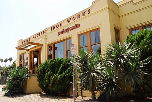
Patagonia is perhaps the ultimate example of holistic biophilic branding. Their entire brand is a biophilic system.
- Identity: Their logo is a biomorphic form (a mountain range).
- Interface: Their website and catalogs are dominated by authentic, “Risk/Peril” imagery of humans in wild nature. The photography is not sterile; it is real, rugged, and connects to natural systems (weather, seasons).
- Ethic: Their mission (“We’re in business to save our home planet”) directly aligns their “Green Design” (sustainability) with their “Biophilic Branding” (love of nature). Campaigns like “Don’t Buy This Jacket” create a sense of trust that is a core part of their brand’s “Refuge” pattern. Their biophilic branding is authentic because their actions are sustainable.
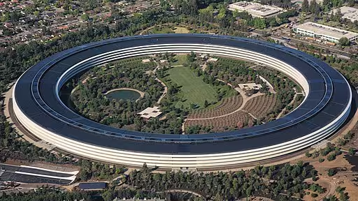
The Architectural Model: 1 Hotels / Apple
These brands demonstrate how a physical biophilic design can be translated into digital biophilic branding.
- 1 Hotels: Their physical locations are masterpieces of biophilic design (reclaimed wood, living green walls, natural light).48 Their website mirrors this. It uses a “Material Connection” with a clean, wood-like texture. The typography is clean, the imagery is light and airy (“Dynamic & Diffuse Light”), and the entire UX feels like a “Refuge” from the chaos of travel.
- Apple: While a tech company, their brand has shifted. Apple Park, their headquarters, is a massive biophilic design project (a ring in a forest). This ethic has infused their digital branding. Their website uses vast white space (“Refuge”), minimal text, and high-resolution, “Complex & Orderly” product shots that are presented like natural specimens. Their biophilic branding is minimalist and focuses on light, space, and form.
The Digital-First Model: Calm / Forest App
These brands have no physical product; their entire business is digital biophilic branding.
- Calm: The Calm app’s entire business model is selling “Nature in the Space.” The ability to “Presence of Water” (rain sounds) or “Non-Visual Connection” (birdsong) is the core product. Their interface is simple, blue (a biophilic color), and easy to navigate, creating a perfect digital “Refuge.”
- Forest App: This app brilliantly gamifies the “Connection with Natural Systems” pattern. To stay off your phone, you “plant” a virtual tree. If you leave the app, the tree dies. This creates a real, emotional stake in a digital, natural process. It is a perfect example of technobiophilia and an innovative biophilic branding strategy.
Why Biophilic Branding Impacts SEO and Core Metrics

As a design expert, I am not just concerned with aesthetics. I am concerned with performance. Biophilic branding is not just a “nice to have.” It is a powerful tool for improving the technical metrics that search engines like Google value.
Improving User Experience (UX) Metrics
Google’s algorithm is increasingly focused on rewarding sites that provide an excellent User Experience (UX). A core goal of biophilic branding is to improve the user’s psychological state.
The famous 1984 Ulrich study found that hospital patients recovering from surgery who had a view of nature recovered faster than those who faced a brick wall. Biophilic design is medically proven to reduce stress.
This translates directly to web metrics. A user who lands on a website with a strong biophilic branding design feels less stress.56 They feel calmer, safer (“Refuge”), and more engaged (“Mystery”). A less stressed user will:
- Stay Longer (Dwell Time): They are more willing to explore.
- Leave Less (Bounce Rate): They do not feel overwhelmed and immediately click “back.”
These are powerful, positive signals to Google, which will rank the site higher as a result. This is how biophilic branding directly impacts SEO.
Core Web Vitals (CWV)
This is the primary technical challenge for biophilic branding. Biophilic design loves big, beautiful, high resolution images and textures. These elements are heavy and can be slow to load, which is poison for Google’s Largest Contentful Paint (LCP) metric.
A naive biophilic branding approach will fail the CWV test. An expert biophilic branding strategy must be integrated with technical SEO. This means:
- Aggressively optimizing all images (using WebP or AVIF formats).
- Using lazy loading for images “below the fold.”
- Optimizing the loading of “hero” images to ensure LCP is fast.
- Using CSS for biomorphic shapes rather than loading them as images.
Technical SEO does not compete with biophilic branding; it enables it.
Semantic Authority & ESG
Search engines no longer just read keywords; they understand concepts. When a website implements a thorough biophilic branding strategy, it creates a powerful semantic signal.
The site’s content, images, and structure all point to concepts like wellness, sustainability, health, and ESG (Environmental, Social, and Governance). This builds topical authority in these high value areas. Google is increasingly focused on ESG, and a site that demonstrates these values through its design and content is seen as more authoritative and trustworthy.
The Technical Component: Green Hosting
This is the final piece of authentic biophilic branding. If your brand is about a love for nature, your digital infrastructure cannot be harming it. “Green Hosting” refers to web hosts that are powered by renewable energy.
Choosing a green host is the technical “walk the walk” for biophilic branding. It ensures that the brand’s digital footprint is as sustainable as its message. This alignment is the final, critical element of an authentic, high performance biophilic branding strategy.
Beyond Aesthetics: A Systemic Shift
Ultimately, biophilic branding is not a trend. It is a necessary, systemic shift in how we think about design.
For decades, we have been focused on “human centered design.” But this philosophy has a fatal flaw: it places the human in a vacuum, separate from the natural system on which we depend.
Biophilic branding is the next step. It is nature centered design. It understands that to be truly human centered, we must first acknowledge our innate, biological connection to the natural world.
In a digital landscape that is increasingly loud, stressful, and draining, biophilic branding is the path forward. The brands that succeed in the next decade will be the ones that do not just demand our attention, but restore it. The future of branding is not artificial. The future of branding is biophilic branding.