Within the disciplines of architecture and landscape design, there exists a foundational concept known as genius loci; the protective spirit, or unique atmosphere, of a place. It is the amalgamation of physical characteristics, history, and cultural memory that gives a location its distinct identity.
For centuries, the most successful structures have been those that do not impose themselves upon a landscape, but rather enter into a dialogue with this spirit, creating a resonance that feels both inevitable and profound. In our current digital epoch, however, we have constructed vast digital landscapes largely devoid of this principle. The internet is saturated with brand identities that are functionally placeless, their websites existing as generic, non-contextual templates that could belong to a business anywhere, or nowhere at all. This digital placelessness creates a subtle but persistent barrier to trust, failing to establish the deep roots of authenticity that drive meaningful user connection.
The following analysis will provide a strategic framework for correcting this deficit. We will deconstruct the methodology by which businesses can observe, analyze, and systematically translate their most prominent local symbols and landmarks, into a cohesive and influential online brand identity. This process moves beyond the superficial application of a landmark photograph; it is an exercise in translation, converting the language of physical form, materiality, and narrative into the digital syntax of user interfaces, color palettes, and content strategy.
In doing so, we engage in a form of digital biophilia, specifically honoring the pattern of “Connection with Place.” By grounding a virtual experience in a tangible, geographically significant context, we not only enhance user engagement and brand recall but also fortify the technical foundations of local search engine optimization.
Table of Contents
The Psychological Framework: Why Landmarks Anchor Digital Trust
Before one can implement a design strategy, one must first understand the cognitive mechanisms that ensure its efficacy. The influence of a local landmark on a digital brand is not a matter of aesthetic preference but is rooted in fundamental principles of human psychology. By aligning a brand with these powerful local symbols, we are leveraging pre-existing neural pathways related to trust, community, and identity.
Cognitive Fluency and Familiarity
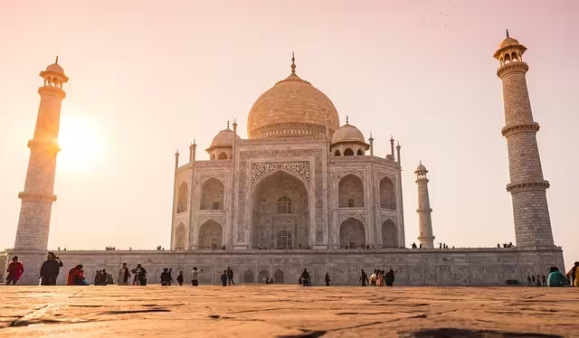
Cognitive fluency is the subjective experience of ease or difficulty associated with a mental task. The human brain is wired to prefer things that are easy to process and understand. A familiar image, such as a well-known local landmark, requires minimal cognitive load to be recognized and categorized. When a user lands on a website and is immediately greeted by the familiar silhouette of their city’s iconic bridge or historic courthouse, a cascade of positive associations is triggered.
This instant recognition creates a feeling of comfort and ease, which is then transferred to the brand itself. The brand feels familiar, even on a first visit. This psychological shortcut bypasses the initial skepticism often reserved for unknown digital entities, creating an immediate, albeit subconscious, foundation of rapport. The landmark acts as a social proof of locality, answering the user’s unspoken question—”Are you really one of us?”—with a resounding and immediate affirmative.
Borrowed Authority and Permanence
Landmarks are, by their very nature, symbols of endurance. They are structures that have weathered storms, witnessed generations, and become woven into the historical fabric of a community. A centuries-old clock tower or a massive brutalist library represents permanence, stability, and a commitment to place. A digital brand, which is inherently ephemeral and intangible, can “borrow” these attributes through strategic association.
When a law firm’s website subtly incorporates the Doric columns of the local county courthouse into its design language, it is not merely decorating its page; it is making a non-verbal claim to the same principles of justice, history, and authority that the courthouse represents. When a tech startup uses the clean, aspirational lines of a modern suspension bridge in its logo, it aligns itself with concepts of innovation, connection, and forward momentum. This transference of meaning is a powerful branding tool. The landmark has already invested the decades or centuries required to build its reputation; the brand can tap into that accumulated reputational equity to accelerate its own journey toward becoming an established and trusted local institution.
Authenticity in a Digital World
Authenticity is a paramount concern for today’s consumer. In an online environment rife with faceless multinational corporations and dropshipping sites, the ability to prove one’s legitimacy is a significant competitive advantage. Leveraging a local landmark is one of the most potent and irrefutable signals of genuine local presence. It is a claim that is instantly verifiable and culturally resonant.
This strategy is particularly effective for service-area businesses, professional services, and any enterprise where local trust is a primary conversion factor. A dental practice in Titusville, Pennsylvania, that uses imagery and thematic elements related to the iconic Drake Well Museum, the birthplace of the American oil industry, is doing more than showing a local picture.
It is communicating a deep understanding of the area’s unique heritage and its role within that community. This act of local identification differentiates the practice from any national dental chain that might enter the market with a generic website, allowing the local business to build a defensive moat of authenticity that is difficult for outside competitors to cross.
The Designer’s Lexicon: Translating Architecture into Digital Assets
The most common error in this process is one of literalism—simply placing a photograph of a landmark on a website. A sophisticated strategy requires a deeper, more analytical approach. The designer must act as a translator, deconstructing the landmark into its core components and reassembling them into a new digital language that speaks of the original without merely quoting it.
Deconstructing the Landmark: Form & Structure (Biomorphic Forms)
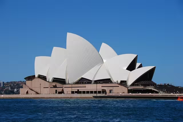
Every landmark has a core structural DNA. The first step is to analyze this form, not as a whole, but as a collection of lines, shapes, and patterns. Is the structure defined by the rigid geometry of a Mies van der Rohe skyscraper, with its strict grid of vertical and horizontal lines? Or is it defined by the flowing, organic curves of a Zaha Hadid building, which mimic forms found in nature? This analysis provides a rich vocabulary for user interface design.
- Grid and Linearity: The grid of a skyscraper can directly inform the layout grid of a website, creating a sense of order, professionalism, and stability. Its strong vertical lines can be echoed in borders, dividers, and even the stems of the chosen typography.
- Curves and Organics: A landmark with biomorphic forms, such as the undulating roof of a concert hall or the arch of a stone bridge, can inspire more fluid layouts. These curves can be translated into rounded button corners (
border-radius), wave-like graphic separators between content sections, and custom iconography that feels more natural and less severe. This approach aligns with the biophilic pattern of “Biomorphic Forms & Patterns,” which posits that humans have an innate affinity for the contours and shapes found in the natural world.
Deconstructing the Landmark: Materiality & Texture (Natural Analogues)
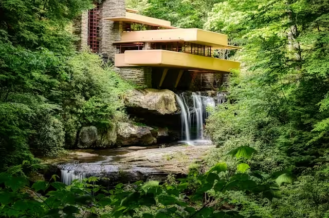
A landmark’s identity is intrinsically tied to its materials. The rough-hewn granite of a historic fort, the sleek glass and steel of a modern museum, the warm terracotta of a mission-style building—these materials evoke tactile sensations and emotional responses. The challenge is to translate this haptic experience into a purely visual, digital medium. This is an exercise in creating “Natural Analogues,” another key biophilic pattern.
- Stone and Brick: The texture of rough stone or patterned brick can be replicated digitally through the use of subtle background noise, textured image overlays, or repeating CSS patterns. This can add a sense of depth and gravitas to a design, preventing it from feeling flat and sterile.
- Metal and Glass: The reflective qualities of metal and glass can be translated into gradients. A linear gradient that moves from a dark grey to a light silver can mimic the sheen of brushed steel. A transparent container with a blurred background (
backdrop-filter: blur()) can evoke the feeling of frosted glass, creating a sophisticated layering effect in the UI. - Wood and Earth: The warmth and grain of wood can be represented through color choice and subtle, linear patterns. These elements can make a digital interface feel more grounded, human, and approachable.
Deconstructing the Landmark: Color Palette Derivation
Extracting a color palette from a landmark is a more nuanced process than using a simple color picker tool on a photograph. A comprehensive brand palette must be derived from the landmark in various conditions, ensuring versatility and depth.
- The Material Palette (Primary): These are the core, dominant colors of the landmark’s physical materials. The grey of the concrete, the beige of the limestone, the deep red of the brick. These often make excellent, stable primary and neutral colors for the website’s background, text, and primary containers.
- The Environmental Palette (Secondary): Observe the landmark’s interaction with its environment. What is the color of the sky behind it at midday? What is the green of the foliage that surrounds it? These colors provide excellent secondary options that ensure the primary palette feels contextually appropriate and not isolated.
- The Atmospheric Palette (Accent): This is the most dynamic element. Capture the color of the landmark during the “golden hour” just after sunrise or before sunset, when it is bathed in warm oranges and golds. Capture it again during the “blue hour,” when the ambient light casts cool blues and purples. These ephemeral, high-impact colors are perfect for accents: call-to-action buttons, links, and hover states, drawing the user’s eye and creating moments of visual interest.
Deconstructing the Landmark: Typography as Architecture
Typography is the architecture of information. The choice of font should be a deliberate echo of the landmark’s structural and historical character. Mismatched typography can create a dissonant effect that undermines the entire branding strategy.
- Classical & Neoclassical: Landmarks with roots in Greek and Roman architecture (courthouses, state capitols, museums) are defined by proportion, order, and elegance. They pair naturally with stately serif typefaces like Garamond, Caslon, or Trajan. These fonts have a historical weight and sense of authority that mirrors the architecture.
- Art Deco & Modernist: The clean lines, geometric shapes, and aspirational nature of Art Deco landmarks (e.g., the Chrysler Building) call for geometric sans-serif fonts. Typefaces like Futura, Gotham, and Montserrat, with their clean letterforms and balanced construction, reflect the optimism and functionalism of the era.
- Brutalist & Postmodern: Brutalist architecture, with its raw concrete and imposing mass, pairs well with bold, heavy-weight sans-serifs like Helvetica Neue Heavy or grotesk fonts that have a strong, utilitarian feel. Postmodern landmarks, often playful and eclectic, allow for more expressive and character-rich font choices.
By undertaking this rigorous process of deconstruction and translation, the resulting brand identity becomes a sophisticated homage to its local context. It is an identity that feels authentic and deeply rooted because every component—from the layout grid to the button color to the text on the page—is part of a single, cohesive system derived from a shared, tangible symbol.
Practical Implementation: Weaving the Landmark into the User Experience
With a design lexicon established, the next phase involves the tactical application of these assets across the digital property. The goal is a holistic integration where the landmark’s influence is felt at every level of the user’s journey, from their first impression to their final click.
Above the Fold: The Hero and the Landmark
The hero section—the first content a user sees—is the most critical real estate on a website. This is the primary opportunity for a direct, high-impact visual statement. However, execution is key.
- Avoid Generic Stock Photography: Using a generic, overused stock photograph of the landmark is counterproductive. It signals a lack of investment and originality.
- Commission Unique Art Direction: The most effective approach is to commission a professional photographer or videographer to capture the landmark from a unique perspective that aligns with the brand’s ethos. A financial firm might want a shot taken from a low angle, looking up, to convey stability and ambition. A wellness center might prefer a shot at dawn, with soft light and a sense of calm. This custom imagery becomes a proprietary brand asset.
- Integrate Brand Elements: The hero image should not exist in isolation. It should be overlaid with the brand’s headline typography (derived from the landmark’s style), a call-to-action button (colored with an accent from the atmospheric palette), and perhaps a subtle texture overlay (pulled from the landmark’s materiality).
Subtle Integration in UI/UX
The most sophisticated brand identities express themselves not just in grand gestures but in the minute details of the user interface. This is where the deconstructed elements of the landmark can be deployed to create a cohesive and immersive experience.
- Interactive Elements: The shape of a landmark’s arch can define the
border-radiusof buttons and input fields. A hover animation on a link could cause a color change that mimics the sun glinting off a landmark’s window. The loading animation could be a simplified SVG animation of the landmark’s silhouette being drawn. - Structural Graphics: The pattern of a bridge’s suspension cables can be simplified into a repeating SVG background for a section divider. The geometric tile work from a historic building’s floor can become the background for the website’s footer. These details may not be consciously registered by every user, but they contribute to an overall feeling of design integrity and thematic consistency.
- Iconography: Instead of using a generic icon library like Font Awesome, commission a set of custom icons. A “location” icon might not be a generic pin, but a simplified representation of the town’s clock tower. An icon for “security” might incorporate the shape of a shield found in the heraldry of a government building.
Content and Brand Storytelling
The landmark provides a powerful anchor for the brand’s narrative. The content strategy should intentionally weave the story of the business into the larger story of the place.
- The “About Us” Narrative: Frame the company’s founding and mission in the context of its location. “Founded in the shadow of the Wasatch Mountains, our company shares the same spirit of pioneering and resilience…” is far more compelling than “We were founded in 2015.”
- Pillar Content and Cluster Models: Create a “pillar page” on the website dedicated to the company’s commitment to its community. This page can link out to “cluster” blog posts that explore related local topics: “The Architectural History of the [Landmark Name],” “Our Founder’s Favorite Local Parks,” or “Sponsoring the Annual [Local Event at Landmark].” This content is not only valuable for users but also sends powerful local relevance signals to search engines.
- Service Area Pages: For businesses serving multiple towns, create dedicated landing pages for each. Use images of each specific town’s unique landmark to demonstrate a granular, authentic local presence, rather than using the same generic image across all pages.
The SEO Symbiosis: Amplifying Local Signals for Search Engines
A brand identity rooted in a local landmark is not merely a creative exercise; it is a potent technical SEO strategy. Search engines like Google are constantly seeking signals that validate a business’s real-world location, expertise, and trustworthiness for local queries. This branding methodology systematically creates those signals.
Building E-E-A-T (Experience, Expertise, Authoritativeness, Trustworthiness)
Google’s E-E-A-T framework is a cornerstone of its quality evaluation. A landmark-driven strategy directly enhances these signals:
- Experience & Trustworthiness: By showcasing deep knowledge of local history and landmarks, you demonstrate firsthand experience and involvement in the community. This builds trust with both users and search algorithms, proving you are a legitimate local entity, not an out-of-town interloper.
- Authoritativeness: Publishing well-researched content about local landmarks and community history positions your website as an authoritative resource on local matters, which can increase your topical authority for location-based searches.
Optimizing Image Assets
The unique, commissioned photos of the landmark are powerful SEO assets that must be technically optimized.
- Descriptive File Names: Before uploading, rename image files from
IMG_8432.jpgto a keyword-rich, descriptive name liketitusville-pa-drake-well-museum-from-our-law-office.jpg. - Specific Alt Text: The alt text should be a clear description for accessibility and search crawlers: “A morning view of the historic Drake Well Museum in Titusville, PA, a landmark of the American oil industry.”
- Geotagging (EXIF Data): Ensure the photographs contain EXIF metadata, specifically GPS coordinates. This is hard data embedded in the image file that unequivocally ties the photograph to a specific physical location, providing a powerful, verifiable local signal.
Leveraging Local Schema
Schema markup is code that you place on your website to help search engines return more informative results for users.
LocalBusinessSchema: Ensure your Name, Address, and Phone Number (NAP) are marked up withLocalBusinessschema. Within thedescriptionproperty, you can naturally mention your proximity to the landmark.
Hyper-Local Content Strategy
As mentioned in the implementation section, the content created around the landmark is not just for user engagement; it’s a deliberate SEO tactic. Every blog post about the landmark’s history or a community event held there becomes an opportunity to rank for hyper-local, long-tail keywords. A user searching for “history of the Drake Well” might discover your business, building brand awareness and creating a new pathway for potential customers to find your services. This transforms the website from a simple brochure into a valuable local resource, which is precisely the kind of site that search engines are designed to reward.
Conclusion: Building a Digital Landmark
We have explored the methodology for transforming a physical landmark into a digital branding asset. This process requires a shift in perspective: a local landmark should not be viewed as mere scenery to be captured in a photograph, but as a rich text to be deconstructed, translated, and woven into the very fabric of a brand’s digital existence. It is a source of form, texture, color, and narrative.
By grounding your online presence in the tangible, shared identity of your community, you accomplish something profound. You move beyond creating a placeless, generic website and begin to cultivate a true digital environment; a space with its own genius loci. In doing so, you transform your website from a fleeting digital storefront into a meaningful, memorable, and trusted local destination. You build a brand that resonates on a psychological, aesthetic, and technical level, ultimately becoming a digital landmark in its own right.
I encourage you to step outside and view your nearest local landmark not as a tourist, but as a brand strategist. Analyze its form, its materials, and its story. Your most powerful branding asset may be right down the street.