For decades, the design of commercial spaces was dominated by a palette of sterile utility. We saw endless seas of beige, dull gray, and flat white. These choices were not strategic; they were defaults, chosen to be inoffensive and inexpensive. That era is over. Today, color is a primary functional tool in commercial design. It is a data-driven asset engineered to improve productivity, guide customer behavior, and build brand identity. This strategic shift defines the new color trends in commercial design. We are moving from arbitrary aesthetics, or picking colors simply because they look nice, to a functional system based on the science of color psychology.
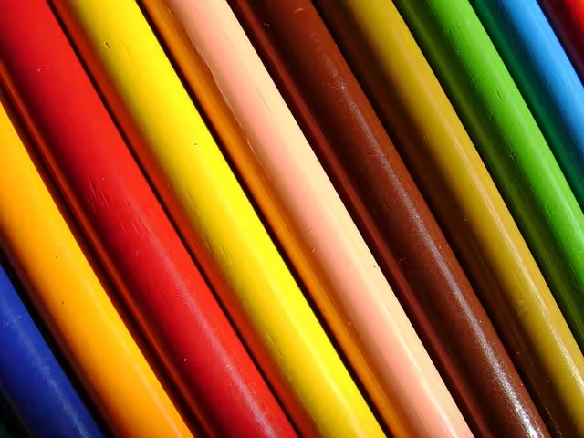
Understanding these psychological triggers is the first step in mastering current color trends. At its simplest, color psychology studies how different hues affect human mood and behavior. We can separate these effects into two main groups. First are the warm tones, such as reds, oranges, and yellows. These colors are associated with energy, passion, and warmth. They are stimulating. Red, for example, can actually increase a person’s heart rate. This makes it a powerful tool for spaces designed for high energy or quick turnover.
On the other side are the cool tones, like blues and greens. These colors evoke feelings of calm, focus, and serenity. They are ideal for environments where stress is high or concentration is necessary. A light blue can lower blood pressure and create a sense of peace, while a deep, natural green helps reduce eye strain and mental fatigue. The application of these simple principles is foundational to all effective commercial color trends.
This science directly impacts how colors affect customer behavior. This is not guesswork; it is a proven business strategy. Red’s ability to create urgency is why it is the dominant color for fast-food brands and “clearance” or “sale” signs. It encourages impulse buys and quick action. In contrast, blue is the single most common color for banks, tech companies, and healthcare systems. Why? Because it projects trust, stability, and reliability. These color trends show you are not just painting a wall; you are sending a subconscious message to every person who enters the space.
Perceived value is also tied directly to color. Darker, richer, and more saturated color trends communicate luxury and sophistication. A restaurant painted in deep charcoal gray, emerald green, or a moody navy blue feels more expensive and exclusive. This palette encourages patrons to slow down and signals that the product is high-end. Lighter, airy palettes, on the other hand, can feel more accessible, friendly, and affordable.
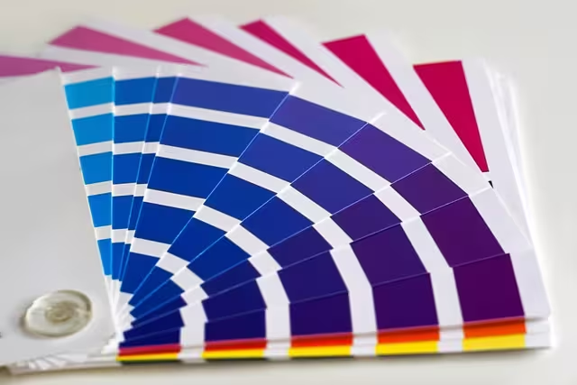
To apply these color trends correctly, designers use basic color schemes. A Monochromatic scheme uses different shades and tints of a single color. This creates a very sophisticated, harmonious, and restful look. An Analogous scheme uses colors that are next to each other on the color wheel, like blue and green.13 This is also very harmonious and is often seen in nature. A Complementary scheme uses two colors that are direct opposites, like blue and orange.14 This creates high contrast and high energy, perfect for grabbing attention. These professional tools are how designers take the raw science of color trends and build a functional, beautiful space.
Table of Contents
The Dominant Megatrend: Biophilic Design in Commercial Palettes
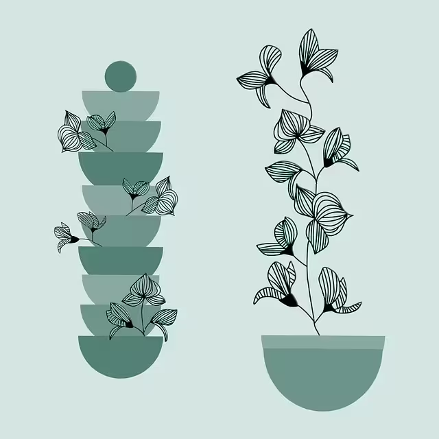
While color psychology provides the “how,” a new megatrend provides the “why.” The single most important driver of modern commercial color trends is Biophilic Design. My expertise is rooted in this concept. Biophilia is the idea that humans have an innate, biological need to connect with nature.15 For thousands of years, we lived outdoors. Our brains are still wired to find natural patterns and colors to be safe, restorative, and calming.
Biophilic design is the practice of bringing elements of the natural world into the built environment.16 This goes far beyond just adding a few potted plants. It means using natural light, organic shapes, and, most importantly, a nature-based color palette. This connection to nature is driving the biggest color trends we see. It is a direct response to our high-tech, high-stress, indoor lives. We are using color to fulfill that need for nature, which in turn leads to proven benefits, including lower stress, higher creativity, and improved employee well-being. This is the core of wellness in the workplace.
This nature-based approach has created a whole new biophilic color palette that now dominates commercial design. These color trends are defined by three main categories:
1. Earthy Neutrals: For years, the go-to neutral was a cold, flat gray. Biophilic design has entirely replaced this. The new neutrals are warm, grounding, and complex. Think of the colors of the earth itself. We are seeing a massive rise in terracotta, a rich, baked-earth red-orange. We see clay, sand, and mushroom, which are sophisticated, warm beiges and taupes. These colors make us feel safe, stable, and connected to the ground. They are the new foundation for office and retail color trends.
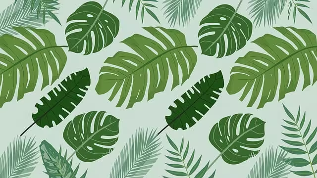
2. Restorative Greens: Green is the most obvious color in nature, and it is the anchor of the biophilic palette. Studies show that looking at the color green can lower your heart rate and reduce stress.17 These are not the artificial lime greens of the past. The current color trends focus on complex, natural greens. Sage green, which is soft and grayed, is extremely popular for creating calm.18 Olive green offers a deep, sophisticated, and warm feeling. Forest green is a dark, rich hue used to create cozy, enveloping spaces that feel protective.
3. Calming Blues: The final piece of the biophilic palette is blue, which represents water and sky. These elements signal safety and openness to the human brain. Again, the color trends are moving toward more complex, “muddied” or “dusty” versions of the color. Dusty blue or powder blue is light, airy, and calming.21 It is perfect for spaces that require quiet and focus. Steel blue, which has a gray undertone, is a more serious, professional blue that still feels calming and stable.
This entire palette is a fundamental shift in design color trends. It moves away from colors that are sterile and artificial and embraces colors that are complex, restorative, and deeply human.
Key 2024-2025 Color Trends: The Specifics

Building on that biophilic foundation, we can identify several specific color trends that are defining 2024 and 2025. These are the exact hues and tones that are being applied in new projects, from small cafes to major corporate headquarters.
The New Neutrals and Earthy Tones
As mentioned, the shift from cool gray to warm neutrals is the most significant change. But even within this trend, we are seeing specifics. The most popular tones are “muddied,” meaning they are complex and have gray or brown undertones. They are not a simple, bright color. For example, instead of a bright peach, we see a “peachy-pink brown,” like Little Greene’s “Mochi.” The most prominent color in this group is terracotta and its cousin, paprika. These are rich, warm, and spicy red-browns. They can be used as a grounding neutral on all four walls or as a powerful accent color. These earthy color trends make a space feel warm and human.
Moody and Luxurious Darks
Running parallel to the natural trend is a move toward dark, moody, and luxurious colors. These color trends are about creating spaces that feel like a cozy, protective hug. Instead of being small and dark, these colors make a room feel intimate, sophisticated, and expensive. We are not using pure, stark black. Instead, the trend is for soft blacks or charcoals. Behr’s 2024 Color of the Year, “Cracked Pepper,” is a perfect example. We also see deep, rich chocolate browns, deep navies, and dark forest greens. These color trends are especially popular in hospitality, like high-end restaurants and hotel bars, where they create a sense of drama and luxury.
Complex and Sophisticated Accents
While the base palettes are earthy or dark, the accent color trends are becoming more complex and brave. This is where designers are adding personality.
- Purples: This is one of the newest and most surprising color trends. We are not talking about a bright, childish purple. The trend is for soft, sophisticated purples. Lavender, mauve (a grayish-purple), and amethyst are being used as accents that feel creative, unique, and calming. Glidden’s “Purple Basil” and Minwax’s “Violet” are great examples of this rising trend.
- Muted Pinks: Pink has shed its old associations and is now a very sophisticated, humanizing color. The trend is for blush pink or dusty rose. These soft, warm tones are used in “soft” retail, cafes, and hospitality spaces to create a welcoming, gentle, and modern atmosphere.
- Energetic Yellows: Yellow is used more sparingly, but with great effect. The color trends point to complex yellows like chartreuse (a yellow-green) or a rich sunflower yellow. These are not used on all four walls. Instead, they are used as a strategic “pop” of energy in a creative space, a collaboration zone, or a retail display to instantly draw the eye.
Practical Application: Color Strategy by Commercial Sector
These color trends are not one-size-fits-all. The right strategy depends on the function of the space and the goals of the business. Here is a technical breakdown of how to apply these color trends in different commercial sectors.
Corporate and Office Spaces
- Keyword Focus: Office color palettes
- Goal: Increase focus, boost productivity, and support employee wellness.
- Application: This is the home of biophilic design. The main work areas, or “focus zones,” should use colors that reduce stress and eye strain. Sage green and dusty blue are the top choices. For common areas, lounges, and break rooms, use warm earthy neutrals like sand or clay to create a relaxing, comfortable environment. For high-energy collaboration rooms or brainstorming zones, use a pop of an energetic accent like tangerine or sunflower yellow on one wall. These color trends are moving offices away from sterile white and gray and turning them into environments that support the people working there.
Retail and E-commerce (Physical Spaces)
- Keyword Focus: Retail color schemes
- Goal: Build brand identity, guide customer flow, and encourage sales.
- Application: In retail, the color is the brand. The color trends here are about creating an immersive experience. A sustainable, all-natural brand must use the biophilic palette of greens, browns, and tans. A luxury brand will use the moody, dark color trends like charcoal and navy to feel exclusive. A key application trend here is Color Drenching. This is where a brand paints the walls, the trim, and even the ceiling in one single, bold color. This is powerful, confident, and looks incredible on social media, which is a key part of modern retail marketing.
Hospitality and Restaurants

- Keyword Focus: Restaurant paint colors
- Goal: Create a specific, memorable mood and influence dining pace.
- Application: This sector uses color psychology in the most direct way. Fast-food and fast-casual restaurants continue to use reds and oranges to encourage energy, appetite, and quick turnover. For fine dining, the color trends are all about the moody and luxurious. Deep jewel tones (emerald, sapphire), dark charcoals, and rich browns are paired with warm, low lighting. This makes the space feel intimate and encourages people to stay longer and spend more. Cafes and casual spots use the biophilic color trends (sage green, terracotta) to become a cozy, welcoming “third place” where people want to relax.
Healthcare and Wellness Spaces
- Keyword Focus: Healthcare color palettes
- Goal: Reduce patient anxiety, promote healing, and create a sense of clean, calm trust.
- Application: This is where evidence-based design is critical. Jarring, bright colors and cold, sterile white can actually increase patient anxiety. The color trends here are driven by science. Soft, restorative greens and calming light blues are the primary choices for patient rooms and waiting areas. They are clinically associated with calm. These are paired with warm, “non-sterile” neutrals like a soft beige or warm white. This approach makes a clinical environment feel more human, safe, and healing. These color trends are a key part of improving the patient experience.
Beyond the Hue: Finishes, Application, and Sustainability
The most advanced color trends are not just about the hue itself. They are also about how the color is applied, what its texture is, and where it comes from.
Application Trends: Drenching and Murals
As mentioned, Color Drenching is a major trend. By painting the walls, the baseboards, the trim, and sometimes the ceiling the same color, you create an incredibly modern, bold, and immersive feeling. This is a very confident design choice. We are also seeing a return of geometric patterns and murals. Instead of a flat wall, designers are using paint to create large, abstract shapes or even huge, nature-inspired murals. This uses color to create architecture and provides a powerful focal point for a space.
Finish Trends: The Rise of Matte and Satin
This is a key technical aspect of modern color trends. For decades, high-traffic commercial spaces used semi-gloss or high-gloss paint because it was easy to clean. We are moving away from this. The dominant finishes today are matte (which has no shine) and satin (which has a very low, soft shine). Why? Because shiny surfaces reflect light, which can create glare and feel harsh.29 A matte finish diffuses light, making a color look richer and deeper. It creates a softer, calmer, and more sophisticated atmosphere. New paint technology has made these low-sheen finishes much more durable and cleanable, so they are now practical for commercial use.
Sustainability and Materiality
Finally, the source of the color is a growing concern. This links directly back to the idea of a healthy, biophilic environment. Clients now demand low-VOC or zero-VOC paints. VOCs (Volatile Organic Compounds) are chemicals in paint that are released into the air and can be harmful to breathe.30 Using low-VOC paint is essential for good indoor air quality.31
More importantly, the best color trends are not just about paint. They are about materiality. This means letting the natural materials provide the color. The rich, warm brown of a walnut wood panel.32 The deep, complex gray of a natural slate floor. The vibrant green of a living plant wall. Integrating these real, natural materials is the most authentic way to apply biophilic color trends. The color is real, tactile, and healthy.
Conclusion: Coloring the Future of Commerce
The trends in color usage for commercial spaces for 2025 mark a clear and definitive shift. We have moved from a world of sterile, thoughtless defaults to a new standard of intentional, human-centric design. The new commercial palette is based on science and psychology. It is deeply connected to our innate need for nature.
These modern color trends demonstrate that color is no longer just decoration. It is a critical component of a business strategy. The right color strategy can calm a patient, focus an employee, build a brand, and welcome a guest.33 Choosing a palette is a direct investment in the human experience of the space, and it has a direct impact on the health of the people and the business within it.34
Contact Silphium Design LLC to integrate these strategic, biophilic color trends into your next commercial project.