Have you ever seen an advertisement where the words themselves looked like they were made of leaves, water, or cracking ice? That’s not just a clever artistic choice; it’s a powerful design strategy called natural form typography. This is the practice of creating letterforms from or in the likeness of natural elements. Instead of using standard, computer generated fonts, designers build words from branches, water ripples, stone textures, or animal patterns.
This article’s main idea is simple but profound: this type of design, which we can also call biophilic typography, does more than just look pretty. It taps into a deep, built in human connection to the natural world. This connection, known as the biophilia hypothesis, makes the campaign’s message more memorable, emotional, and much more persuasive. Our purpose here is to explore compelling examples of natural form typography, break down exactly why they are so effective, and give you a clear framework for understanding this potent intersection of graphic design, psychology, and ecological activism.
Table of Contents
The Biophilic Principle: Why Nature Inspired Fonts Resonate
At the heart of natural form typography is a scientific concept called the biophilia hypothesis. The term was made popular by a biologist named Edward O. Wilson. He proposed that humans have an innate, or built in, tendency to seek connections with nature and other forms of life. It’s the reason why an office with plants feels more calming, why a walk in the park can clear your head, and why a view of the ocean feels so majestic. Our brains are fundamentally wired to respond to natural patterns and shapes. This is the core mechanism that gives natural form typography its incredible power.
When we see letters made of cold, hard, geometric shapes, our brains process them efficiently but without much emotional engagement. They are purely functional. But when we see letters that mimic the curve of a vine, the texture of bark, or the flow of water, our brains react differently. These organic, non rigid forms are perceived as less threatening, more interesting, and more engaging. They activate the part of our minds that connects with the living world. This psychological resonance is the secret ingredient. The message is no longer just a collection of words on a page; it becomes a small piece of the natural world itself, creating an emotional connection with the person viewing it.
This principle is a cornerstone of the broader fields of sustainable design and green graphic design. The goal is not just to create something visually appealing, but to create something that feels aligned with the natural world it seeks to protect. By using natural form typography, a designer can make the visual style of a message match the content of the message. If a poster is about saving the rainforest, using typography that looks like it’s made of leaves and vines instantly reinforces that idea before a single word is even read. This creates a complete, harmonious experience that resonates with our deepest instincts. The use of natural form typography is a direct appeal to our biophilic tendencies.
Case Studies: Iconic Examples of Eco Typography in Action
To truly understand the impact of natural form typography, we need to look at how it has been used in the real world. Major environmental organizations have been using this technique for decades to create some of the most memorable and effective campaigns in history.
The WWF (World Wildlife Fund): Beyond the Panda
The WWF is a master of visual communication, and their use of typography is often subtle but brilliant. They understand that to get a message across, they need to do more than just present facts; they need to make you feel something.
- The “Give a Hand to Wildlife” Campaign: This is a fantastic example of a related concept, biomimicry, in visual communication. In these images, human hands are painted with incredible detail to look like endangered animals like tigers or eagles. The hands are then positioned to spell out messages or form shapes. While not strictly natural form typography made from leaves or stones, it follows the same core principle. It uses a biological form, the human hand, to create a message, powerfully connecting human responsibility directly to the fate of these animals. It’s an unforgettable visual that says, “their fate is in our hands.”
- WWF “Population” Font: This is a more direct and data driven example of natural form typography. Designers created a font where the thickness of each letter is directly related to the remaining population of an endangered species. For a species with a healthy population, the letters might be thick and bold. For a critically endangered animal, the letters are terrifyingly thin, almost fading away. This transforms typography from a simple communication tool into a piece of data visualization. You don’t just read that a species is in trouble; you see it in the very structure of the words. It’s a chillingly effective use of design to communicate a harsh reality.
- Earth Hour Campaigns: For their annual Earth Hour event, the WWF has used numerous posters that employ natural form typography. In some, the letters of the message appear to be made from constellations of stars in a dark night sky. This connects the act of turning off lights to the beauty of the universe it reveals. In other versions, the typography looks like it’s made from the glowing filament of a lightbulb that is about to go out. This directly links the text to the campaign’s central concept of conserving electricity. In every case, the style of the typography is the message.
Greenpeace: Confrontational and Organic Visuals
Where the WWF often uses a tone of urgent beauty, Greenpeace is known for its more direct, confrontational, and powerful visuals. Their use of natural form typography often serves to shock the viewer into recognizing the severity of an environmental crisis.
- “Tree” Poster: One of the most famous examples of environmental design is a Greenpeace poster where a detailed illustration of a tree is actually composed of hundreds of tiny words. From a distance, you see a tree. As you get closer, you realize the entire image is built from text describing the ecological importance of forests, the threats they face, and the consequences of deforestation. The natural form typography here works on multiple levels. It is both the image and the information, creating a rich, detailed piece that rewards closer inspection.
- Anti Whaling Campaigns: Greenpeace has never shied away from difficult imagery. In some of their anti whaling campaigns, they have used typography that mimics the shape and form of a great whale. In more graphic examples, the message is written in a font that appears to be dripping with blood. This is a visceral and uncomfortable use of natural form typography. It’s designed to be unsettling because the topic itself is unsettling. It forces the viewer to confront the brutal reality of the issue, creating a powerful and lasting emotional impact.
- Oil Spill Lettering: To protest ocean pollution and oil spills, Greenpeace has created campaigns where messages are spelled out using images of thick, black oil sludge or photos of oil slicks on the water’s surface. For example, the name of a polluting corporation might be written in this oily font. This is a brilliant tactic. It visually and directly connects the entity responsible with the environmental damage they caused. The natural form typography isn’t just representing nature; it’s representing nature that has been harmed and destroyed.
Grassroots and Public Awareness Movements
The use of natural form typography isn’t limited to large, global organizations. It’s also a powerful tool for grassroots movements, where authenticity and passion are key.
- The Extinction Symbol: While not a traditional alphabet, the symbol for Extinction Rebellion (XR) is a perfect example of non alphanumeric typography that conveys a powerful natural message. The simple, stark circle represents the Earth, while the hourglass inside serves as a clear warning that time is running out. It’s a modern hieroglyph for our planet’s emergency. Its raw, often stenciled application on protest materials gives it an organic, urgent feel that a polished corporate logo could never achieve.
- Fridays for Future Protest Signs: When you look at images from youth climate strikes led by movements like Fridays for Future, you’ll often see protest signs that embody the spirit of natural form typography. Protesters will use materials from the environment itself to create their messages. Words might be spelled out by gluing real leaves, mud, or twigs onto a piece of cardboard. This is perhaps the most authentic form of natural form typography. It shows a deep connection to the earth and a rejection of synthetic, mass produced materials.6 It sends a message that is both visually and philosophically consistent: we are fighting for the natural world, and we will use the natural world to make our voices heard.
A Taxonomy of Natural Form Typography Techniques
So, how is natural form typography actually created? While the results can look complex, the methods can be broken down into a few key techniques. Understanding these techniques helps us appreciate the skill involved and shows how versatile this design approach can be.
Found Object & Environmental Typography
This is the most literal and physical technique. It involves going out into the environment and using physical, natural materials to create words and messages. The artist or designer might arrange stones on a beach, lay out fallen leaves in a field, or draw in the sand to spell out a message. The final piece is then captured with photography.
This method has a powerful sense of authenticity. It’s not a digital imitation of nature; it’s the real thing. The famous designer Stefan Sagmeister is known for using this technique in his work, sometimes using hundreds of natural objects to create elaborate typographic installations. The final photograph captures a specific moment in a specific place. The slight imperfections, the play of light and shadow, and the texture of the materials make the message feel grounded and real. This hands on approach to natural form typography creates a deep connection between the message, the materials, and the environment itself.
Illustrative & Custom Lettering
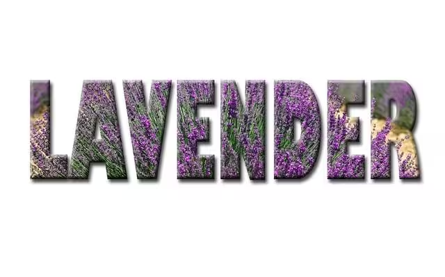
This is the most common technique used in professional environmental advertising and graphic design. It involves an artist digitally or manually drawing custom letterforms that mimic natural textures and shapes. A designer might create a font where each letter looks like it’s carved from wood, woven from grass, or formed from a splash of water.
The possibilities are endless. We see typography that has the rough texture of tree bark, the delicate veins of a leaf, the smooth contour of a river stone, or the fluffy texture of a cloud. This technique allows for a high degree of control and polish. Designers can perfectly craft the letters to fit the tone and style of their campaign. For example, a campaign about water conservation might use a fluid, flowing blue font, while a campaign about protecting old growth forests might use a rugged, textured font that looks ancient and strong. This form of natural form typography combines artistic skill with strategic communication.
Generative & Biomimetic Fonts
This is a more modern and technologically advanced approach to natural form typography. It involves using computer algorithms that follow natural growth patterns to generate letterforms. For example, a programmer could design an algorithm that mimics the way a tree branch grows, with smaller branches splitting off from larger ones, and use that code to “grow” the letters of the alphabet. This is known as a generative process.
This technique is a fascinating part of the future of sustainable web design and digital art. It’s a form of biomimicry, where design imitates the processes and systems of nature. The resulting fonts can look incredibly organic and complex, because they were created using the same mathematical principles that shape the world around us, like fractal patterns or cellular division. This cutting edge approach to natural form typography shows how technology can be used not to replace nature, but to better understand and represent its beautiful complexity.
Broader Implications: Eco Branding and Digital Biophilia
The power of natural form typography extends far beyond single posters or ad campaigns. It has become a crucial element of long term eco branding. When a company wants to signal to its customers that it is environmentally friendly and committed to sustainability, it often incorporates these principles into its core visual identity.
Think about the logos of companies in the organic food, outdoor recreation, or renewable energy sectors. Many of them use organic lettering or symbols that evoke natural forms. A logo might feature a leaf, a mountain, or a wave. The font used for the company name might have soft, rounded edges instead of sharp, industrial ones. This isn’t just a trend; it’s a strategic choice. These visual cues communicate a set of values to the consumer. The use of natural form typography in a logo tells a story of being earthy, wholesome, and responsible.
These principles are also incredibly important in the digital world. The concept of digital biophilia involves incorporating natural elements and patterns into website and app design to create more calming and engaging user experiences. This is where natural form typography can truly shine online. A website for a national park might use a heading font that has a subtle woodgrain texture. A wellness app might use buttons that are shaped like smooth pebbles instead of perfect rectangles. A custom cursor on an environmental non profit’s site could leave a trail of tiny leaf prints as it moves across the screen.
These might seem like small details, but they add up. They make the digital experience feel less cold and mechanical, and more connected to the real, living world. In a world where we spend so much time looking at screens, using natural form typography is a way to bring a little bit of nature back into our digital lives. It is a key element of effective visual communication for any brand or organization that wants to be associated with nature and sustainability. The thoughtful application of natural form typography is a hallmark of sophisticated eco branding.
Frequently Asked Questions (FAQ)
What is biophilic typography?
Biophilic typography, another term for natural form typography, is the design practice of creating letters and words that look like they are made from natural elements. This can involve using photos of real objects like leaves and stones, or illustrating letters to have the texture of bark, water, or fur. The main goal is to use the appearance of the text to create a stronger connection to nature for the viewer.
How can typography be used to raise environmental awareness?
Typography can raise environmental awareness by visually representing the message it’s trying to convey.12 For example, in a campaign about melting glaciers and climate change, using a font that looks like it’s made of cracking, melting ice creates an immediate and intuitive understanding of the problem. You feel the coldness and the danger before you even finish reading the words. This makes the message more urgent and memorable than if it were written in a plain, neutral font. This is the essence of natural form typography’s power.
What are some famous environmental campaigns that use this technique?
Some of the most iconic examples come from major non profits. WWF’s Earth Hour campaigns often use typography made of stars or light filaments. Various Greenpeace posters have used powerful natural form typography, such as text that looks like it’s made from oil sludge to protest pollution or composed of words that form a tree to highlight deforestation. Additionally, the visual identity of movements like Extinction Rebellion, with its simple and powerful hourglass-in-a-circle symbol, is a form of non traditional typography that communicates an urgent environmental message.13
What is eco branding?
Eco branding is a marketing strategy where a brand’s entire visual identity, which includes its logo, colors, imagery, and typography, is carefully designed to communicate environmental responsibility and a strong connection to nature.14 A company might use a logo with a leaf in it or use natural form typography for its name to show customers that it values sustainability.15 The goal is to build an identity that customers associate with being green, organic, and environmentally conscious.
Conclusion: The Enduring Power of Nature in Visual Messaging
As we’ve seen, natural form typography is far more than just a stylistic gimmick. It is a sophisticated and effective design tool that works because it taps directly into our innate human love for the natural world, our biophilia. By shaping our words with the forms and textures of nature, designers can create messages that are not only seen and read, but are also felt on a deeper, more emotional level.
From the data driven urgency of a WWF font to the raw, confrontational power of a Greenpeace poster, the most successful examples show us that the power of this technique lies in its authenticity. The medium truly becomes the message. When the letters on the page look like the very thing you are fighting to protect, the argument becomes infinitely more compelling. The strategic use of natural form typography can elevate a simple message into a powerful call to action.
For designers, marketers, and activists, the lesson is clear. The next time you need to communicate a message about the environment, sustainability, or our relationship with the planet, consider looking outside your window for inspiration. Think about how a biophilic approach to your design, specifically through the use of natural form typography, can add a layer of depth, integrity, and emotional resonance that a standard font never could.