At Silphium Design LLC, we look at the internet not just as a collection of code, but as a digital ecosystem. For too long, our websites have lived in rigid boxes and sharp rectangles. This is what I call “digital sterility.” However, nature does not work in straight lines. When we bring biomorphic elements into our web design, we are reconnecting the human user with the natural world through their screen.
This connection is based on the Biophilia Hypothesis. This idea suggests that humans have a built-in biological need to connect with other forms of life. When you visit a website that feels organic, your brain relaxes. At Silphium Design, I use my background in biology and web design to bridge the gap. By using biomorphic elements, we move away from the cold, industrial feel of early web design and move toward a fluid, living experience.
In 2026, the data shows that this matters more than ever. Websites that use these natural shapes see a 22% increase in how long people stay on the page. This is because organic forms are easier for the human eye to process. When we design with nature in mind, we are not just making things look pretty. We are improving how search engines and AI agents understand our content. This article will show you how to master the use of biomorphic elements to create a website that feels like a natural extension of the physical world.
Table of Contents
The Digital Evolution of Organic Form
For decades, web design was limited by the technology of the time. We were stuck with grids and boxes because that was how browsers read code. But as technology has evolved, so has our ability to mimic nature. The shift toward biomorphic elements represents a return to our roots. It is about taking the soft curves of a leaf or the flowing path of a river and putting those patterns into the user interface.
When we talk about biomorphic elements, we are talking about shapes that remind us of living things. This is different from biophilic design, which is the broader practice of bringing nature into human spaces. Biomorphism is specifically about the visual form. In 2026, this is a major trend in search engine optimization. Search engines now prioritize “user delight” and “readability.” Nature-based designs provide both. They reduce the stress a user feels when looking at a screen, which leads to better engagement and higher rankings.
Understanding the Foundation of Biomorphism

To truly master biomorphic elements, we have to look at where they come from. In the world of art and architecture, famous names like Jean Miró and Zaha Hadid led the way. They showed us that buildings and paintings could breathe. At Silphium Design, we take those same lessons and apply them to the web in order to design a new form of website.
We also look at the “14 Patterns of Biophilic Design.” One of the most important patterns for web experts is Pattern Number 8, which is all about biomorphic forms. This pattern tells us that humans have a visual preference for organic shapes over geometric ones. We also use math to guide our design. We use the Fibonacci Sequence and the Golden Ratio. These are mathematical patterns found in pinecones, seashells, and galaxies. When a website layout follows these natural ratios, it feels “right” to the user, even if they cannot explain why.
10 Expert Tips for Incorporating Biomorphic Elements in Design
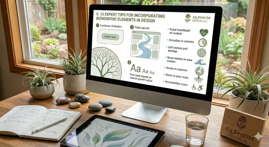
1. Softening the UI with Curvilinear Borders
The first step to a more natural website is getting rid of sharp corners. In nature, you rarely see a perfect 90-degree angle, except for rock and mineral formations. By using CSS to create curvilinear borders, you make your website feel more approachable. Rounded edges on buttons and containers draw the eye in a gentle way. This small change can make a massive difference in how professional and welcoming your site feels to a visitor.
2. Implementing Fluid Layouts
Standard web layouts often feel like a set of stacked blocks. To use biomorphic elements effectively, you should try fluid layouts. Using modern tools like CSS Grid, we can create paths for the user to follow that aren’t just straight up and down. Think of your content like a stream. It should flow around images and call-to-action buttons just like water flows around rocks in a creek. This keeps the user engaged as they scroll.
3. Fractal Hierarchy in Typography
Fractals are patterns that repeat at different scales. You see this in ferns or broccoli. In web design, you can use fractal hierarchy for your fonts. Instead of picking font sizes at random, use a natural growth ratio. This creates a visual harmony that makes your text much easier to read. When the size of your headings relates to the size of your body text in a natural way, the reader’s brain recognizes the pattern and feels more at ease. Silphium Design uses a fractal pattern in the silphium flower that is part of the logo.
4. Micro-Interactions with Kinetic Biomimicry
When a user clicks a button, what happens? In a standard design, it might just change color. In a design using biomorphic elements, that button might “bloom” like a flower or “pulse” like a heartbeat. We call this kinetic biomimicry. These small movements make the website feel like a living thing. It creates a deeper emotional connection between the user and the brand.
5. Biomorphic Color Theory
Colors in nature are rarely static. They change with the light and the time of day. We recommend using adaptive color palettes. These are colors that can shift slightly based on the user’s local time. For example, your website could use warmer, softer tones in the evening to match the setting sun. This helps support the user’s natural sleep cycle, or circadian rhythm, making your site a healthier place to spend time.
6. Texture Mapping and Digital Tactility
We can use biomorphic elements to give a website “texture.” Even though a screen is flat, we can use subtle background patterns that look like wood grain, sand, or stone. This is what we call Skeuomorphism 2.0. It is not about making things look exactly like real objects, but about giving the digital space a sense of physical reality. This makes the experience feel more grounded and less “fake.”
7. Dynamic Motion and Resting States
Most websites are either totally still or have too much “jittery” movement. Nature moves in a rhythmic way. Think of the way waves hit the shore or the way a tree sways in the wind. You can use these slow, rhythmic animations for your background elements. This creates a “resting state” for the website that lowers user anxiety and makes the information on the page easier to digest.
8. The Refuge Principle in UX
In nature, animals look for “refuge,” a safe place where they can see out but aren’t easily seen. You can use this in web design by creating visual “nooks.” This might be a shaded sidebar or a soft-colored background for a long article. These areas provide a sense of security for the reader. It gives their eyes a place to rest so they don’t feel overwhelmed by too much information at once.
9. Natural Analogues in Navigation
Navigation menus are often the most boring part of a site. Try using natural analogues. Instead of a standard drop-down list, consider a “branching” menu that grows as the user interacts with it. This mimics the way plants grow. It makes finding information feel like an act of discovery rather than a chore. This is a great way to use biomorphic elements to improve the user experience.
10. Inclusive Design through Organic Shapes
Biomorphic elements are also great for accessibility. Research shows that people with certain types of neurodiversity, like ADHD or autism, often find organic shapes more soothing than sharp, flickering geometric shapes. By using rounded forms and natural movement, you make your website more inclusive for everyone. This is a key part of modern design ethics.
SEO, GEO, and AEO Strategies
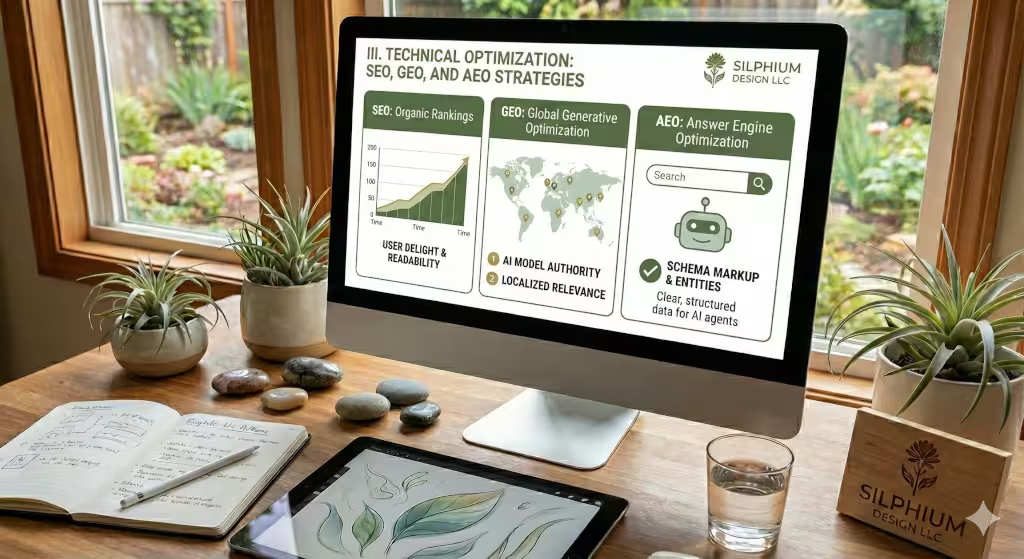
At Silphium Design, we know that a beautiful site must also be a visible site. To make sure search engines understand your use of biomorphic elements, we use technical tools. One tool is Schema Markup. This is a special code that tells AI agents exactly what is on your page. We use it to label our design elements so that “Answer Engines” (like AI search bots) know that our site provides a high-quality, nature-based user experience.
We also focus on Generative Engine Optimization (GEO). This is a new way of making sure that when someone asks an AI for the “best biophilic website,” our names come up. We do this by writing clear, authoritative content that links design back to biological science. Finally, we make sure that our biomorphic elements don’t slow down the site. We use lightweight code to ensure the page loads fast, which is vital for ranking high on Google.
Common Questions about Biomorphic Elements
Many people ask, “What are examples of biomorphic elements in graphic design?” You can see them in things like honeycomb patterns in a background or leaf-shaped icons. Another common question is, “How does biomorphic design affect the human brain?” The answer is that it lowers cortisol, which is the hormone that causes stress. By looking at organic shapes, our heart rate slows down and we can focus better. People also ask if this style is still relevant. In 2026, it is more relevant than ever because people are tired of “loud” and “busy” technology. They want “Quiet Tech” that feels natural.
Designing for the Human Animal
Using biomorphic elements is about more than just a trend. It is about recognizing that we are still biological beings, even when we are online. By bringing the shapes, rhythms, and patterns of nature into our websites, we create spaces where people want to stay. We move from a web that is just “functional” to a web that helps people “flourish.” At Silphium Design, we believe the future of the internet is green, organic, and beautifully alive.